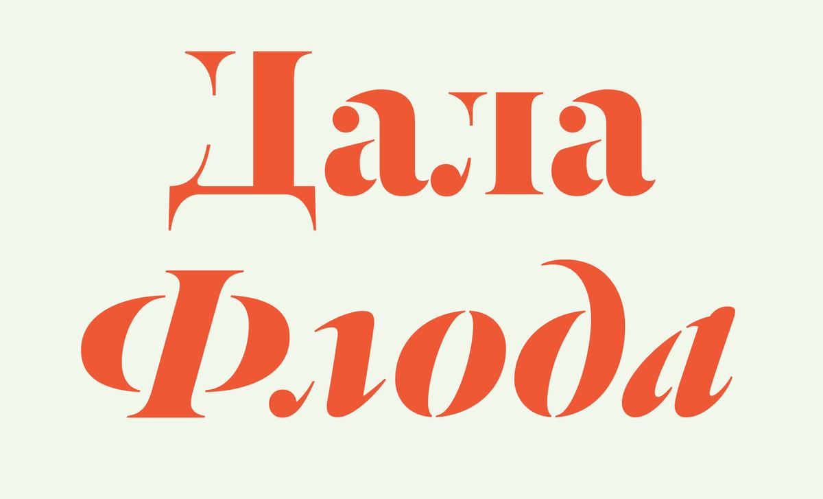
Dala Floda, designed by Paul Barnes, was one of our first releases. Originally inspired by worn gravestone lettering and lettering on shipping crates, the elegance of the forms belies their everyday origins. After three years of work, Ilya Ruderman has completed a Cyrillic extension to the family.
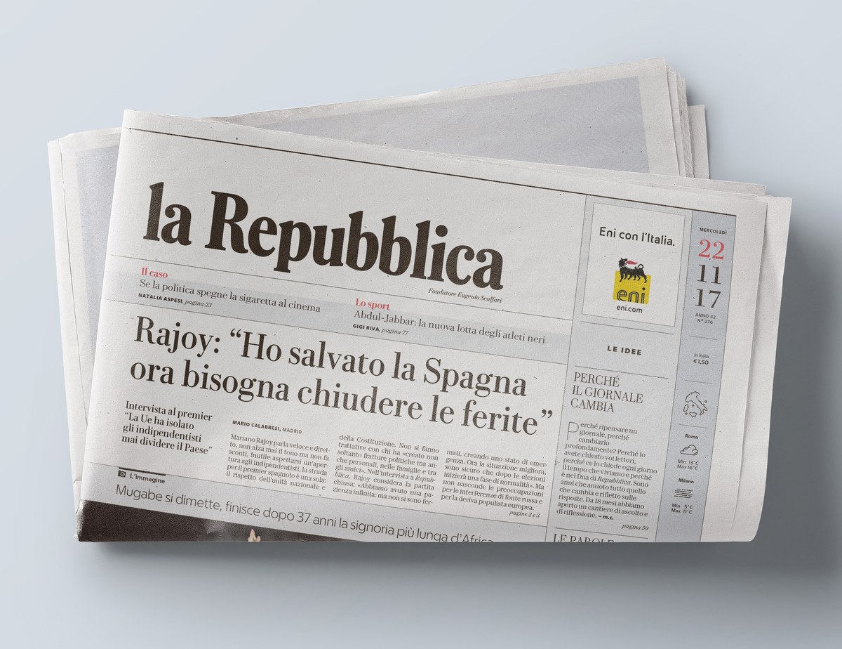
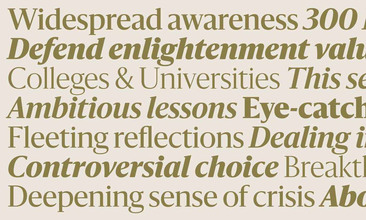
The team of designers at Commercial Type recently worked to create a new typographic palette for the redesign of La Repubblica, a popular national daily newspaper in Rome, Italy. Combining three complete typefaces under the unifying theme of being uniquely Italian and refreshingly stylish; the Eugenio family consists of Eugenio Serif, Eugenio Sans, and Eugenio Text.
Miguel Reyes will be teaching an two-day introduction to sign painting at Type@Cooper West. This workshop will focus on the Casual Letter style, also known as single stroke or speed stroke, one of the most popular among sign painters today. No prior brush lettering experience is required. Handouts will be provided with the basic construction.
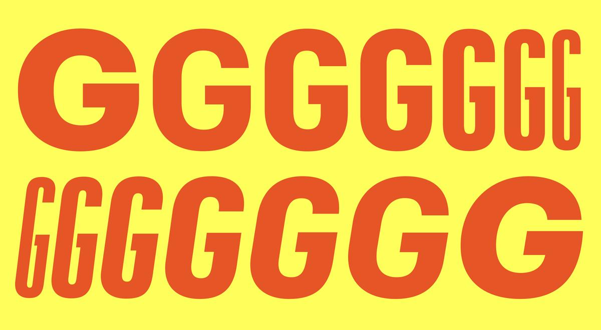
Duplicate now been expanded to five related families with the addition of Duplicate Soft and Round, drawn by Miguel Reyes.
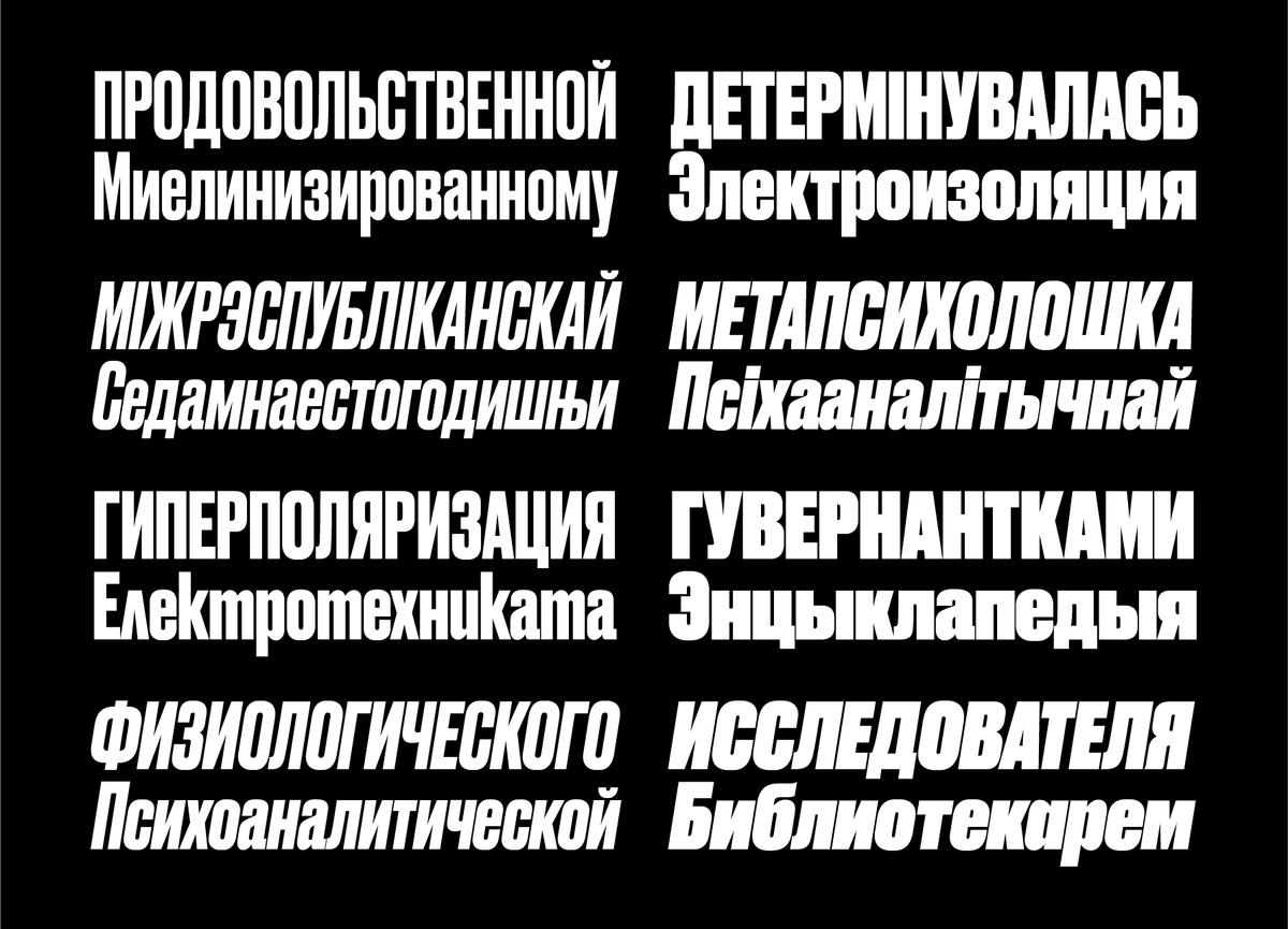
Druk, the singularly bold typeface designed by Berton Hasebe and released by Commercial Type in 2014, has now been expanded to support Cyrillic by the team of Russian designers Ilya Ruderman and Yury Ostromensky.
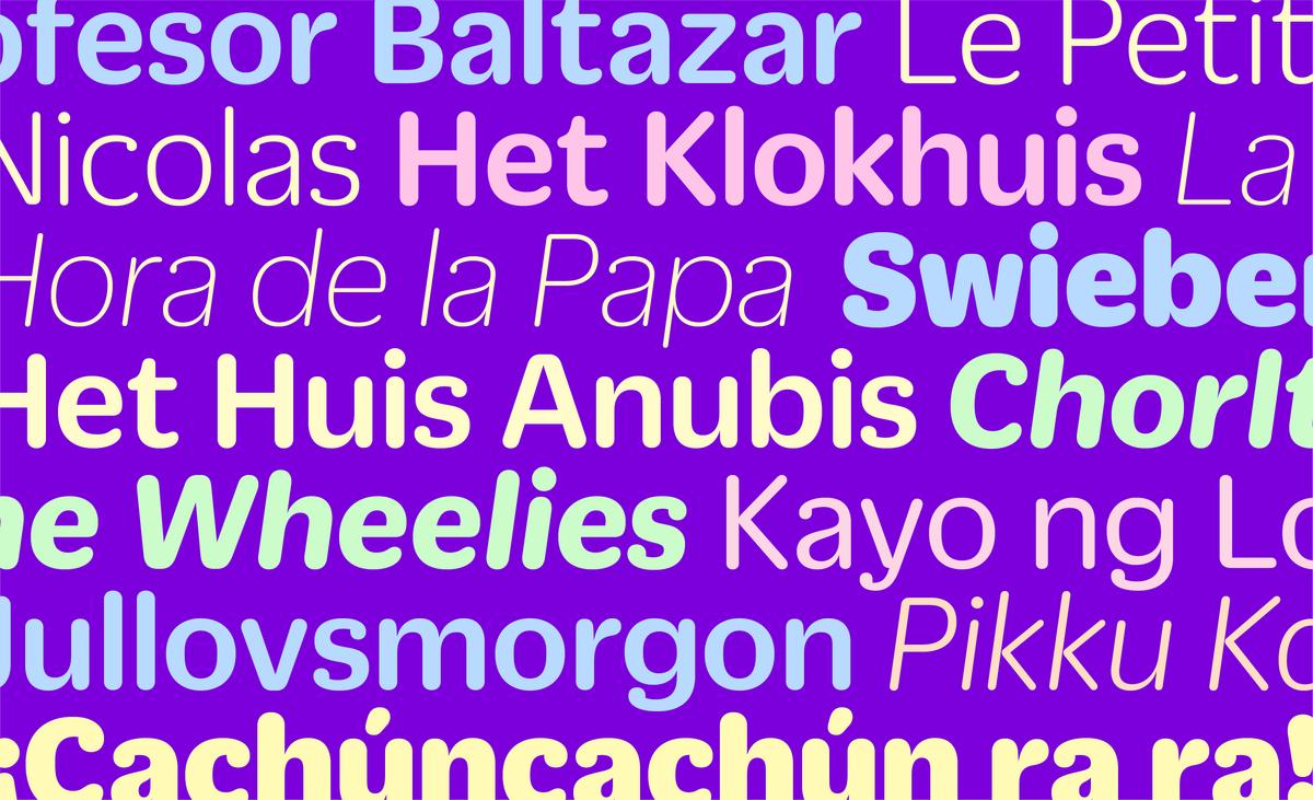
Graphik was designed to be a blank slate; a “vanilla-flavored” typeface that is perfectly suited for whatever style of expression needed. From the beginning, Schwartz had a master plan to build Graphik into a large, multi-width typeface system with a rational approach to the grid of widths and weights. Ten years later, his plan is finally a reality.
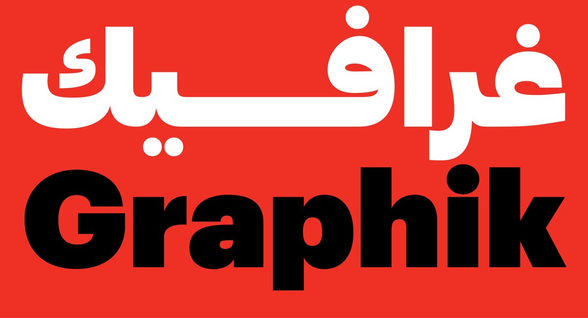
Graphik has been expanded by Lebanese type designers Waël Morcos and Khajag Apelian to support the Arabic script. Rather than simply adapting the Latin forms, Graphik Arabic has adapted the idea of Graphik—a plain, all-purpose sans serif suited both to expressive display use and to extended reading.
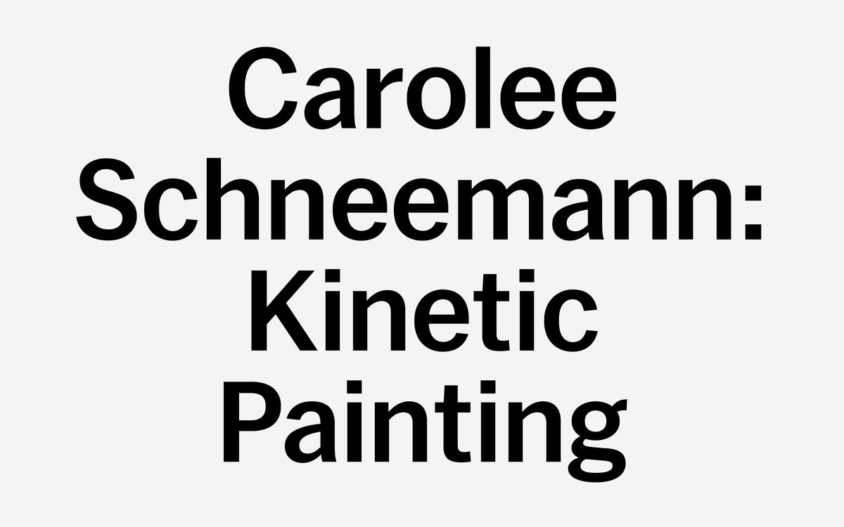
A major expansion project provided the impetus for a refresh of communications and signage at The Museum of Modern Art in New York, including a new typeface: MoMA Sans, a cohesive family designed to cover the full range of typographic needs, including exhibition graphics, subway posters, wall labels, film schedules, mobile apps, the website, and signage.
Sanomat is a new serif display family designed by Paul Barnes. Both serious and elegant, with an inviting warmth, it was originally commissioned by Sami Valtere in 2013 for his acclaimed redesign of Helsingin Sanomat.
Paul will be speaking at the Society for News Design’s 2017 conference, Unite + Rebel. Paul’s talk will focus on our work for newspapers, and how type can help a publication’s distinctive voice make the leap from print to screen. Greg will also be giving a very short presentation, and we'll have an all new newsprint specimen for attendees.
Algebra Display was designed by Altelier Carvalho Bernau for the US edition of Esquire, adding a gracefully aggressive tone to large headlines and initials. Like its all-purpose sibling Algebra, Algebra Display was inspired by the construction and proportions of Grotesks. The family has a contemporary air of brutality, with terminals and serifs abruptly sheared off.
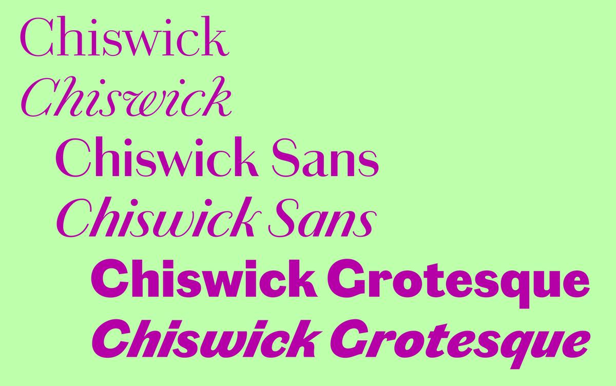
Chiswick is a collection of eight interrelated families in three sets – serif, sans, and grotesque – inspired by the vernacular style of lettering found in the British Isles from the 18th century onward. With a common skeletal structure, they range from the warm beauty of Chiswick to the industrial Chiswick Grotesque.
As part of the Herb Lubalin Lecture Series for Type@Cooper in New York, Paul will speak in depth on the ideas, research, and process that went into the development of Chiswick.
The New York Type Directors Club is celebrating its 70th anniversary with a day of lectures and discussions with such luminaries as Ed Benguiat, Louise Fili, and Erik Spiekermann. Our very own Greg Gazdowicz will be on a panel together with Elizabeth Carey Smith, Zipeng Zhu, and Jessica Svendsen, hosted by the famous Debbie Millman.