MoMA Sans for the Museum of Modern Art
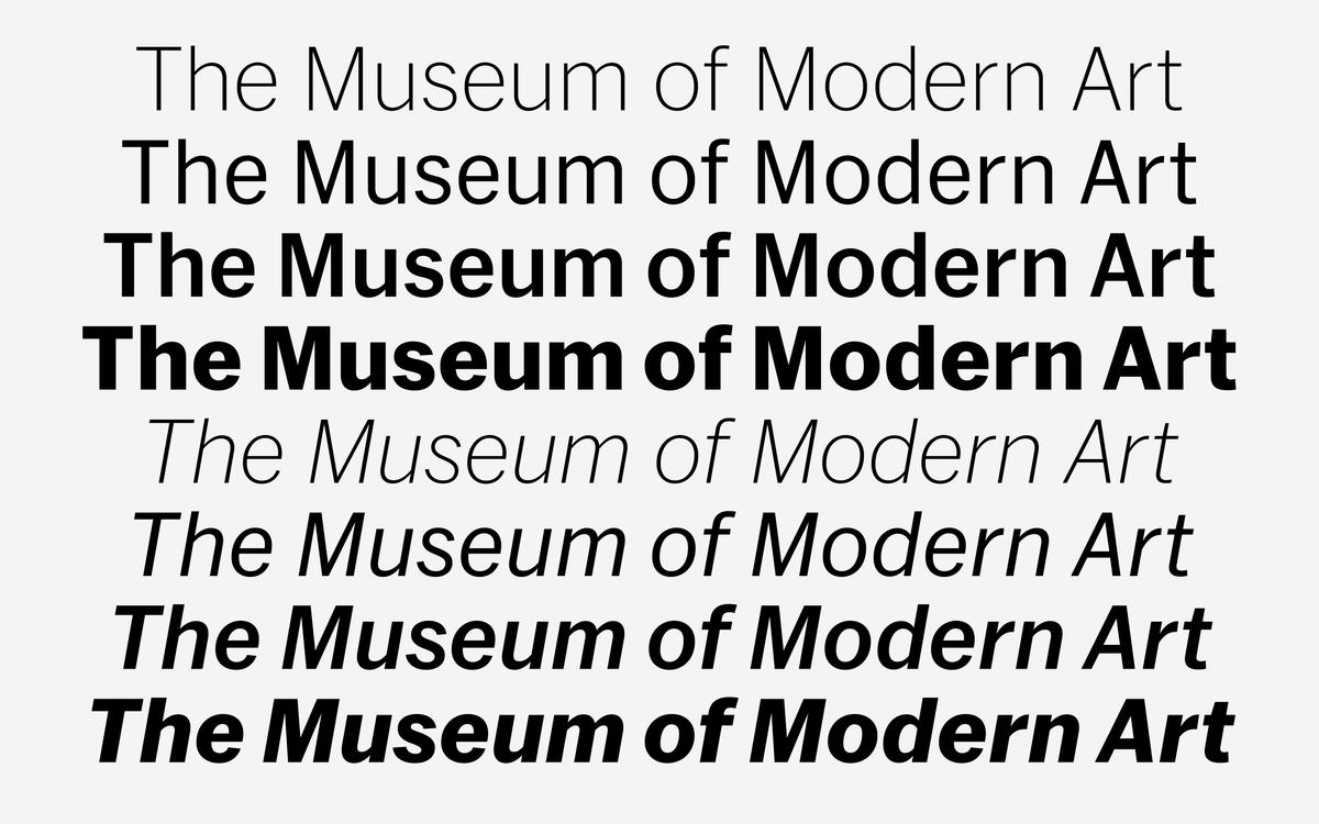
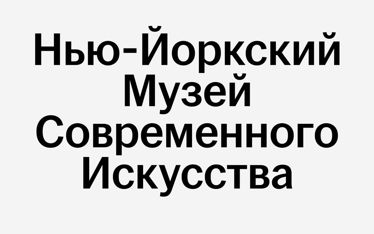
As regular visitors to The Museum of Modern Art, we were both honored and intimidated by the opportunity to create a new typeface for the institution. A major expansion project provided the impetus for a refresh of communications and signage; as part of this process, MoMA decided to replace the mix of sans serifs they had been using by commissioning one cohesive family to cover their full range of typographic needs, including exhibition graphics, print materials, subway posters, wall labels, film schedules, mobile apps, the website, and signage, to name just a handful of the hundreds of applications. Our solution was MoMA Sans, drawn by Christian Schwartz under the direction of the MoMA in-house design team and London design consultancy Made Thought, with input from Matthew Carter. Greg Gazdowicz drew the italics and Ilya Ruderman added Cyrillic support.
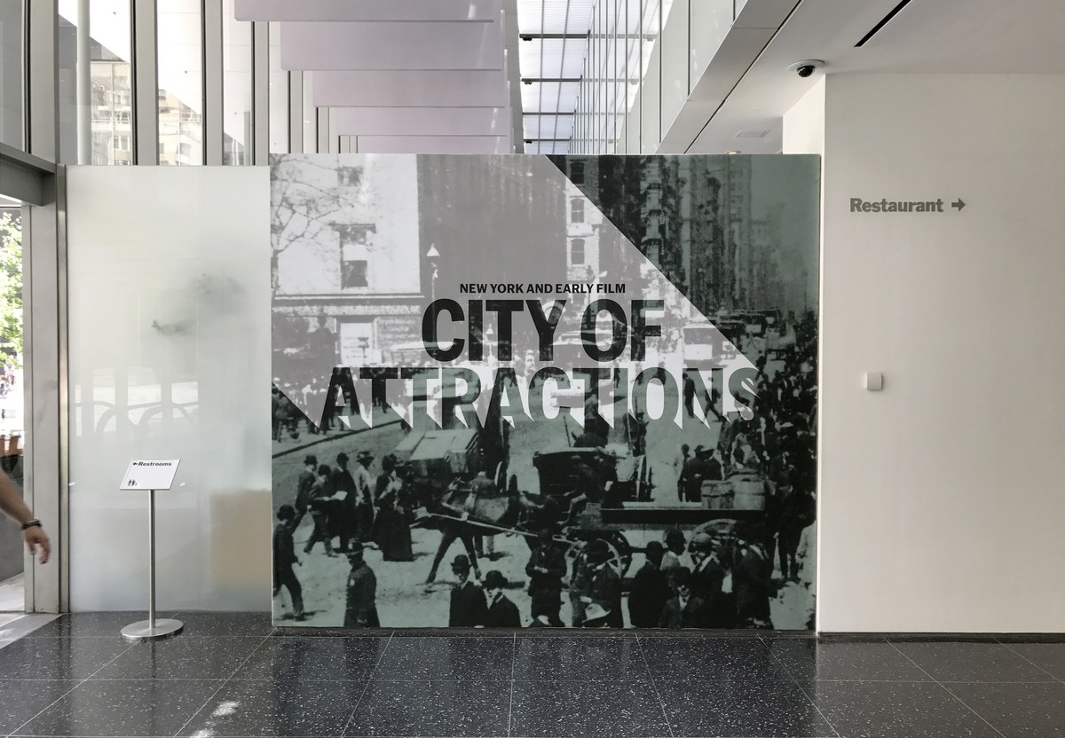
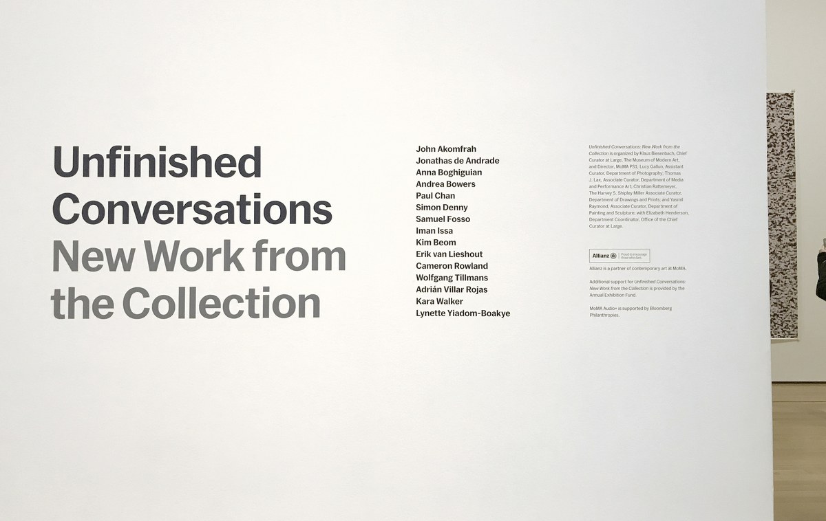
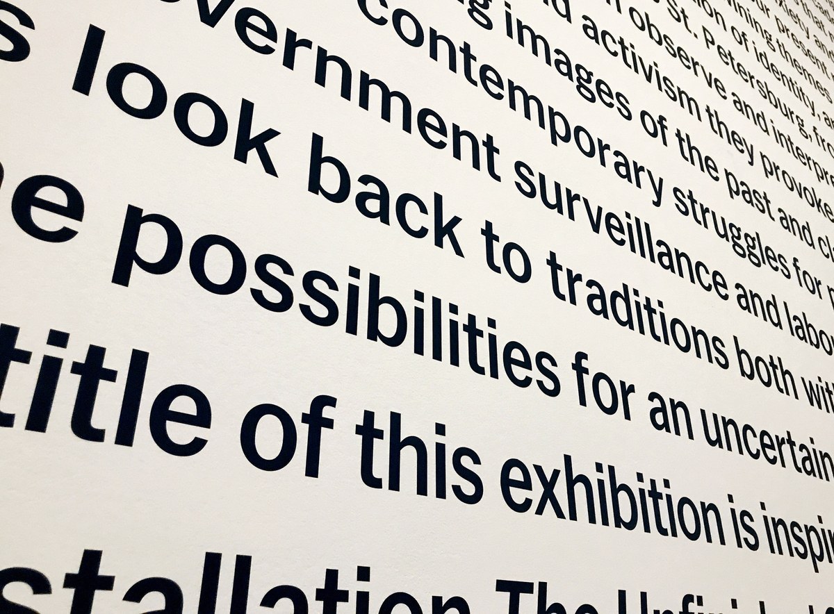
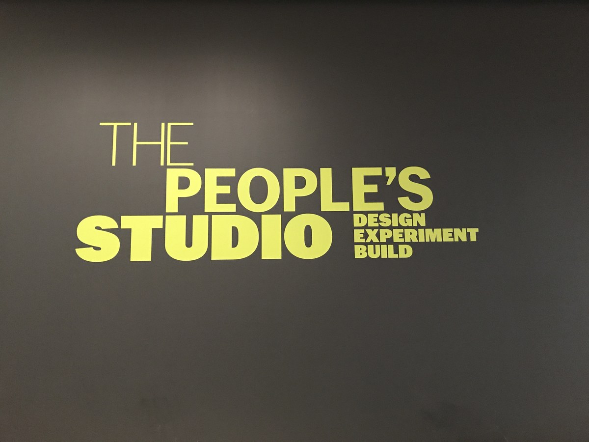
Franklin Gothic has been the core of MoMA’s typographic voice since the 1930s. Since 2003 MoMA’s primary typeface has beenMatthew Carter’s MoMA Gothic, a flawless digital recreation of Morris Fuller Benton’s 1902 Franklin Gothic, digitized from a tray of lead type in MoMA’s permanent collection. MoMA Gothic was supported by a number of loosely related American Gothic typefaces: ITC Franklin Gothic, News Gothic, and Trade Gothic. MoMA Sans takes the underlying structures and many signature details of this genre, such as angled stroke terminals, distinctive forms of G R a and g, and a measure of stroke contrast, and uses them as the starting point for a systematic family in two widths and a full range of weights. This connection to Franklin Gothic maintains the distinctive voice of MoMA, but the typeface diverges from the model as needed to satisfy contemporary needs. For example, the x-height is a bit larger than is typical for an American Gothic, for better readability on wall labels and on screen, and the angle of the terminals is reduced, for a clean, quiet feeling. Our governing principle was that the typeface should play a secondary role to the art it will accompany, informing viewers without distracting them with visual tricks and busy details.
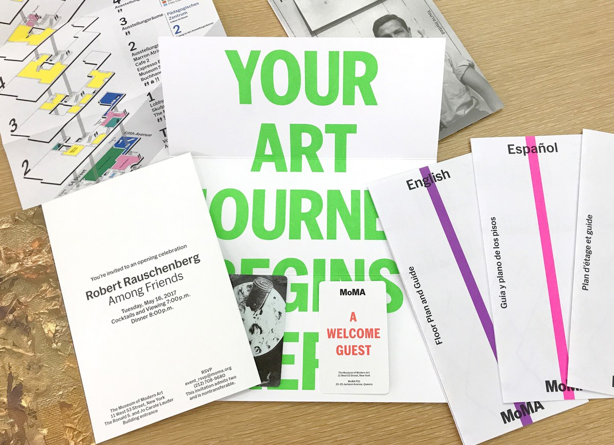
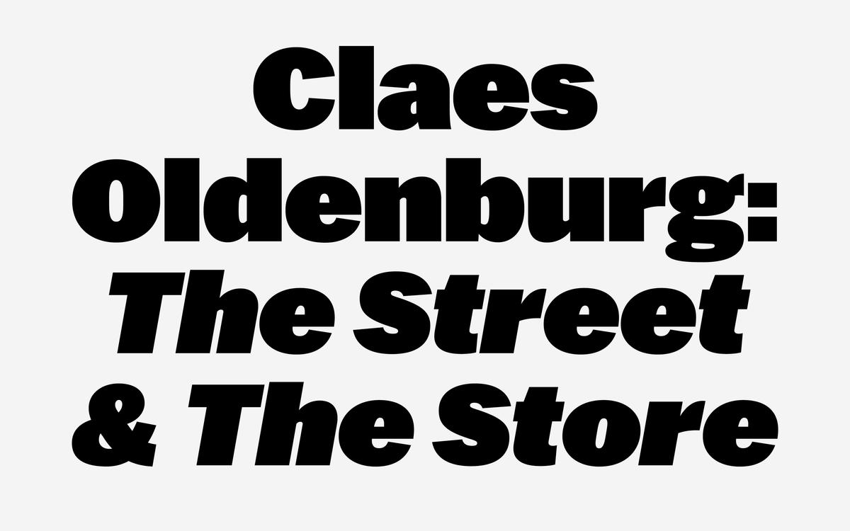
MoMA Sans has already started to be phased in, and can be seen in some of the newly renovated spaces, in current temporary exhibitions, new print materials, and on the website. The typeface is exclusive to The Museum of Modern Art and will not be available for licensing.