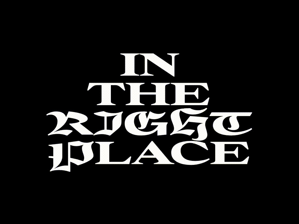
Responding to the briefest of briefs, French calligrapher and type designer Julien Priez delivers an adventurous new display serif that sits squarely at the intersection of elegance and width.
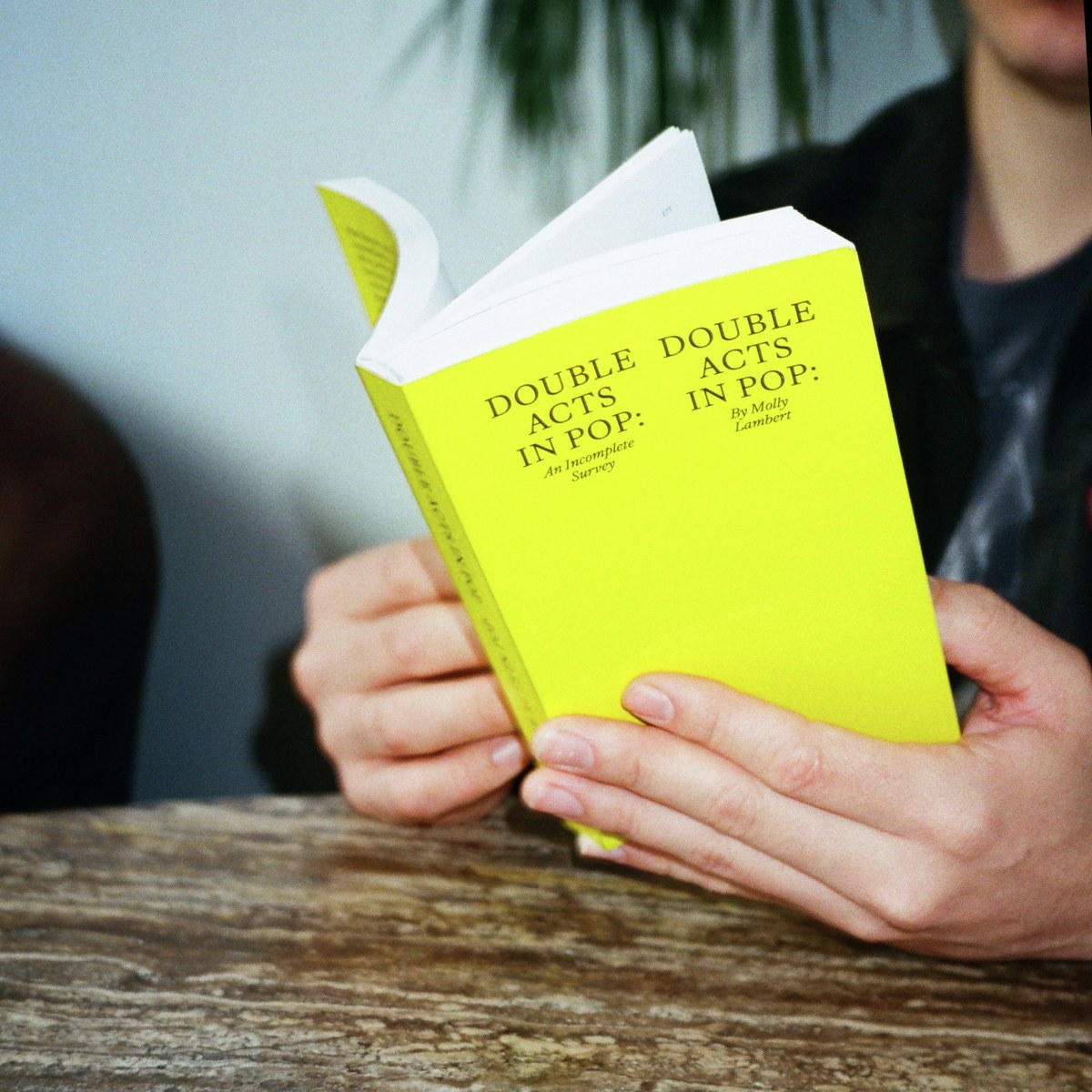
Double Acts in Pop: An Incomplete Survey is the first specimen book in almost a decade to feature Commercial Type’s full library. It’s our latest installment in a series of specimens that are designed to be as compelling to read as they are to look at.
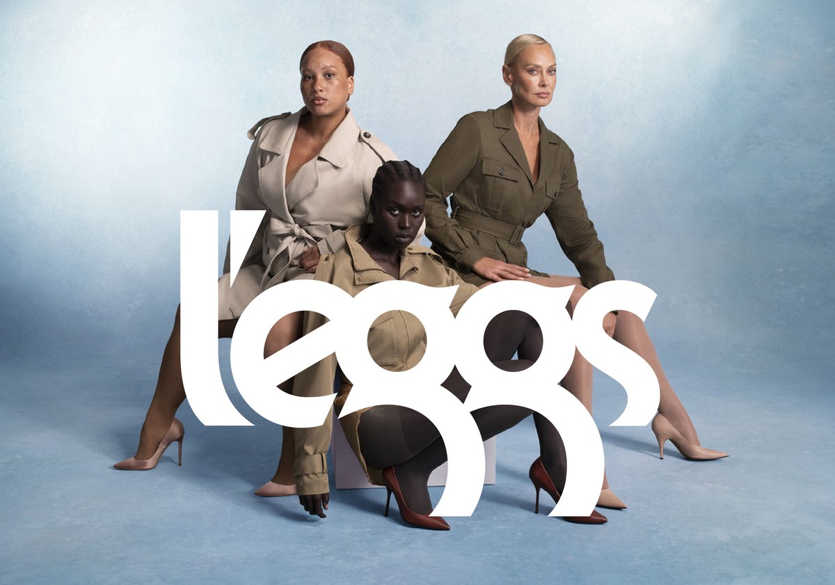
Working with Britt Cobb and Jonny Sikov, Christian Schwartz has updated Roger Ferriter’s iconic logotype for a relaunch of the L’eggs hosiery brand.
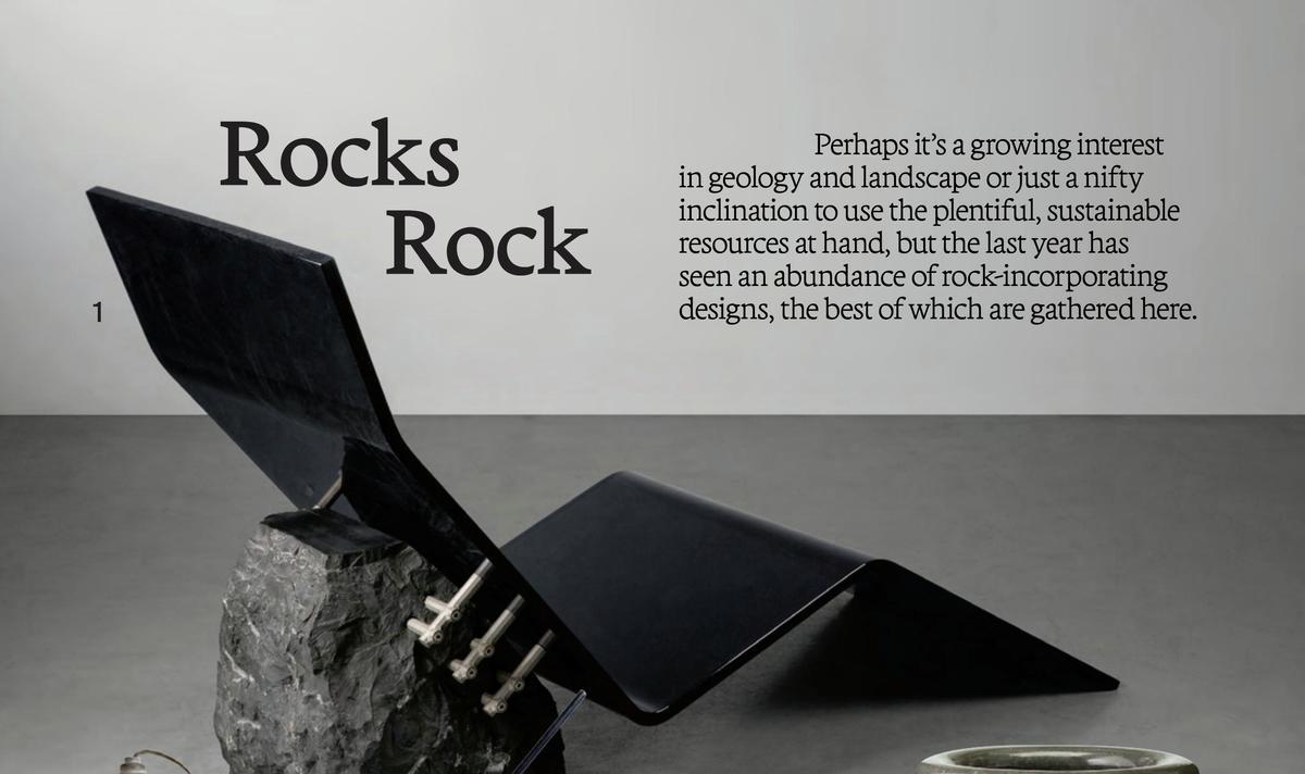
After releasing Terza last year, Greg Gazdowicz noticed that some designers were using Terza Reader—crafted with continuous text and immersive reading in mind—at very large sizes. So he made a proper display cut.
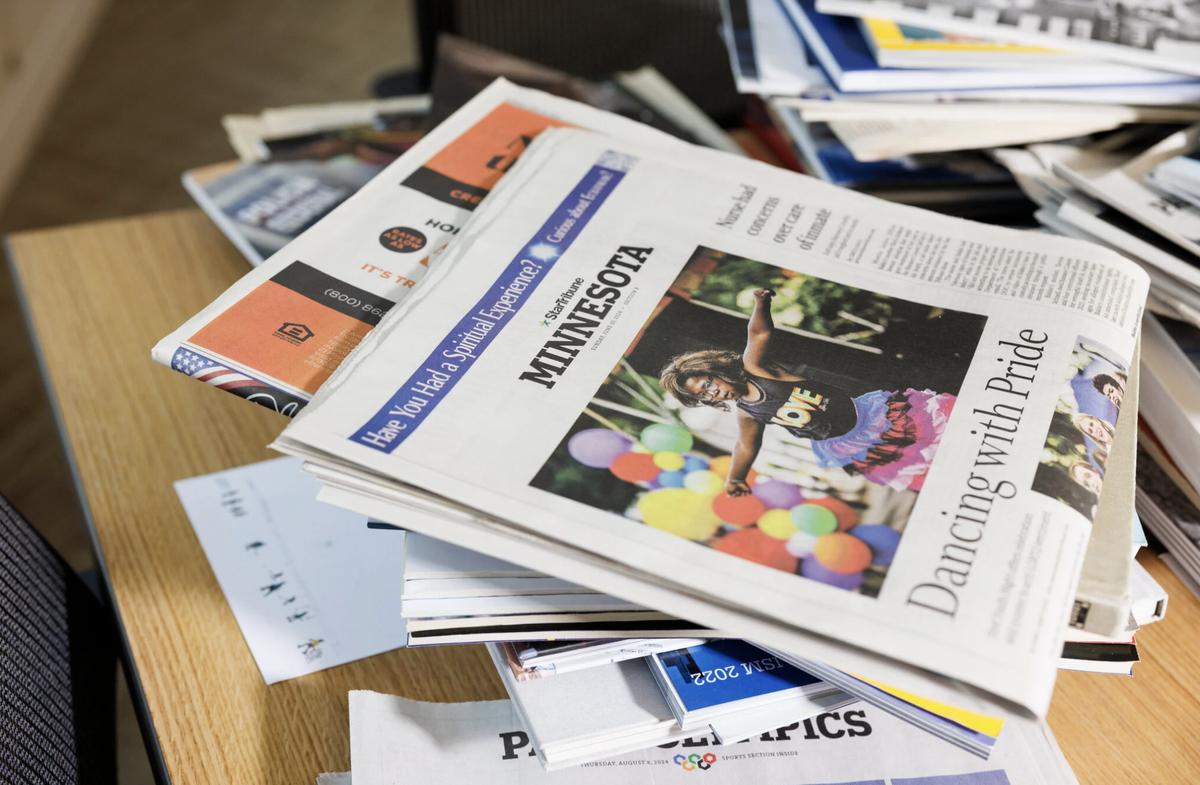
The Minneapolis Star Tribune, affectionately known as the Strib, has been reborn as the Minnesota Star Tribune—with a new mission and some Commercial Type fonts.

Tim gave a lecture titled The Past Inside the Future: Commercial Classics at Five on July 9 at the San Francisco Public Library, presented by Letterform Archive and Type West. The talk was recorded and is now available on YouTube.
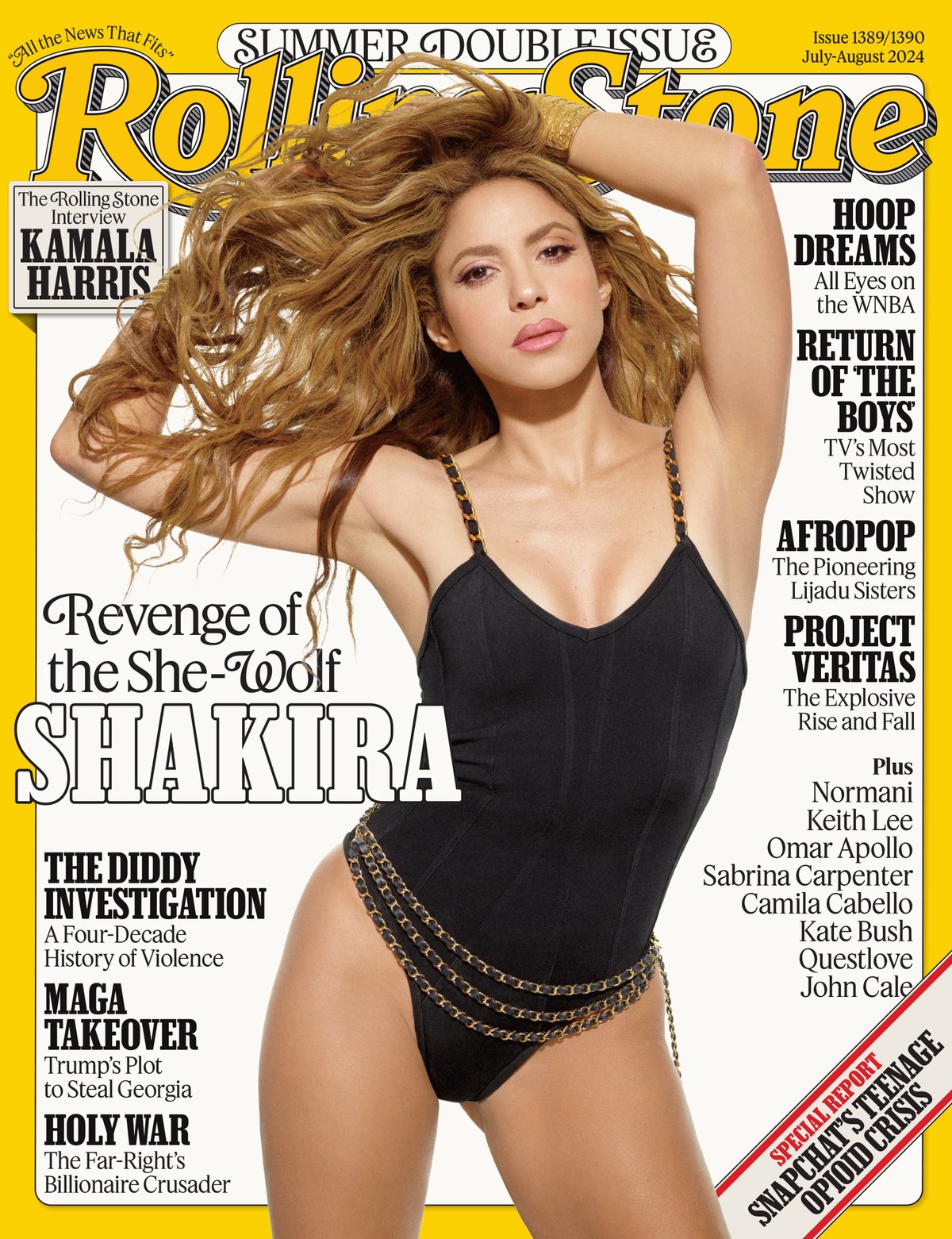
Commercial Type teamed up with Food and c-ll-ct-v-ly to redesign a magazine known for continually reinventing itself. It landed on newsstands in June.
Tim Ripper will give a lecture on July 9 titled The Past Inside the Future: Commercial Classics at Five at the San Francisco Public Library, presented by Letterform Archive and Type West.
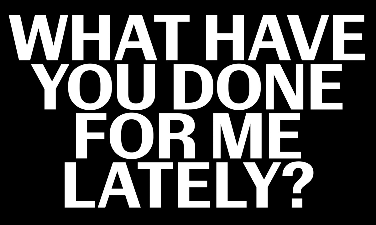
Control, a new sans serif designed by Christian Schwartz and Miguel Reyes, has no “correct” version. It can express itself as a tastefully legible mid-century grotesk, or it can morph into a tightly spaced headline face straight out of the 1970s.
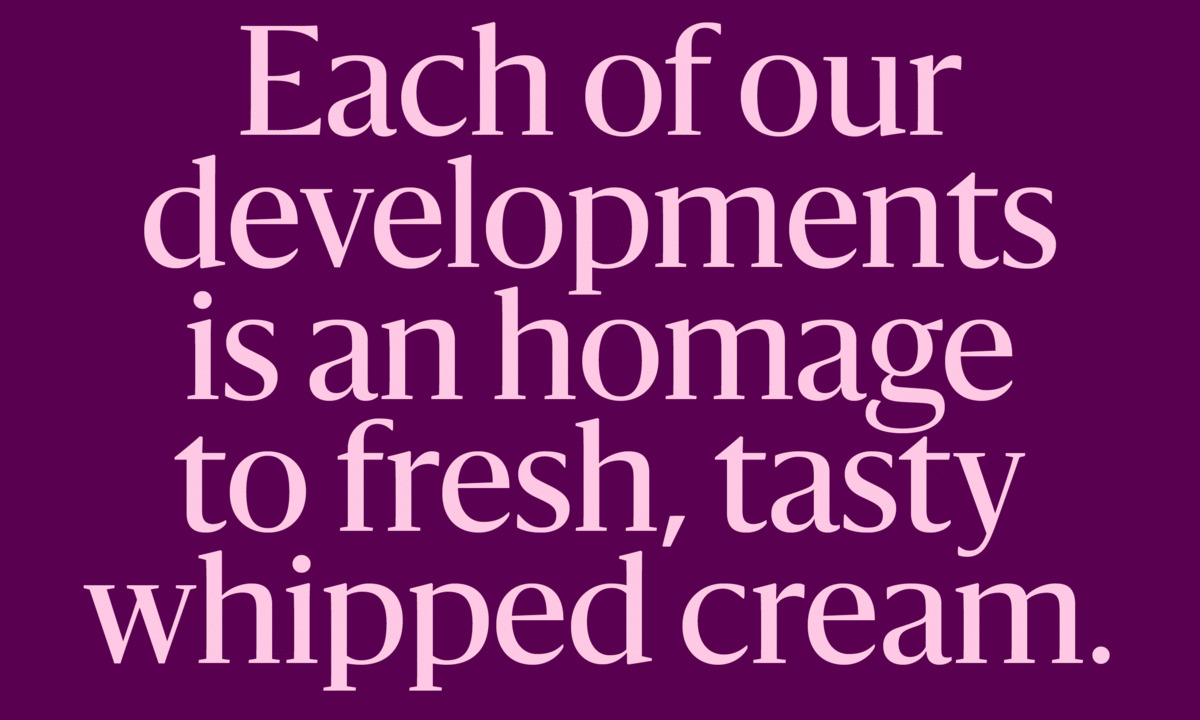
When the Helsingin Sanomat design team commissioned two narrower styles of their headline typeface in 2023, we produced two new families—Sanomat Condensed and Sanomat X Condensed—along with a variable font to give users access to the widths in between.
For those not there for Part One, Peter had so much to say that we couldn’t resist inviting him back to carry on the conversation. We’ll be picking up from the early ’90s and continuing to the present day.
Join online or in-person
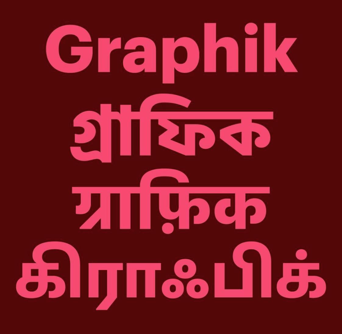
Under the creative direction of Shiva Nallaperumal of November, Graphik has branched out into Bangla, Devanagari, and Tamil.
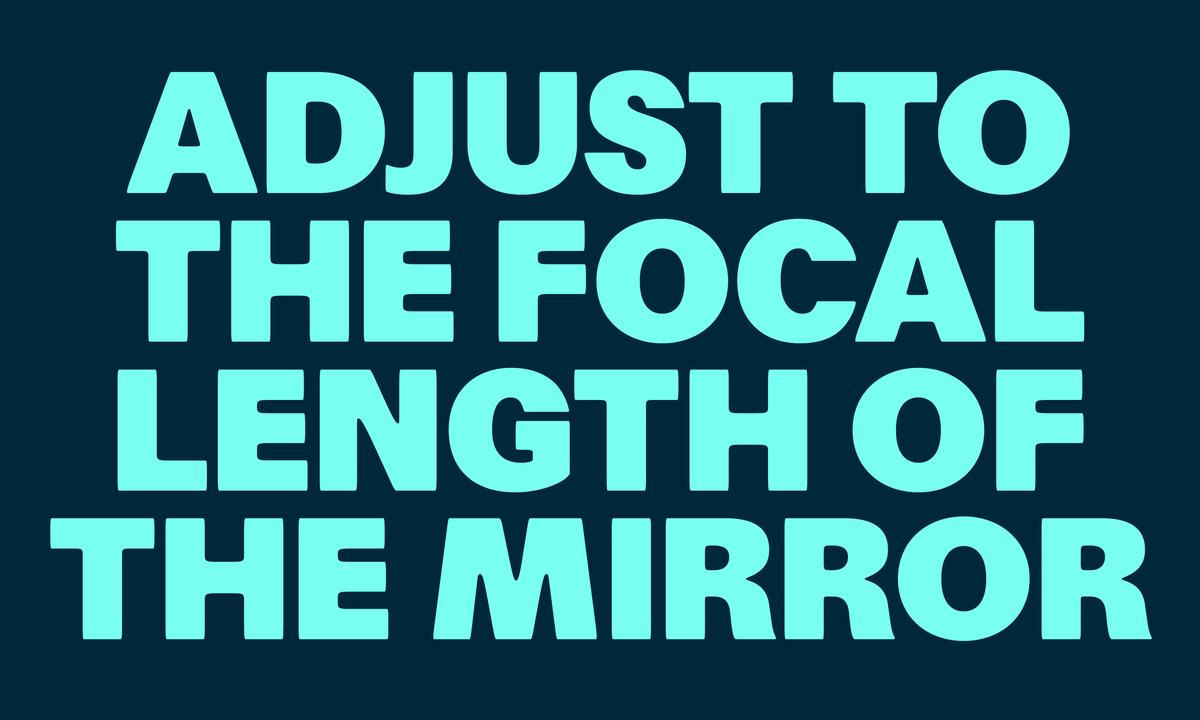
A new sans serif from Greg Gazdowicz revisits a bygone era of print production: phototypesetting in the 1970s, when type as a whole lost some of its sharpness.
Throughout his career, Peter Saville has consistently put type to work, often in conjunction with imagery, to elegantly sign the ‘way’ for many of us. In conversation with his friend and typographic consultant, Paul Barnes, Saville will discuss how his work, has been informed by an intuitive understanding of the semiotic power typography has to shape contemporary culture.
A new variable font designed by Paul Barnes and Greg Gazdowicz fuses the highly contrasted Modern and the rugged Ionic along the axes of contrast and weight, opening up a range of possibilities in the space between them.
The blunt, imposing typeface designed by Berton Hasebe for T: The New York Times Style Magazine now has a wide variant drawn by Tim Ripper.
Commercial Type created a new logo system for American luxury leather goods company Mark Cross, drawing on their rich 179-year history, in collaboration with illustrator Caroline Church and creative director Povilas Utovka.