Double Acts in Pop now shipping
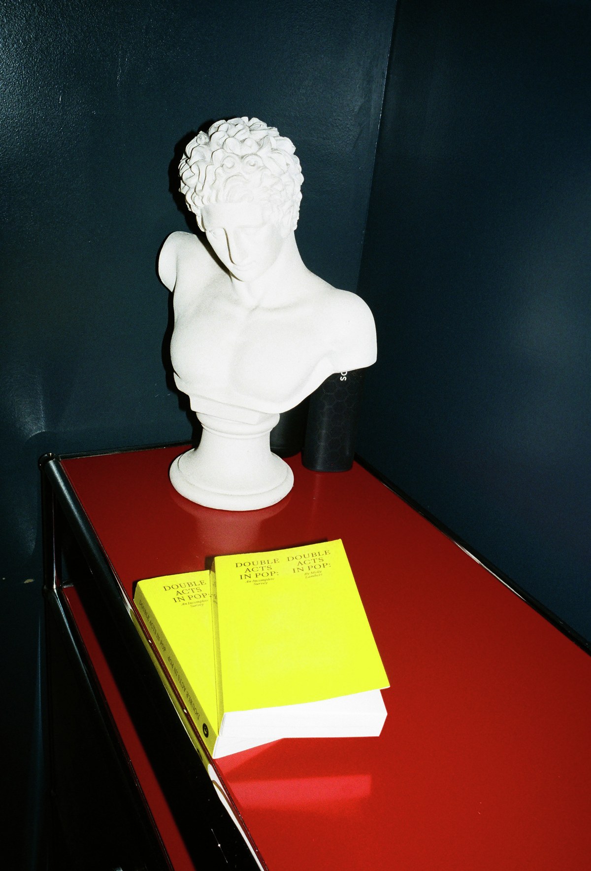
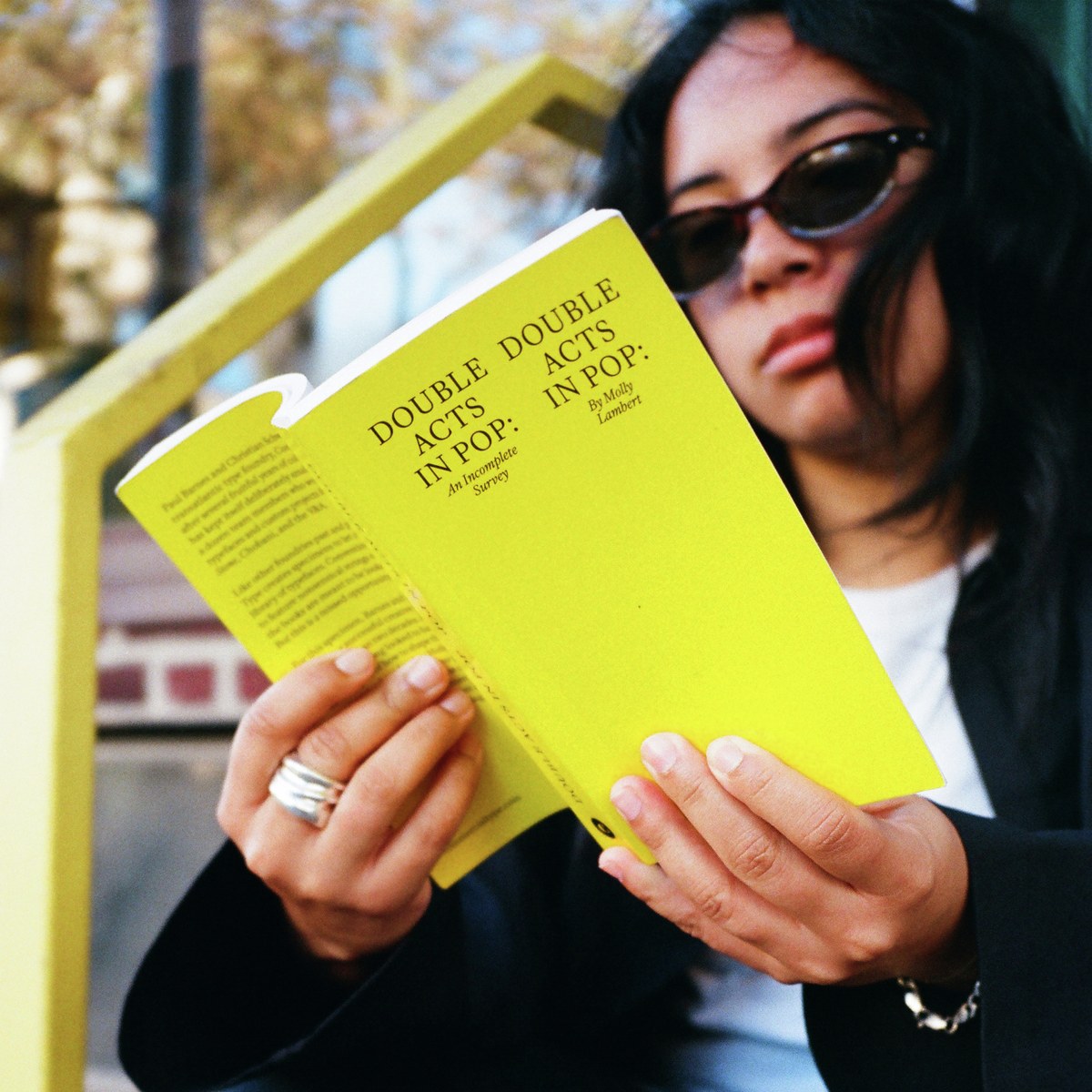
Christian Schwartz and Paul Barnes have enjoyed a successful creative partnership for more than twenty years. It all started with an email. Paul emailed Christian to ask about the lowercase g in FF Bau, Christian’s 2002 homage to Schelter & Giesecke’s late-nineteenth-century Grotesk, and the rest is history. Soon enough, Paul was using Christian’s then-new display agate Amplitude for a redesign of Wallpaper*; not long after that, creative director Mark Porter suggested Paul and Christian collaborate on new type for his redesign of the Guardian.
“There was a chance—but no guarantee—that we would complement each other,” they write in their foreword to Double Acts in Pop: An Incomplete Survey, the first specimen book in almost a decade to showcase Commercial Type’s full library. They clicked. “At the end of the sometimes arduous two-year process,” they write, “we were not only still on speaking terms, but were still laughing at each other’s jokes and actively looking forward to future collaborations.” Paul and Christian formalized their partnership with the launch of Commercial Type in 2007.
The pair bonded over many things, not least of which was a shared love of type specimens—studying them, collecting them, making them—and pop music. Always deeply invested in the relationship of type to the broader culture, Paul and Christian found themselves looking to record labels and bands for examples of how to build their company and present their work to the world, with a particular focus on double acts. “We have been interested in how two people working together can create something different than either would have created on their own,” they write in their foreword.
Their approach to creating specimens reflects a similar impulse to reach beyond the insular world of type. Specimen books emerged in Western Europe in the sixteenth century; for most of their history they were geared toward a rarefied audience of printers and their customers. And although the strings of jabberwocky the books typically contained could be artful, they were really intended to be looked at and evaluated solely on their formal qualities—not to be read. But the trajectory of specimens, like the trajectory of the technology used to produce fonts themselves, has been one of increasing mobility and immateriality—and of increasing openness.
Type specimens are no longer only for specialists, just as access to fonts is no longer only for specialists. Theoretically fonts are available to everyone. So why wouldn’t everyone be interested in them? Fonts are amazing little pieces of industrial design that all of us interact with every day. The audience has broadened. Paul and Christian have always been interested in creating type specimens that everybody can experience and interact with, with an increasing focus on specimens that can be looked at and read.
For Double Acts, they invited Los Angeles-based journalist and podcaster Molly Lambert, veteran of outlets like Pitchfork, MTV, and Grantland, to write a short book about, well, double acts. The brief really was that general: “Write 13,000 words about double acts.” It was a continuation of Paul and Christian’s ethos of collaboration—new elements materialize that would have been impossible to predict or replicate, but that in hindsight seem inevitable. In a brilliant, deadpan voice that will be familiar to listeners of Night Call, Molly interrogates the dynamics of both celebrated and obscure duos throughout pop history. As Paul and Christian note in their foreword, it’s a wild ride.
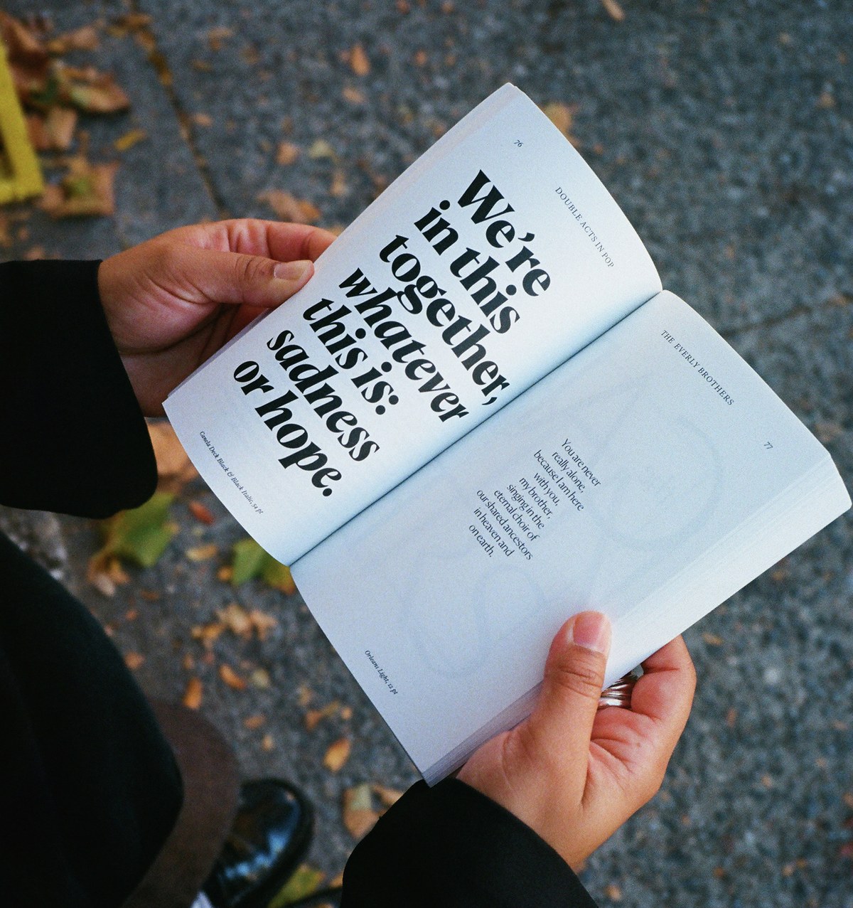
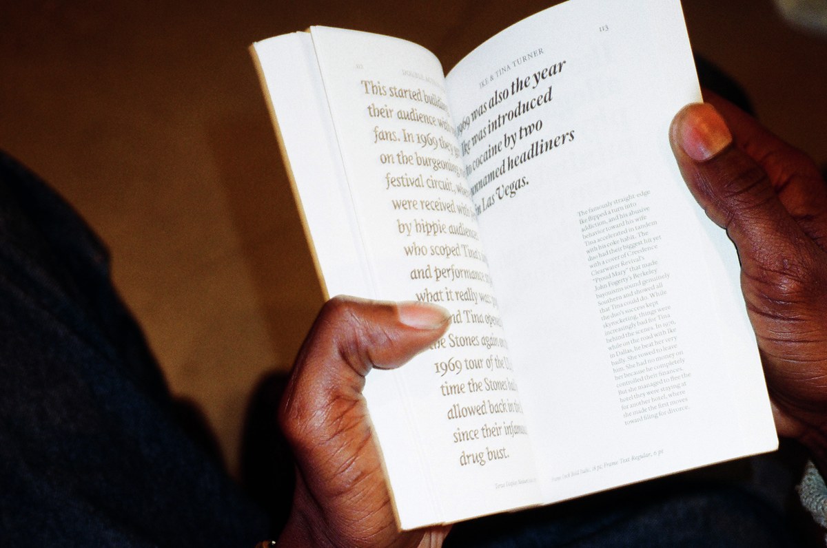
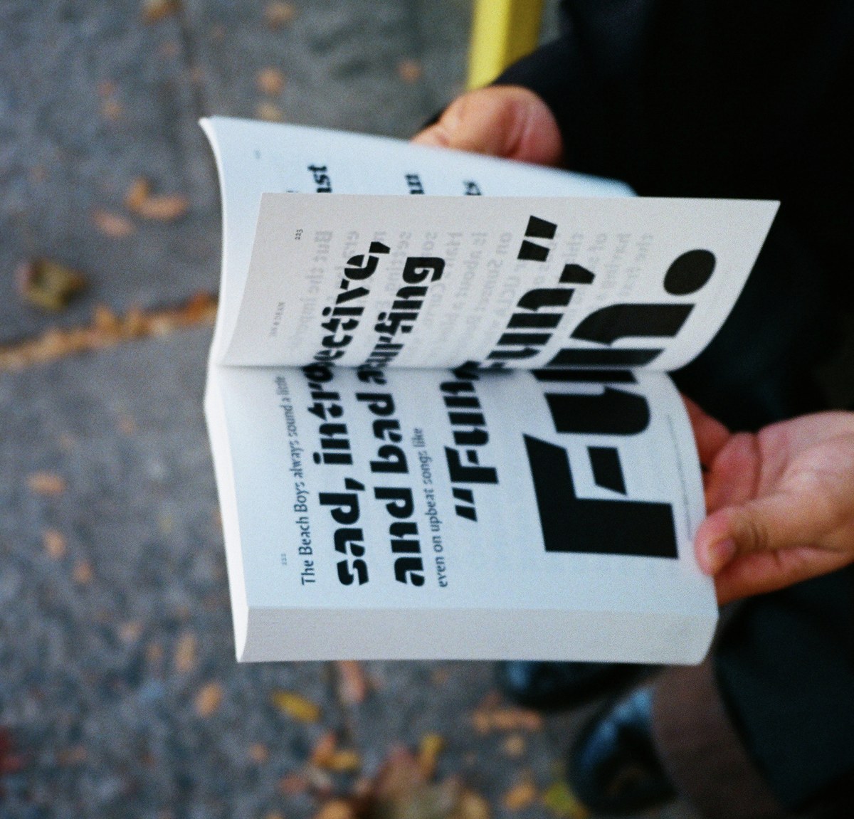
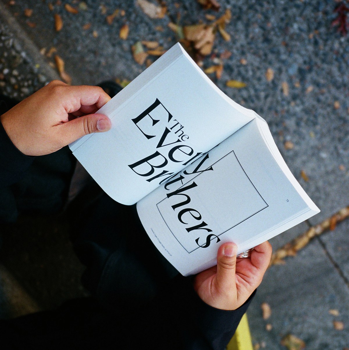
Draft in hand, they needed to figure out how to present this bawdy, rollicking survey of double acts. Enter Chris Wu of Wkshps, the multidisciplinary New York- and Berlin-based practice he runs with Prem Krishnamurthy. Chris had completely free rein over the design. Although he has never been one to follow an orthodox book-design methodology, which establishes a relatively fixed structure and then essentially imposes it on a text, he rarely has an opportunity to give every single page of a book a unique design. That’s what he felt Double Acts called for, though, and he ran with it. This is a design that listens to the text. The result is less a straightforward book containing information than a performance, an ecosystem—type specimen meets concrete poetry meets pop criticism.
Chris read through Molly’s manuscript several times, digesting its particular cadence and vicissitudes. “Working through Molly’s texts made me feel like I was reliving some ancient memory from a parallel universe,” he says, recalling his days growing up in Taiwan in the eighties and nineties as an ardent fan of pop. His thoughts drifted toward the mook (a portmanteau of “magazine” and “book”), a publishing format that sprang up in the 1970s and became quite popular in Japan, peaking in the late nineties. “I had a vague idea to make a ‘reversed’ mook,” Chris says. “It’s a publication (physically) like a book, but the design lends itself to a magazine or newspaper, where each story / each page can take on distinctive formatting and a fresh visual style.”

Spread showing text set in Greg Gazdowicz’s Robinson Medium and Hrvoje Živčić’s Ergon Medium.
Incorporating every typeface Commercial Type has published (including faces in the Vault) as of July 2024, Chris found a way to give form to Molly’s words. “InDesign’s mechanical report logged a total of 352 fonts, which includes different styles (italic, display, banner, deck, text, etc.) and weights (regular, bold, black, etc.),” he says. The typefaces are grouped loosely by genre; if you flip through the book and something catches your eye, you can see variations on the theme or genre by paging backward or forward. In the ecology of Double Acts, Moulin grows well near Sanomat. Druk thrives near Review.
Lean forward and read the text; lean back and look at the shapes. We hope you enjoy the book as much as we do.
Photos: Rashad Rastam.
