Austin Hairline Condensed Family

Austin Hairline Condensed

| Designers | Paul Barnes, Maria Doreuli |
| Designed | 2018 |
| Last updated | 10 Oct, 2018 |
| Styles | 2 |
| Price | $50.00 style $75.00 family |
| Character set | Standard character set |
Austin Hairline Condensed Family


Austin Hairline Condensed Family
Condensed width of Austin Hairline Roman, drawn by Maria Doreuli for Kuchar Swara for the Daily Telegraph's magazines.
Austin Hairline Condensed Family
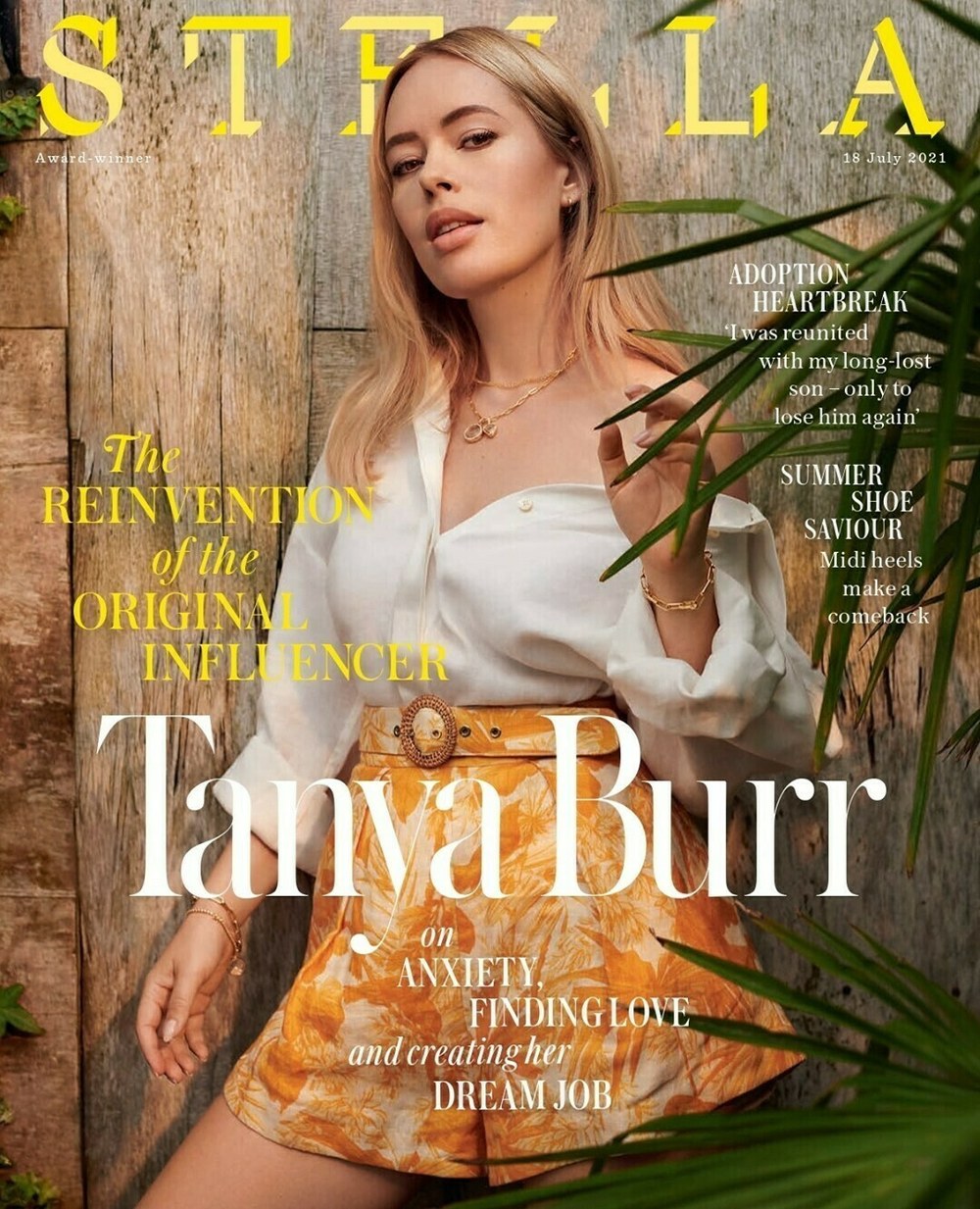
Cover of Daily Telegraph style magazine Stella, 18 July 2021
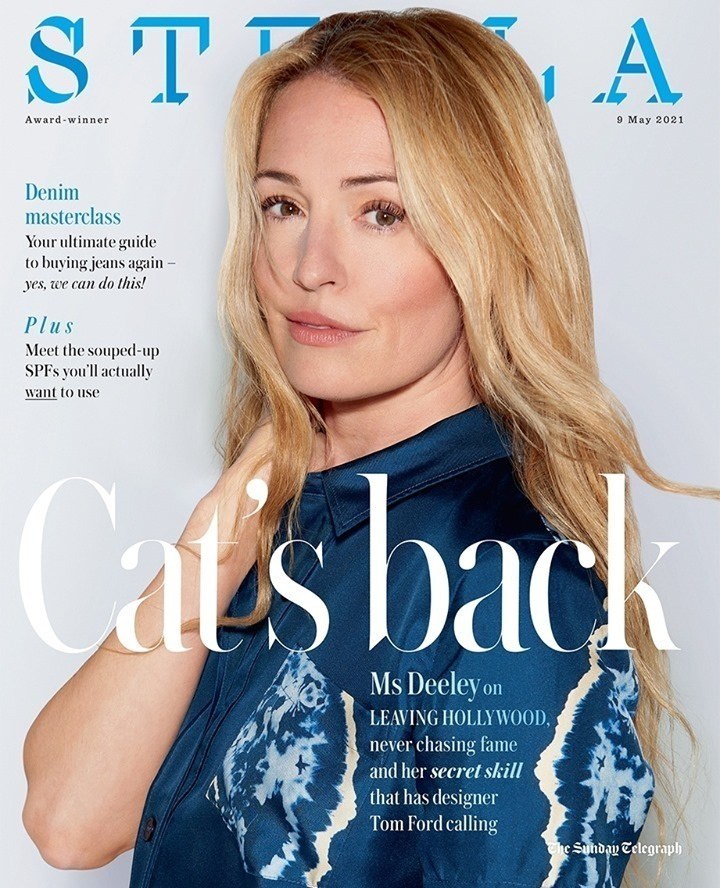
Cover of Daily Telegraph style magazine Stella, 9 May 2021
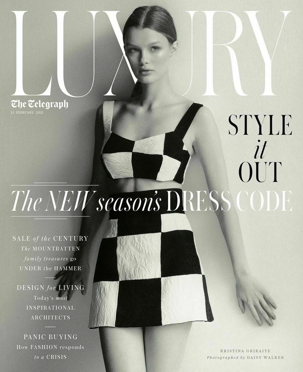
Cover of Luxury magazine in The Daily Telegraph, 13 February 2021
Azzurri Regular Style

Azzurri

| Designer | Paul Barnes |
| Designed | 2010 |
| Last updated | 22 May, 2014 |
| Styles | 1 |
| Price | $50.00 |
| Character set | Standard character set |
Azzurri Regular Style

Azzurri Regular Style
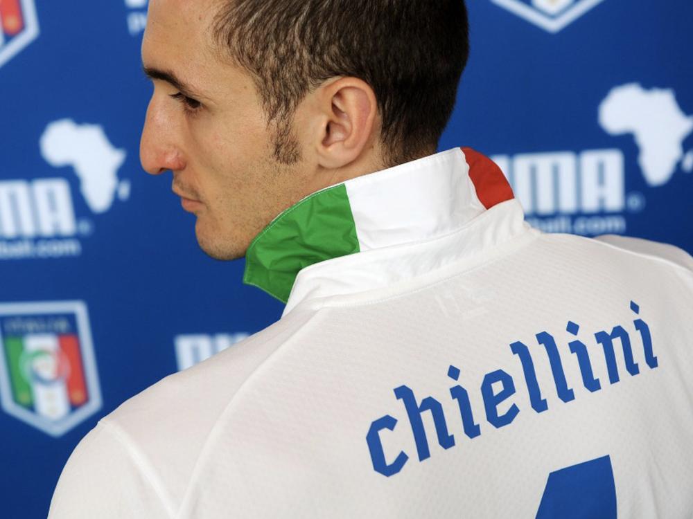
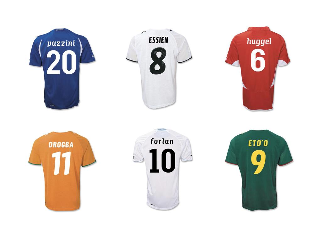
Designed by Paul Barnes, along with Gabriello, for Puma. Azzurri is a low-contrast italic with faceted edges and no curves, designed to look both legible and stylish on the backs of football shirts. The swashes were a later addition.
Azzurri Regular Style


Azzurri and Gabriello in their original context
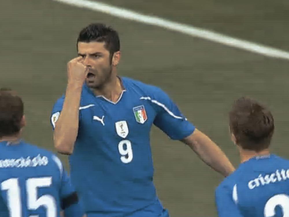
Azzurri in action in 2010
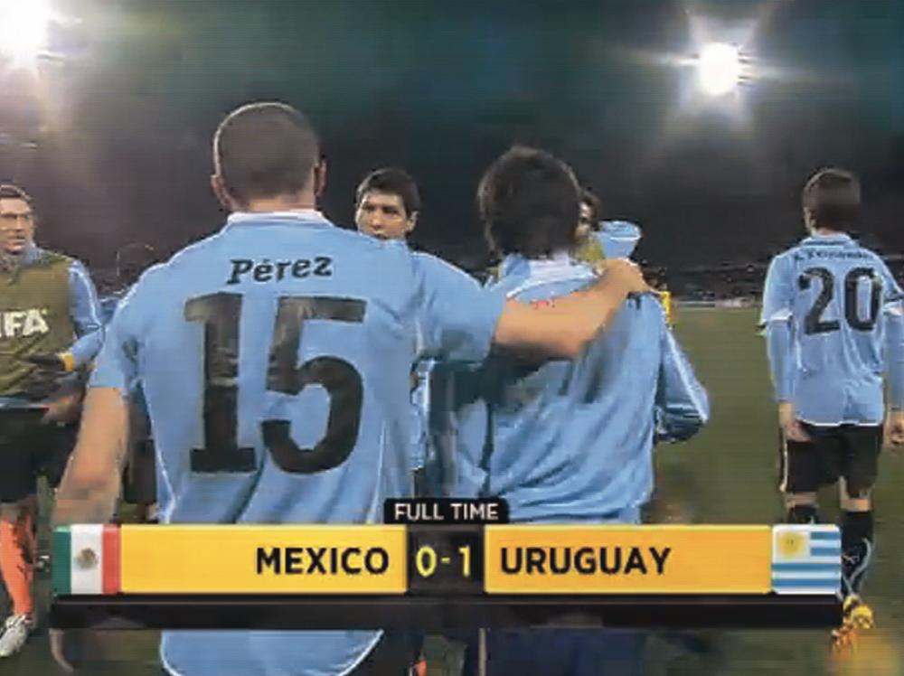
Azzurri in action in 2010
Caponi Condensed Family

Caponi Condensed

| Designers | Paul Barnes, Christian Schwartz |
| Designed | 2013 |
| Last updated | 17 May, 2018 |
| Styles | 2 |
| Price | $35.00 style $35.00 family |
| Character set | Uppercase, lowercase, numbers, rudimentary punctuation |
Caponi Condensed Family

Caponi Condensed Family
Christian Schwartz and Paul Barnes drew this around when finishing Caponi for Entertainment Weekly. Our memory is hazy but this seems to have been sketched for their covers. They ended up sticking with a condensed sans instead, maybe because the Marlboro Man vibe was too strong.
Caponi Condensed Family

Round terminals

Flat terminals
Caslon Dot Regular Style

Caslon Dot

| Designer | Paul Barnes |
| Designed | 2007 |
| Last updated | 2 Nov, 2007 |
| Styles | 1 |
| Price | $20.00 |
| Character set | Capital letters and figures, with period and at sign |
Caslon Dot Regular Style

Caslon Dot Regular Style
Very light dotted caps, loosely related to Caslon Doric.
Caslon Dot Regular Style

Caslon Ionic Rounded Family

Caslon Ionic Rounded

| Designers | Greg Gazdowicz, Paul Barnes |
| Last updated | 4 Mar, 2025 |
| Styles | 12 |
| Price | $60.00 style $350.00 family |
| Character set | Standard character set, without fractions |
Caslon Ionic Rounded Family


Caslon Ionic Rounded Family
Bolder and more robust than the modern, yet lighter and more refined than the Egyptian, the Ionic with its bracketed serif was another innovation of the nineteenth century. Lesser known than Thorowgood’s Clarendon, Caslon’s Ionic No. 2 is a superb example of the form and greatly influenced the newspaper fonts of the next century. Greg Gazdowicz created the Rounded variant of Caslon Ionic in 2025.
Caslon Ionic Rounded Family

Gabriello Family

Gabriello

| Designers | Paul Barnes, Miguel Reyes |
| Designed | 2014 |
| Last updated | 18 Jul, 2021 |
| Styles | 5 |
| Price | $50.00 style $150.00 family |
| Character set | Standard character set |
Gabriello Family

Gabriello Family
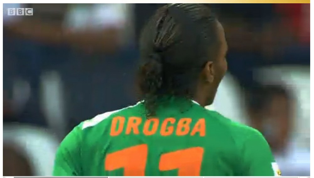
Football numbers are an exercise in balancing style with functionality. Inspired by brush lettering, Puma commissioned the Bold weight of Gabriello for the shirts of their sponsored teams in the 2010 Africa Cup of Nations, and also used it for their African teams in that year’s World Cup: Algeria, Cameroon, Ghana, and Côte d’Ivoire. Far more organic than the typical straight-sided octic athletic letters, Gabriello is slanted on two axes, both horizontally and vertically, giving the energy of a script without causing production problems for the shirts.
Gabriello Family

Guardian Agate Sans Grades Family


Guardian Agate Sans Grades

| Designers | Christian Schwartz, Paul Barnes |
| Designed | 2009 |
| Last updated | 2 May, 2017 |
| Styles | 32 |
| Price | $50.00 style $500.00 family |
| Character set | Standard character set |
Guardian Agate Sans Grades Family

Normal character set

Duplex character set
Guardian Agate Sans Grades Family
Compensating for the worst possible printing conditions, Guardian Agate Sans is designed for maximum legibility at 6 point and below on newsprint.
What are Grades?
The family features four subtly different weights, or “grades”, allowing users to find the perfect weight for a particular situation, from 1, the lightest, to 4, the heaviest. The Medium weight can be used for reversing out of a dark background, subheads, and other cases where an additional level of typographic hierarchy is needed.
What is Duplexing?
Guardian Agate Sans features two kinds of bolds. The standard Bolds are wider than the Regulars, as requested by The Guardian to make sport scores a bit more readable at 4.5pt. The Duplex Bolds set at exactly the same widths as the Regulars, useful for things like classified ads and stock listings where line length is at a premium. All numerals are tabular across all styles, so they can be freely mixed in tables of figures no matter which version is used.
Guardian Agate Sans Grades Family
Guardian Compact Family

Guardian Compact

| Designers | Christian Schwartz, Paul Barnes |
| Designed | 2005 |
| Last updated | 19 Dec, 2007 |
| Styles | 9 |
| Price | $50.00 style $250.00 family |
| Character set | Basic character set with limited accented support |
Guardian Compact Family

Guardian Compact Family
Guardian Compact has shorter, simpler serifs and narrower, stiffer proportions than Guardian Egyptian Headine. People always seemed to like this compact, flat-sided variant of Guardian Egyptian, but we never got around to drawing italics and finishing it.
Guardian Compact Family
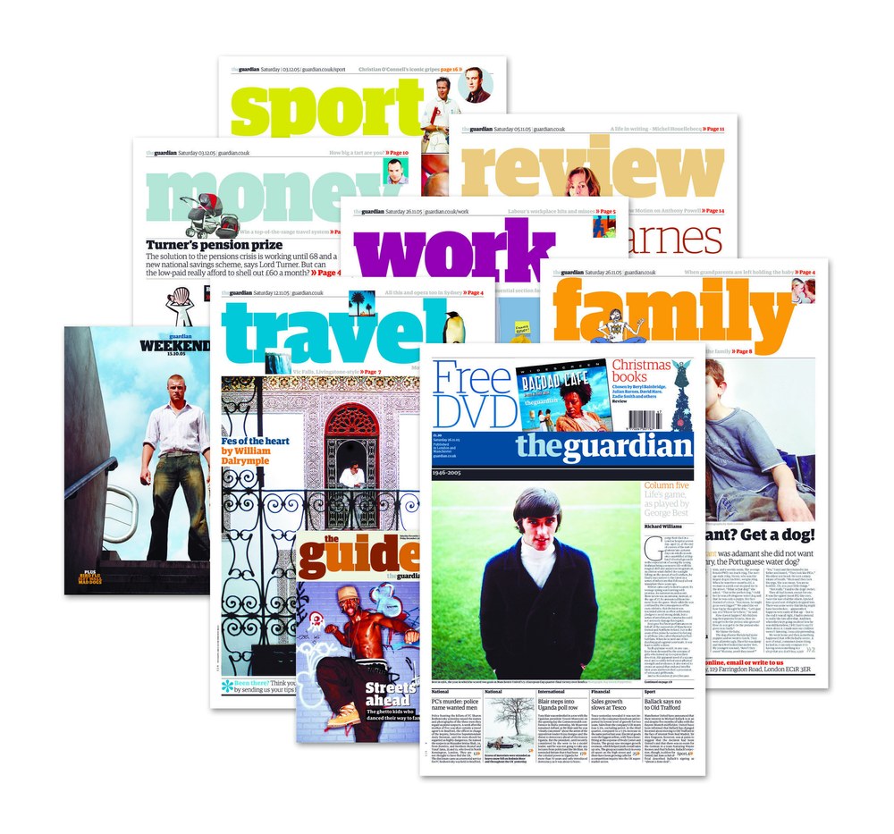
Saturday sections from the Guardian redesign in 2003.
Punch Family

Punch

| Designer | Paul Barnes |
| Designed | 2023 |
| Last updated | 4 Jan, 2024 |
| Styles | 2 |
| Price | $60.00 style $90.00 family |
| Character set | Standard character set |
Punch Family


Punch Family
Punch is a revisiting of Miller & Richard’s News Bill series, a display face made in the 1880s. Paul Barnes added a roman to the italic for Fraser Muggeridge studio’s exhibition and publication design for ‘Yayoi Kusama: You, Me and the Balloons’ at Factory International, Manchester.
Punch Family

Book cover designed by Fraser Muggeridge studio, 2023

Book designed by Fraser Muggeridge studio, 2023
Sanomat Banner Family

Sanomat Banner

| Designers | Paul Barnes, Greg Gazdowicz |
| Designed | 2016 |
| Last updated | 21 Apr, 2016 |
| Styles | 7 |
| Price | $50.00 style $250.00 family |
| Character set | Standard character set |
Sanomat Banner Family

Sanomat Banner Family
High contrast version of Sanomat, drawn by Greg Gazdowicz for Sami Valtere at Helsingin Sanomat.
Sanomat Banner Family
Sanomat Slab Family

Sanomat Slab

| Designers | Paul Barnes, Miguel Reyes |
| Designed | 2016 |
| Last updated | 14 Apr, 2016 |
| Styles | 7 |
| Price | $50.00 style $250.00 family |
| Character set | Standard character set |
Sanomat Slab Family

Sanomat Slab Family
Slab version of Sanomat, drawn for Sami Valtere at Helsingin Sanomat.
Sanomat Slab Family

Cover of HSmetro, a free daily newspaper published by Helsingin Sanomat
Williamson Italic Style

Williamson

| Designer | Paul Barnes |
| Designed | 2024 |
| Last updated | 26 Nov, 2024 |
| Styles | 1 |
| Price | $50.00 |
| Character set | Standard character set, without fractions |
Williamson Italic Style

Williamson Italic Style
Williamson Italic is a distinctive display typeface originally crafted for a series of Franz Kafka book covers that never happened. Created by Paul Barnes, it draws inspiration from his own lettering, blending influences from Eastern European design, Berthold Wolpe’s lesser-known Hyperion, and the stone-carving traditions of western Scotland. Its condensed form, with a subtle six-degree angle, features robust slab serifs and a dynamic tension between rounded curves and sharp joints. Designed in a single weight, Williamson Italic is ideal for book covers, menus, and logos, offering a striking and versatile aesthetic.
Williamson Italic Style