Advocat
| Designer | Christian Schwartz |
| Designed | 2021 |
| Last updated | 20 Sep, 2021 |
| Styles | 3 |
| Price | $50.00 style $100.00 family |
| Character set | Standard character set without fractions and sub/superscripts |
Advocat Family
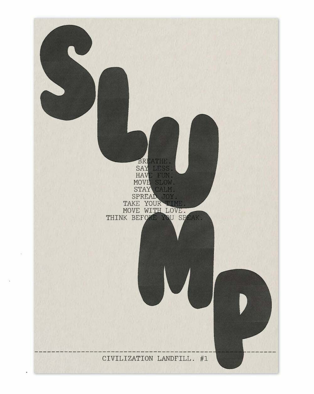
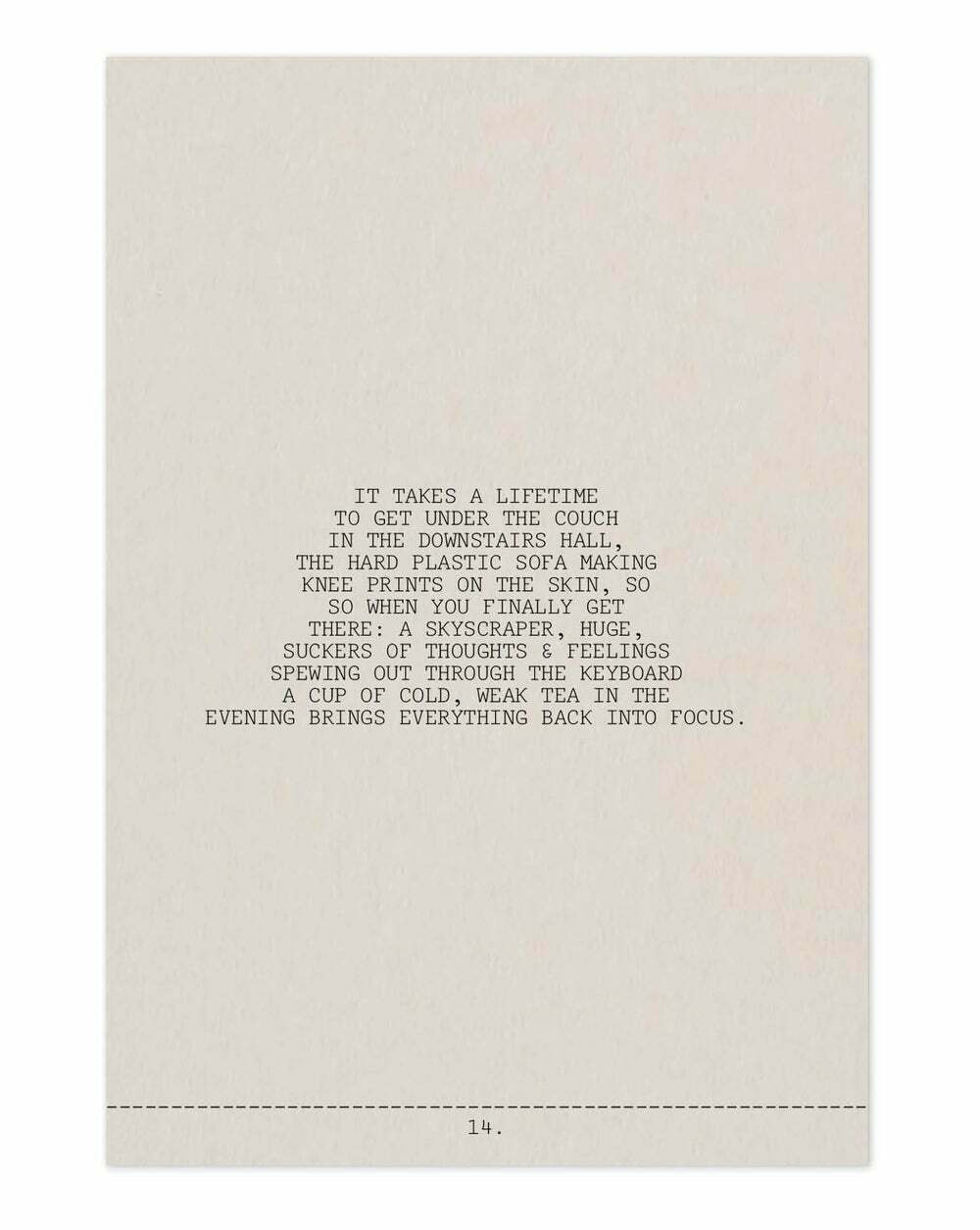
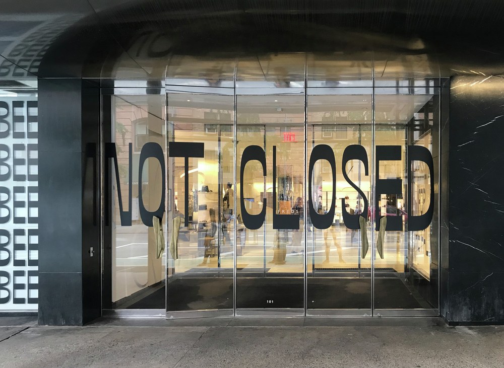
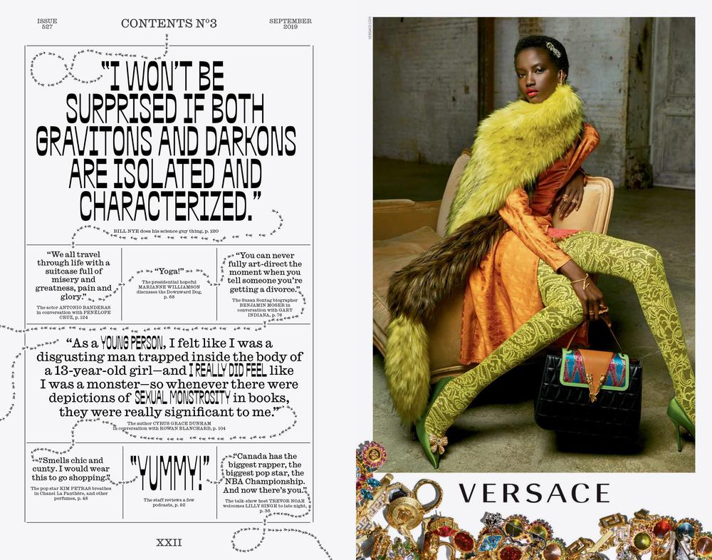
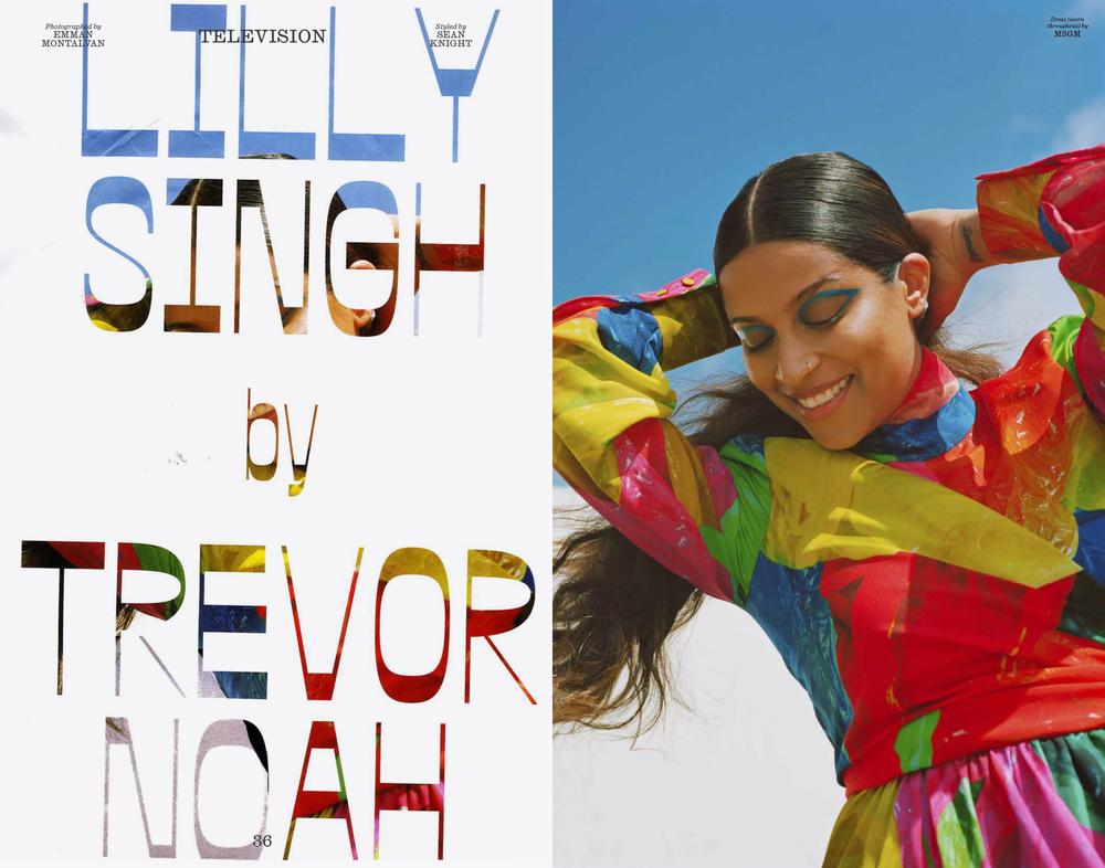
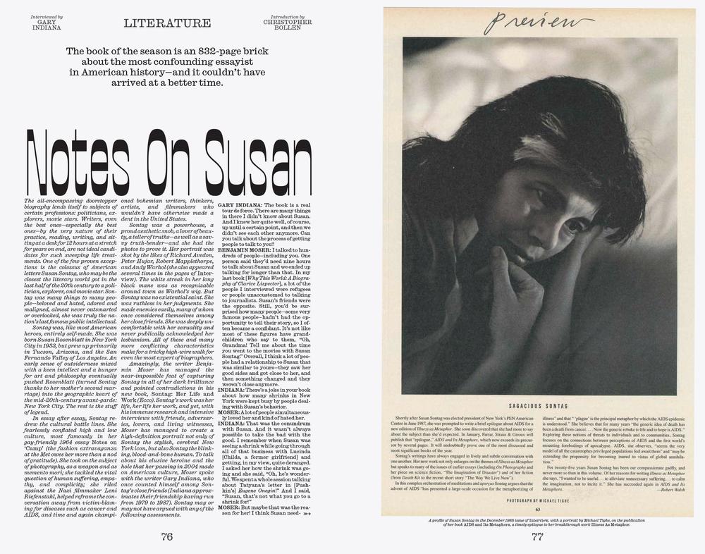
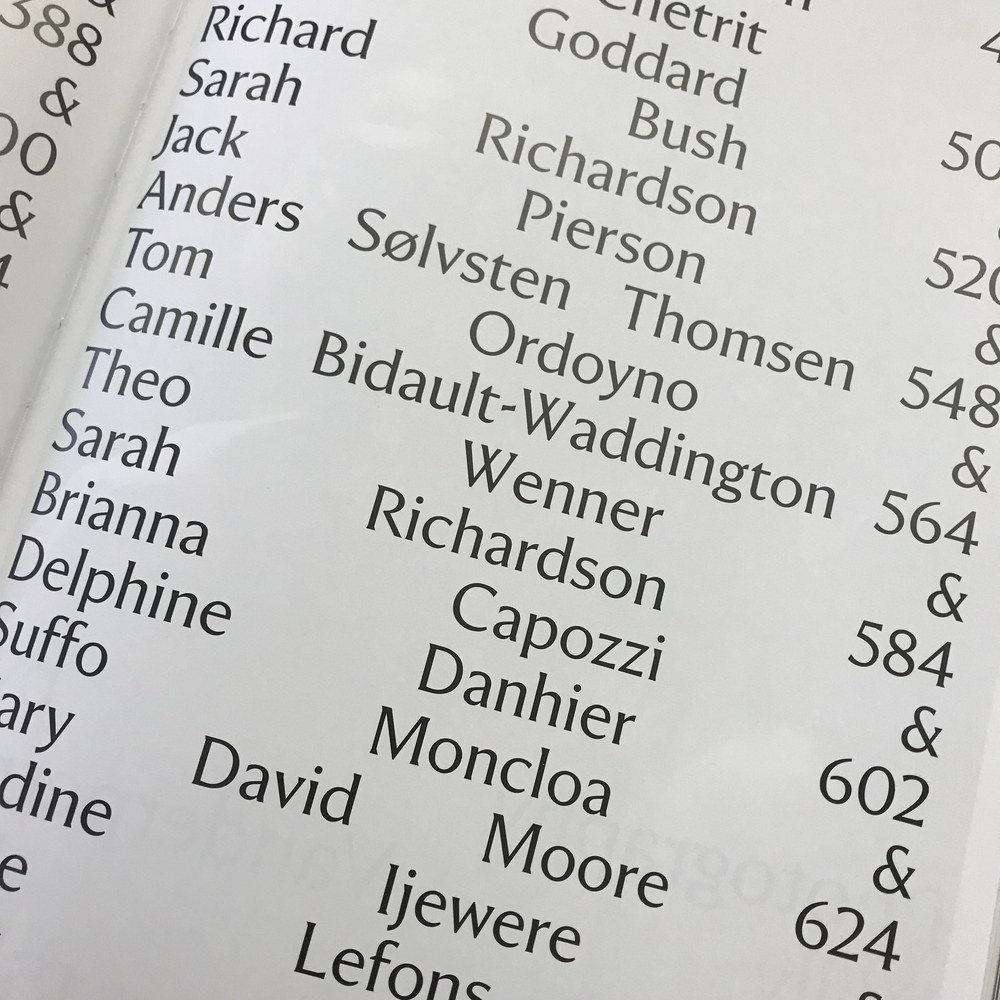
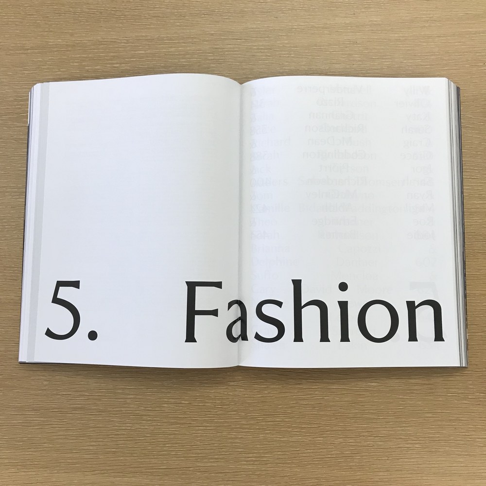
Christian Schwartz spent most of 2020 on an extended parental leave that made it hard to find time or energy to concentrate on type design. Scattered hours while the kids were in bed went to this typewriter face, a sufficiently low-stakes project, based on a low-res scan of an old IBM Selectric ‘golf ball’ alphabet called Advocate, designed by Howard “Bud” Kettler (best known as the designer of Courier). Rough source material led to a very loose interpretation. Richard Turley has used it for a few small publications with Civilization. Updated 23 Sep 2021: Apologies to Matthew Butterick, who already published a typeface called Advocate.
Caponi Condensed
| Designers | Paul Barnes, Christian Schwartz |
| Designed | 2013 |
| Last updated | 17 May, 2018 |
| Styles | 2 |
| Price | $35.00 style $35.00 family |
| Character set | Uppercase, lowercase, numbers, rudimentary punctuation |
Caponi Condensed Family
Christian Schwartz and Paul Barnes drew this around when finishing Caponi for Entertainment Weekly. Our memory is hazy but this seems to have been sketched for their covers. They ended up sticking with a condensed sans instead, maybe because the Marlboro Man vibe was too strong.
Gingrich
| Designers | Christian Schwartz, Kara Gordon |
| Designed | 2015, 2019 |
| Last updated | 12 Dec, 2018 |
| Styles | 8 |
| Price | $50.00 style $150.00 family |
| Character set | Standard character set (no fractions) |
Gingrich Family
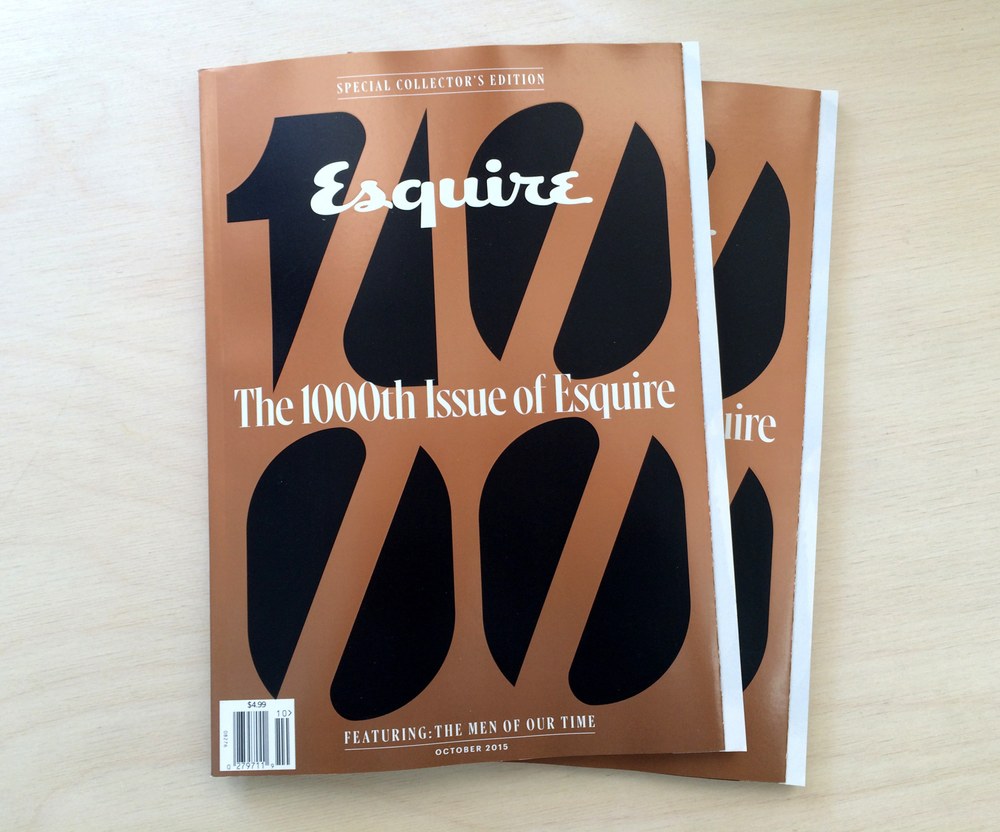
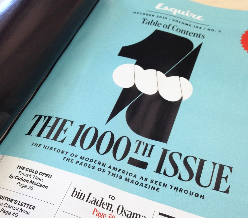
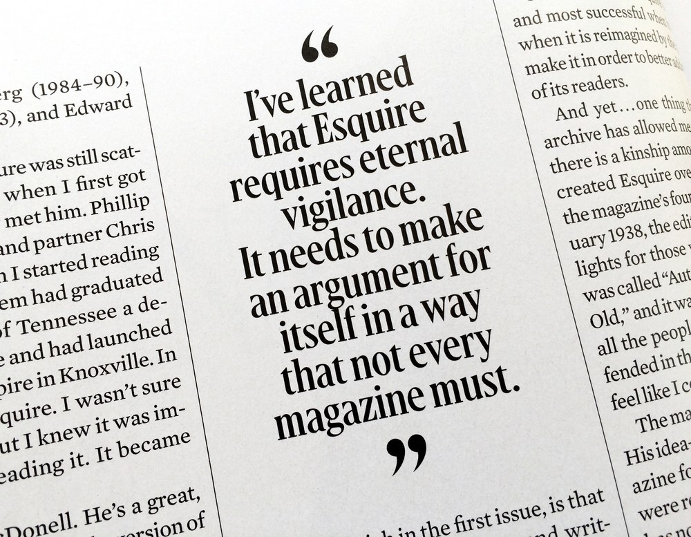
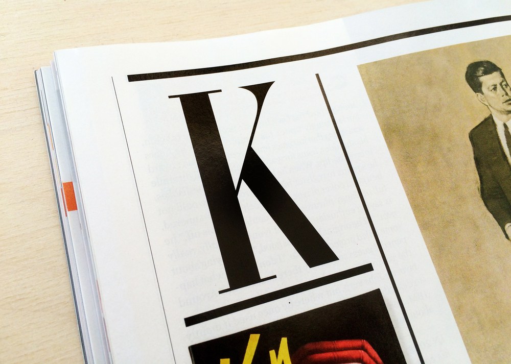
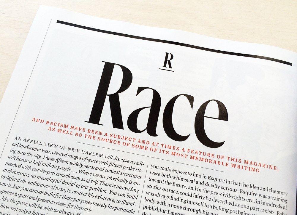
Gingrich is a condensed display serif faily in 4 optical sizes, originally drawn for David Curcurito for the 1000th issue of Esquire in 2015. Italics were added later for Barron’s by Kara Gordon.
Goldscheider
| Designer | Christian Schwartz |
| Designed | 2026 |
| Last updated | 16 Mar, 2026 |
| Styles | 1 |
| Price | $40.00 |
| Character set | Standard character set, caps only |
Goldscheider Titling Style
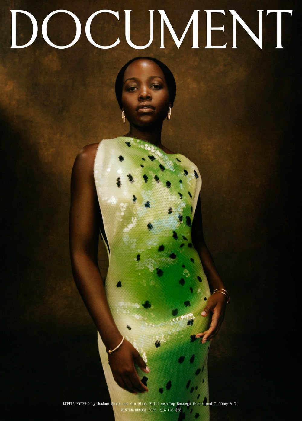
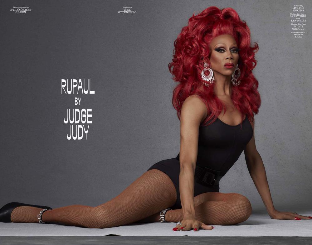
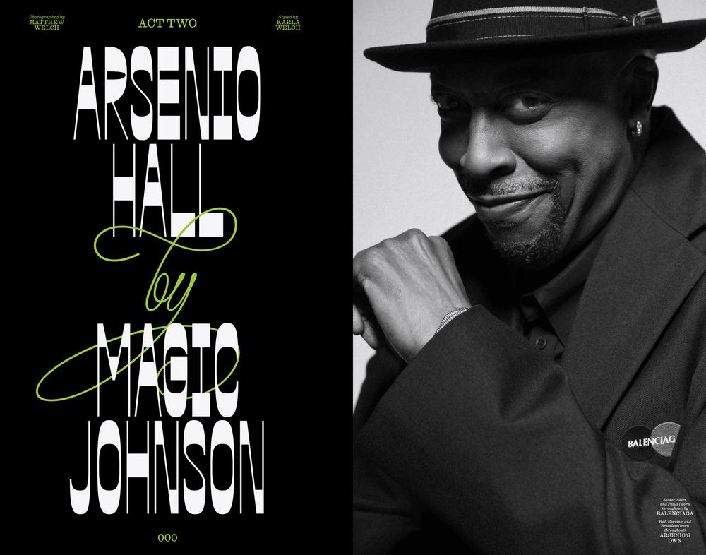
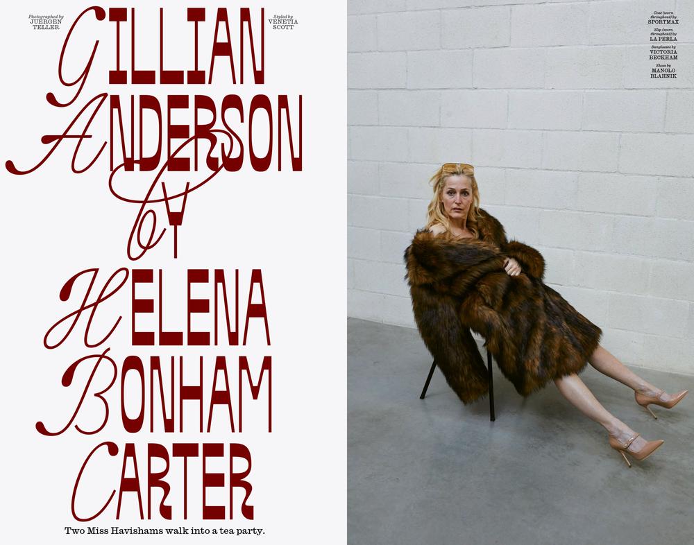
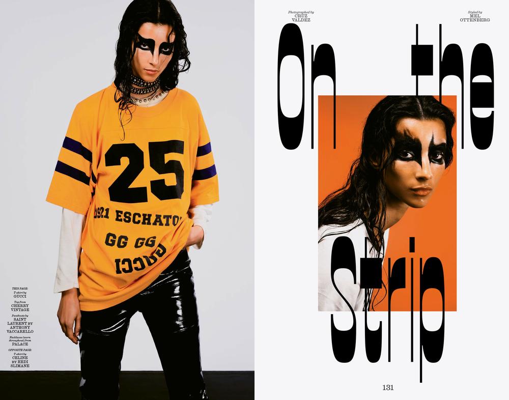
Based loosely on the elegant lettering used by Ludwig Goldscheider in the lush but affordable monographs he wrote, edited, designed, and published as co-founder of Phaidon in the early 20th century. Books on Da Vinci, El Greco, Michelangelo, and Holbein provided the main inspiration. Christian Schwartz drew this version for Nick Vogelson, first as the 2020 nameplate for Document Journal, then later as a complete set of titling caps, used until the magazine folded in 2026.
Graphik Decorated
| Designer | Christian Schwartz |
| Designed | 2009, 2015 |
| Last updated | 10 Aug, 2015 |
| Styles | 4 |
| Price | $20.00 style $50.00 family |
| Character set | Limited character sets, see images for details |
Graphik Decorated Family
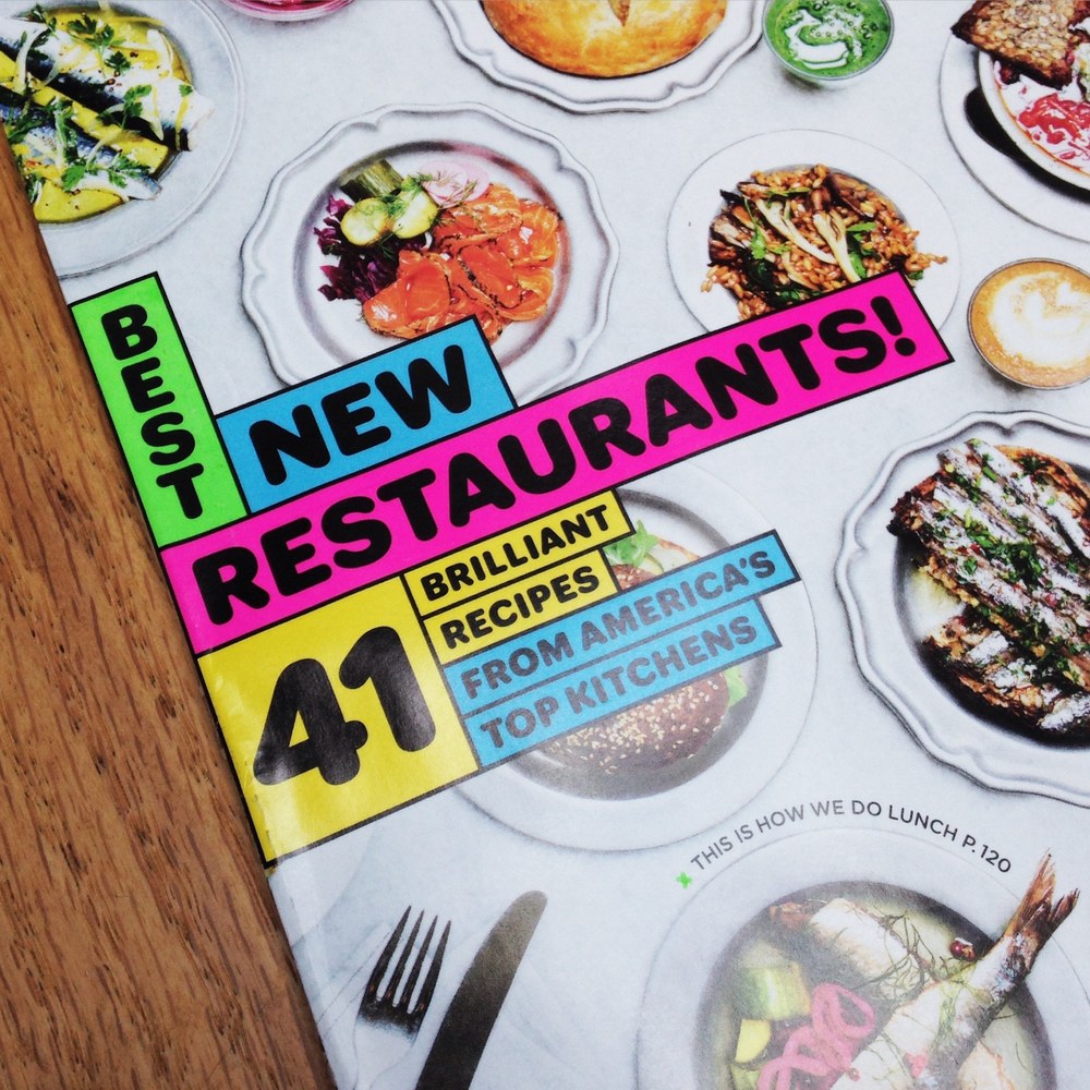
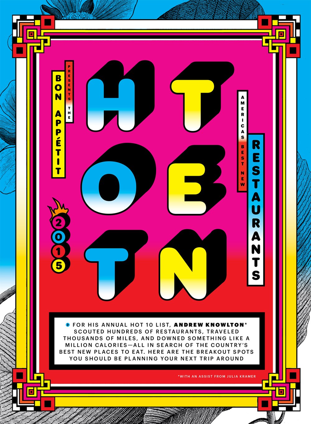
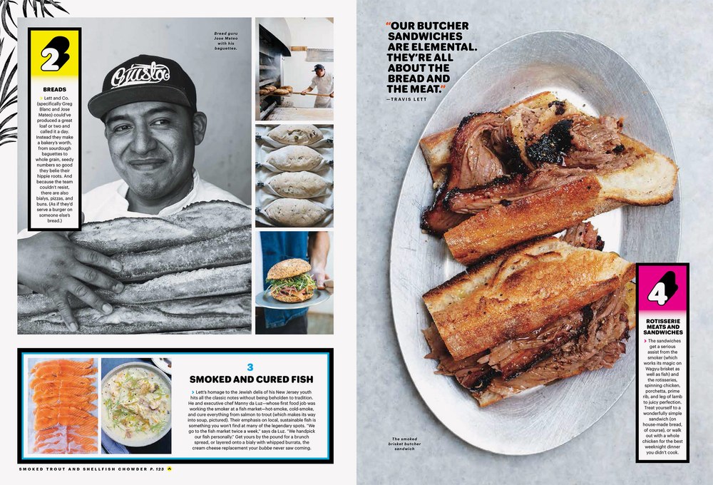
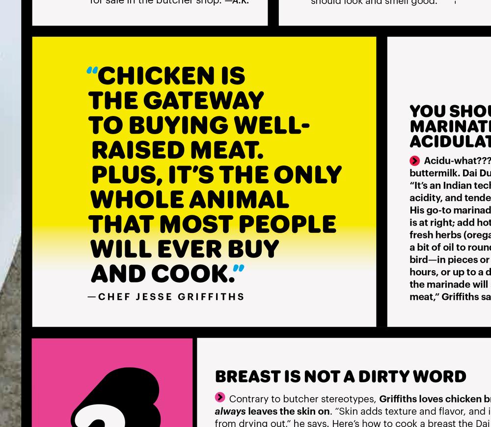
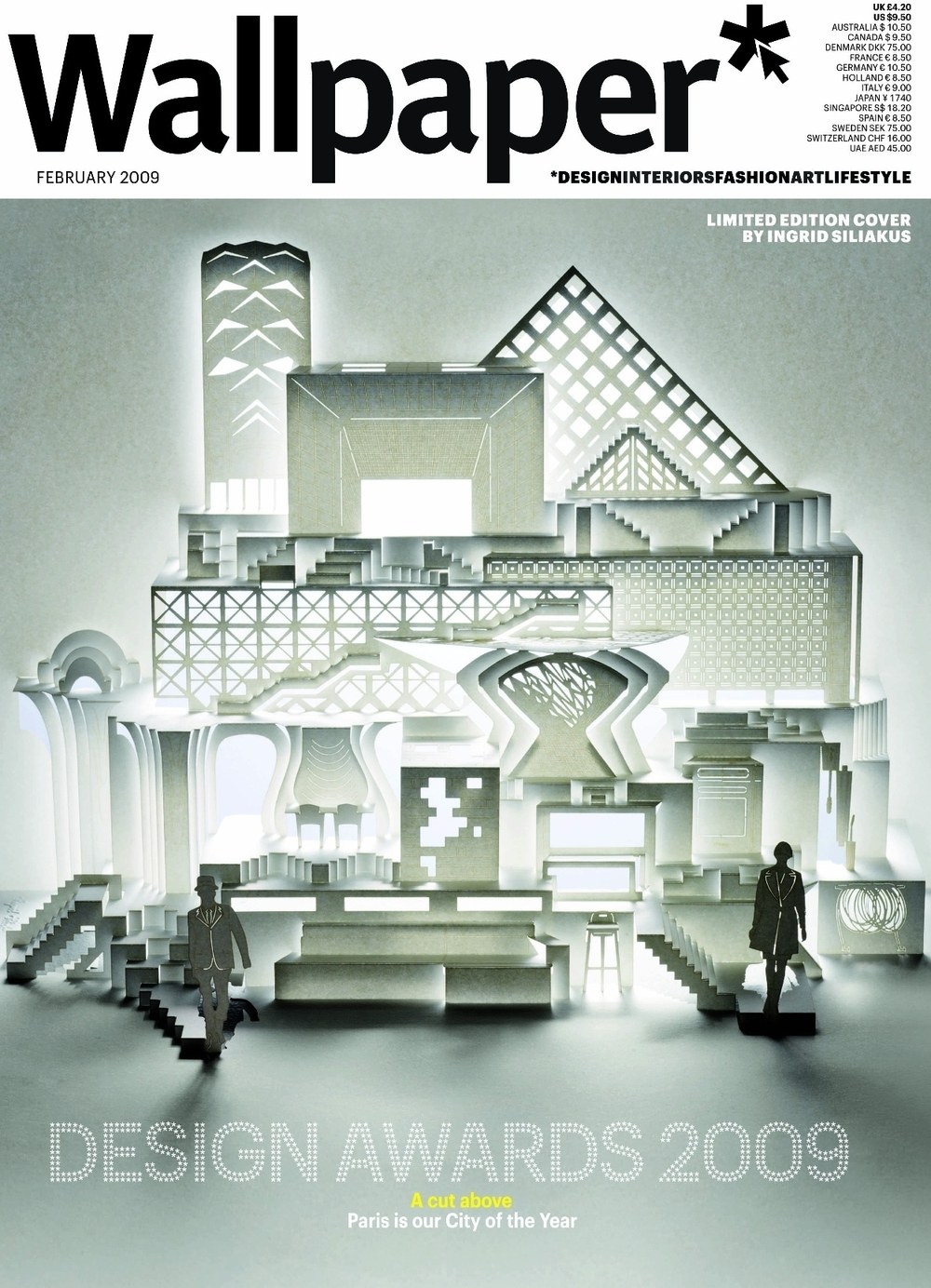
Graphik Round and Graphik Dot were drawn for two one-off issues of Bon Appétit for creative director Alex Grossman. Graphik Round Black proved surprisingly useful for Commercial Studio. The other two dot styles were developed for Meirion Pritchard at Wallpaper*.
Guardian Agate Sans Grades
| Designers | Christian Schwartz, Paul Barnes |
| Designed | 2009 |
| Last updated | 2 May, 2017 |
| Styles | 32 |
| Price | $50.00 style $500.00 family |
| Character set | Standard character set |
Guardian Agate Sans Grades Family
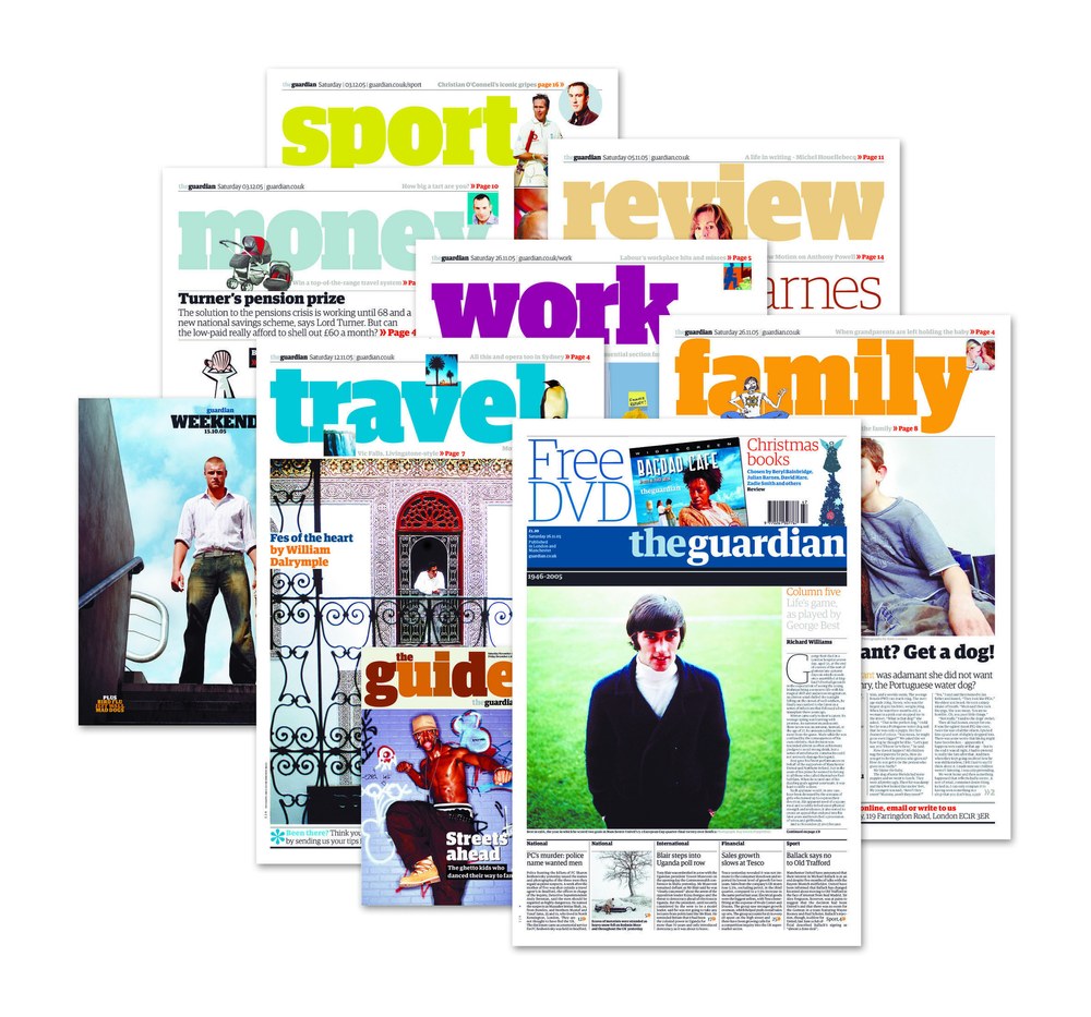
Compensating for the worst possible printing conditions, Guardian Agate Sans is designed for maximum legibility at 6 point and below on newsprint.
What are Grades?
The family features four subtly different weights, or “grades”, allowing users to find the perfect weight for a particular situation, from 1, the lightest, to 4, the heaviest. The Medium weight can be used for reversing out of a dark background, subheads, and other cases where an additional level of typographic hierarchy is needed.
What is Duplexing?
Guardian Agate Sans features two kinds of bolds. The standard Bolds are wider than the Regulars, as requested by The Guardian to make sport scores a bit more readable at 4.5pt. The Duplex Bolds set at exactly the same widths as the Regulars, useful for things like classified ads and stock listings where line length is at a premium. All numerals are tabular across all styles, so they can be freely mixed in tables of figures no matter which version is used.
Guardian Agate Sans Grades Family
Guardian Compact
| Designers | Christian Schwartz, Paul Barnes |
| Designed | 2005 |
| Last updated | 19 Dec, 2007 |
| Styles | 9 |
| Price | $50.00 style $250.00 family |
| Character set | Basic character set with limited accented support |
Guardian Compact Family
Guardian Compact has shorter, simpler serifs and narrower, stiffer proportions than Guardian Egyptian Headine. People always seemed to like this compact, flat-sided variant of Guardian Egyptian, but we never got around to drawing italics and finishing it.
Local Gothic
| Designers | Tal Leming, Christian Schwartz |
| Designed | 2005 |
| Last updated | 2 May, 2017 |
| Styles | 1 |
| Price | $50.00 |
| Character set | All caps with standard accented character set |
Local Gothic Regular Style
Local Gothic is inspired by the moveable lettering of outdoor signs in America. Its individual characters look ordinary, but in combination they appear random and irregular, giving a distressed and unusual appearance. Designed by Christian Schwartz while he was studying graphic design in the late 1990s, Local Gothic gives a surprising and uneven texture that can breathe life into both print and web projects. The characters are loosely based on the four most ubiquitous sans serifs in America: Helvetica, Futura, Franklin Gothic, and Alternate Gothic No. 2. Tal Leming developed innovative OpenType code, using theories based on quantum mechanics, to mix the mismatched letters in a way that feels truly random.
Neue Haas Grotesk Agate
| Designers | Christian Schwartz, Max Miedinger |
| Last updated | 30 Sep, 2013 |
| Styles | 10 |
| Price | $70.00 style $350.00 family |
| Character set | Standard character set, plus numbers in circles and squares |
Neue Haas Grotesk Agate Family
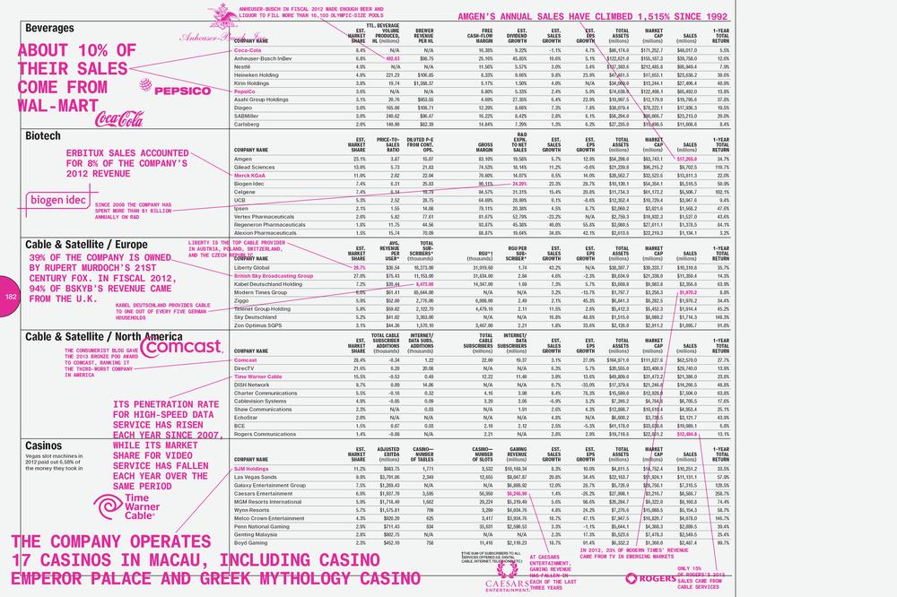
The 2013 year end issue of Bloomberg Businessweek featured a long section of very dense spreads of hard data from various industries, showing a snapshot of the current state of many companies. Creative director Richard Turley commissioned an Agate version of Neue Haas Grotesk in a number of duplexed weights, to cram tons of information into this section. Compared to the existing Text version, which is drawn for use around 8pt to 12pt, the Agate, drawn for use at 4pt to 6pt, has a larger x-height, smaller cap height, looser spacing overall, and ink traps to counteract the effects of ink on paper, which has a dramatic effect on text set at such small sizes.
Neue Haas Grotesk Stencil
| Designer | Christian Schwartz |
| Designed | 2011 |
| Last updated | 13 Sep, 2011 |
| Styles | 1 |
| Price | $70.00 |
Neue Haas Grotesk Stencil 55 Roman Style
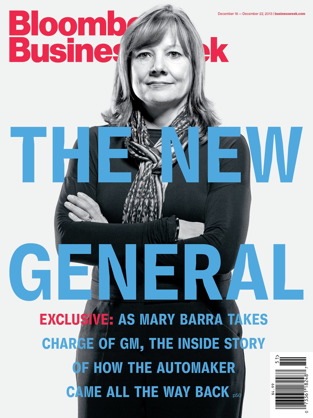
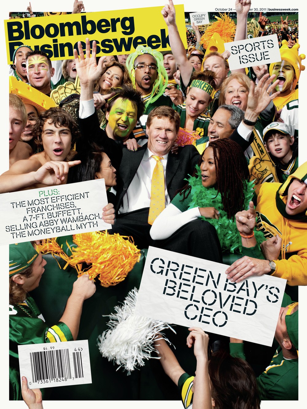
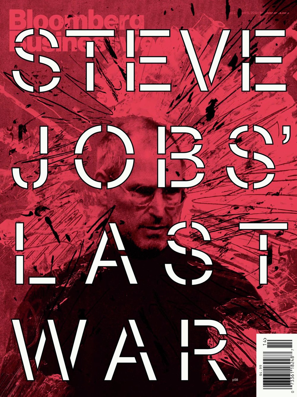
This is a stencil version of the Regular weight of Neue Haas Grotesk, drawn for a sports issue of Bloomberg Businessweek in 2011, loosely inspired by the work of Lawrence Weiner (who despised Helvetica, as we found out the week after the issue came out).
Neue Haas Grotesk Text Mono
| Designers | Christian Schwartz, Max Miedinger |
| Designed | 2016 |
| Last updated | 22 Jul, 2016 |
| Styles | 6 |
| Price | $70.00 style $200.00 family |
| Character set | Standard character set |
Neue Haas Grotesk Text Mono Family
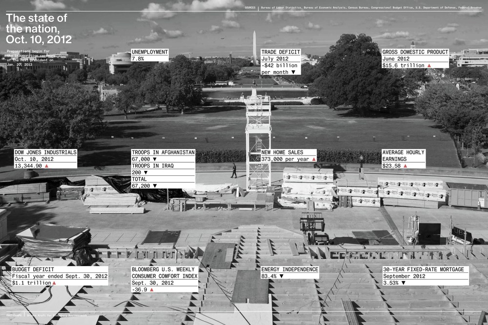
This was originally created for Bloomberg Businessweek, for a special issue on the 2012 US presidential election, and was later extended for general use in info graphics. The idea was to make text set in the Mono look and feel like unfiltered data.
Oboi
| Designers | Vincent Chan, Christian Schwartz |
| Designed | 2012 |
| Last updated | 23 Jul, 2012 |
| Styles | 1 |
| Price | $35.00 |
| Character set | Basic Latin + Cyrillic, no accents, limited punctuation |
Oboi Stencil Style
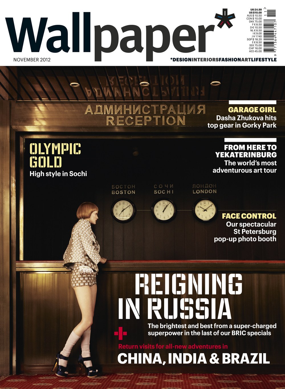
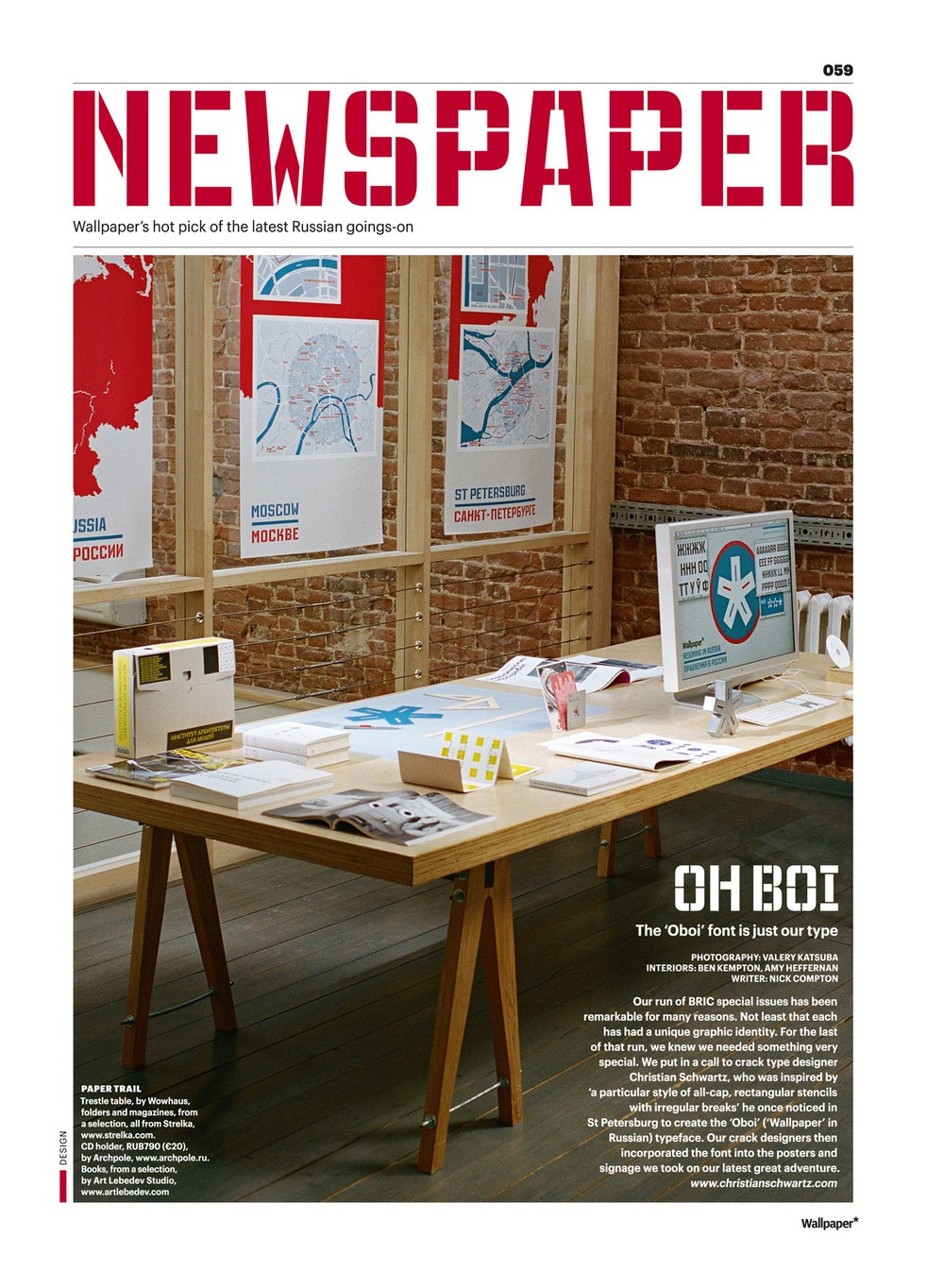
Based loosely on stencil lettering on house number plates in St Petersburg, Russia, with lots of alternate forms. Drawn for Meirion Pritchard for a special issue of Wallpaper*.
Popular
| Designers | Christian Schwartz, TienMin Liao |
| Designed | 2004, 2024 |
| Last updated | 23 Jan, 2024 |
| Styles | 14 |
| Price | $50.00 style $350.00 family |
| Character set | Standard character set |
Popular Family
Christian Schwartz drew Popular in 2004 for Robb Rice’s redesign of Popular Mechanics. Rice wanted a slab that would combine the clunky, mechanical charm of DIN with the power of Rockwell and Stymie. The family appeared in a few publications over the years before being finished for release in 2024 with help from TienMin Liao.
Popular Family
Poseidon Sans
| Designer | Christian Schwartz |
| Designed | 2016 |
| Last updated | 8 Jul, 2016 |
| Styles | 2 |
| Price | $50.00 style $75.00 family |
| Character set | Standard character set, without fractions |
Poseidon Sans Family
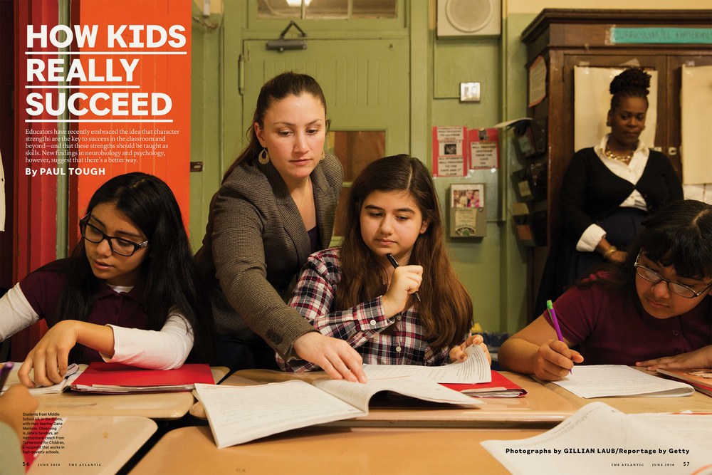
Loosely inspired by 20th century typewriter typefaces. Proportional but awkward. Designed for Darhil Crooks when he was at The Atlantic.
Produkt Condensed
| Designers | Kara Gordon, Berton Hasebe, Christian Schwartz |
| Designed | 2022 |
| Last updated | 9 Mar, 2022 |
| Styles | 18 |
| Price | $50.00 style $400.00 family |
Produkt Condensed Family
Narrower width of Produkt, drawn by Kara Gordon.
Produkt Typewriter
| Designers | Christian Schwartz, Berton Hasebe |
| Designed | 2018, 2021 |
| Last updated | 28 Jun, 2021 |
| Styles | 9 |
| Price | $50.00 style $200.00 family |
| Character set | Standard character set |
Produkt Typewriter Family
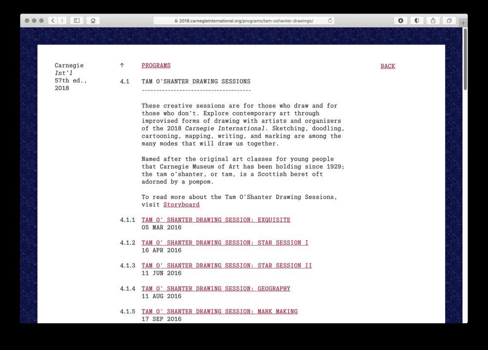
Drawn for Project Projects, for the 2018–2019 Carnegie International, and later finished for the interface of this site.
Produkt XX Condensed
| Designers | Berton Hasebe, Christian Schwartz, Greg Gazdowicz, Kara Gordon |
| Designed | 2016-2021 |
| Last updated | 8 Mar, 2021 |
| Styles | 18 |
| Price | $50.00 style $400.00 family |
| Character set | Standard character set |
Produkt XX Condensed Family
Narrower widths of Produkt, to accompany Graphik. Heavier weights of XX Condensed were initially drawn by Greg Gazdowicz for the Village Voice, but the publication closed their print edition before the redesign by Luke Hayman's team at Pentagram could be implemented. Promphan Suksumek drew light weights and Kara Gordon completed and refined the family.
Proxy
| Designer | Christian Schwartz |
| Last updated | 28 Jul, 2021 |
| Styles | 5 |
| Price | $50.00 style $150.00 family |
| Character set | Character sets vary between styles, See images for details. |
Proxy Family
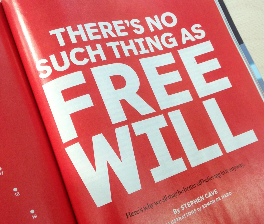
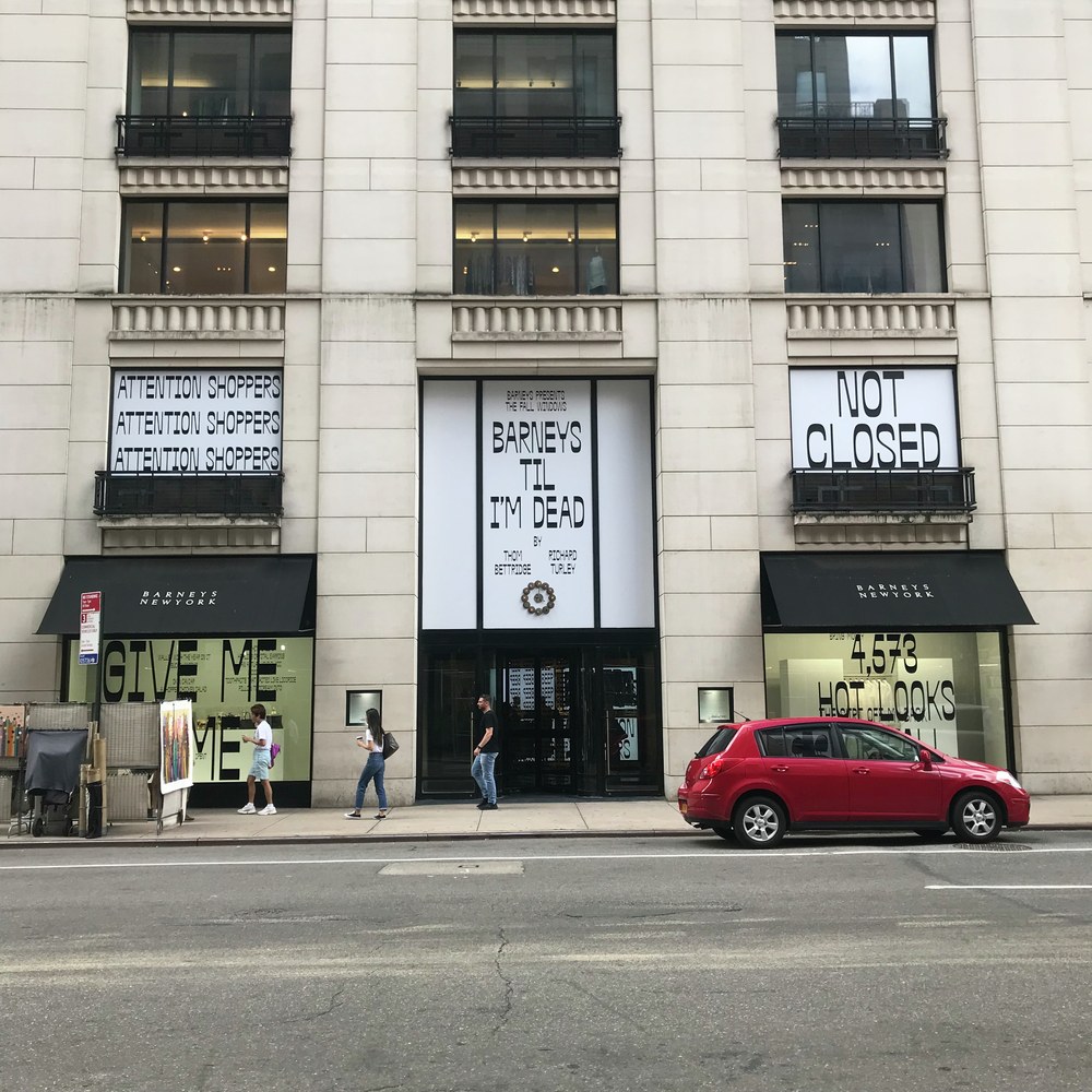
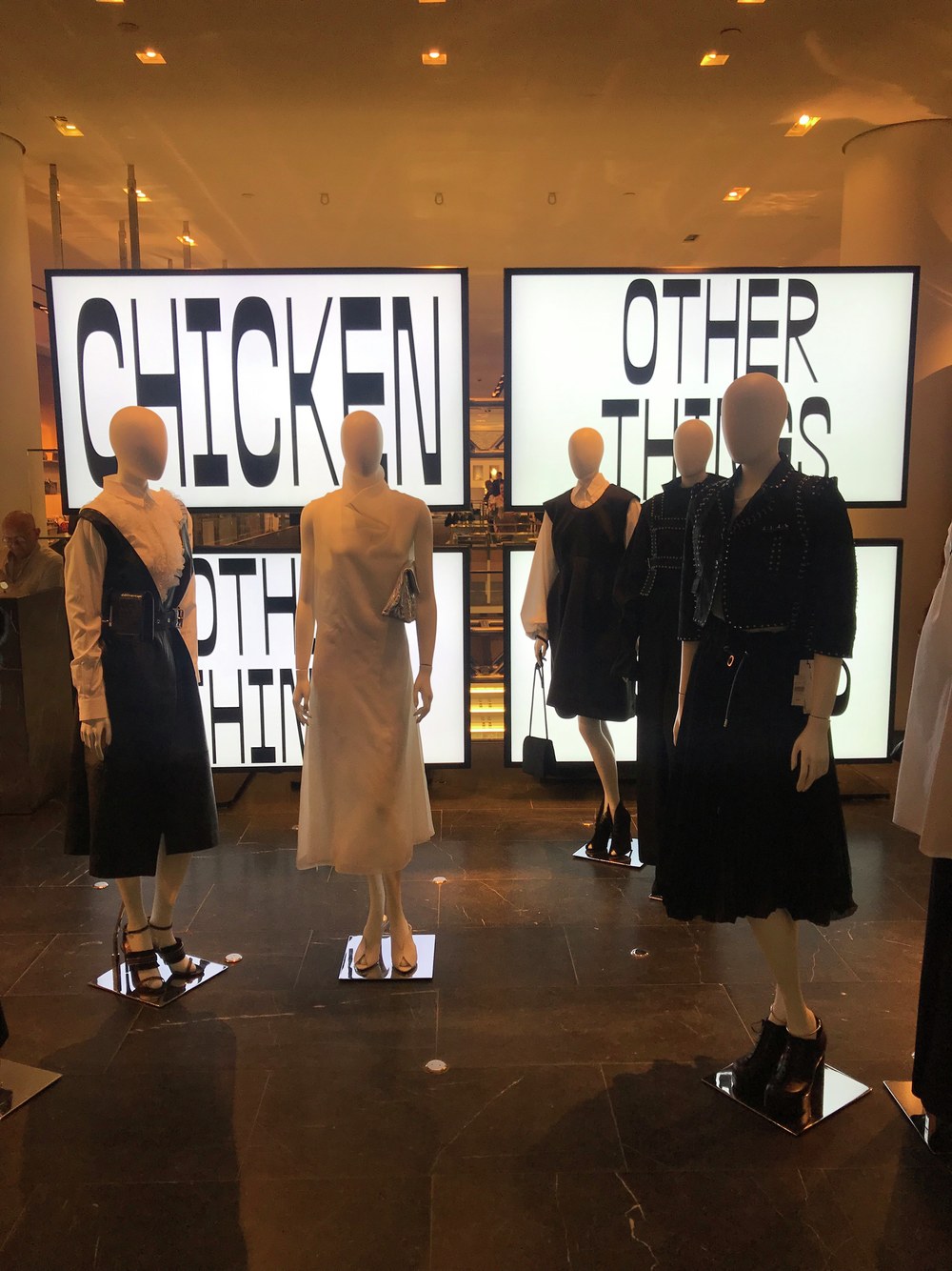
Condensed reverse contrast typeface initially inspired by Swiss roadway lettering, but ended up wandering off into its own territory. Drawn for Richard Turley and used for Barneys, Good Buys, Interview…
Schnyder Titling
| Designers | Berton Hasebe, Christian Schwartz, Jean-Frédéric Schnyder |
| Designed | 2013 |
| Last updated | 12 Feb, 2013 |
| Styles | 12 |
| Price | $80.00 style $500.00 family |
| Character set | All caps in 3 widths with standard punctuation |
Schnyder Titling Family
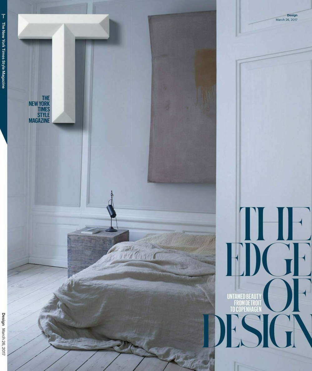
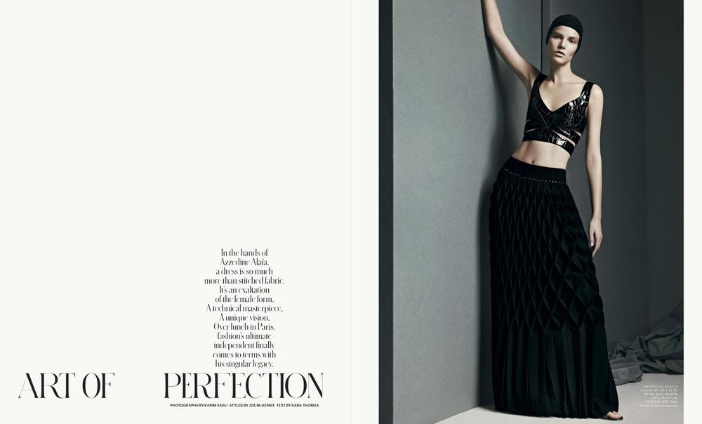
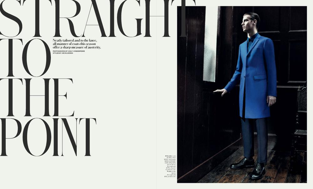
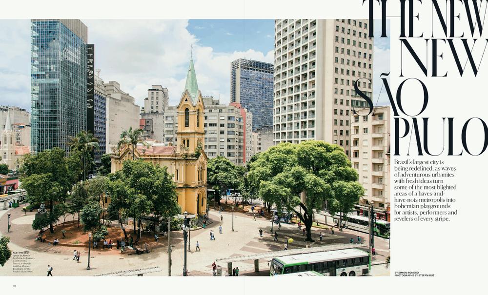
Mixing different widths in a single headline was a signature of how Patrick Li and his team used Schnyder in T: The New York Times Style magazine between 2013 and 2019. Schnyder Titling was built to make it easier to implement this effect, with three widths of capitals combined into a single font and all kerned together. Uppercase is the widest proportion, lowercase the middle, and small caps the narrowest.
Viktor
| Designer | Christian Schwartz |
| Designed | 2018 |
| Last updated | 31 Jul, 2018 |
| Styles | 1 |
| Price | $40.00 |
| Character set | Basic upper & lowercase character set with limited punctuation |
Viktor Regular Style
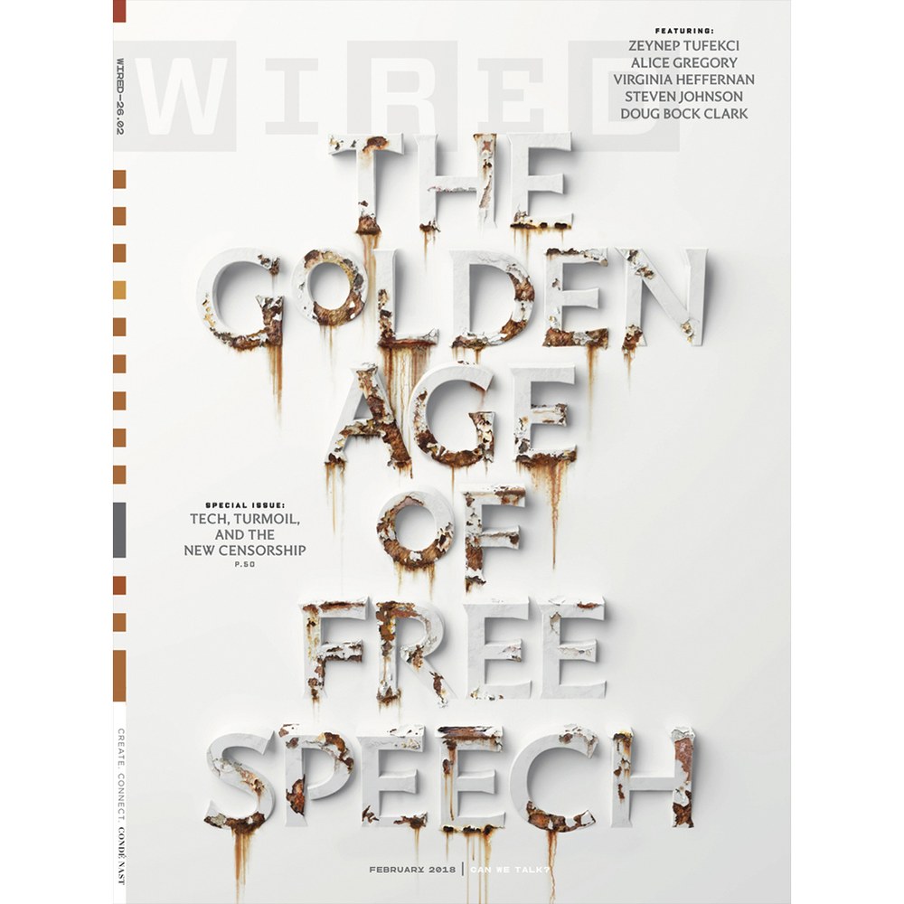
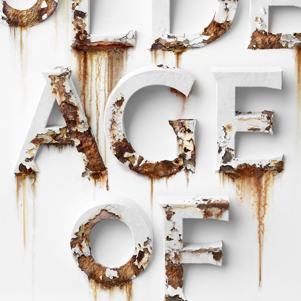
Incised, barely-seriffed display face drawn by Christian Schwartz. Used on a Wired cover, and in a couple of issues of Document Journal.
