Amplitude Collection


Amplitude

| Designers | Christian Schwartz, Benjamin Tuttle |
| Last updated | 13 May, 2025 |
| Styles | 70 |
| Price | $50.00 style $350.00 family |
| Character set | Standard character set |
Amplitude Collection


Amplitude Collection
A successful agate predicts the spread of ink on paper and effectively keeps its legibility under less than ideal conditions. Fascinated by the visual aspects of these entirely functional compensations, Christian Schwartz designed Amplitude, an extensive sans serif series for text and display that turns function into style: Deep angled cuts keep small sizes readable, while adding character at display sizes. First released by Font Bureau in 2003, Amplitude was renovated and updated with italics for all styles with help from Ben Tuttle in 2025.
Amplitude Collection
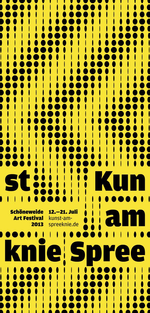
Flyer for Kunst am Spreeknie Schöneweide Art Festival, 2013. See more
Analog X Condensed Family

Analog X Condensed

| Designer | Miguel Reyes |
| Designed | 2021 |
| Last updated | 17 Sep, 2021 |
| Styles | 2 |
| Price | $40.00 style $60.00 family |
| Character set | Standard character set |
Analog X Condensed Family

Analog X Condensed Family
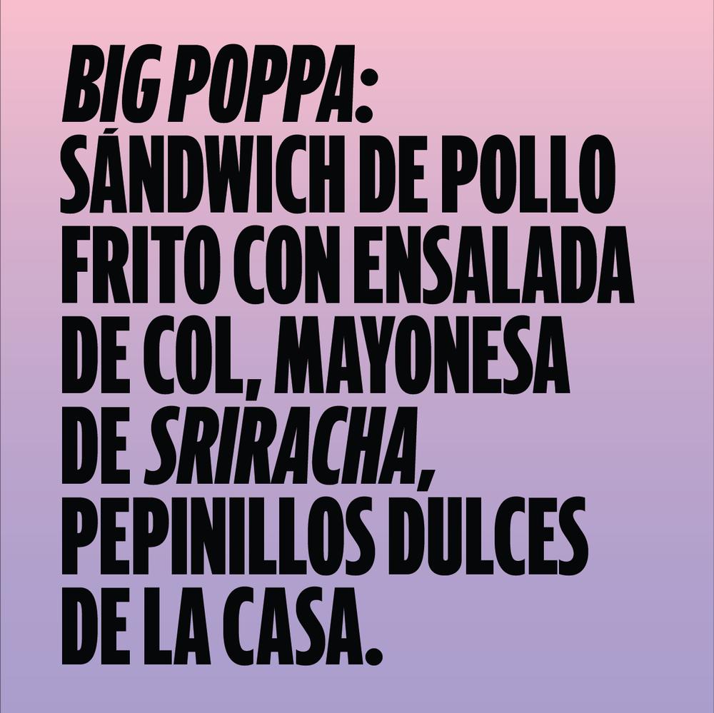
Miguel Reyes drew this extra condensed sans with 90s vibes for his restaurant in Cholula.
Analog X Condensed Family

Analog includes an alternate set of accents for extra tight leading.
Guardian Agate Sans Grades Family


Guardian Agate Sans Grades

| Designers | Christian Schwartz, Paul Barnes |
| Designed | 2009 |
| Last updated | 2 May, 2017 |
| Styles | 32 |
| Price | $50.00 style $500.00 family |
| Character set | Standard character set |
Guardian Agate Sans Grades Family

Normal character set

Duplex character set
Guardian Agate Sans Grades Family
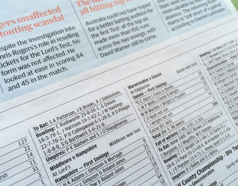
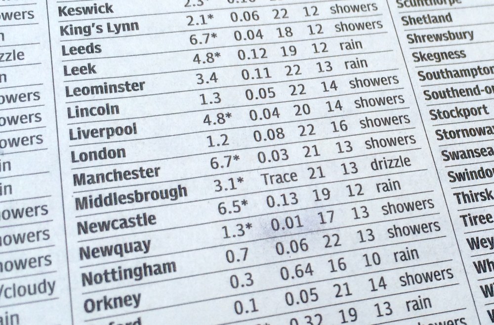
Compensating for the worst possible printing conditions, Guardian Agate Sans is designed for maximum legibility at 6 point and below on newsprint.
What are Grades?
The family features four subtly different weights, or “grades”, allowing users to find the perfect weight for a particular situation, from 1, the lightest, to 4, the heaviest. The Medium weight can be used for reversing out of a dark background, subheads, and other cases where an additional level of typographic hierarchy is needed.
What is Duplexing?
Guardian Agate Sans features two kinds of bolds. The standard Bolds are wider than the Regulars, as requested by The Guardian to make sport scores a bit more readable at 4.5pt. The Duplex Bolds set at exactly the same widths as the Regulars, useful for things like classified ads and stock listings where line length is at a premium. All numerals are tabular across all styles, so they can be freely mixed in tables of figures no matter which version is used.
Guardian Agate Sans Grades Family

Poseidon Sans Family

Poseidon Sans

| Designer | Christian Schwartz |
| Designed | 2016 |
| Last updated | 8 Jul, 2016 |
| Styles | 2 |
| Price | $50.00 style $75.00 family |
| Character set | Standard character set, without fractions |
Poseidon Sans Family

Poseidon Sans Family
Loosely inspired by 20th century typewriter typefaces. Proportional but awkward. Designed for Darhil Crooks when he was at The Atlantic.
Poseidon Sans Family
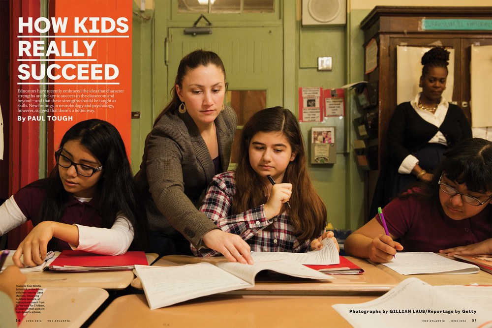
Spread from The Atlantic, creative director Darhil Crooks, May 2016
The Atlantic, May 2016
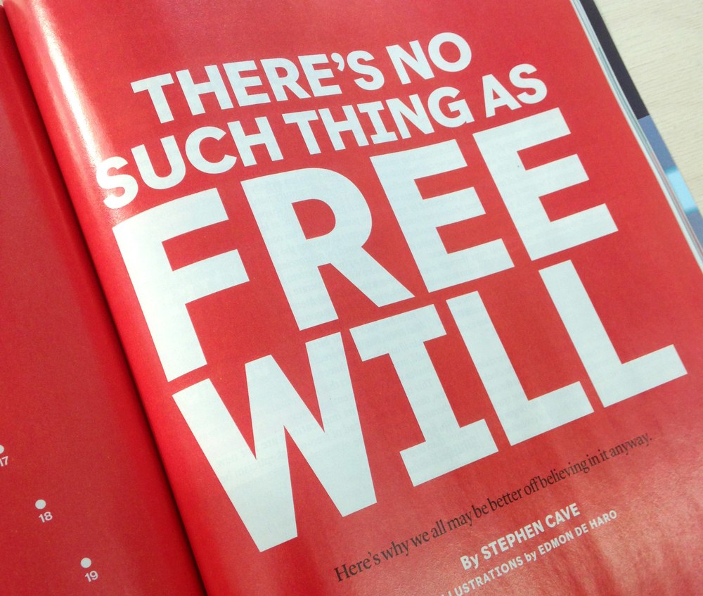
The Atlantic, May 2016
Telesans Collection


Telesans

| Designers | Dan Milne, Paul Barnes |
| Designed | 2014 |
| Last updated | 1 May, 2013 |
| Styles | 36 |
| Price | $50.00 style $200.00 family |
| Character set | Standard character set |
Telesans Collection

Telesans Head

Telesans Text

Telesans Agate
Telesans Collection
Compact humanist sans designed for the Daily Telegraph. The Agate is particularly useful. This family makes a very good companion to Austin News.
Telesans Collection