Neue Haas Grotesk Collection
Designer
Technical
Bonus Cuts
Neue Haas Grotesk Stencil 55 Roman Style, Neue Haas Grotesk Text Mono Family, Neue Haas Grotesk Agate Family
Bonus Cuts are additional styles or families not included in the main collection
Pricing
$850, styles from
$70
One-time fee for perpetual use
Completed for Richard Turley's 2010 redesign of Bloomberg Businessweek, this typeface was a restoration project: bringing Miedinger's original Neue Haas Grotesk back to life with as much fidelity to his original shapes and spacing as possible, rather than trying to rethink Helvetica or improve on current digital versions. Miedinger's original Neue Haas Grotesk included a number of interesting alternates, including a cedilla that looked more like a flattened comma (apparently preferred in Switzerland at the time), but the most striking was a straight-legged R, available in each of his handful of original weights by special order only, but now easy to access in digital form.
Neue Haas Grotesk Display Family


Neue Haas Grotesk Display (Round Dots) Family
Go to top


Neue Haas Grotesk Text Family
Go to top


Neue Haas Grotesk Text (Round Dots) Family
Go to top


Supported Languages
Go to topAfrikaans
Albanian
Asturian
Basque
Bosnian
Breton
Catalan
Cebuano
Cornish
Corsican
Croatian
Czech
Danish
English
Esperanto
Estonian
Faroese
Faroese
Filipino
Finnish
Flemish
French
Frisian
Friulian
Gaelic
Galician
German
Greenlandic
Guarani
Haitian
Hawaiian
Hiligaynon
Hungarian
Icelandic
Igbo
Indonesian
Irish
Italian
Kurdish (Latin)
Latin
Latvian
Lithuanian
Livonian
Luxembourgish
Malagasy
Malay
Maltese
Maori
Moldavian
Nederlands
Norwegian
Occitan
Polish
Portuguese
Provencal
Romanian
Romansch
Saami
Samoan
Scots
Scottish
Slovak
Slovenian
Spanish
Swahili
Swedish
Tagalog
Turkish
Walloon
Welsh
Wolof
Specimens
Go to top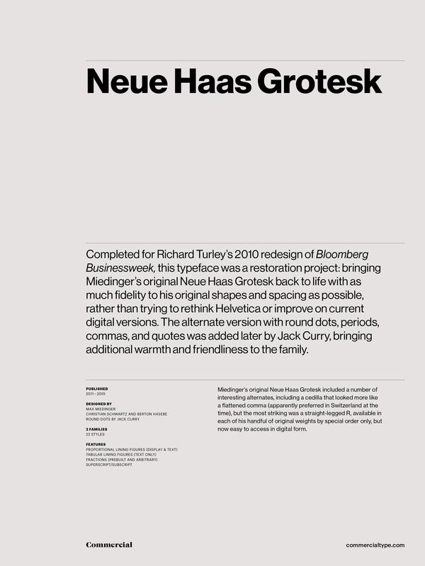
Bonus Cuts
Go to topNeue Haas Grotesk Stencil 55 Roman


Neue Haas Grotesk Text Mono Family
Go to top


Neue Haas Grotesk Agate Family
Go to top


