Startling Spectator
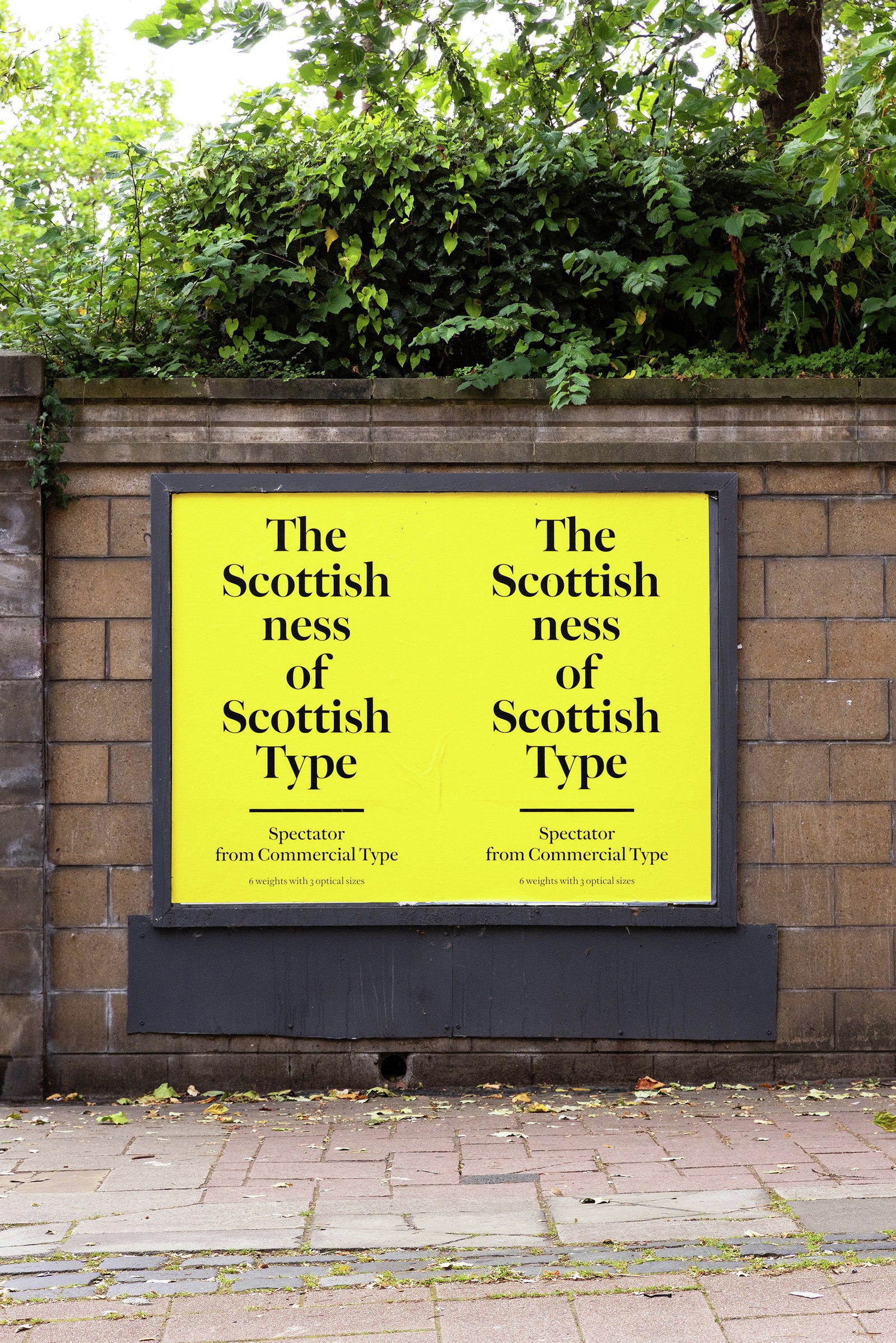
Spectator, Paul Barnes’s new tour de force, is a restoration and reimagination of Alexander Wilson’s legendary but elusive English No. 1, which first appeared around 1760 and was used extensively by the renowned Foulis Press at the University of Glasgow. (The name “English” referred to the typeface’s size; at around 14pt, it was on the large side for a text face, falling somewhere between text and display.) Paul and Christian had long admired the English No. 1 because of its surprising modernity and unique place in the canon: Wilson’s design showed traces of Caslon, but, with its graceful curves and larger-on-the-body proportions, most clearly owed a debt to Baskerville, whose groundbreaking serif had appeared just a few years before. They contemplated resuscitating the typeface so that it could be readily used today—they themselves wanted to use it—but felt a bit stymied by the prospect. Could they do the English No. 1 justice?
In his Bibliography of the Foulis Press, Philip Gaskell called Wilson’s type “startling”; noting Baskerville’s obvious influence, Gaskell added that “Wilson has outdone the master in the width, the weight and even the size of the face.” Its large x-height, loose fit, elegantly tapered serifs, and wide proportions gave it a distinctly modern appearance. Wilson first showed the English No. 1 in his 1772 specimen, but it was no longer used at the Foulis Press after 1783. And then it fell into obscurity—interpreted by Giovanni Mardersteig for Monotype composition in the 1930s, and David Quay and Freda Sack with the advent of digital type in the 1990s, but rarely seen of late. Both of these revivals responded to the technologies of their time, just as Spectator—which has four optical sizes in six weights and has also been built as a variable font—is as much a product of today’s technologies as it is of the Scottish Enlightenment. The past is the present.
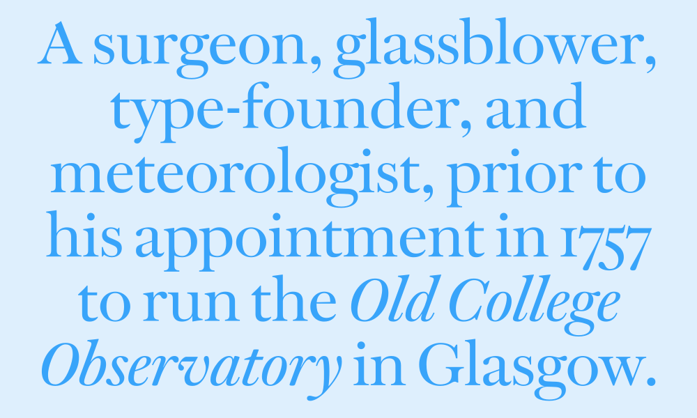
Depending on your perspective, Spectator took either roughly two years or two decades to make. Even before Paul and Christian joined forces in the mid-aughts, Paul had been collecting specimens showing the English No. 1 and books set in it, returning to them periodically to study Wilson’s work. Christian has had a framed copy of Wilson’s one-sheet specimen from 1783 on the wall in his office for years. When they began planning the Commercial Classics label in the 2010s, they talked about an interpretation that would faithfully capture the spirit of the English No. 1, but, after a few false starts, they put it aside. Then, in the early 2020s, a Glasgow design firm approached Commercial Type for a serif to pair with Marr Sans. This gave Paul the push—and the perfect excuse—to renew his efforts to explore the English No. 1. He came up with a number of proposals drawing on designs inspired by Wilson, finding a fresh interpretation of the English No. 1 the most promising. The client project fell through, but a seed had been planted.

Paul built on the momentum of his sketches and finished the collection. It is massive. At heart this is a reading face—a text face designed as an elegant machine for reading—that comes in four optical sizes, each with six weights ranging from Regular to Black: Text, geared toward sizes smaller than the 14pt English No. 1, with lower contrast than the original; Deck, for intermediate settings between around 14pt and 30pt; Headline, for around 30–72pt; and a highly contrasted and tightly spaced Poster for 72pt and up. The Poster family is a bit of an exercise in imagination—display types appear not to have been a priority for Wilson, and this is much tighter than anything he ever would have made. It is, however, more in line with what designers today expect, as is the fact that Spectator also exists as a variable font.
The italic presented an unusual challenge. Wilson’s foundry had cut a single example that, with its much smaller x-height, didn’t match the English No. 1. It also followed Caslon more than Baskerville, and Paul felt the need to draw a face that was closer to the latter, which contemporary tastes—and Wilson’s larger sizes—tend to favor. His initial design was transitional in style, but with a sharper angle more suggestive of Caslon. Finding it a bit too dramatic for text, Paul revised it with a gentler slope. We’re offering the first italic, dubbed “Original,” as a bonus cut. Try it huge.
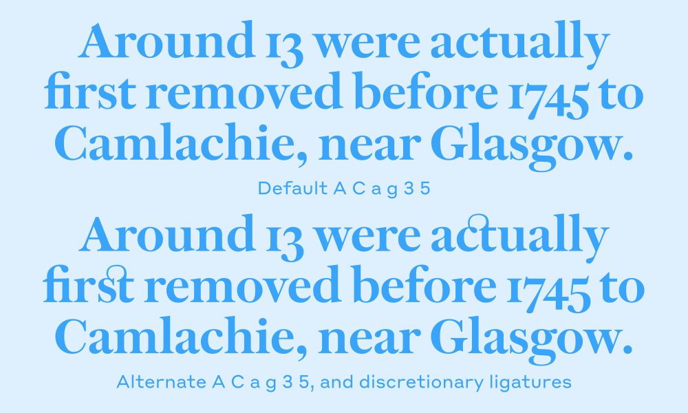
Oodles of alts hide in stylistic sets: A more transitional a with a less abrupt join to its lower bowl. A g with an open lower bowl. A Q with a less runaway tail. A Q with a squat, cursive tail. An R with a straight leg. A J that sits on the baseline. An A with a pointed, rather than scooped, apex. A more transitional C lacking a lower serif. Two extra italic ampersands. Discretionary ligatures. Lining figures. Semi-lining figures. And much more, because Paul can’t be stopped.
As the English No. 1’s fluctuating trajectory exemplifies, it is difficult to predict what will endure and what will fade away. Wilson’s near-contemporary Baskerville’s work, if somewhat underappreciated in its day, has never gone out of use—consider the faithful interpretation of John Quaranda’s ITC New Baskerville, or Zuzana Licko’s reimagining of it as Mrs Eaves. And then there’s Matthew Carter’s “blended Scotch” Miller, a perfect example of a typeface meeting its moment. Will Spectator stick? We can’t say. All we can do is hope that designers will find Spectator as startling, useful, and beautiful as the English No. 1 was in its time. “Spectator is Paul’s magnum opus,” Christian said recently. He paused for a moment and then added: “It’s my favorite typeface.”
Related fonts