Shiva Nallaperumal’s path to Delegate

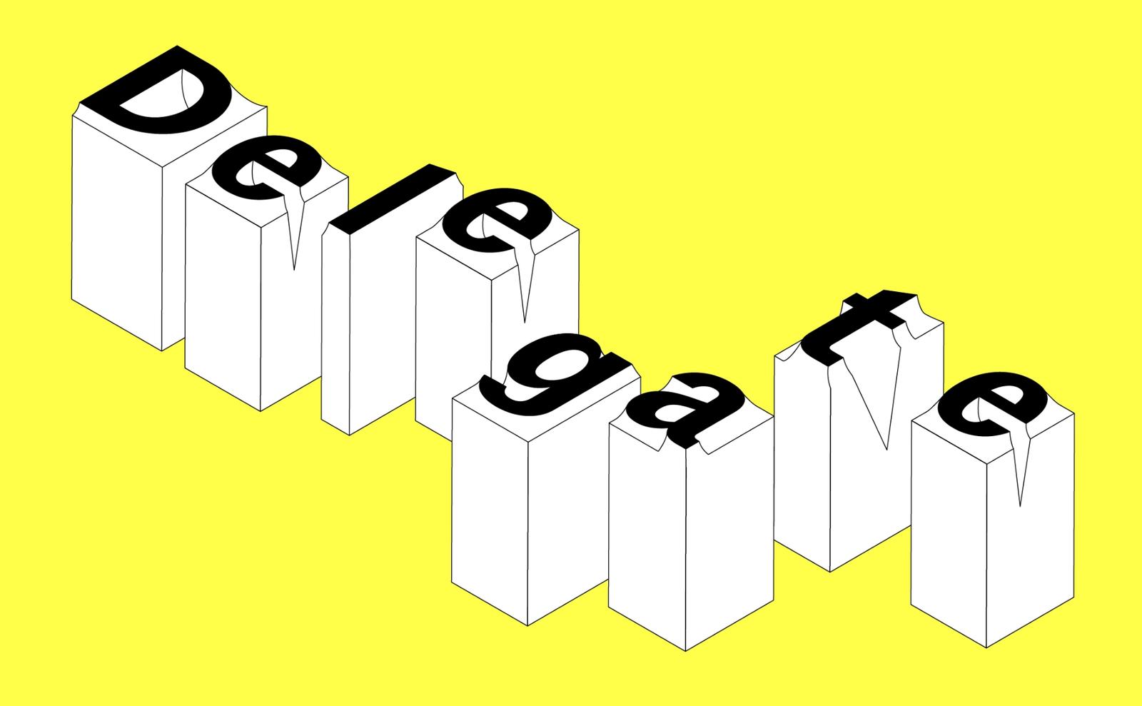
Delegate in use in Double Acts in Pop. Written by Molly Lambert; book design by Chris Wu of Wkshps.
Type designers and graphic designers are natural allies, but their respective disciplines can seem asymptotic, traveling along companionably while never quite overlapping. Graphic designers (mostly) love type, and, perhaps especially since the 1990s when a Mac with Fontographer installed on it became fairly commonplace in MFA programs and in design studios, plenty of graphic designers have tried their hand at making a display typeface or two. But the subset of graphic designers who also practice designing text typefaces with any regularity or success is minuscule. Shiva Nallaperumal is one of those designers.
In late 2023, Commercial Type released Delegate. Although it’s Shiva’s first release with Commercial Type, it’s not his first exploration of agates and grotesks; they have fascinated him throughout his career. The family continues Shiva’s investigation into agates, but also advances a hypothesis about how an “American grotesk” might reasonably look and behave. Long-distance correspondents Caren Litherland and Shiva met up via text for a conversation about Delegate, design, and November’s new website.
Caren Litherland: So, Shiva, I need to congratulate you on multiple fronts. First of all, huge congratulations on November’s new website, which I understand was a fairly long time in the works. It’s so you: the supercut at the beginning seems like a nod both to the splash pages of the early web, which frankly I miss, and to your love of film, which seems so central to who you are as a designer. One of my favorite parts of the site is the Log, which is kind of like a hidden treasure; users have to toggle a switch to even know that it’s there, and then it’s like this magic door opens that reveals this marvelous repository of cultural artifacts that inform November’s work. Do you want to talk a bit about the new site—what the development process was like, how you plan to use it, how you think it might evolve?
Shiva: Thank you very much! The website is a reflection of both Juhi’s and my obsessions and interests (cinema being a shared love). It has been a very long and arduous process. It was also very iterative: We originally started designing it a year into our studio (2019) and it went through many different versions. When we returned to India in 2023 we started over from scratch — because for the first time we were clear about our own identity, and what we wanted to say to the world. We wanted the website not just to be a portfolio showcase but also a way for us to communicate with the world. When we were younger and in college, the only way we could keep in touch with what our favorite designers/studios were doing was to religiously check their websites in regular intervals. Each studio’s website echoed the studio’s specific identity and because there was no other medium (like Instagram), we experienced someone’s work on their own terms. There were hardly any preset templates, so every site was a surprise. We detest the centralized communication that Instagram has created, where everyone is fighting for two microseconds of your attention. We wanted our site to echo our early experiences from the web: surprise, fun, and personality. Most importantly: We want people to waste time on it, reading, looking, searching, and finding. I remember losing hours to “the internet” but coming out smarter and energized, unlike the doom-fatigue I feel today.
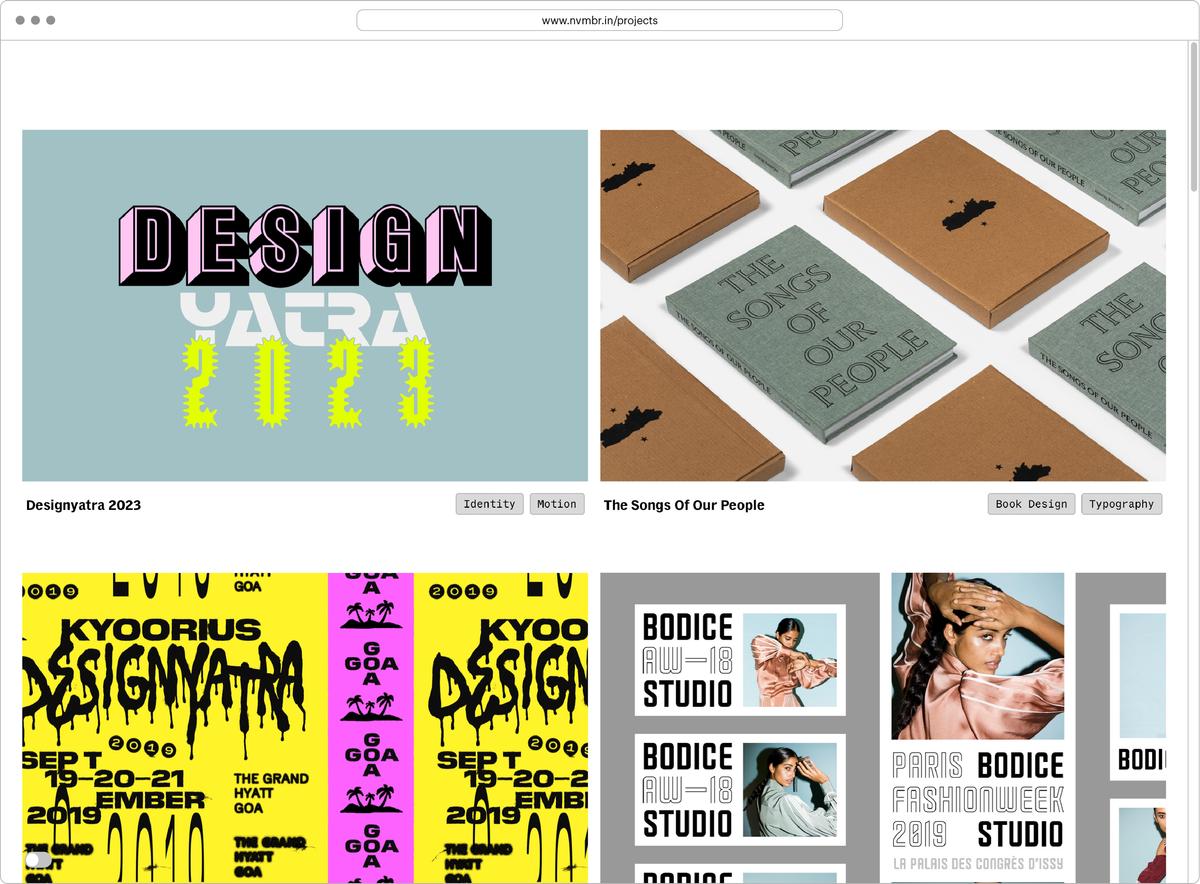
Detail of the project page on November’s site.
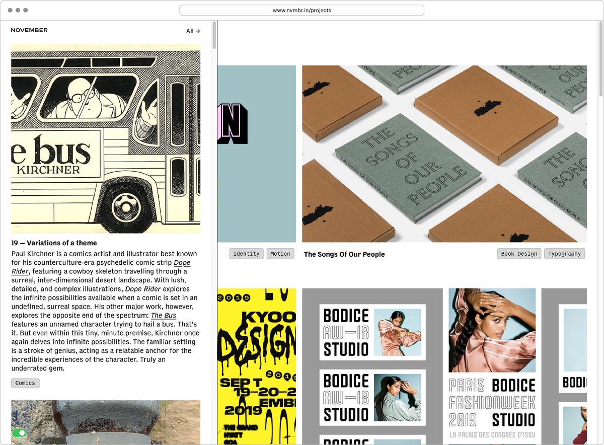
“What does this button do?” By flipping the toggle switch at the bottom left of November’s new site, visitors open up the magical world of the Log, Shiva and Juhi’s nod to FFFFOUND! and Tumblr.
The log is our tribute to Tumblr and FFFFOUND!, the bookmarking site. We are always reading and consuming, and we enjoy sharing with and learning from friends and colleagues about the books, films, art, writing, music, and TV we’re consuming. I have long been an ardent reader of music and culture magazines (I spent most of my formative years reading back issues of Spin I found in a bargain bin at a local bookstore in Chennai) and love the short, quick opinion columns they’ve always carried. The log is both our way of sharing knowledge and also practicing writing more seriously. I’ve always wanted to be a better writer, but essays just seem very intimidating.
Shiva, you write beautifully. I’m just saying.
Ha, that means a lot coming from an actual writer! So these short pieces, about things we know well, could be a good start, we thought. Another reason we started the Log was also because we are seeing a marked drop in young designers’ and students’ exposure to the larger cultural field. I don’t know what it is, but young designers, at least here in India, haven’t seen the films, read the books, or heard of the creatives that they should have. It’s not their fault—they’re all super eager and interested but I’ve heard the same problem multiple times: one of not knowing where to start.
It’s understandable, all our platforms today are designed to keep people within and not venturing out to explore more. For example, the other day I was shocked that our junior designer had never heard of The Terminator. I gave her the day off to watch the first two films. When I was a student, design schools took cinema very seriously; my school had mandatory film screenings Tuesdays and Fridays followed by intense discussions, and we watched everything: from Fritz Lang to John Carpenter to Werner Herzog to Die Hard. It’s just not the case today. Maybe it isn’t practical: in my time, my entire cohort (of all disciplines) was never more than thirty people. How are designers supposed to understand narrative, pacing, structure, or cultural insight without fully immersing themselves in cinema and music?
Anyway, our goal with the Log is to be that starting point. Every image is linked to a bigger resource: a book, a film, or a longer essay that you can explore should you be more interested in that topic. Every month we dedicate one day of studio time to collect and write the next month’s Log entries, and we hope to keep it going. We will keep it limited to our website only: I realize people spend infinitesimally less time on individual websites nowadays but it’s for that one someone who finds it and finds value in it. Even if that is only one person forever, I’m happy if it makes a difference.
You need to add an RSS feed for the Log!
It’s on our to-do list!
Digital punches of Delegate.
Moving on to the next order of congratulations: At the end of 2023, you published Delegate—belated congrats on your first release with Commercial Type! More recently, you were the creative director for Graphik’s expansion into the Bangla, Devanagari, and Tamil scripts, which I’ll come back to in a bit. Would it be fair to say that Delegate was a full-circle moment for you? I remember reading an interview with you where you said that while attending a design conference in Goa when you were an undergraduate at DJAD, you chanced upon a print artifact that sort of changed your life: a Commercial Type specimen. Now you’ll be in Commercial Type specimens. How does it feel?
It’s an incredible feeling and quite an honor. It’s a funny story, actually: I decided to go to design school because I liked to draw and wanted to be an illustrator or animator. I had no idea what graphic design or typography was before school and I really enjoyed those classes. A pivotal moment was seeing David Carson’s End of Print in the library: It totally changed my perspective on graphic design. His work aligned with the music I loved (Grunge, alternative, punk). It was loud and abstract, and each layout felt more like a painting than anything else. Anyway, it was announced that David Carson was speaking at Designyatra (Asia’s biggest design conference) that year and it was killing me that I couldn’t go, since the school rule was that only third- and fourth-year students were allowed to attend. My friend Samrudh and I decided to go rogue, lied to the administration that we needed leave to attend my sister’s wedding (I used this excuse four more times over the next few years), worked on a small freelance project that paid for the tickets, and went to Goa. When we got there, the very first thing the emcee announced on stage even before the welcome address was that Carson couldn’t make it. It was a HUGE huge disappointment.
I didn’t know it then but I found something else through that experience that changed my life forever: The goodie bag had a specimen from Commercial Type featuring the newly released Marian and Stag families. It was my first time seeing a typeface specimen and I sort of came to terms with the fact that someone actually designs these things. Of course, I’d done the basic foundational typography classes but I’d never fully encountered Type Design as a discipline. And it wasn’t just any typeface, it was fucking MARIAN! It was stunning and perplexing—the ligatures, the swashes, and all as thin as hair. But the typeface that really blew a bulb in my head was Stag: There was a showing of both the Sans and Slab versions (again, my first time encountering a superfamily concept) and I distinctly remember noticing that Christian had retained the terminal slab on the a in the sans. That sort of realigned my brain a little bit, the subtle way of creating a relationship between two styles: It was suddenly like ooooohhhhhhh I get it! It seems miniscule now but you can’t choose what influences you 🙂

The specimen that made Shiva’s head explode.
When we got back to school I did a deep dive on Commercial Type—its typefaces, designers, and partners. When I found out that Paul had worked with Peter Saville, that was it for me (music was my gateway drug to design). I loved (and still love) Christian’s personal Schwartzco site—It was so well written, with such personal writing about the process behind each typeface. He generously shared his sources, ideas, and inspirations, which then led to a lot more googling and rabbit holes. I still recommend the site to everyone.
I think I can trace whatever knowledge and passion I have for typography to picking up that specimen that day. So yes, fifteen years later, being in a Commercial Type specimen myself is a wonderful feeling.
Have any other specimens influenced you? Do you have quite a collection?
Many! I don’t have all that much (nothing compared to Commercial Type or the legendary collection of Tobias Frere-Jones), but most of my collection is from my time in Baltimore during my MFA at MICA or brief travels in Europe. Tal Leming (to whom I owe my career) introduced me to Oak Knoll Books and I spent most of my teaching-assistant stipend there. I’ve got some really great ones I found in bargain bins and thrift stores, including specimens by William Addison Dwiggins (I’ve always loved how the covers of his specimens were adorned with lettering and not the typeface itself); an old one from Enschedé showcasing their entire history (gorgeous, sparkling Rosart and Fleischmann faces); a few from ATF and Linotype; and one fantastic one from Fonderie Olive. All of these have greatly influenced me. I’ve been very lucky also to be given specimens from many current foundries and designers: I love the carefully considered type specimens of Typotheque (I later got to design one for them), Typonine, Bold Monday, and Production Type.
Tal told me once that if I emailed Enschedé they’d mail me some specimens, so I did and I received a very beautiful package that felt more like mail art than specimens: It was an envelope with postcards, specimens, and, most interestingly, pages torn out of books and newspapers that use their fonts. That was SO COOL! How better to sell a font than to show you how it looks printed in 8pt on bible paper? I’ve still kept the envelope as it contains the most beautiful handwriting I’ve ever encountered: that of Peter Matthias Noordzij (he writes oldstyle numerals and small caps for emphasis).
Another set of specimens I’ve loved are the collection from Storm Type. I’ve always been a huge fan of František Štorm’s eclectic and distinctly Eastern European style. His specimens are just as eclectic. Finally, a specimen I absolutely love: an early one from Klim. It’s a small black book with a horizontal layout, a single big word per page—it feels like a flip-book. I love that it mirrored his website of the time (another huge influence). It helped me understand how there’s a larger graphic language and philosophy that lends itself as easily to print as it does to the web. Specimens have often taught me more about graphic design and typesetting than type design itself.

Poster for a screening of John Waters’s Pink Flamingos at the Charles. Riso printed in four colors.
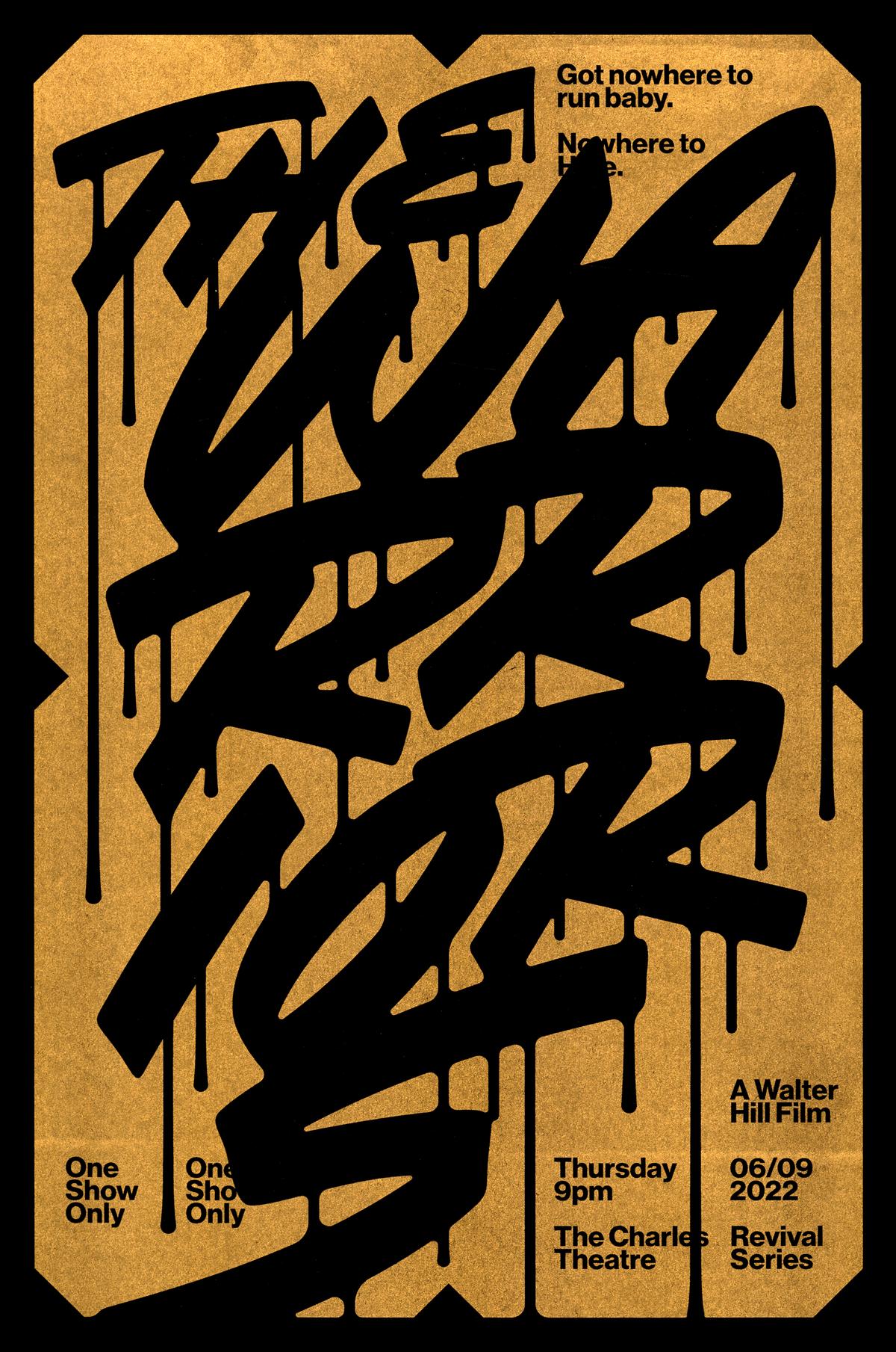
Poster for a screening of Walter Hill’s The Warriors. Riso printed in metallic gold on black paper in an edition of 100.
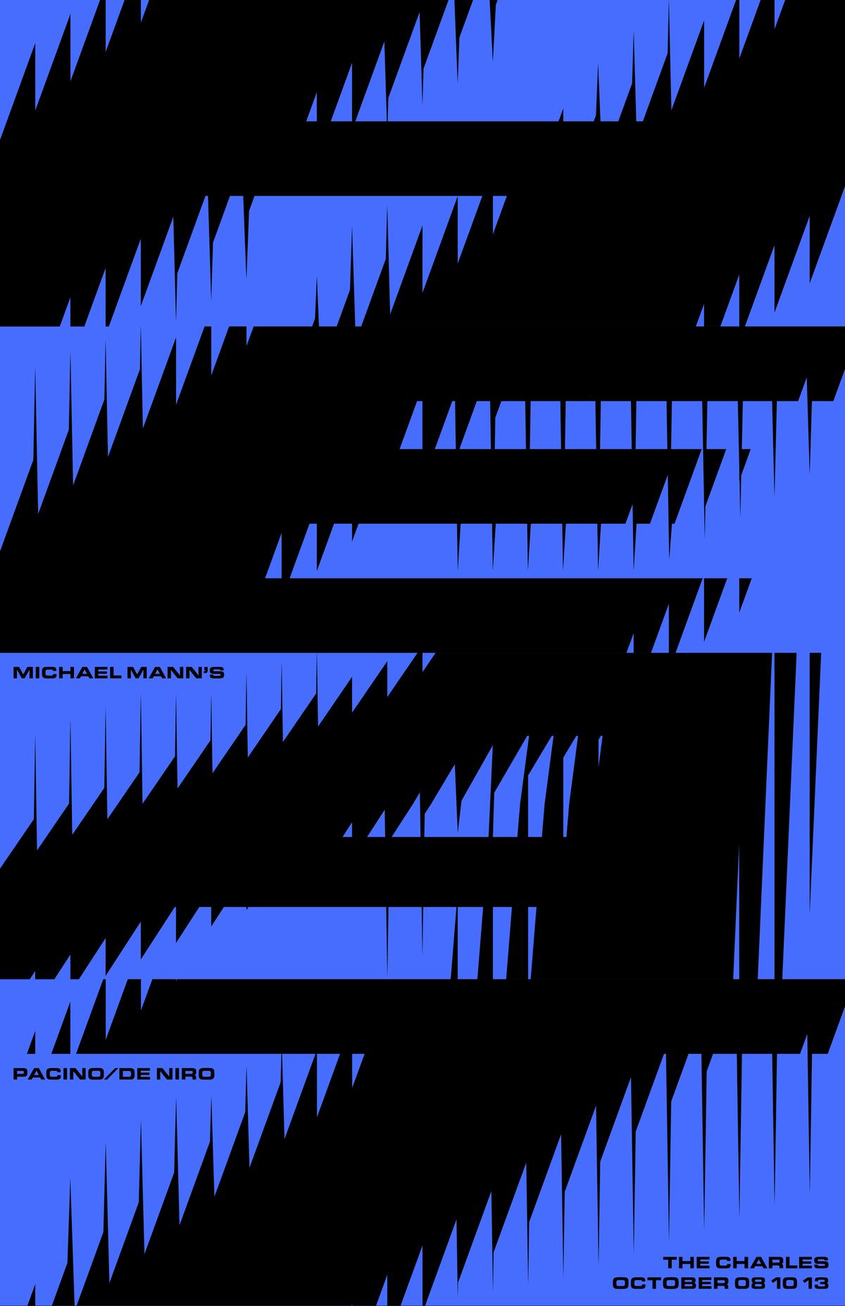
Poster for a screening of Michael Mann’s Heat at the Charles Theater in Baltimore.
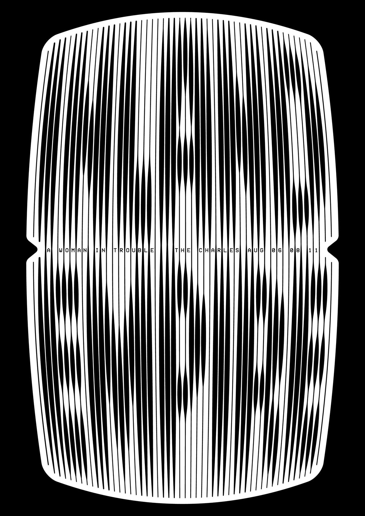
Poster for a screening of David Lynch’s Inland Empire at the Charles. Riso printed in various colors.
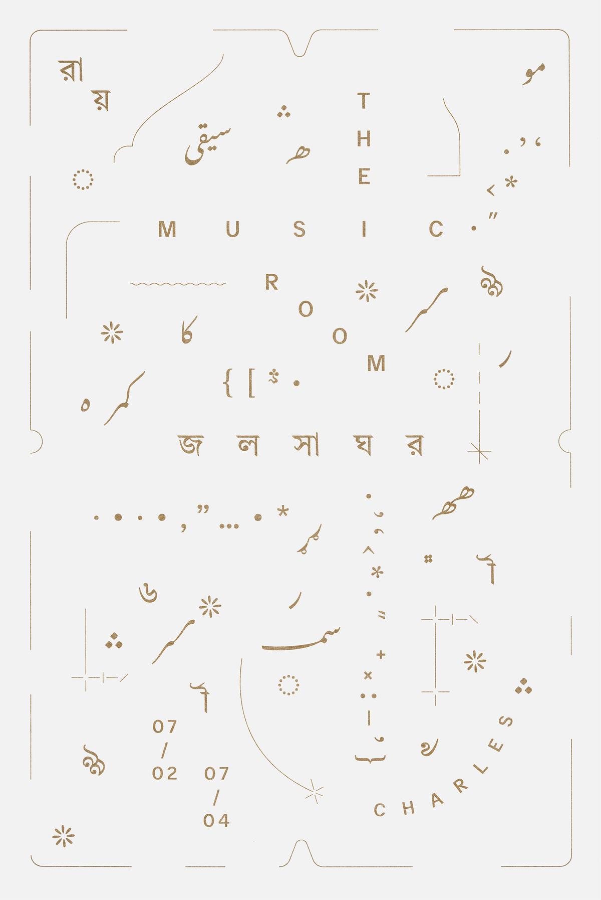
Poster for a screening of Satyajit Ray’s 1958 Jalsaghar / The Music Room. Riso printed in an edition of 100.
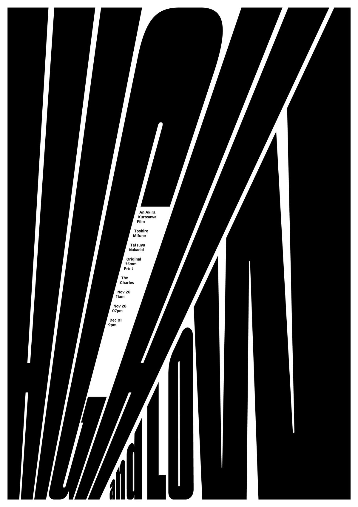
Poster for for a screening of Akira Kurosawa’s High and Low at the Charles.
Poster for a screening of John Waters’s Pink Flamingos at the Charles. Riso printed in four colors.
Poster for a screening of Walter Hill’s The Warriors. Riso printed in metallic gold on black paper in an edition of 100.
Poster for a screening of Michael Mann’s Heat at the Charles Theater in Baltimore.
Poster for a screening of David Lynch’s Inland Empire at the Charles. Riso printed in various colors.
Can you tell me about your 2021–22 stint at MICA? You wrote on Instagram that the year served as a kind of sabbatical after a pandemic-induced period of self-doubt and stasis. I really appreciated your honesty and I imagine quite a few other people did, too. So did the sabbatical work? Did it give you a lot of latitude for experimentation? Do you hope to make it a regular practice? I particularly loved the series of posters you did for the Senator and Charles theaters in Baltimore—just brilliant, thoughtful, exuberant stuff. And I know that the sabbatical also gave you an opportunity to further develop Delegate (formerly named Diplomat) and prepare it for release. Say more about your year at MICA and what it felt like to return to your alma mater in a more professional capacity.
Juhi and I started November in late 2018, but at the time I was still living in Chennai and she was based in Mumbai. We were traveling a lot over the next two years for events, conferences, meetings, and working between the two cities. We planned to properly move to Mumbai and set up the studio in January 2020. We’d hired our first intern at that time, too, but then Covid changed everything. I was hit very hard during the pandemic, both mentally and physically. Some people used the pandemic for personal projects and lots of self-work, working out etc., etc., but man, I wasn’t learning to bake banana bread. The experience changed me: I’d always been extremely restless, excited to create work, and, most importantly, consistently inspired and motivated. The pandemic affected the latter and it impacted both of us greatly. I’d always been a great reader throughout my life but in 2021 I didn’t read a single book.
Anyway, we were looking to change things, to get back into the rhythm of inspired work. So when the Designer-in-Residence opportunity came up, we thought it was a great idea. I had the most creatively explosive time of my life when I did my MFA there and it felt like an opportunity to return to that zone again. In retrospect it was pretty crazy to leave the absolute comfort, safety, and natural beauty of Goa to move to Baltimore during the pandemic. But it was a whole new environment and it really really helped. It was great working with Ellen Lupton and Jennifer Cole Phillips (codirectors of the program), who greatly influenced me as a student. Teaching was great, just being around excited young energy helped. We only worked with one of our long-term clients back in India and focused the rest of our energy on personal projects, unfinished typefaces being a major focus. This was the time I really spent on Delegate, working closely with Christian on refining and completing it. Christian somehow could see the typeface that was in my head and helped me get there.
Additionally during that year I returned to my love for film in a big way. We began going to the Charles, which was walking distance from the school, several times a week to catch revivals they would play. On one such visit, for The French Connection, I met John Standiford, the projectionist / curator / director of the place. It was an instant friendship: We discussed Friedkin for an hour in the lobby and I just sort of proposed that I’d love to design posters for the revival shows. He loved the idea and simply let me do it.
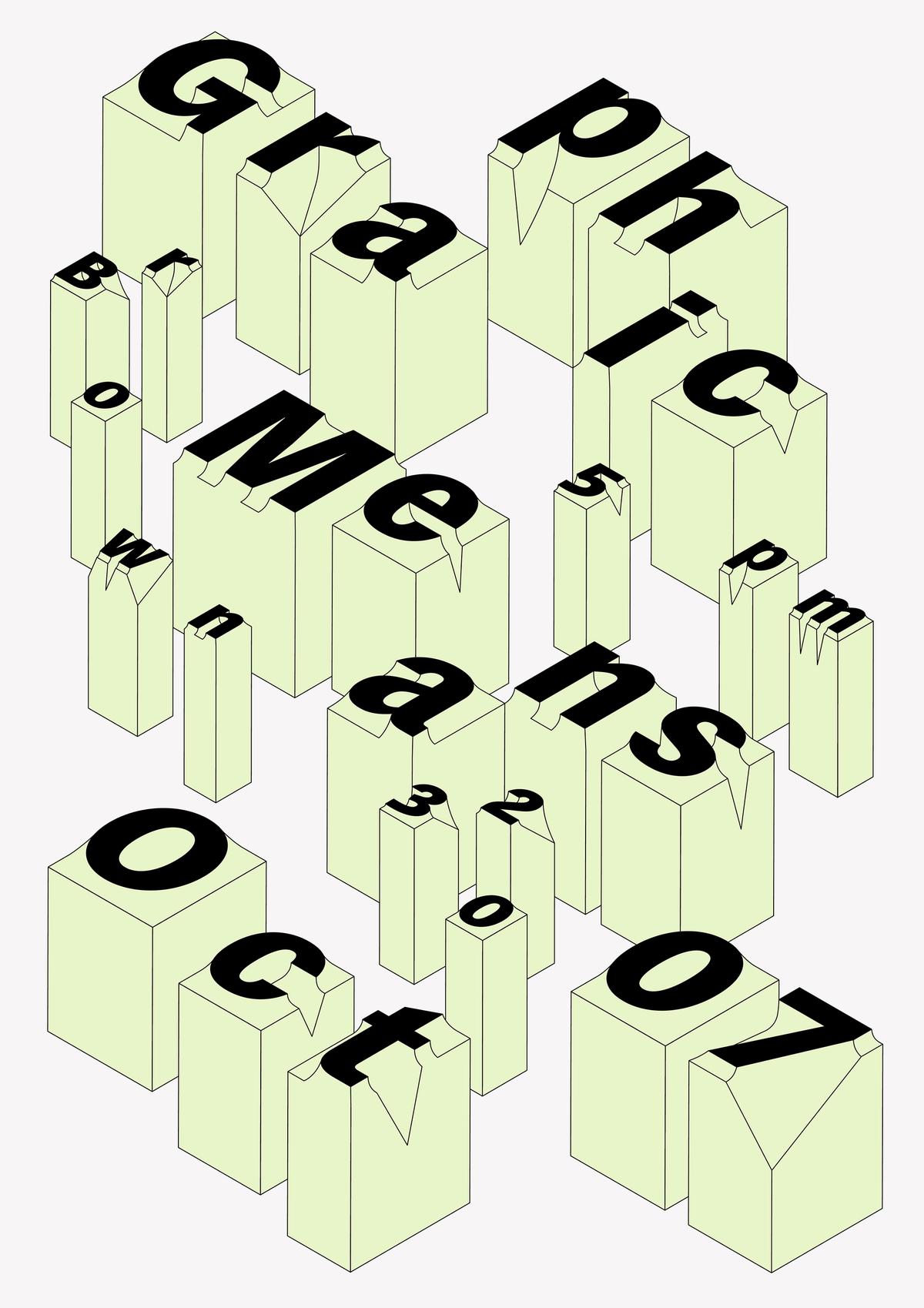
Shiva used an early version of Delegate for a poster promoting a screening of Briar Levit’s Graphic Means at MICA.
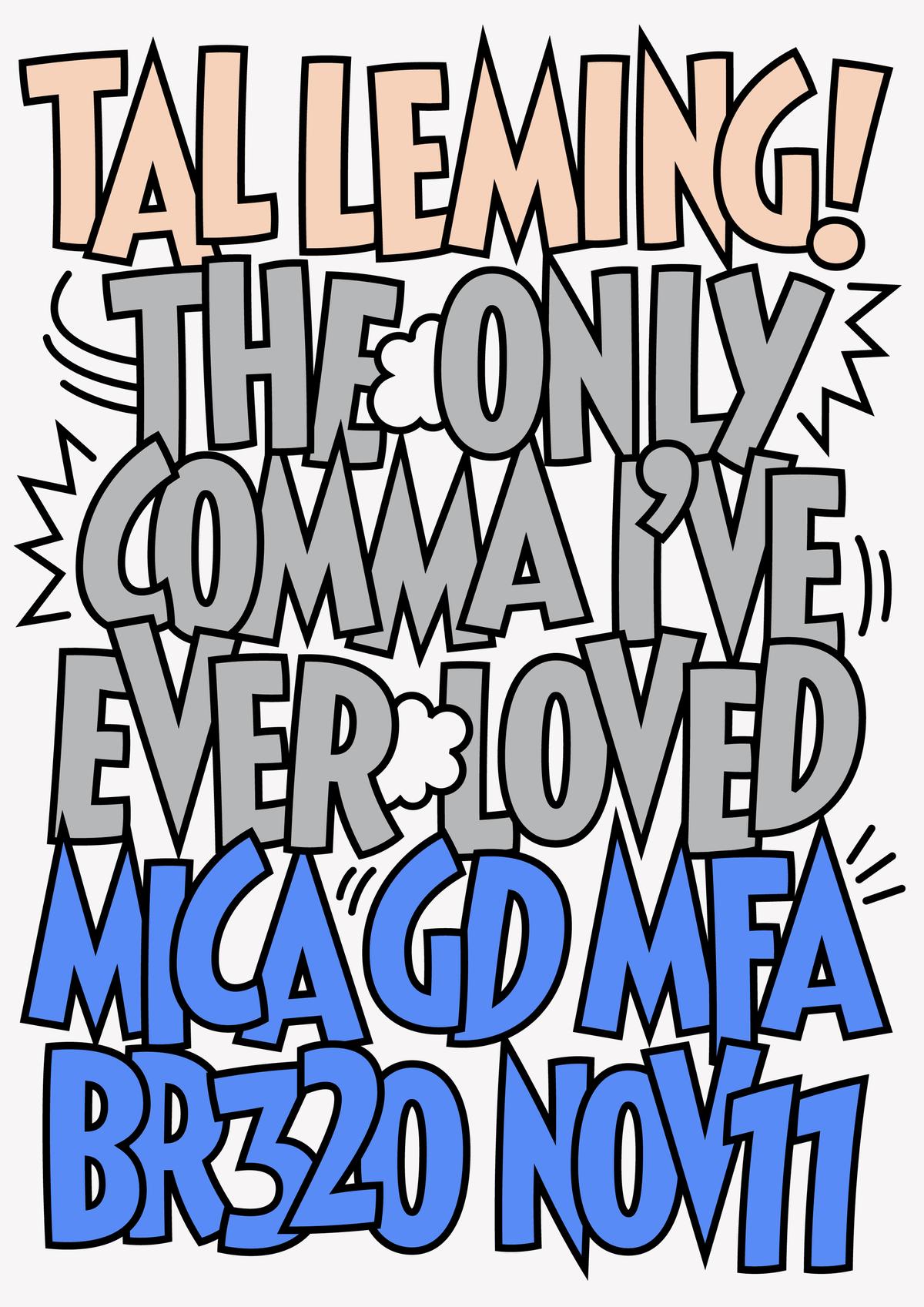
Poster for a talk by Tal Leming, Shiva’s mentor, at MICA. Shiva based the lettering on the style created by Harvey Kurtzman for MAD in the 1950s. The colors reference Tal’s daily uniform of gray T-shirt, jeans, and sneakers.
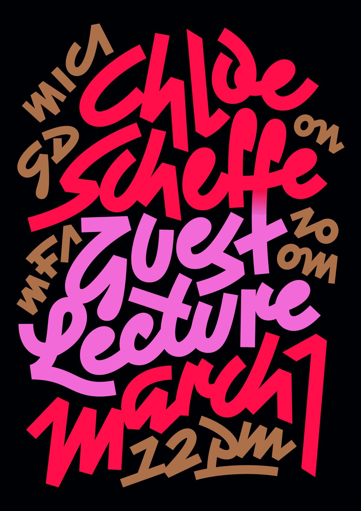
Poster using an energetic, Wild Style-esque script for a talk by Chloe Scheffe for Shiva’s class at MICA.
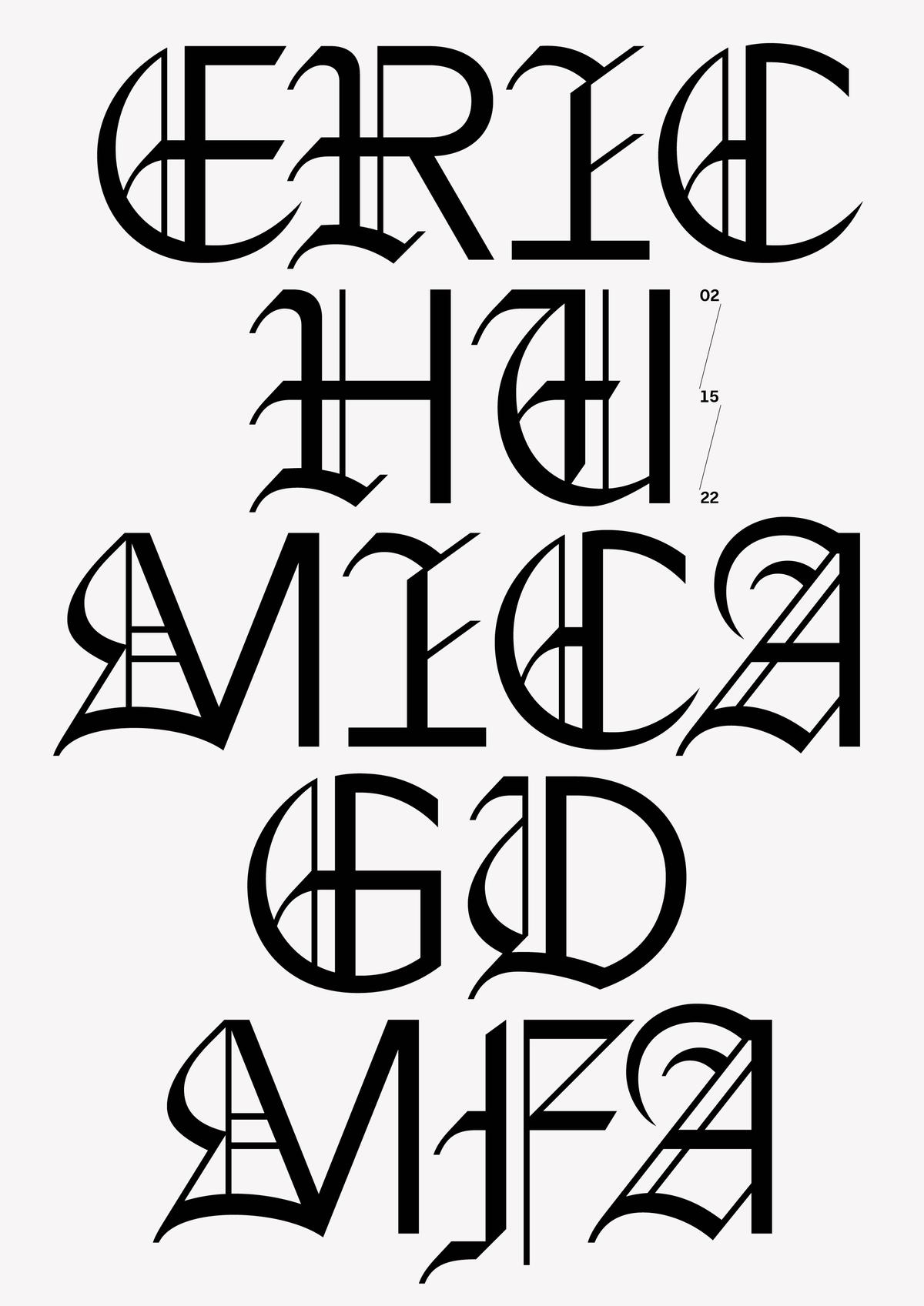
Lettering and poster for a talk by Eric Hu for Shiva’s Advanced Publication Design class at MICA.
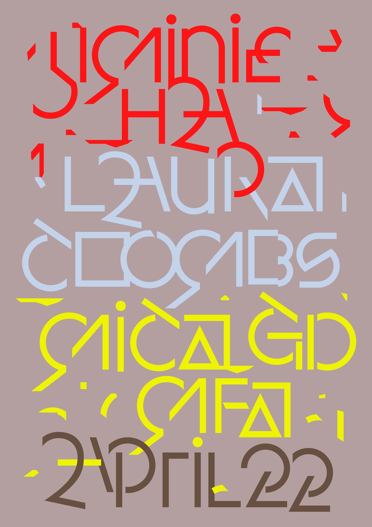
Deconstructed letters for a lecture by Jiminie Ha and Laura Coombs at MICA.
Shiva used an early version of Delegate for a poster promoting a screening of Briar Levit’s Graphic Means at MICA.
Poster for a talk by Tal Leming, Shiva’s mentor, at MICA. Shiva based the lettering on the style created by Harvey Kurtzman for MAD in the 1950s. The colors reference Tal’s daily uniform of gray T-shirt, jeans, and sneakers.
Poster using an energetic, Wild Style-esque script for a talk by Chloe Scheffe for Shiva’s class at MICA.
Lettering and poster for a talk by Eric Hu for Shiva’s Advanced Publication Design class at MICA.
I was exploring the risograph machine at school at the time and thought it was a great medium to explore for this project. A student of mine from the GD MFA cohort, Sam Raduns, was so passionate about riso that he had just bought his own machine and was looking at possible opportunities to use it. So it all came together. The greatest advantage of this relationship, even more than the fun work, was we got to be such good friends that John asked for a list of films that I’d always wanted to watch on the big screen but never got to—and then he played all of them for me. Heat, Akira, To Live and Die in LA (Robby Meuller’s sun-soaked cinematography cannot be experienced in any other way), The Warriors, They Live, and High & Low, among many others.
The posters were my way to go back to a naive space, to be honest. Personally I had experienced an extreme inspiration burnout. What I mean by that is the near-constant exposure to perfect graphic design projects on Instagram, dialed to infinity. All of this work, but only the final, perfectly photographed, mocked-up sheeny trendy imagery and grid breakdowns of logos and so on. I felt like I knew more than I could process, seen more than I could understand, and I just needed to go back to naivety, a place where I was curious, experimenting for the sake of the experience, and working without PrObLeMs tO bE sOlVeD. The posters were primal, intuitive works without any concept other than visualizing my experience of the films: the colors, themes, ambience, and eras. I applied the same method to my series of posters for the program’s lecture series. I experimented not just with letterforms themselves, but with the process too.
For example, for the poster for Jeremy Hoffman—the lecture was decided at the last minute and the poster had to be done within a few hours and I wasn’t familiar with his work. But I did meet him briefly the previous day and I just found him to be most polite and kind. And so, the poster simply tries to express that. I just wanted to do silly things seriously: like a sans-blackletter hybrid (that feels natural) or a digital, flat interpretation of Reporter, or letters deconstructed and put back together again. These calendars for The Senator (another theater John was curating for) were just exercises in excess typography: How many different typefaces can I work with on a single composition while remaining coherent? This process really helped me get back to my old rhythm and led to a large body of personal work that I’m very grateful for. It all culminated in the exhibition at the end of our residency in late 2022, after which we returned to India and finally did the move to Mumbai we’d been planning in 2019 and restarted the studio, rejuvenated.
Do you teach in Mumbai? I know you have said that design needs to be decolonized, perhaps especially in India, and that you envision that happening through design education that emphasizes empathy and offers courses in history and the social implications of design. Have design programs like that started to gain a foothold in India?
I love teaching but no, I haven’t taught since MICA. Juhi and I both wanted to take a break from teaching and get back to studio practice. In terms of design programs that emphasize empathy, haha I think it's gotten much worse now and I don’t see the situation getting any better any time soon. When we went to design school, there were maybe five design schools in India. It was still a super unorthodox choice of study and those running design schools were not motivated by profit—I doubt my school made any for the corporation that owned it. We greatly benefited from being left alone by the forces of capital, shall we say. But in the past decade, with the explosion of tech and UI/UX, design has suddenly become one of the top choices of study. This market demand was answered in a big way: There are now over 250 schools in India offering design degrees. 250! We were far far away from providing a good design education even when there were only five schools. It’s the age-old story of a good thing getting ruined by the intervention of profit-driven forces. Schools are mandated to take in as many students as possible while keeping faculty hiring to a minimum. A younger designer we work with told me about his class of over a hundred students taught by a single teacher—I can imagine a lecture working in that context, but a design class? With prototypes, group work, feedback ... how? My school had 120 people on campus at any given time, including all students, faculty, and staff.
It looks bleak and I think these universities are doing a great, GREAT disservice to their students.
Sharing knowledge seems quite important to you—is that something that you’re sort of paying forward from teachers who have had a strong impact on you?
Very much so! I’ve been called a “serial recommender”—I’m constantly annoying my friends to watch this or that film or read this or that book. Our Log is basically that. I also take recommendations seriously. But yes, I’ve greatly benefited from my teachers (especially Tal) sharing knowledge with me.
Cover designs for longtime client Panther’s Paw Publications, a Nagpur-based publisher of anti-caste books.
Do political activism and social justice enter into your work at all?
I think our ideals make us and therefore influence our work greatly. But I’m also very careful not to use social justice narratives to further our own standing or whatever—like making stupid pins and claiming to have made a difference. I think the first step is to imbibe values and influence your own immediate environment: Pay people fairly and on time, treat everyone with dignity and respect, and create a collaborative, healthy working environment. Activism comes after this.
We’ve done a lot of work for organizations we admire, especially in the anti-caste space like Kattiyakkari, Navayana, Neelam—but our longest and most productive is our ongoing collaboration with Panther’s Paw Publications. PPP, run by Yogesh Maitreya, is an Ambedkarite publishing house that works with Bahujan authors on underrepresented narratives. They publish nonfiction, fiction, poetry, essay collections, and translations of major works into English. We’ve designed their identity, book covers, book typography and many other graphic and printed matter since 2020. It’s been a very close collaboration, and a very open one: Yogesh is kind of the perfect client—he takes risks and is encouraging of our crazy ideas. At the same time, it’s not just a linear collaboration. He once told us he is interested in learning typography so he can typeset the books himself, and so we did an intensive type and InDesign workshop with him. We often joke that now he writes, publishes, and typesets the books and if he just buys an offset printer, he will fully own the means of production.
You were inducted into the Alliance Graphique Internationale (AGI) in 2019. Commercial Type partner Paul Barnes was also inducted into the organization at the end of 2024; and one of my all-time favorite designers, Catherine Zask, has been a member for years. What has that experience been like for you in practical terms? What does membership involve? What does it bring to your everyday work as a designer? What role do you think the AGI plays in the larger design community?
LOVE her work! The last congress in Basel (2024) was the first one I attended since I joined. It was a really wonderful experience, meeting and hanging out with designers from all over the world. Everyone was really nice and there was just an overall lack of any hierarchy—there was a genuine fandom across cultural and age lines, with great conversations and exchange of ideas. It was like a creative vacation in the best sense. Membership involves being nominated by a member or group, and then there’s a rigorous application process. Each year a new jury is selected at random to vote for the members to be inducted that year. I was nominated by Astrid Stavro and supported by Taku Satoh and Erik Brandt and got voted in in 2019. The thing with AGI is, it's not vying for some sort of mega marketing-driven world domination: it is primarily a meeting place for designers from across the globe. I felt very welcome and at home.
I’d love to hear more about November, the design practice you run with Juhi Vishnani (your partner in all things). You’ve called November a “plural practice.” What do you mean by that?
When we started (in 2018), we wanted our studio to be a way to explore our interests and the real world. By “plural” we mean just that: multidisciplinary, curious, multilingual, etc. We didn’t want to be known as a branding agency or a type foundry or anything specific: We are both proud generalists and we wanted our practice to be defined as such. We wanted (hoped) that our studio would acquire acceptance as defined by an attitude rather than a style or type of industry we service.
Both Juhi and I returned to India in late 2015 (me from the States and Juhi from the UK) after finishing our master’s degrees. We’d been dating since we were eighteen and we always knew we wanted to start our own practice one day. So now we decided to gain some experience first: her in big branding and corporate environments and me in type and cultural work. So 2016–2018 I freelanced, worked on various cultural projects while working on typefaces (I published Calcula, Oli Grotesk, Faction and other types during this time) while Juhi worked at large agencies on various banks and fast-moving consumer goods (FMCG) brands. When we felt ready and confident, we started out on our own. Of course, we burned our fingers a bunch in the early years but there’s no other way to learn.
It’s been an interesting journey: I think we’ve achieved our goal of working on very varied projects (from books to skincare, fashion to media companies, typefaces to linocut book covers) in a variety of industries. We’ve worked hard to push against templatized ideas and see the gains now: Many of our clients today have come to us for our attitude, rather than specific examples from our portfolio. Several corporate clients are attracted to our cultural output; cultural clients are drawn to our experience in scale. It’s important for us to also question the role of design with each project, and what form it could take beyond the color-logo-type-voice field. More than anything, we’ve tried to have fun. And it’s been great fun.
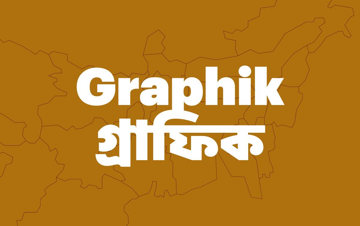
Graphik Bangla, drawn by Arya Purohit.

Graphik Tamil, drawn by Hitesh “Rocky” Malaviya.
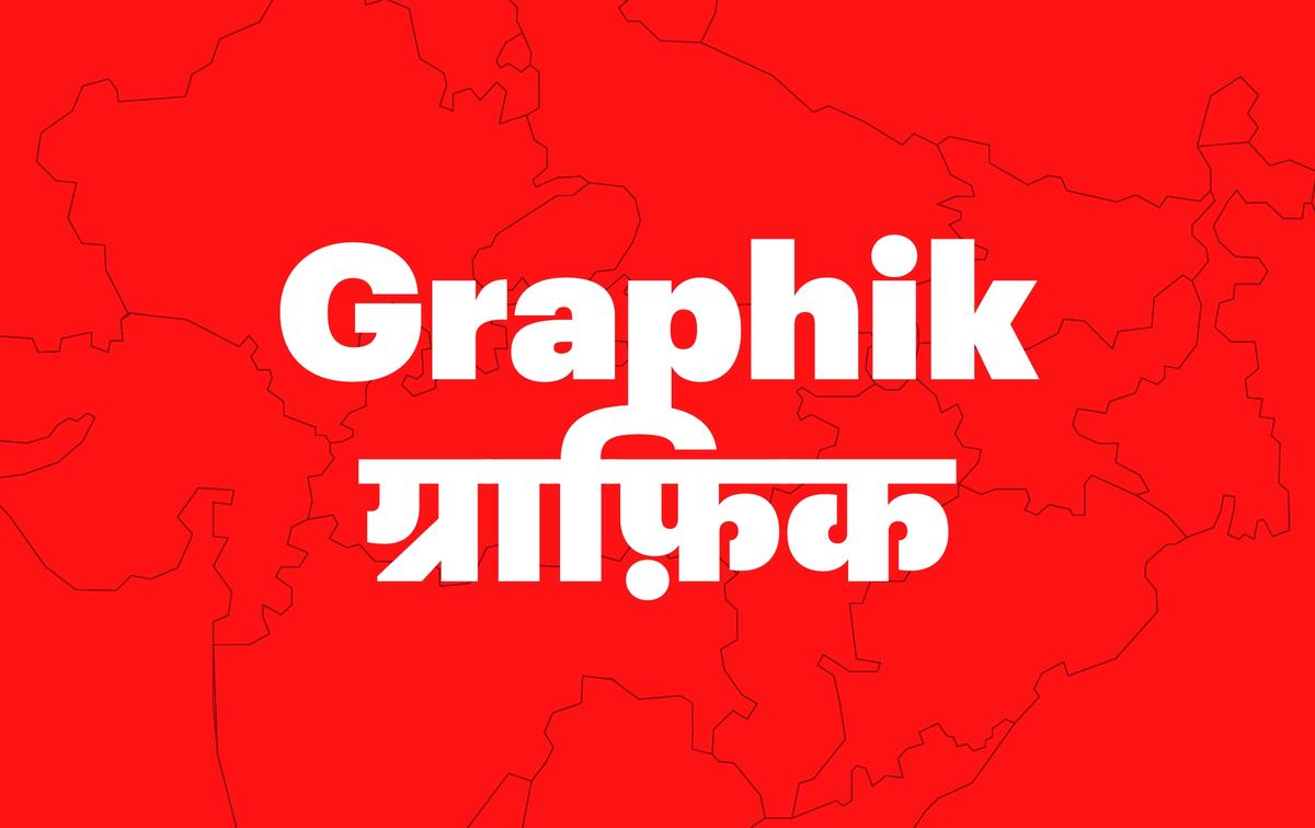
Graphik Devanagari, drawn by Hitesh “Rocky” Malaviya.
Graphik Bangla, drawn by Arya Purohit.
Graphik Tamil, drawn by Hitesh “Rocky” Malaviya.
Graphik Devanagari, drawn by Hitesh “Rocky” Malaviya.
Graphik Bangla, drawn by Arya Purohit.
November is somewhat unusual as a design practice because type seems to occupy equal ground with the rest of the studio’s output. Can you tell me more about Delegate, and also about creative-directing the design of the Bangla, Devanagari, and Tamil versions of Graphik? That seems like a huge undertaking with a lot of moving parts (and personalities). You also recently served as creative director for GT America Devanagari, working again with Rocky Malaviya and Universal Thirst. Clearly you have a gift for collaboration and navigating complex projects. Say more.
Yes, I’ve always oscillated between type and graphic design. I love the rigor and craft of the former and the conceptual side of the latter. I think this marriage has also led to one field seeping into the other: We love making technically complex identity systems and conceptual typefaces. Type weighs heavily in our branding work too, we’ve created hundreds of pieces of lettering for all sorts of projects. Now motion has also become an important part of our process.
I enjoy long-term projects. Brian Eno once defined two kinds of creative processes: the architect’s approach, where one plans the entire project and outcome at the outset; and the gardener’s approach, where one anticipates change and movement and slowly guides a project through time by watering and nurturing different elements. Type design is a mix of both, I think: You can plan a large family but it will change and grow over time no matter what. Since type design is a craft, one only gets better with time. But I think a type designer can track their growth by the lessening discrepancies between what’s in their head and what they can draw. Ideas are one thing, but the ability to see them clearly and give them form accurately is the great challenge in type.
In Delegate, this process was the one that Christian greatly influenced. I came in with the broad idea that I wanted to design a modern agate typeface that doesn’t depend on the traditional ink traps. Ink traps had by now become a trend of sorts, with many typefaces using them as an aesthetic feature. So I looked at pre-Bell Centennial agates and news types to learn lessons in achieving legibility at the smallest sizes. I think the pixel environment is not that different from the constraints of halftoning and printing on newsprint (conceptually at least). Delegate relies on traditional micro-type moves: asymmetric counters (b, d, p, q), angled ascenders, short descenders, tall x-heights, a narrow lower case versus a wide upper case, high contrast, and generous spacing. The most identifiable parts of letters have also been exaggerated, like the deep middle link in the B, hard links in n, m, h, and u, and open apertures in c and e, etc. Bell Gothic was a significant influence and I’d always loved it, but studying it in detail was quite an education. It is truly a masterwork. I wanted Delegate to be a grotesk at the same time—I realized that there’s actually no typeface one can call an American grotesk. So I figured a typeface like Delegate, which marries the high functionality of gothics with the coldness of neo-grotesks, would be a good contender for that title.
Another significant influence on Delegate was not a specific typeface, but the way some were used. Tibor Kalman is probably one of my most favorite designers and I’ve always loved his reliance on Franklin Gothic, News Gothic, and Trade Gothic. In terms of proportions and a general feeling, I really tried to get that M&Co flavor. Amazingly—and this threw me out of my chair—in one of his feedback emails, Christian said, “It should essentially be a typeface Tibor would’ve loved to use,” and I’d never mentioned this idea to him before. It was very validating, and also incredible how something as abstract as typography can signal the same obscure meaning to two different people. I find the same synergy with Rocky Malaviya and Aarya Purohit, and continue to work with them on a variety of projects.
Rocky is a master of the craft and his conceptual and technical knowledge of Indic scripts is immeasurable. He’s one of those once-in-a-generation talents in the sense that this stuff just makes sense to him. I’d say Graphik Tamil is probably the best most balanced Tamil typeface ever made and Rocky isn’t Tamil, and has no background in the script. He just gets visual balance, form, and rhythm (backed by years of research, of course). That project was a lot of fun—translating a typeface (or its abstract idea) to a different script is always a puzzle: How can these forms feel like Graphik? What are the moves we can make to convey Graphik’s mild affability but overall neutrality? How to match texture? How to emulate the tension between Graphik’s round shapes and a few pointed ones? Our approach has always been to make equivalents rather than imitations. There are many multiscript projects that are clearly led by the Latin: in the sense the other scripts feel like the family to a non-native but look equally ridiculous to native eyes. This is because shapes are borrowed and edited wholesale. In Graphik, we approached it as a philosophical exercise: teaching the person that is Graphik to speak in a different language but with the same voice.
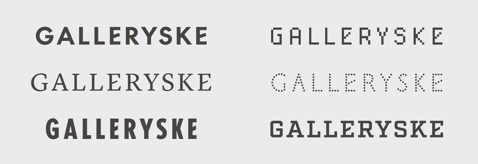
Six of the flexible logotypes November designed for GALLERYSKE.
What are you working on these days? Anything you can talk about?
We moved to Mumbai in 2023 and since then we are lucky to have been super busy with back-to-back projects. We’re excited to work with one of our favorite galleries in India: GALLERYSKE, based in Bangalore and Delhi. They have been super-encouraging clients, giving us free rein to explore and interpret their incredible and challenging oeuvre of avant-garde practices. We devised a chameleonic, growing identity system that references the early avant-garde (the E is a nod to the E in Kurt Schwitters’s Merz) but is not fixed in form: essentially a gesture as identity. We look forward to exploring it further—it is definitely a gardener’s approach with this project. Other than that, we’ve been working on a roster of interesting brands on identity, packaging, websites, and printed matter.
My 2025 resolution was to return to type in a big way. I worked very little on type this past year owing to a busy move and focus on the website production. So I’ve restarted several in-progress typefaces: TM, my revival of Times Modern; a superfamily based on “ideal” proportions, a grotesk influenced by rip-offs of Univers (mainly Maxima) and some fun display fonts. I’m also working on a large industrial grot superfamily with Grilli Type, which I’m very excited for. So yes, lots of exciting stuff, every day is a gift haha.
Finally, you strike me as a big reader. Are you reading anything interesting? Any recommendations?
Oh I wish. I used to be, the pandemic killed that very integral part of me. I’m slowly getting back to it. I recently finished a fascinating book called Beyond The Wall by Katja Hoyer about regular life behind the Iron Curtain in East Germany. It traces the history of the state from its inception post-WW2 to the fall of the Berlin wall, eschewing usual portrayals of GDR as a pervasive Orwellian state painted in deep decaying gray (which, of course it was), instead exploring the everyday life of its citizens: their routines, university experiences, national aspirations, and workings of an insecure and unpopular government. I’ve long been fascinated by the Cold War, especially what life was actually like behind the Iron Curtain and this book was an eye-opener. Have you heard of Dean Reed?
I have not!
Reed was an American communist rock ’n’ roller who moved to the GDR and became “Red Elvis,” one of the most popular performers in the Eastern Bloc. Fascinating! I usually get obsessed with a topic and read several books back-to-back about it. Before Beyond the Wall I read Stasiland, which I didn’t care much for, and the next one is a more objective history of the Stasi. I’m also rewatching several great Cold War-era German films (Wenders, Fassbender, and so on).
Before this I read two books about Pakistan’s Bhutto family: The Bhutto Dynasty by Owen Bennet-Jones, and Songs of Blood and Sword by Fatima Bhutto. The former is an objective political biography of the controversial family that led Pakistan and the latter is a personal memoir and biography of the author’s father, the son of Bhutto patriarch Zulfikar and brother to his political heir, Benazir. It’s a sad and violent story and juxtaposes the family’s history with that of the nation itself. I highly recommend both, to be read together.
It’s funny, I’ve never read literature (fiction). Never—I don’t know why. I’ve only ever read nonfiction. Though I’ve always been interested in writers as artists. For example, while I’ve never actually read the books of Cormac McCarthy, William Burroughs, or Frank Herbert, I’ve read tons of their commentary, essays, and thought. I don’t know why I could never get into fiction.
Thank you, Shiva!
Thank you very much! It's been an honor :)