Schnyder for T, the New York Times Style Magazine
T, PUBLICATIONS, CUSTOM TYPEFACES | 17 FEBRUARY 2013
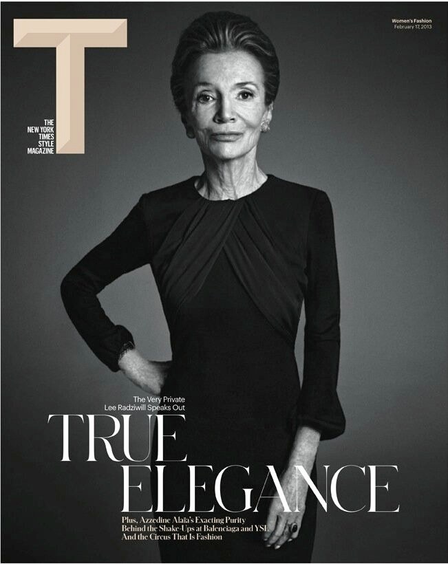
Berton Hasebe and Christian Schwartz have designed Schnyder, a new serif display typeface, for the 2013 top-to-bottom redesign of T, the New York Times Style Magazine under new editor in chief Deborah Needleman and creative director Patrick Li and his team of Shawn Carney, Aurelie Pellissier, and Natalie Do. Between Hasebe and Schwartz, this is their sixth custom typeface project for T, but the first they've co-designed.
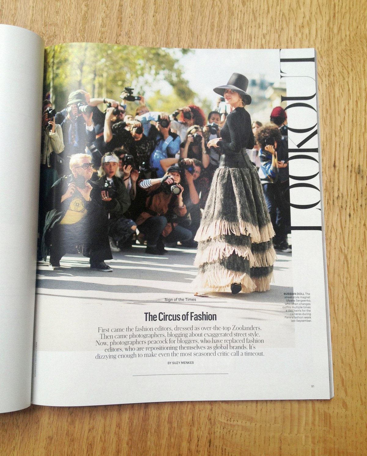
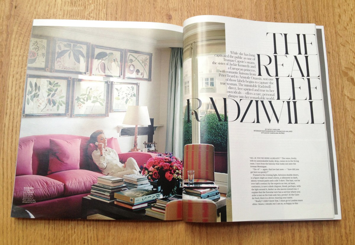
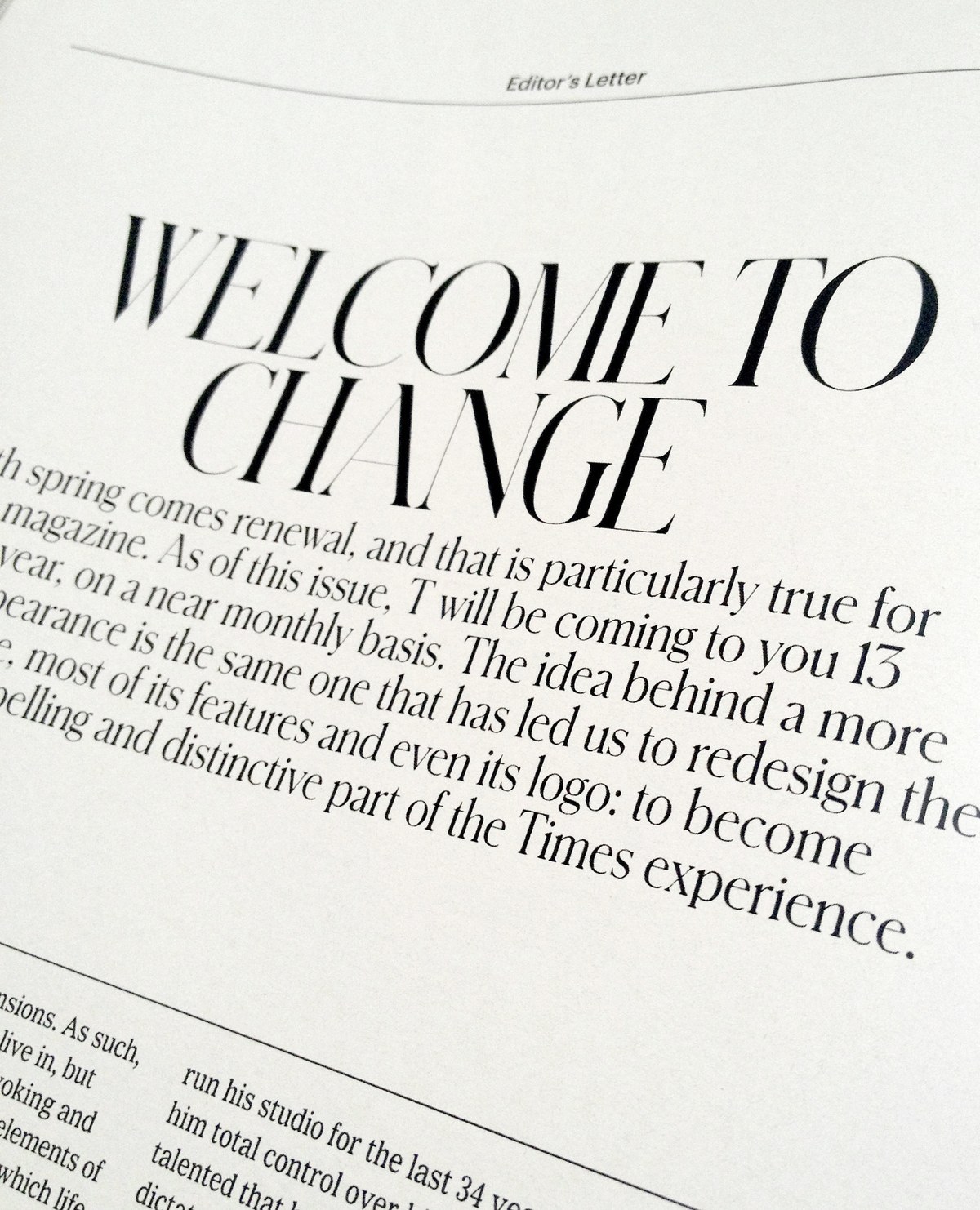
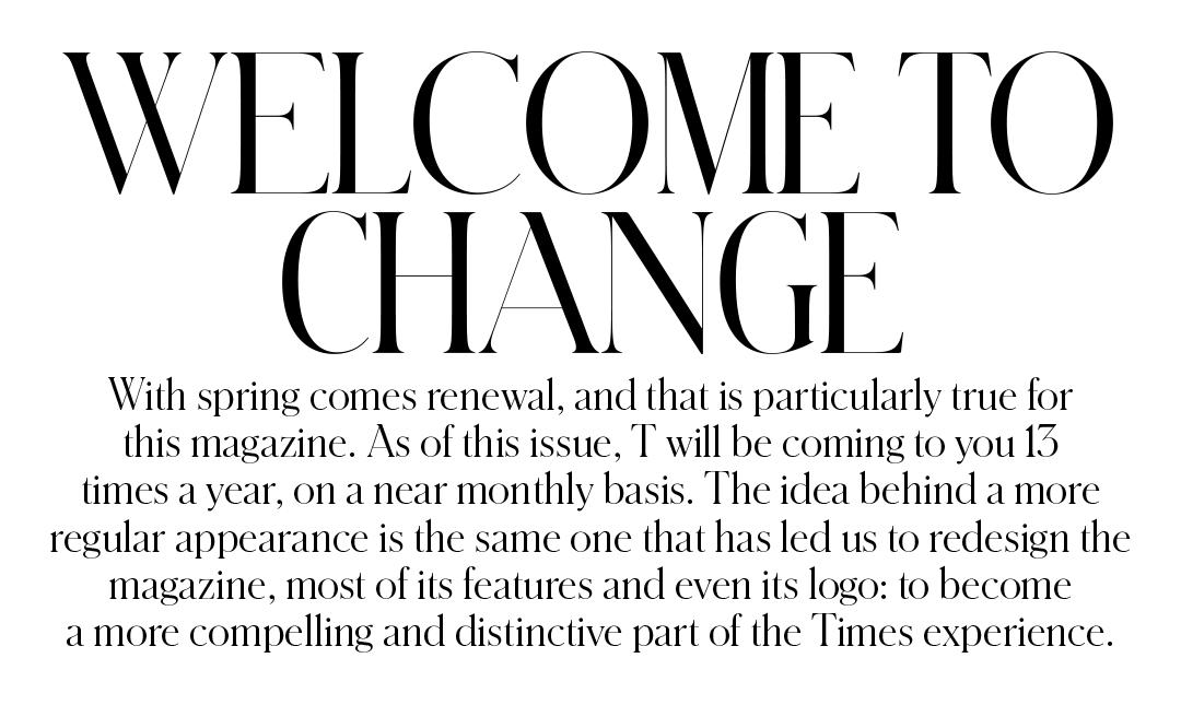
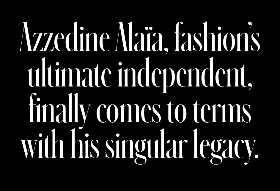
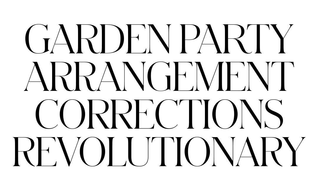
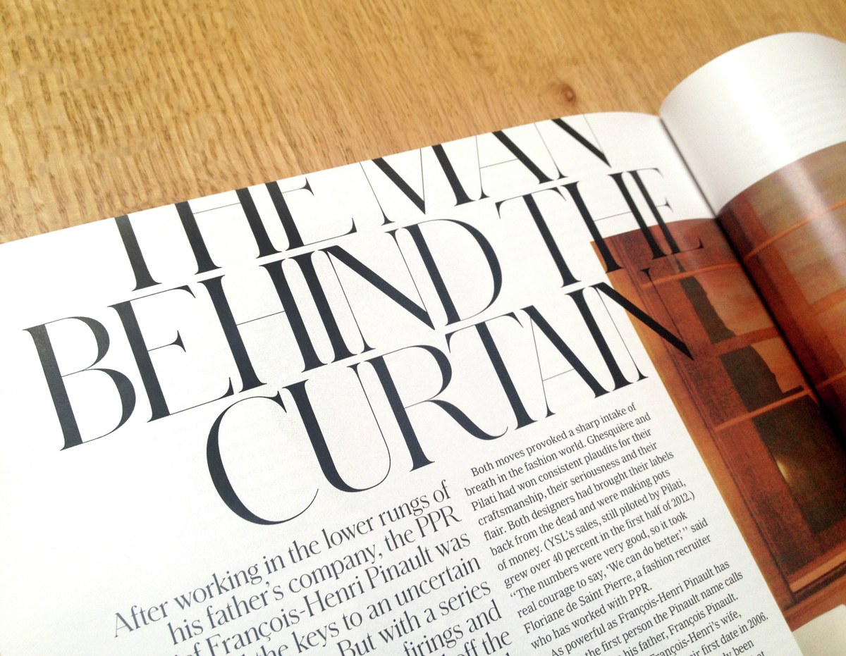
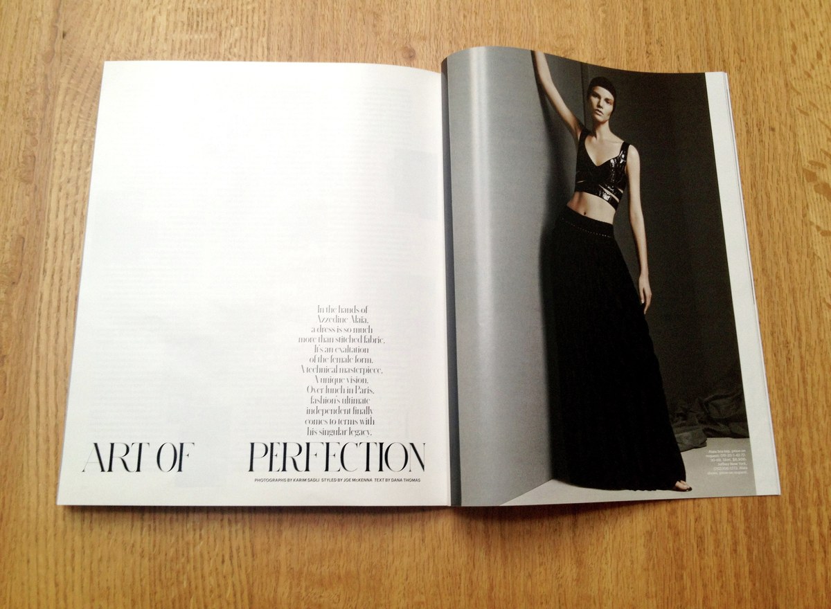
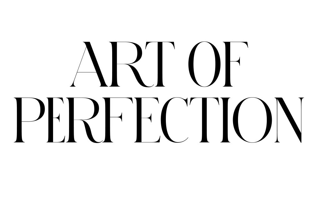
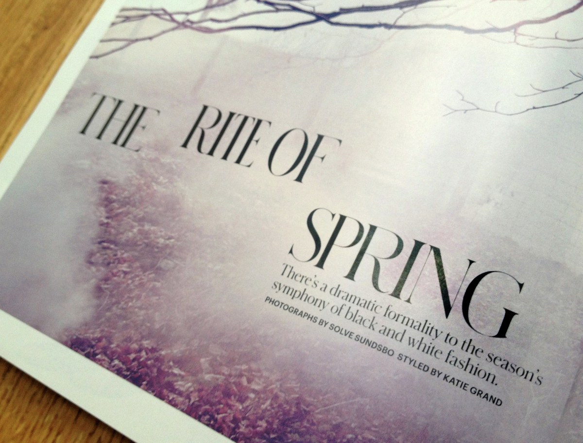
The initial jumping off point for the design was a piece of pointed pen lettering from Switzerland, recently acquired by Li, which was quite precise in its thick and thin strokes, but had organic and unusual structures for invidvidual letters and great variations in character widths from line to line. Schnyder features two weights, a Light and a Bold, in 3 widths. The stem weights in each weight are identical across the widths, an unusual feature that allows the widths to be mixed freely in headlines, even within single words. Certain characters were given a large number of alternates, allowing the headlines to feel even more like lettering rather than set type. The lowercase draws from German typefaces popular in the the early 1900s. This typeface tests the limits of gravure printing, and has four optical sizes to ensure that its thin strokes can be thin as possible at each size without falling apart.
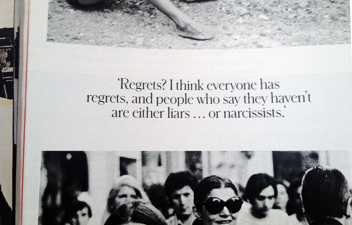
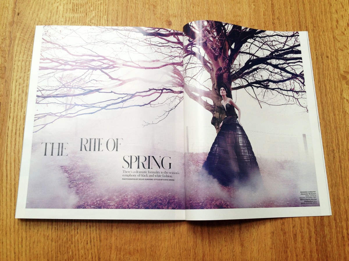
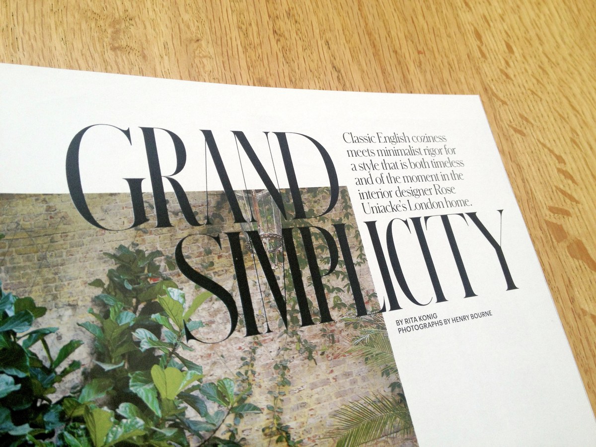
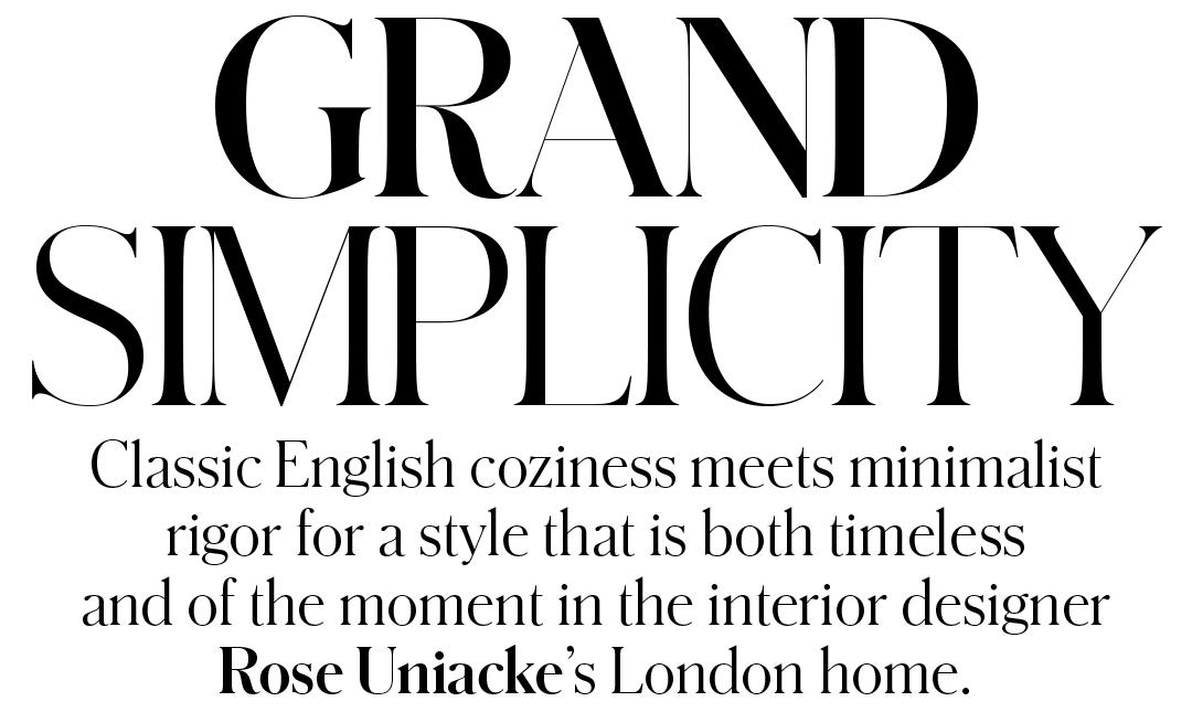
The type palette is rounded out by Graphik in its regular width and a couple of styles from the X Condensed width. Lyon Text has been replaced as the text face with Imperial, the text face used in the newspaper's main news sections. We found this to be a bold and inspired choice that accentuates the elegance and quirkiness of Schnyder.
T, PUBLICATIONS, CUSTOM TYPEFACES | 16 FEBRUARY 2014
A Wide width in three weights has been added to Schnyder for this year's issues of T, the New York Times Style Magazine. Schnyder was originally designed by Berton Hasebe and Christian Schwartz for the 2013 top-to-bottom redesign by creative director Patrick Li and his team of Shawn Carney and Aurelie Pellissier.
READ MORE
T, PUBLICATIONS, CUSTOM TYPEFACES | 22 AUGUST 2010
Pialat is the latest display face designed by Commercial Type for T, the New York Times Style Magazine. Senior Art Director Chris Martinez was very taken with lettering in the titles for À nos amours, a 1983 film by French director Maurcie Pialat, and asked us to use these forms as the starting point for a new typeface. Berton Hasebe drew the face in two variations, one with conventional hairli...
READ MORE
T, PUBLICATIONS, CUSTOM TYPEFACES | 16 AUGUST 2009
With their 5th Anniversary issue, T, the New York Times Sunday style magazine, has unveiled their first complete redesign since the magazine was founded. As part of this redesign, Berton Hasebe has drawn a hairline Fraktur called Karl.
READ MORE
T, PUBLICATIONS, CUSTOM TYPEFACES | 13 APRIL 2014
A small addition to Graphik debuted in today's issue of T, the New York Times Style Magazine: Graphik Titling, based on the as-yet unreleased Condensed, X Condensed, and XX Condensed widths of Graphik.
READ MORE
RELEASES | 1 MAY 2018
Schnyder was designed by Berton Hasebe and Christian Schwartz for the 2013 top-to-bottom redesign of T, the New York Times Style Magazine by creative director Patrick Li and his team. With three weights, four widths, and four optical sizes, Schnyder is a complete system for making beautiful, offbeat, and distinctive headline treatments.
READ MORE