Rapha x Commercial Type at the Spring Classics

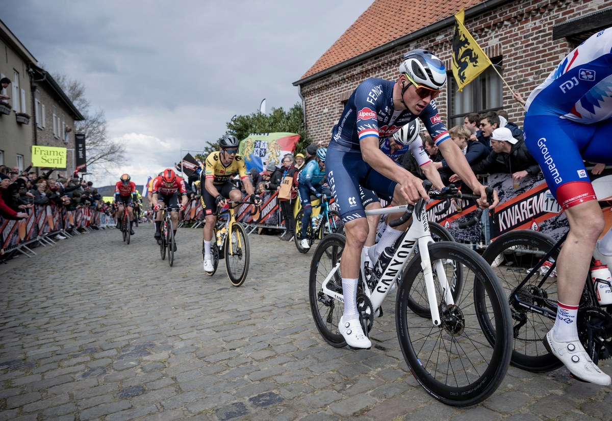
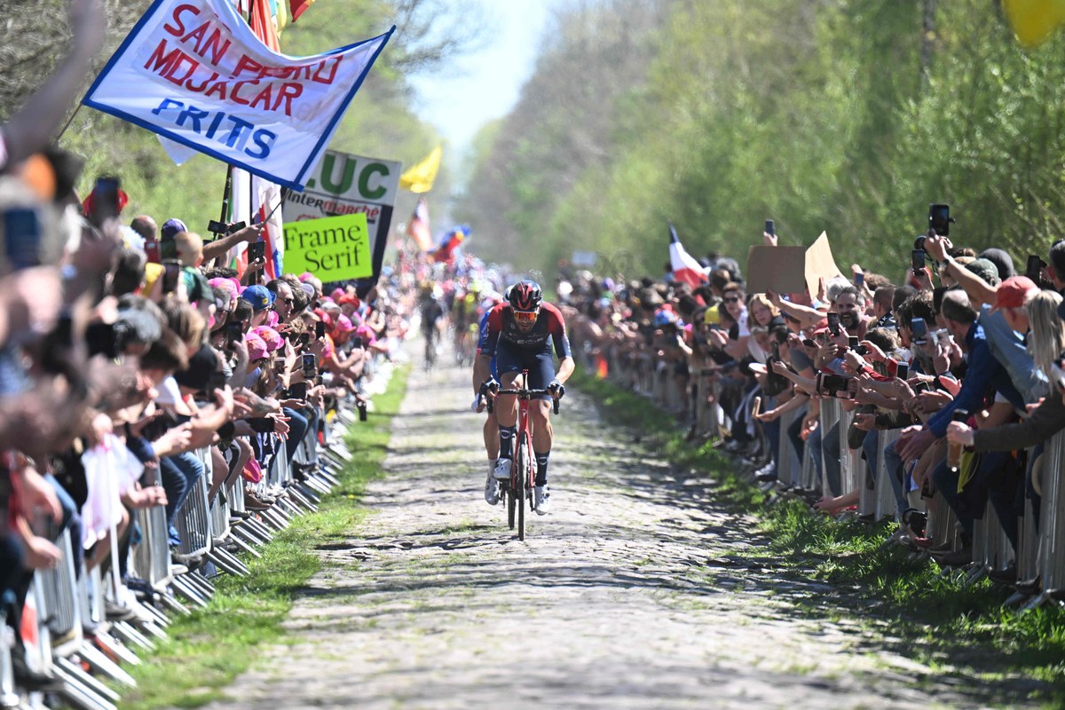
Frame at the feared Trouée d’Arenberg as Italian Filippo Ganna of Team Ineos puts down the power in the 2022 edition of Paris-Roubaix. Photo © Sirotti Photo Agency.
The Tour de France may be the biggest race in the cycling year, but the heart and soul of the sport are the Spring Classics. The Tour of Flanders (Ronde van Vlaanderen) and the Hell of the North, Paris-Roubaix are beloved by fans and athletes. This is where legends are born.
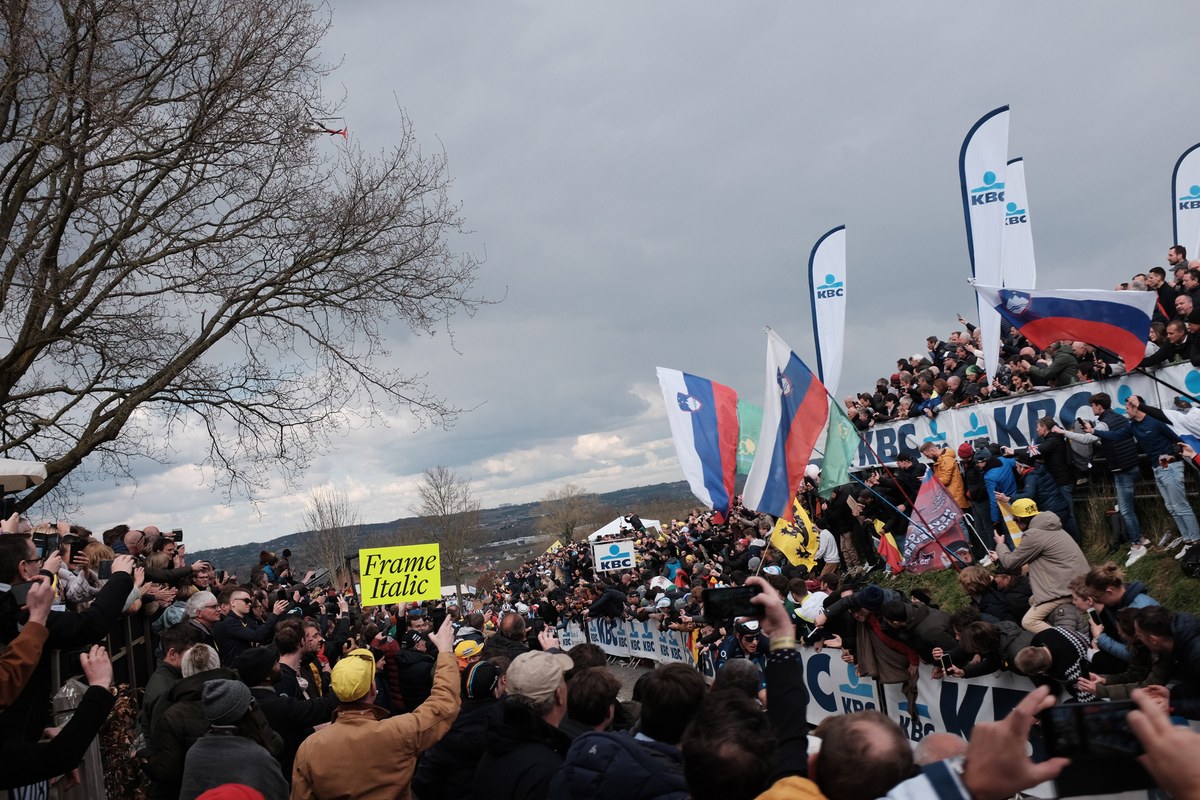
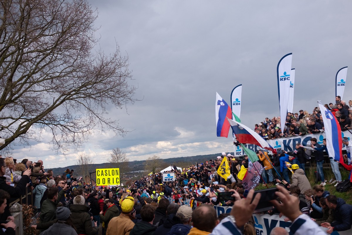
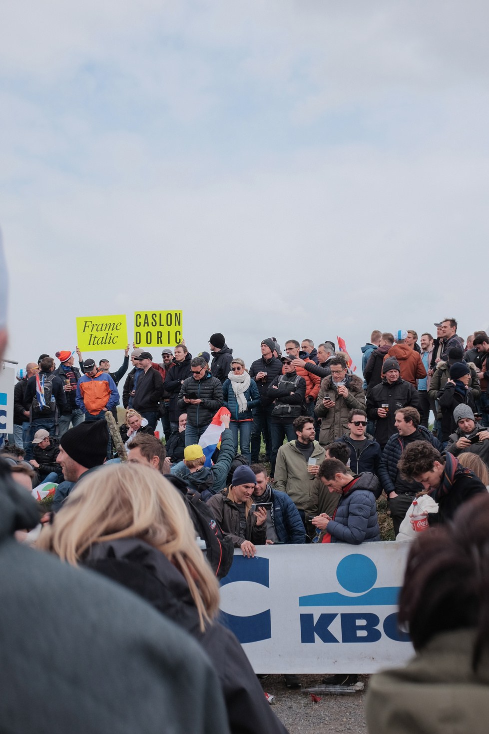
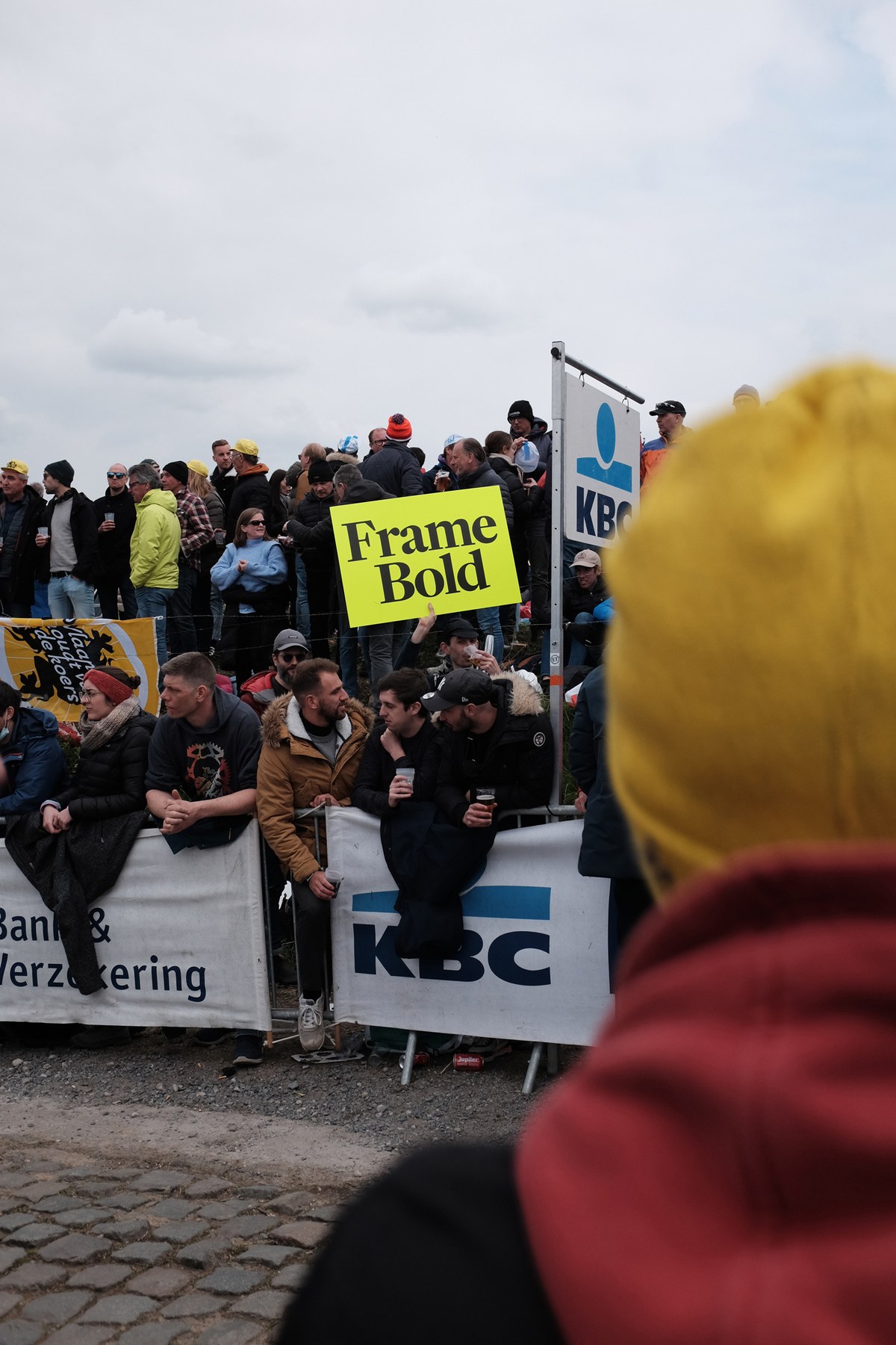
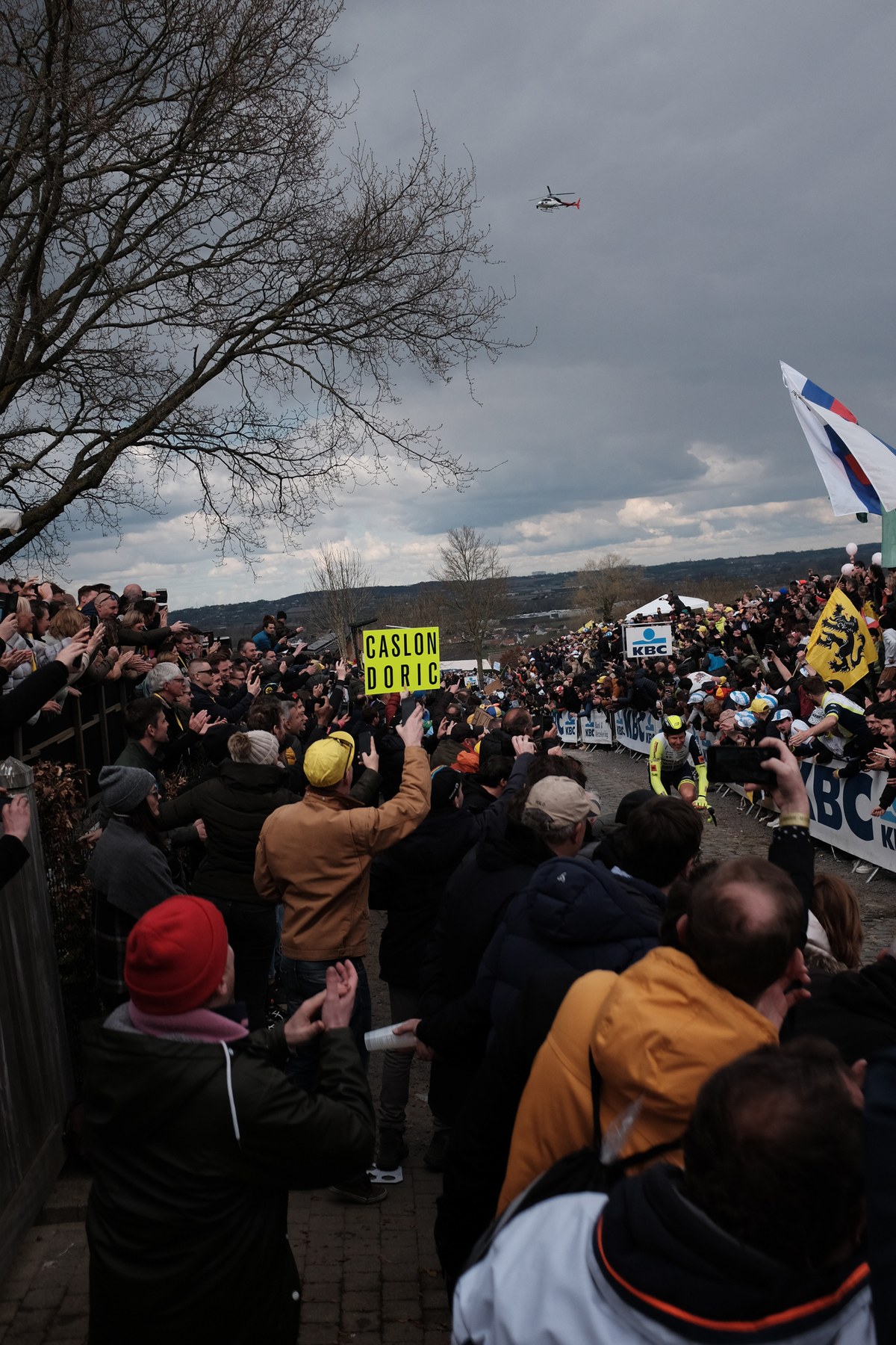
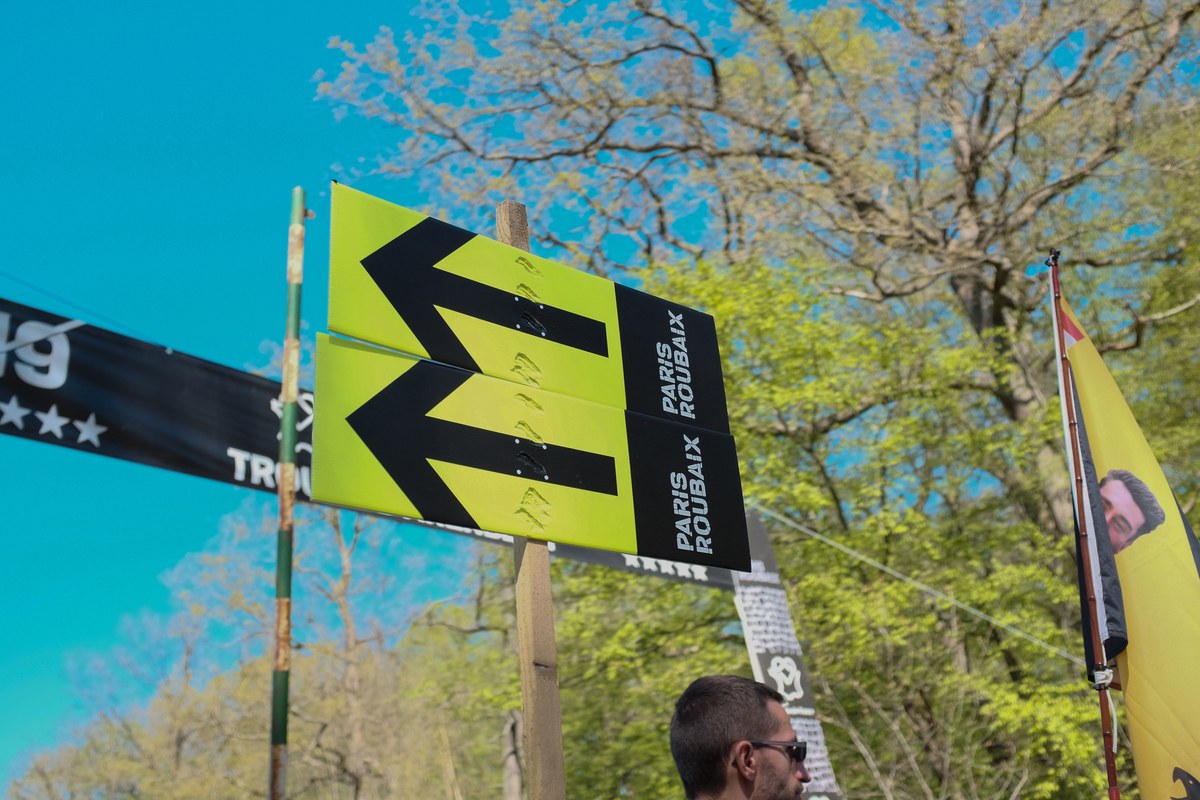
The richness of these events is a combination of athletic performance, brutal courses and the passion, and fervour of the fans. Thousands and thousands gather by the roadside what ever the conditions are to celebrate the sport at its purest. The most dedicated hold aloft signs proclaiming love of teams, of individuals (a mix between those competiting, friends and loved ones), causes and of course regional pride shown most prominently by the Flandrian Lion. But it is also an advertisers dreams; getting your name in front of a captive TV audience. For years and years a small Belgian business Dirk Hofman Motorhomes could be seen at every race advertising their business and gaining a cult like following amongst the fans.
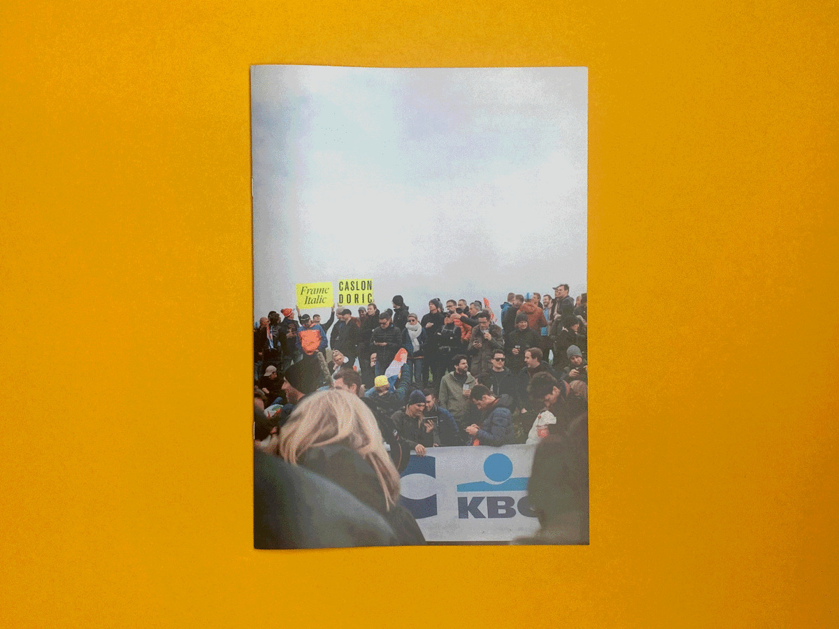
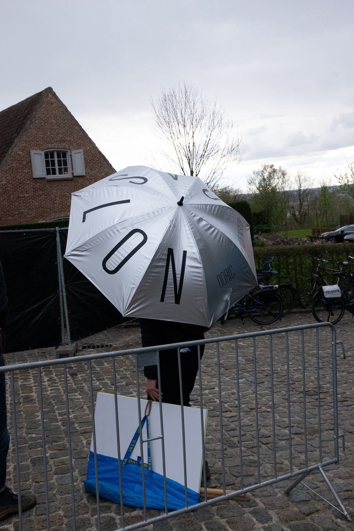
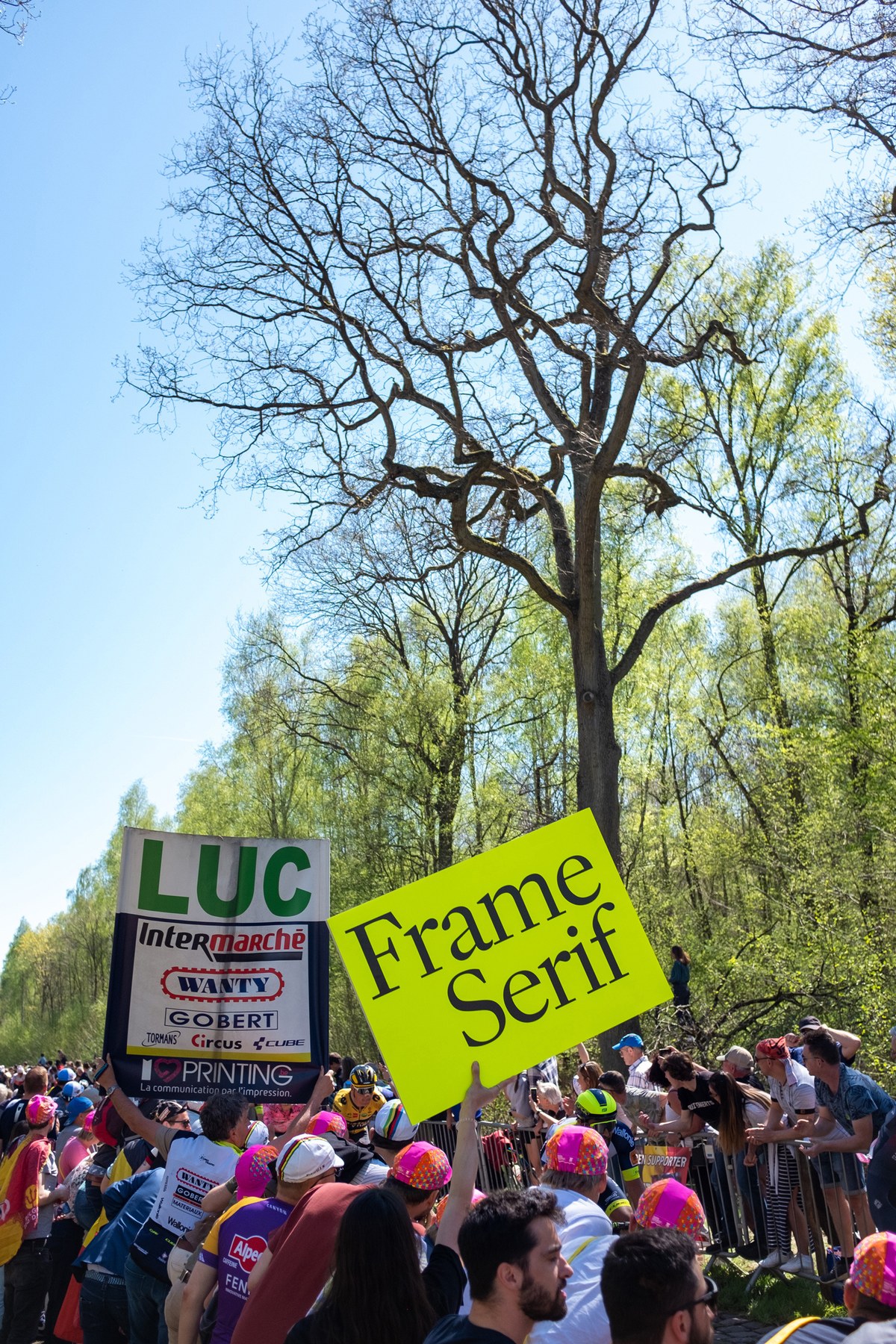
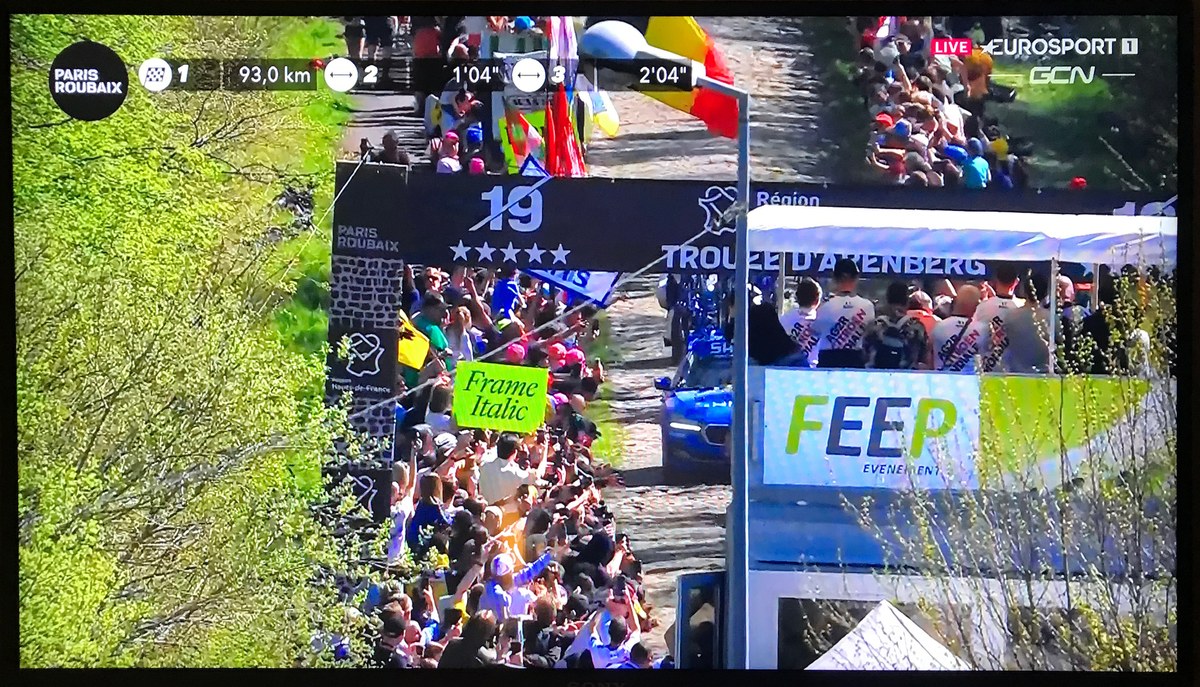
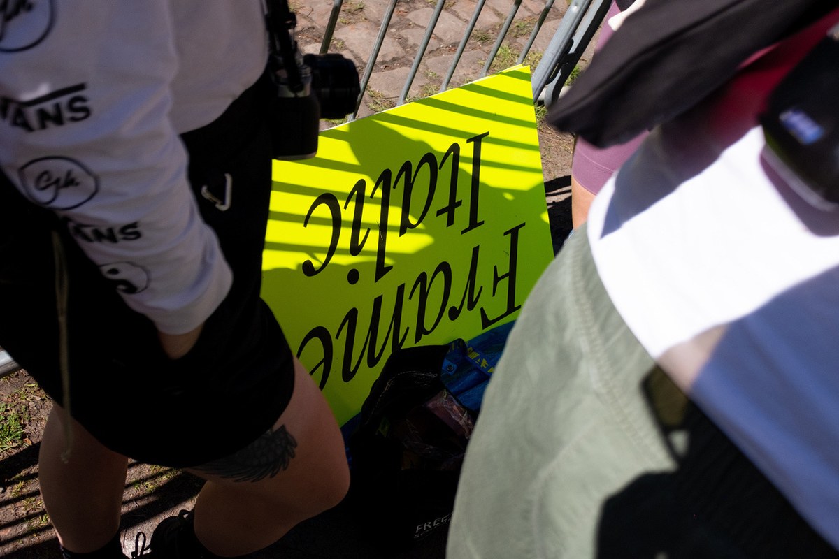
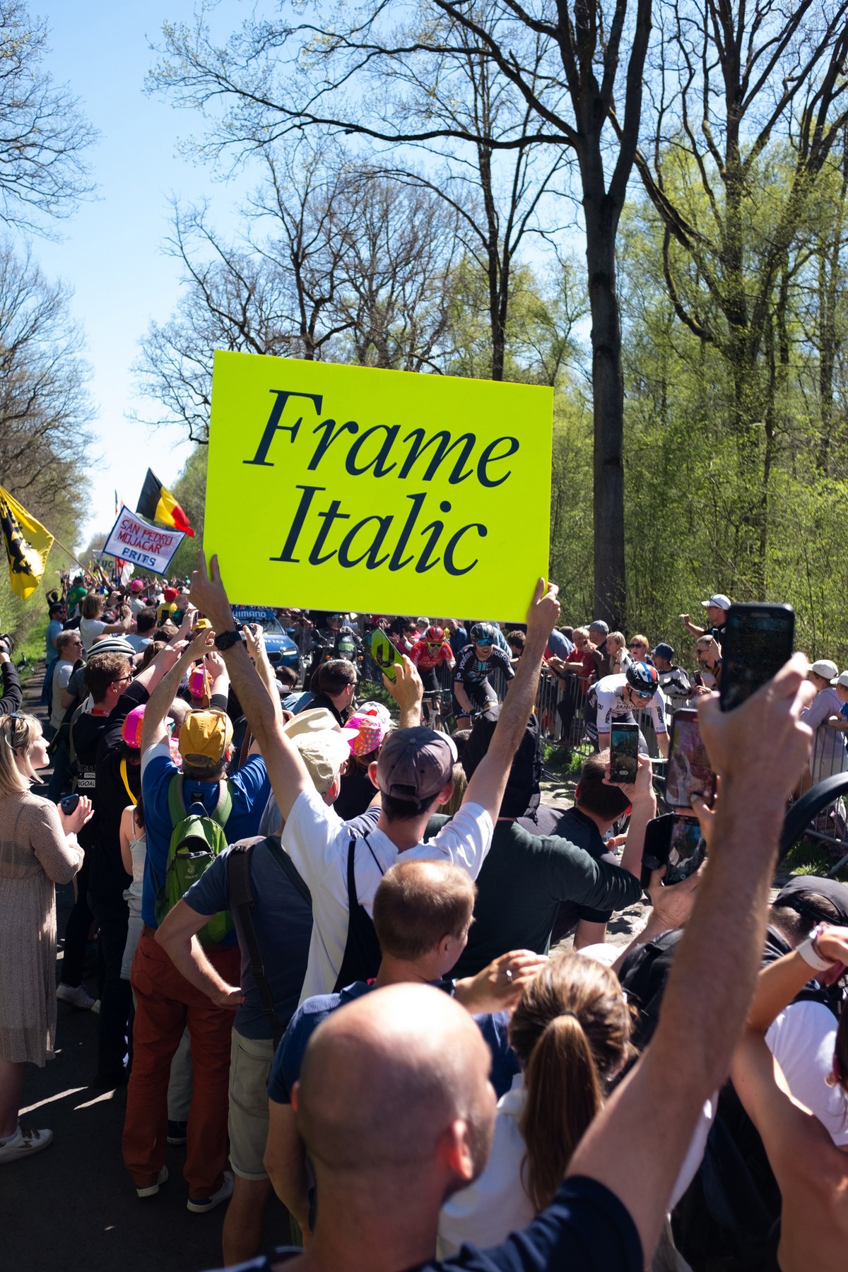
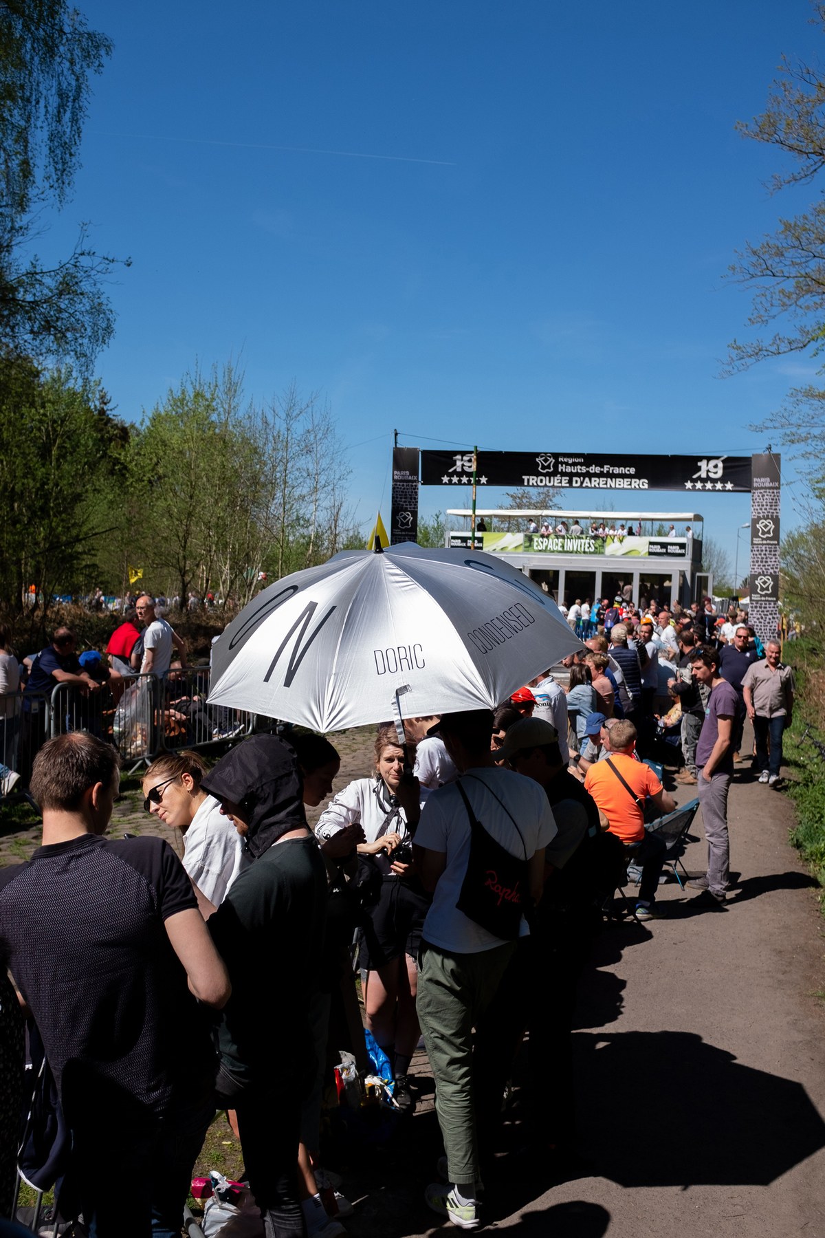
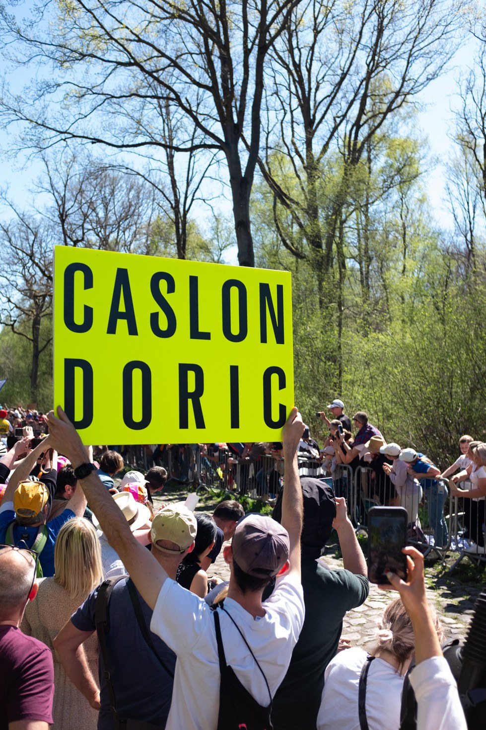
Inspired by these forms of marketing, Matt Tucker, head of Brand Design and Andy Edwards at Rapha came up with a series of eye catching placards for these two races. Promoting Frame and Caslon Doric, their two brand fonts, they drew a mixture of admiration and quizzical bemusement at two key points of the race.
For Frame, a modern serif based on the Caslon model, which in turn was a copy of the faces of the low countries, and the ‘Dutch’ style, it was a return to its spiritual home. Both the races and the typefaces are documented in a series of specimens and posters available from Commercial Type.
