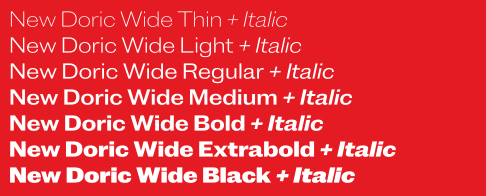
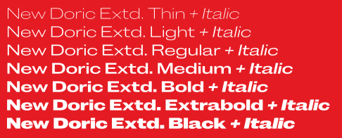
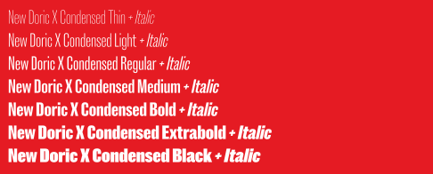
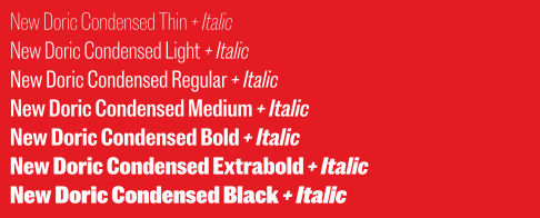
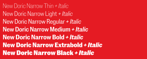
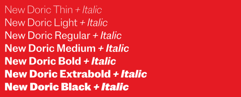
Our new New Doric
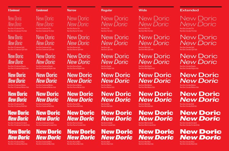
Pretend, for the purposes of this discussion, that at some point in the 1950s the Caslon Foundry looked at the methodical, universalizing impulses behind runaway hits like Neue Haas Grotesk and Univers and decided to modernize its mainstay sans serif in a similar vein. Never mind that Caslon went bust in the mid-thirties; that’s beside the point. This is an exercise in imagination. And, along with some gentle prodding from clients and customers, it’s what drove Paul Barnes and Tim Ripper to conceive of New Doric—a variable font that evens out the deliberate tics, inconsistencies, and gaps of the Caslon Doric Collection.
When we launched Commercial Classics in 2019, we organized it around four core typefaces: Brunel, a distinctly British Modern; Caslon Ionic, a robust editorial face; Antique No. 6, a slab serif designed to complement Caslon Ionic; and of course Caslon Doric, a massive collection of five families in multiple widths and weights that enshrined the haphazard development, in the latter half of the nineteenth century, of a brand-new form: the sans serif. With its eccentricities and discontinuities and differences—the families were clearly related, yet divergent—Caslon Doric was almost like a wonky, parallel Univers.
Designers liked it. We liked it. But its quirky historicism, hooklike terminals, and loopy Q proved perhaps a bit too idiosyncratic for the contemporary corporate gaze. Questions started cropping up. Could we make it a little more ... normal? A little more consistent? And: “When is the variable version coming out?” Some designers felt the need for more granularity and control. We balked. A variable font didn’t really make sense, we explained; our digital restoration of Caslon Doric was meant to memorialize the inconsistencies, gaps, and irregularities of widths and weights that had been cut at different times by different people. But the possibility intrigued us.
A commission from the Daily Telegraph in 2022 provided the occasion to revisit Caslon Doric and evolve it into something truly new—and finally variable, the flatter condensed forms merging seamlessly with the rounder regular and extended ones. Paul and Tim cracked open the original files and reassessed the design space. The challenge was to see if they could take a motley crew of types spanning from the 1840s through the early twentieth century and compile them into a tighter, more organized whole, without sacrificing the original collection’s personality.
They took cues from Schelte & Giesecke Grotesk’s metamorphosis into Akzidenz Grotesk, which was in turn rationalized into Neue Haas Grotesk. Could they perform a similar trick with Caslon Doric? They ironed out the terminals for a more uniform appearance, while preserving vestigial traces of Caslon Doric’s inward turns in ever-so-subtle gestures on the loop of g and the top terminal of a. The bicameral g has lost a stor(e)y, the double-storey g now serving as an alternate. And the Q has shed its extravagant loop for an unkinked tail. As Paul and Tim continued refining the typeface, they realized that the number of weights needed to decrease. So where Caslon Doric proceeded from a spidery hairline to an unapologetic fat, New Doric shows more restraint, going from thin to black.
But all is not reduction. The italics that had been absent from Caslon Doric’s Wide and Extended families have now surfaced in New Doric, thus filling in all corners of the range. And two new, useful widths—Condensed and Narrow—have plugged the gap between Caslon Doric’s more rounded regular width and the flatter X Condensed, offering the flexibility contemporary designers expect from a workhorse sans family.
The New Doric Collection is a Doric for the twenty-first century made with twenty-first century tools. It’s still unmistakably Doric, and warmer than systematized twentieth-century neogrotesques like Helvetica and Univers—but it’s cleaner and more streamlined than the original, with the control and precision afforded by variable fonts. You asked for it, you got it. And if you miss all of the hooks and loops and inconsistencies and weirdness, well, you know where to find Caslon Doric.