Means, a friendly new serif typeface for Mailchimp
Greg Gazdowicz has drawn a new workhorse serif family for the latest evolution of the Mailchimp identity, being carried out by their in-house team. Working closely with designers from Mailchimp’s brand, interface, and marketing teams, Gazdowicz created Means, a variable font that will be used from display mobile applications to billboards. After living with the identity designed by COLLINS and their in-house team since September 2018, they realized the limitations of their primary typeface and wanted something that could better fit their particular needs while retaining some of the personality that had made it a good choice in the first place.
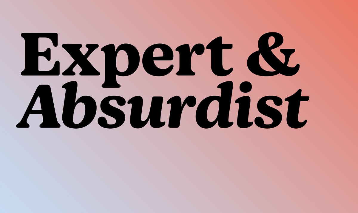
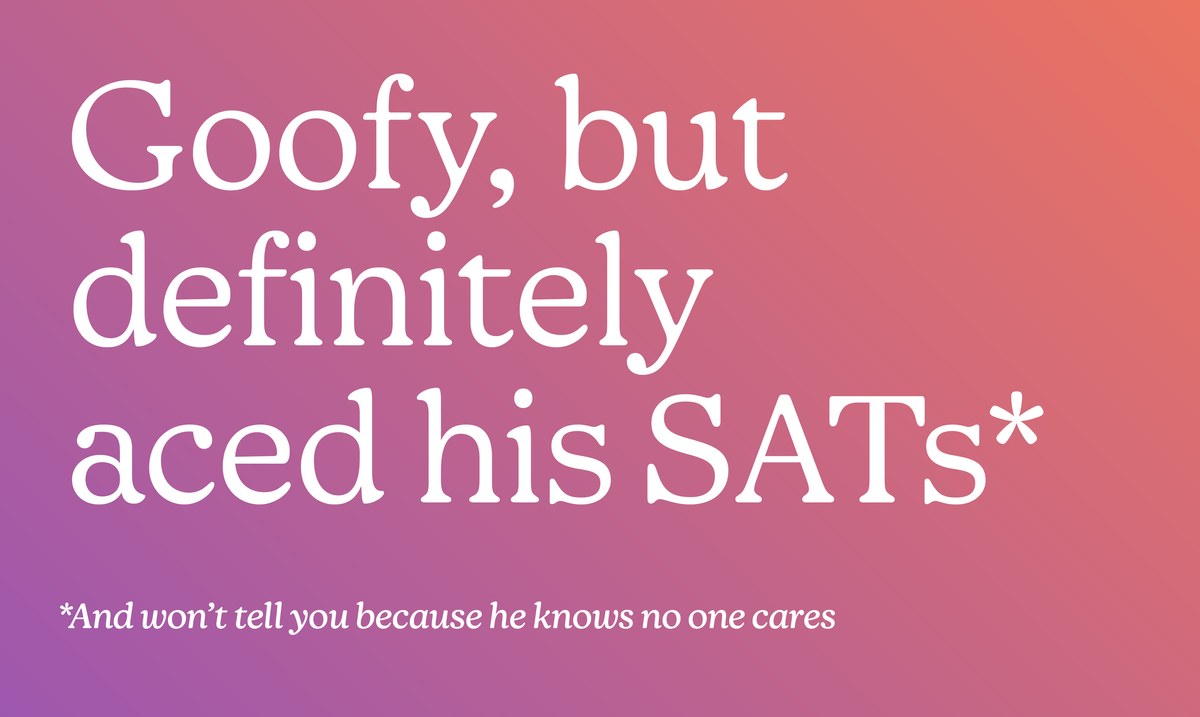
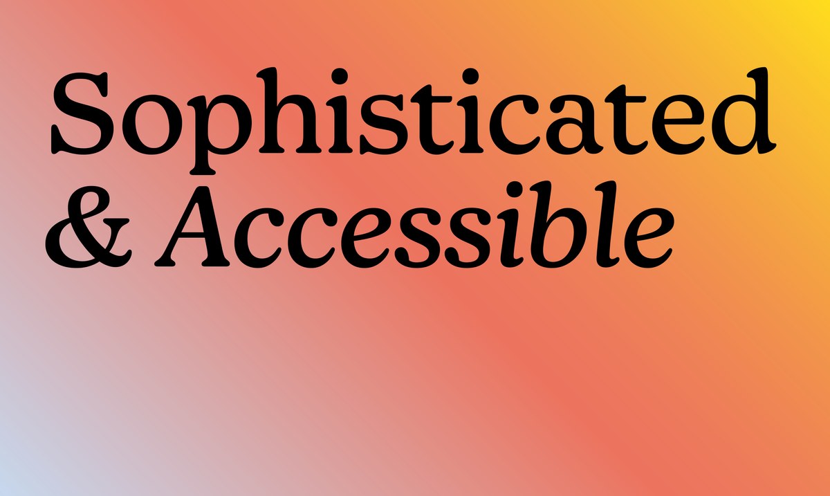
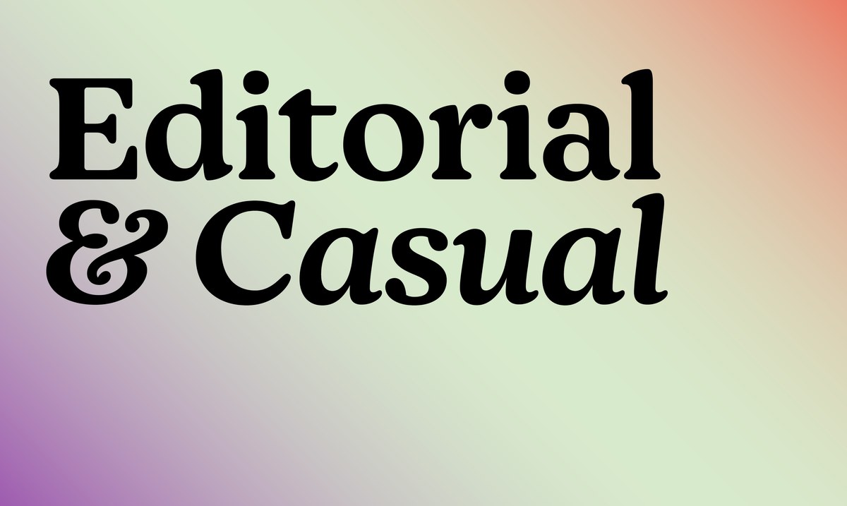
The project began at the end of 2019, when Mailchimp approached Commercial Type to design a replacement for Bitstream Cooper Light (essentially a light weight of Cooper Black, designed in 1986), which served the company well through the initial period of using their new identity, but came up short in its limited weight range, poor suitability for interface design, and the ubiquity and strong retro flavor of Cooper Black. Mailchimp liked that Cooper Light could feel refined and editorial but also casual and approachable, depending on the setting. The new typeface still needed to straddle the line between Expert and Absurdist. In Mailchimp's words: “Smart but not stuffy. Goofy but definitely aced its SATs.”
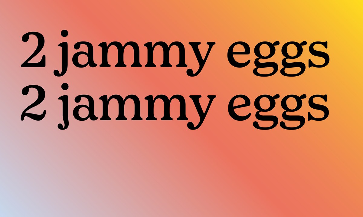
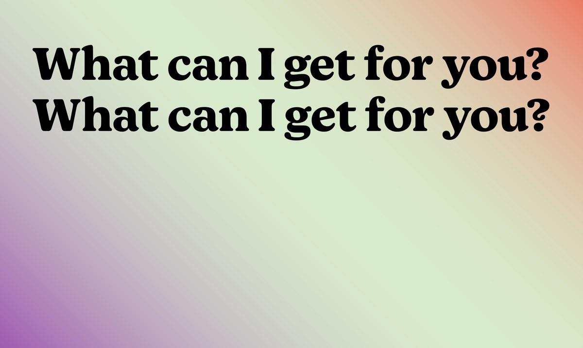
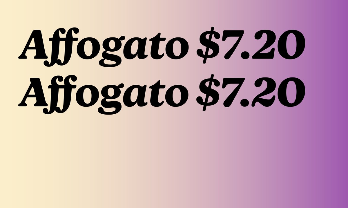
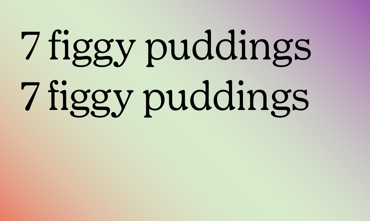
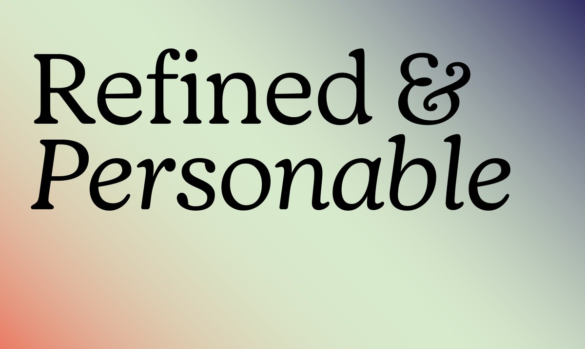
After looking closely at Oswald Cooper’s full output as a type designer, Gazdowicz settled on Cooper Oldstyle as the ideal starting point, as it shares a lot of Cooper Black’s DNA but does not carry the same baggage of being strongly associated with the 1930s, 1970s, and 1990s. Means has 4 weights, ranging from Light to Bold. While it keeps several elements from Cooper Black’s in the mix – quirkiness and softness in the stems, the axis of the bowls, and globular serifs – Means has more tightly structured roundness in its serifs and higher contrast in its heavier weights, keeping it from looking overly cartoonish. While Cooper’s figures are quite wide, Means makes them more traditionally proportioned, another way Gazdowicz quite literally tightened up and gave this Cooper-inspired typeface a contemporary character. Finally, the vertical proportions were designed to be compatible with Graphik, the quietly functional secondary typeface of Mailchimp’s identity.
Commercial Type partner Christian Schwartz pitched in to assist Gazdowicz with the accompanying italics, which are inspired by the work of Fred Goudy, a friend and contemporary of Cooper’s. Schwartz explains, “While I’m not the biggest fan of Goudy’s work, none of Cooper’s italics seemed like the right jumping off point. They tend to either be fussy, like Cooper Oldstyle, or overly regular, like Cooper Black, where Goudy’s italics have a subtle chaos that felt right for this project. I mostly looked at Goudy Oldstyle, which has wandering slant angles from letter to letter, and this seemed like it could bring in some absurdist energy.”
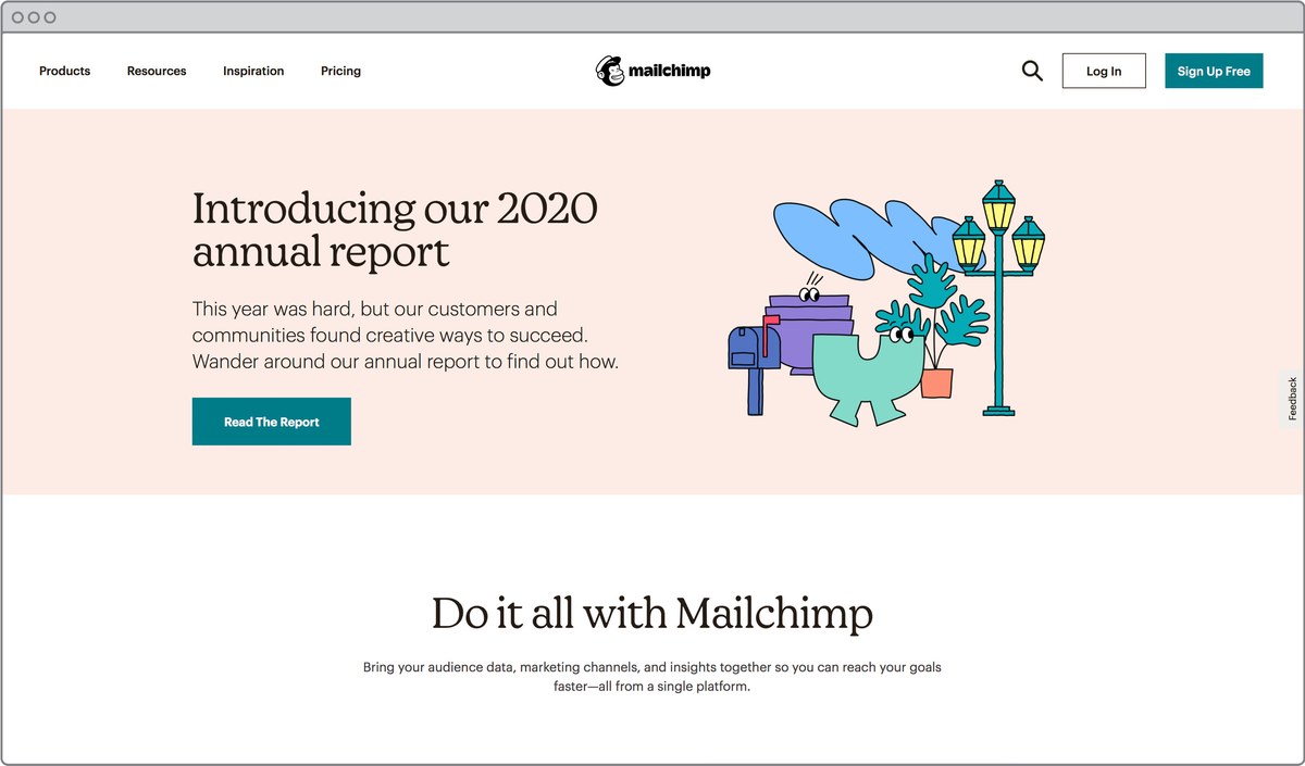
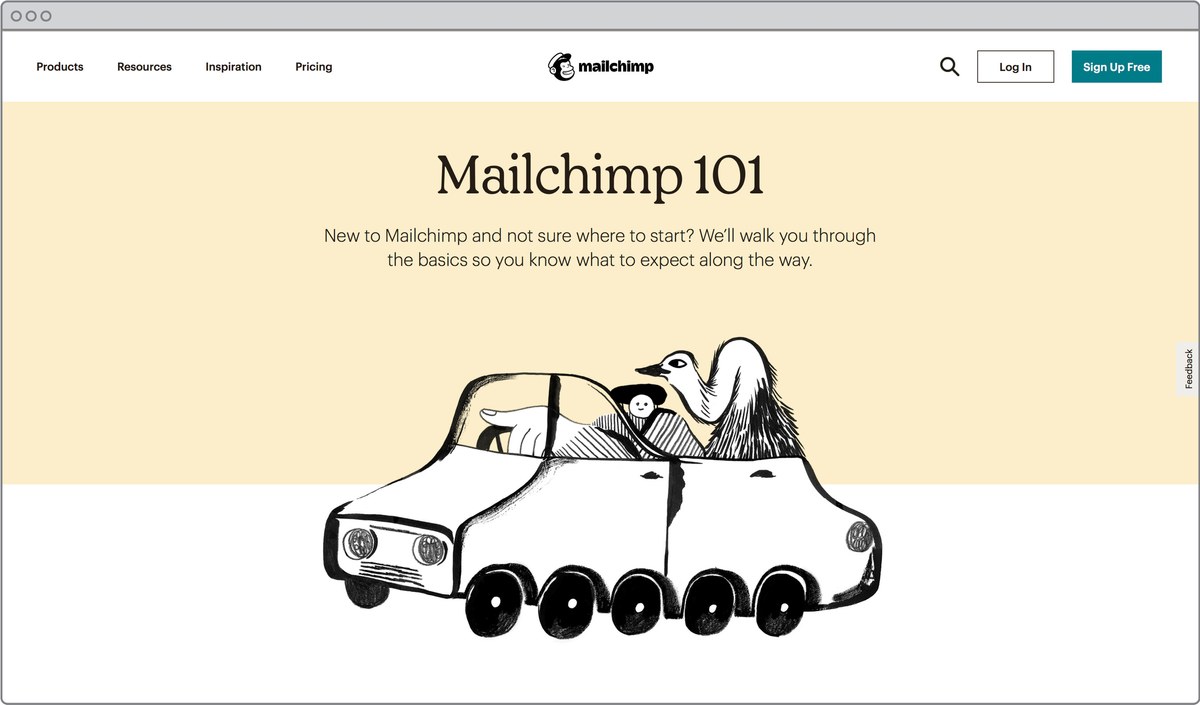
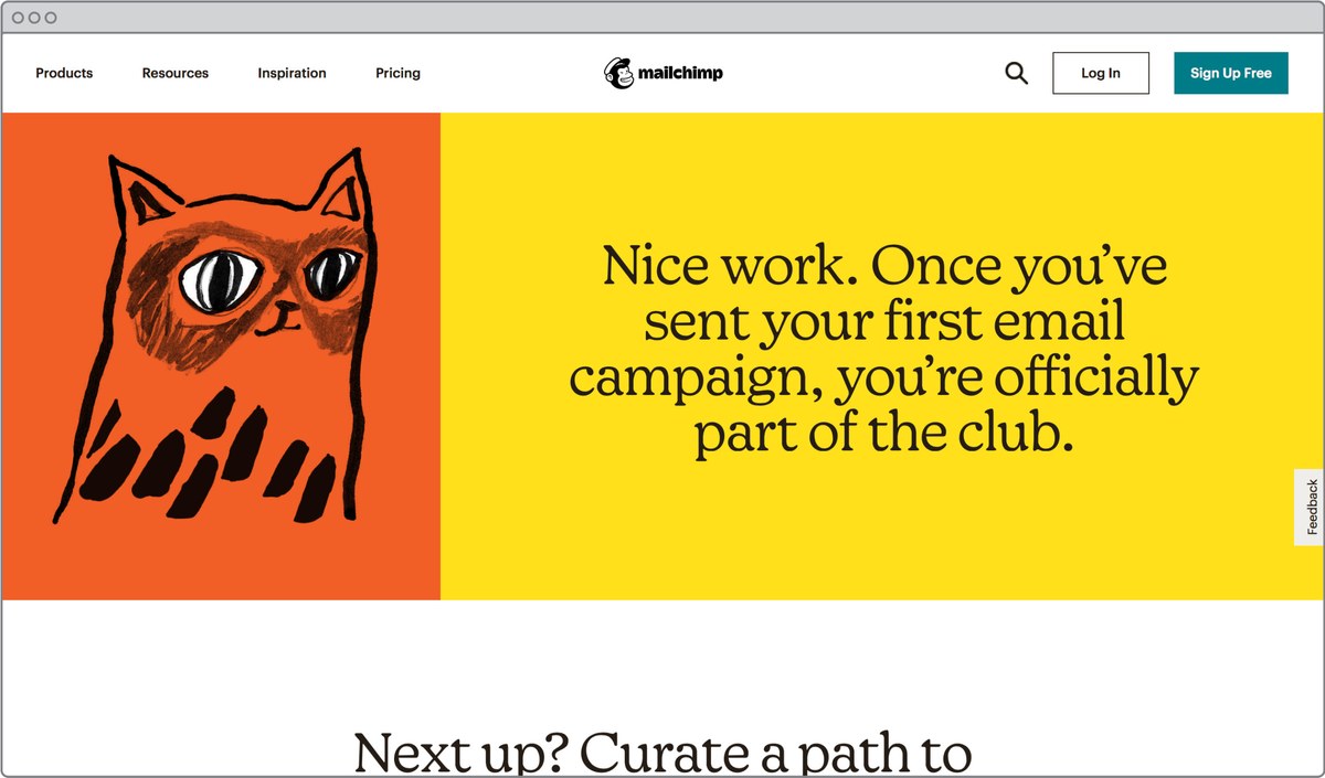
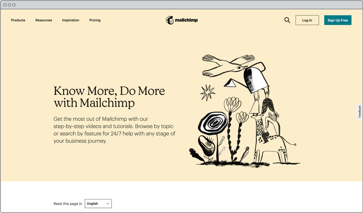
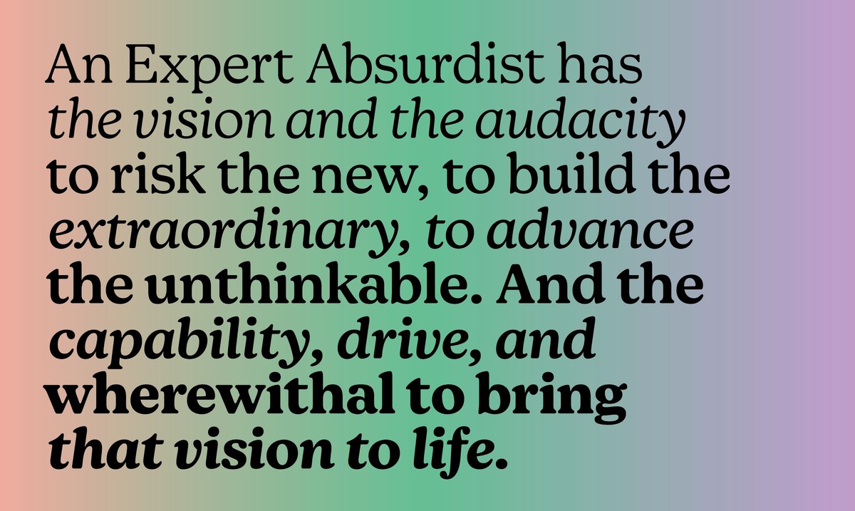
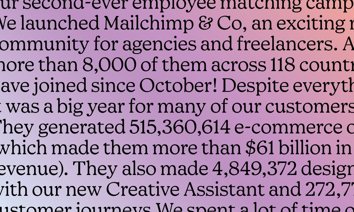
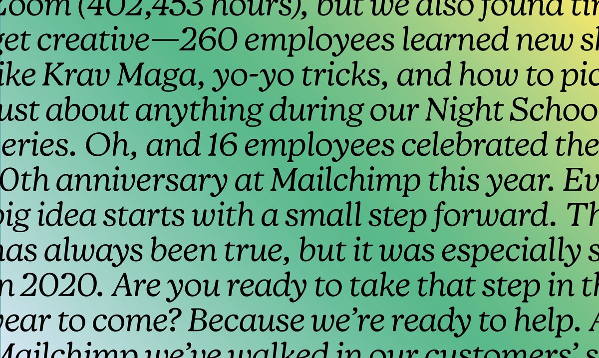
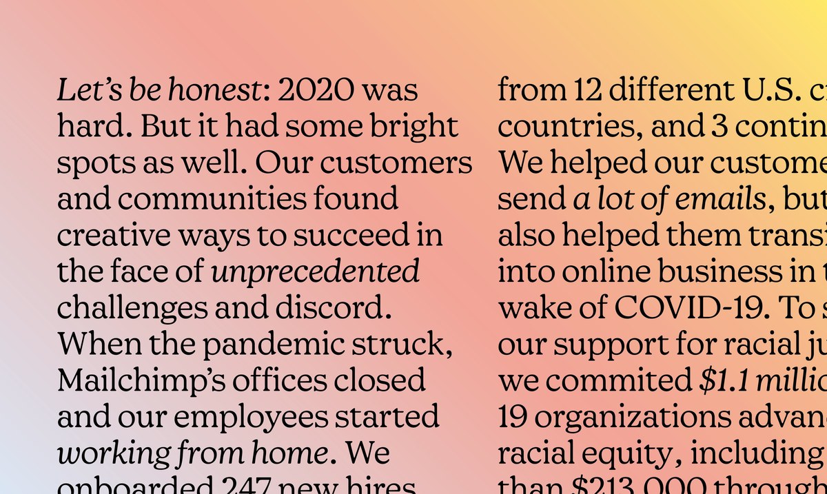
The in-house design team’s evolution of the Mailchimp identity has Means at its core. The lighter weights carry the editorial voice, its warmth perfect for chatty and friendly headlines. At smaller sizes, Means can also take a step back, allowing illustrations to shine when necessary. This expert balance looks effortless.

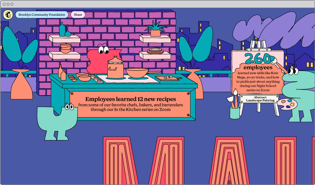
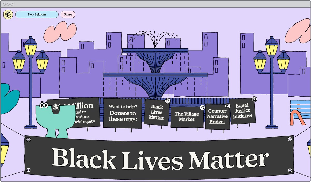
While the base identity primarily uses Means Light, the heavier weights shine in creative applications like their annual report. That it’s a variable font gives the brand more flexibility and room to play. The heavier weights are optimistic, the friend at the party everyone seems to gravitate to. Means gives Mailchimp a versatile palette for a multi-faceted business.