Marr Sans by Paul Barnes and Dave Foster
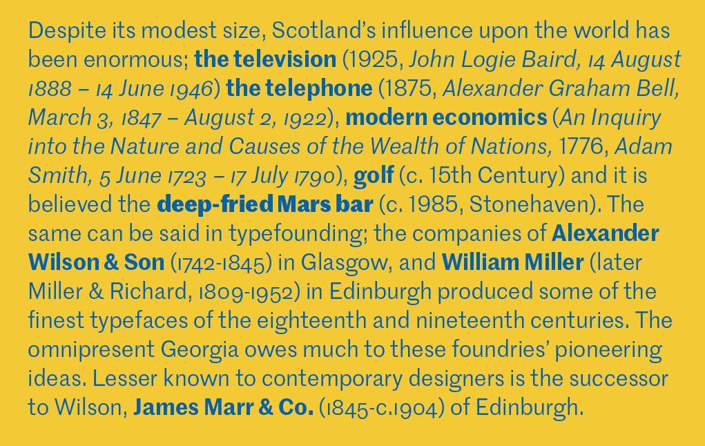
Despite its modest size, Scotland’s influence upon the world has been enormous. The television, the telephone, modern economics, golf, and, it is believed, the fried Mars bar were all invented by people of Scottish extraction. The same can be said of typefounding: The companies of Alexander Wilson & Son in Glasgow and William Miller (later Miller & Richard) in Edinburgh produced some of the finest typefaces of the eighteenth and nineteenth centuries. The omnipresent Georgia owes much to these foundries’ pioneering ideas. Lesser known to contemporary designers is the successor to Wilson, James Marr & Co. of Edinburgh.
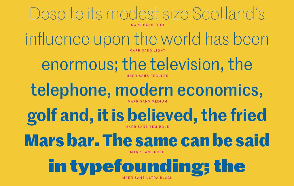
Marr Sans is a 2014 revival of a characterful grotesque that appeared in only one weight during the 1870s. Paul Barnes and Dave Foster have expanded this original into a seven weight family.
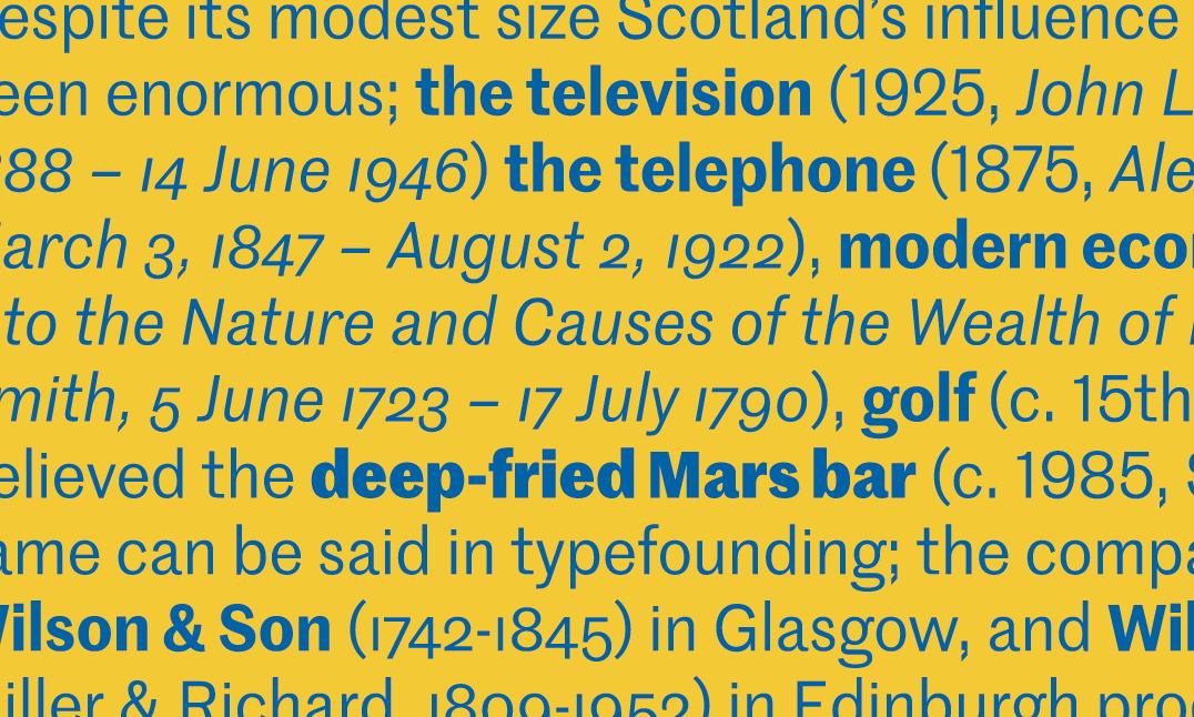
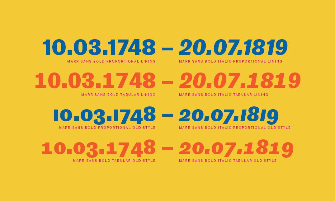
One of the innovations of the nineteenth century captured in Marr is the first example of sans serif oldstyle figures in a typeface, at the time a considerable novelty.
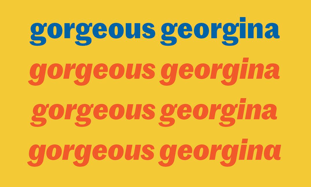
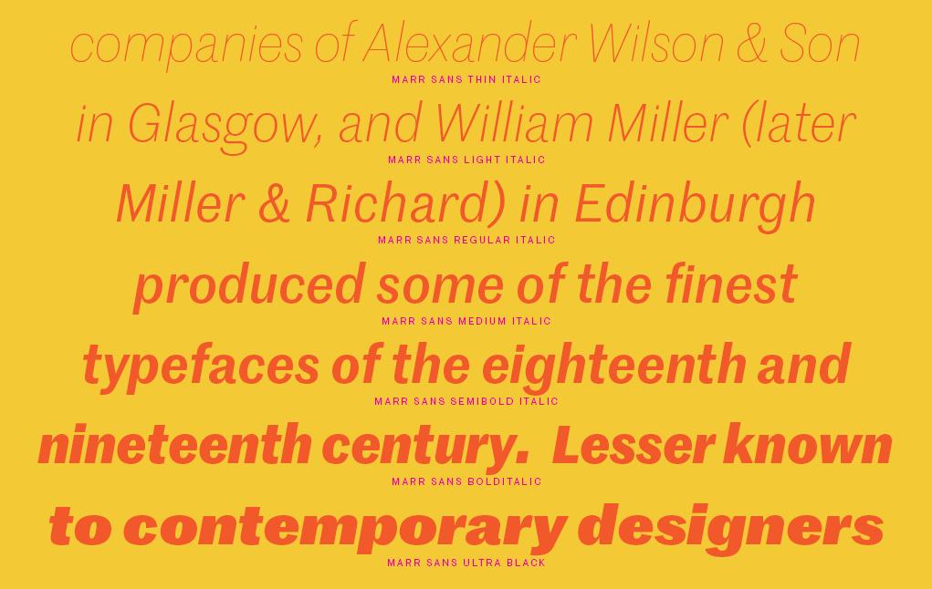
The italic is essentially a sloped roman—but check out the alt single-storey ‘a’.
The italic shows signs of “true” italic form, such as an alternative single-storey a. For the most part, though, it has the feeling of a slanted roman rather than the cursive forms of many nineteenth-century revivals. While Graphik and Atlas represent the desire for homogeneity and universality of the twentieth-century sans, Marr, like Druk, revels in the more individual and at times eccentric nature of the nineteenth-century pioneers of the form. This means that Marr is an excellent companion to serifs with a stronger personality, such as Austin, Lyon, and Portrait.
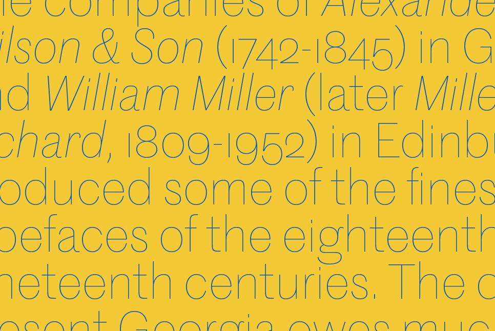
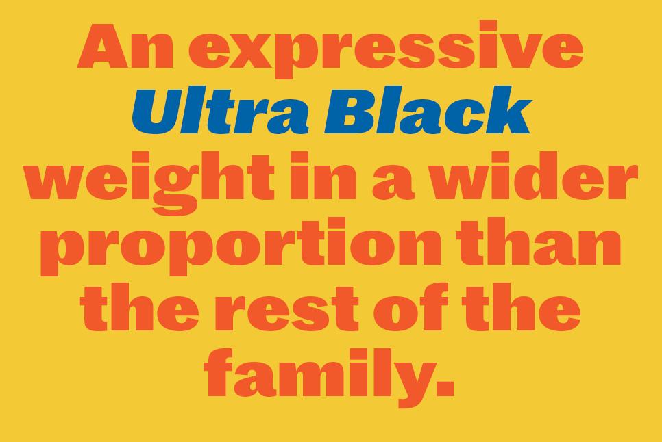
Proceeding from an elegant Thin to an industrial-strength wide Ultra Black, Marr Sans captures a utilitarian but sharp and distinctive aesthetic. The family is useful for graphic design, but not out of place in editorial or corporate design. Though its eccentricities belie its nineteenth-century origins, they never overwhelm its usefulness. Like Franklin Gothic and Morris Fuller Benton’s other loosely related gothics for ATF in the early twentieth century, the organic shapes of Marr Sans make for very comfortable reading.
Marr Sans comes in seven weights with italics, designed for both text and display usage. The family is available for use on the desktop, for self-hosted web use, and for embedding in mobile apps.
