Focal to the max
We slipped Greg Gazdowicz’s Focal Maxi into the library in June, right before Typographics. Its predecessor, Focal, came out last year, quickly attracting the attention of journalist-turned-creative director Francesco Franchi, who put it to work in La Repubblica and Domus. Focal popped up in other contexts, too, like Elastic Magazine and Jesse Reed’s Second Hand. At a certain point people started setting it big. And that worked, giving the face a slightly wonky, off-register quality—but after talking with Paul Barnes and Christian Schwartz, Greg determined that it might be a good idea to design a variant of Focal intentionally destined for headlines and other larger applications.
Two of Focal Maxi’s tutelary spirits are Victor Caruso’s Futura Maxi, published in 1960 by Photo-Lettering, Inc. to add more display styles to Futura; and the underutilized Vectora (of which Christian drew a custom thin weight for O, The Oprah Magazine, when he was at Font Bureau), Adrian Frutiger’s early-nineties meditation on News Gothic and Franklin Gothic. “I think part of the idea was to tie Vectora and Futura Maxi together,” says Greg, noting that Vectora is oriented toward legibility, readability, and functionality, whereas Futura Maxi is more about punchiness and visual impact. The most obvious mark left by these two precursors is the towering x-height, which Greg willfully kept on the low side in the original Focal as a riposte to the inflated post-ITC counterforms that have permeated type design for the past couple of decades.
The biggest influence on Focal Maxi, though, is of course Focal itself. And an important touchstone for that was Maxima, designed by Gert Wunderlich in the sixties and first produced by the East German foundry VEB Typoart in metal in 1970 before being adapted for phototypsetting and early digital typesetting. Greg also studied Frutiger’s Univers, Bauer & Baum’s Folio, and Karlgeorg Hoefer’s Permanent for clues to how these designs negotiated heavier weights in conjunction with rather small x-heights.
Nevertheless, Focal is a highly original paean not to a specific typeface or genre but rather to an ephemeral period in 1970s phototypesetting that skewed type in unpredictable ways, giving it a muted, lived-in quality. Greg began by exploring how designs like Franklin Gothic and News Gothic appeared on seventies Varityper machines, complete with the large x-height, gently angled terminals, moderate contrast, and super-tight spacing that became popular during that period. He soon found that that was letting genre short-circuit effect, though; what he really wanted was to capture a lost era of softness. He started questioning the unspoken norms that have accumulated around sans serifs. So along with Focal’s rather low x-height you also see the spurless G, the curved leg of R, the splayed M, an irregular roundedness and nonuniformity of shapes; these latter traits have all carried over into Focal Maxi.
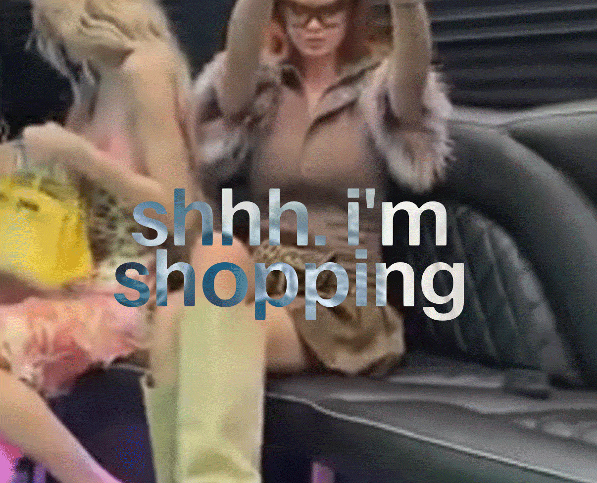
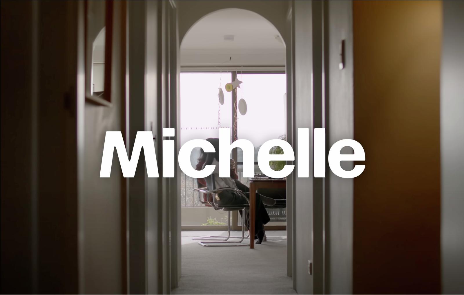
A client project for lifestyle platform Emcee with Richard Turley of FOOD provided the real-world impetus for early sketches of Focal Maxi. (Working with Echo Wu, Greg also drew the spiky-soft logo for Emcee, expanding it into a completely unhinged display typeface—but that’s another story for another day.) For Emcee’s primary workhorse face, the team initially proposed Focal and a few other ideas that leaned into the “fonts for small text used big” kind of energy, but the client found Focal a little too understated out of the box. Blowing up its x-height and abridging its extenders to facilitate tighter setting gave it a more unique feeling while keeping it extremely functional for small text. Focal Maxi was selected by Jonny Sikov for titles and incidental text on Derrick Gee’s show Solid Air, and so far has appeared on episodes featuring Lorde and Michelle Zauner of Japanese Breakfast.
Think of the Focal collection not so much as a text cut versus a display cut, but as complementary partners at slightly different frequencies—one very much in your face, the other not—that can be used at any size, for different purposes. “Focal Maxi has that fullness that I think a lot of designers want when they’re making posters or punchy opening spreads,” Greg says, hastening to add that “Focal works well really large, too; it just definitely has a different vibe, it’s not as boisterous, maybe a bit more polite.” Greg gets a kick out of seeing the two faces side by side. Set together, the combination is almost like a visual performance of binaural beats—analogous, shimmering, and just a little bit off.
Related fonts
