Erik van Blokland’s Action Grotesque
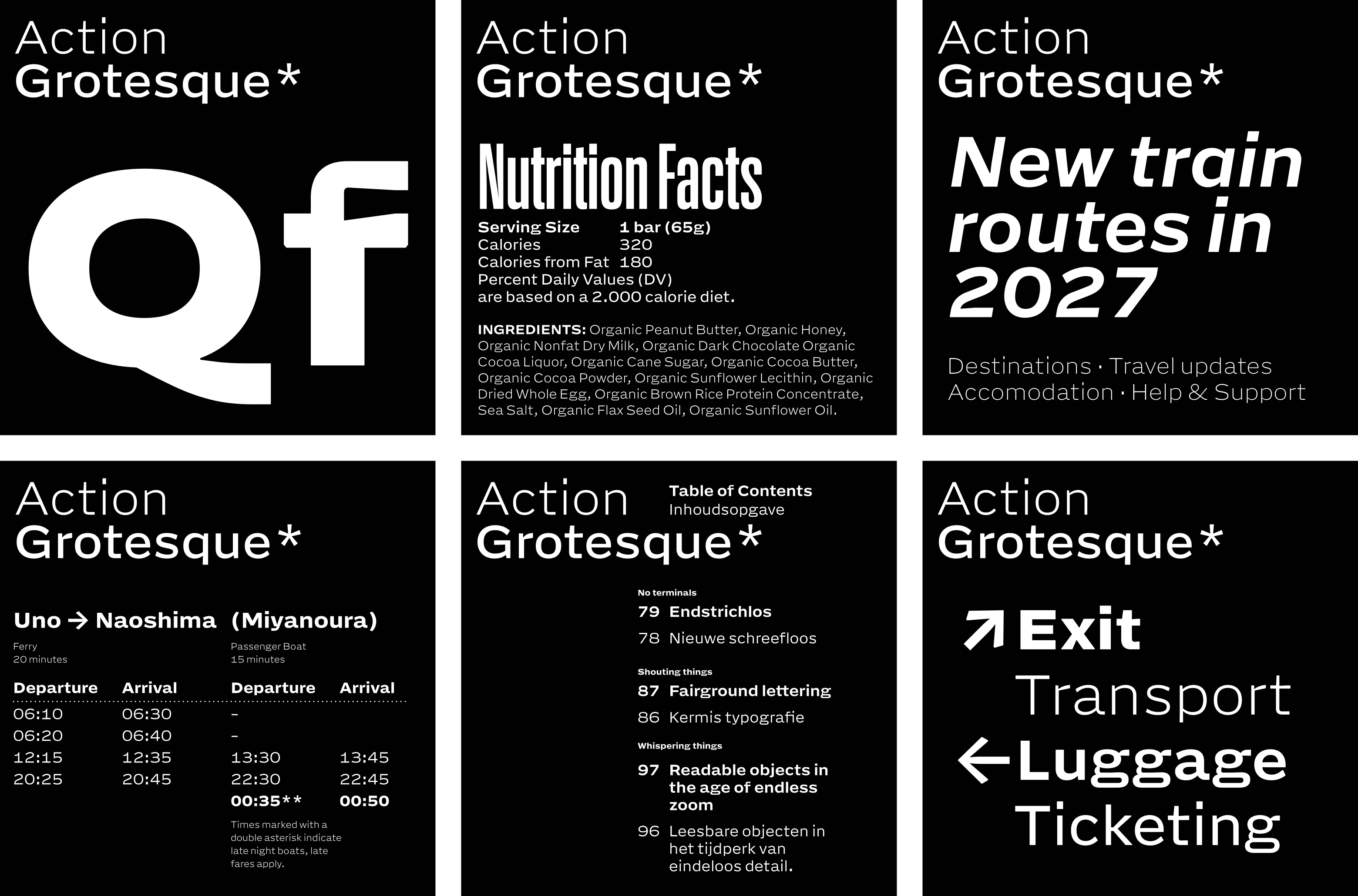
While he was drawing the even-tempered Action Grotesque, Dutch designer Erik van Blokland referred to it as “Action Micro,” since he began proofing it at 7pt and worked his way up from there. But he soon realized that the name was doing the family a disservice—it’s so much more than micro. Erik’s working hypothesis was that if he made the typeface readable at small sizes, everything else would fall into place: AG, he writes, is “guaranteed to work smol as well as embiggened.”
Action Grot, the third installment in Erik’s Action Collection, is a record of its own making and of the thought that went into its making. With the reader at the center of its concerns, it relies less on dicta and the history of letterforms than on the observation of optical phenomena and material constraints. It also performs a close reading of Harry Carter’s 1937 text “Optical Scale in Type Founding.” Carter posited that type broadly falls into three size buckets—small, medium, and large—and that a single typeface capable of working well in more than one category is exceedingly rare, if not nigh impossible. So if you are Erik, and you set yourself the challenge of designing something that performs well across all three tiers, how do you go about it? You start small. You concentrate on legibility and readability; you consider proportion, weight, and distance. You trust your eye and your gut more than you trust math.
Guided by his understanding of hardware, software, and the quasi-miraculous convergence of circumstances that enables the act of reading, Erik was curious to see how proofing type at the very edges of readability, at the smallest feasible sizes, could guide his design process. With micrological focus, he subjected Action Grot to a battery of stress tests. He wrote a script that generated a webfont, produced a proof at 7pt, and spit the proof into a browser, where he squinted at it. And then he did this over and over again—observing, adjusting, regenerating, squinting. Design happened in the interplay between these activities. “If I could not observe the effect of a particular intervention,” Erik notes, “then maybe it was not necessary.”
He took special care to make punctuation, numerals, and diacritics robust and unequivocal—and the italic a distinct departure from the roman at a fairly steep 9.4623 degrees. Punctuation marks may be small, but they’re hugely important; the reader will get lost without them, and sense will unravel. Erik made Action Grot’s “semantic punks” clearly decipherable at the tiniest sizes, with ample spacing. The diacritics look like they were painted by Philip Guston (i.e., crude, plastic, chonky), but that’s a good thing, actually: “I wanted them to be unique enough so that at the smallest size there is enough material for disambiguation,” Erik writes. At small sizes disambiguation serves legibility; at large sizes it becomes art.
Erik wants Action Grot to be a useful addition to a typographer’s toolbox—an instrument for negotiating complex, structured information and clear hierarchies, with a fluid range of weights. Are today’s typographic needs really more complex than in the past? Arguably yes, because surfaces have proliferated, and so have orientations. In One-Way Street, Walter Benjamin described the orientation of reading as following a strict linear temporality, shifting from columnar inscriptions to the sloping desks of scribes to the quiet flatness of printed books, before rising up again in the verticality of newspapers, movies, and ads. Today, though, reading is more apt to circulate spatially, open to myriad possibilities. We can’t reliably predict a text’s orientation—and that demands a different way of designing type, one that hews perhaps less to the conventional, predictable rhythms of calligraphy and more to the unpredictable and spatially adventurous moves of drawing.
You could call Action Grot a workhorse: It works hard and it does a lot of work. And even though Erik calls it “a bit boring,” it’s not without wonderful idiosyncrasies that were organically precipitated by the design workflow: Look at the flamboyant, generous ampersand, for example; or the tail of Q; or the hatchet-like r that, like Dutch people, is at once friendly and blunt. But you might also call Action Grot a generalist. It’s good at a lot of things, at a range of sizes and weights. “It is worth considering,” writes Harry Carter, “whether the modern type-producers ought not to allow themselves more latitude in adapting a general design for a face to the various bodies on which they put it.” Erik appears to have nailed it.
Be sure to check out Erik’s design notes.
Related fonts
