Caslon Doric for the 2nd Istanbul Design Biennial
Paul Barnes and Christian Schwartz have drawn a custom version of Paul's Caslon Doric Black for the identity of the 2nd Istanbul Design Biennial, designed by Project Projects.
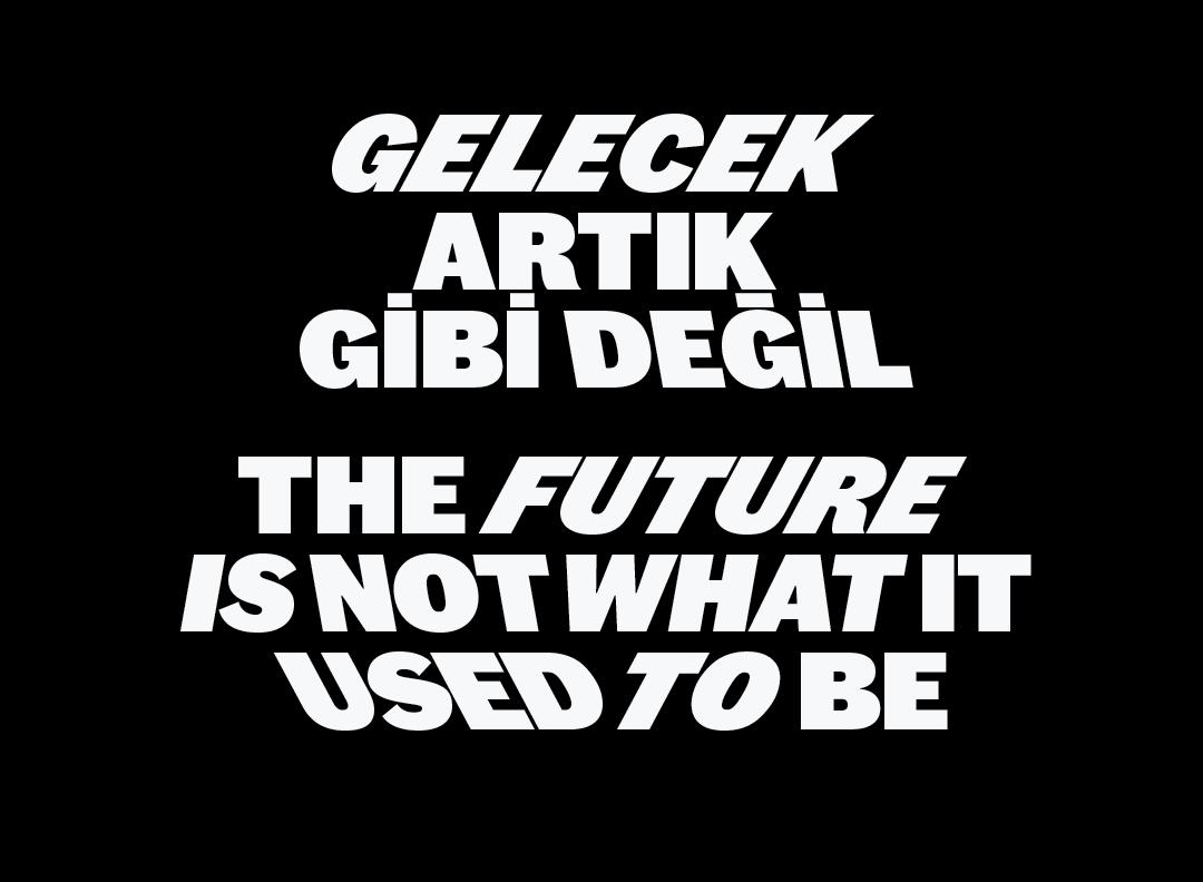
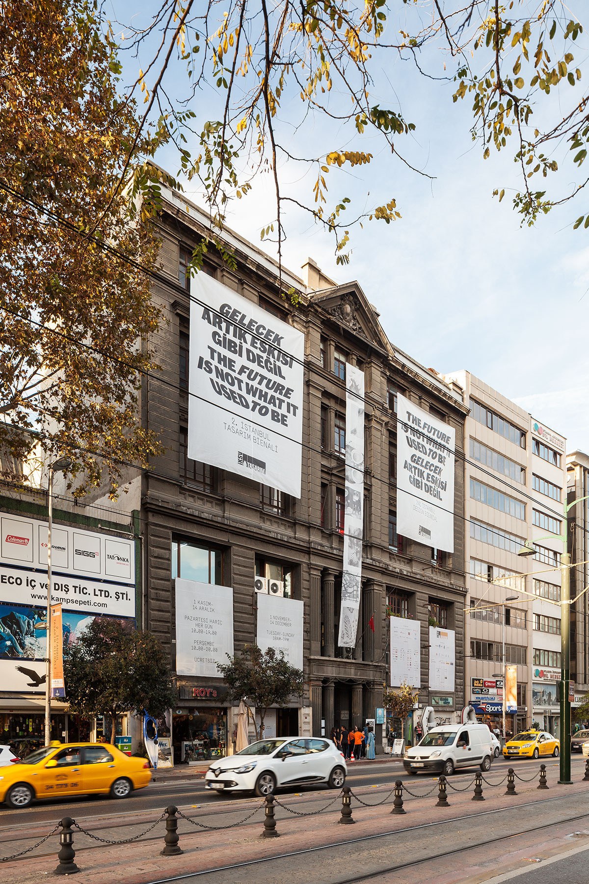
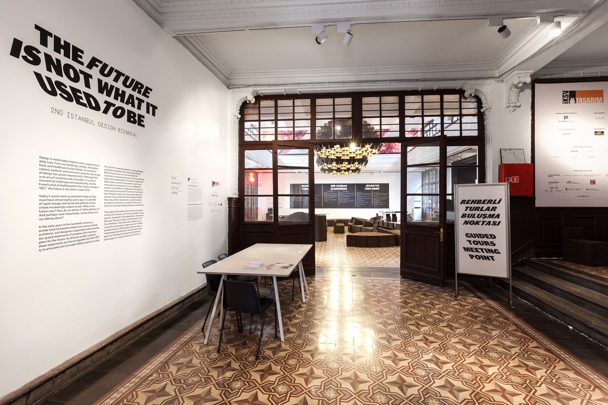
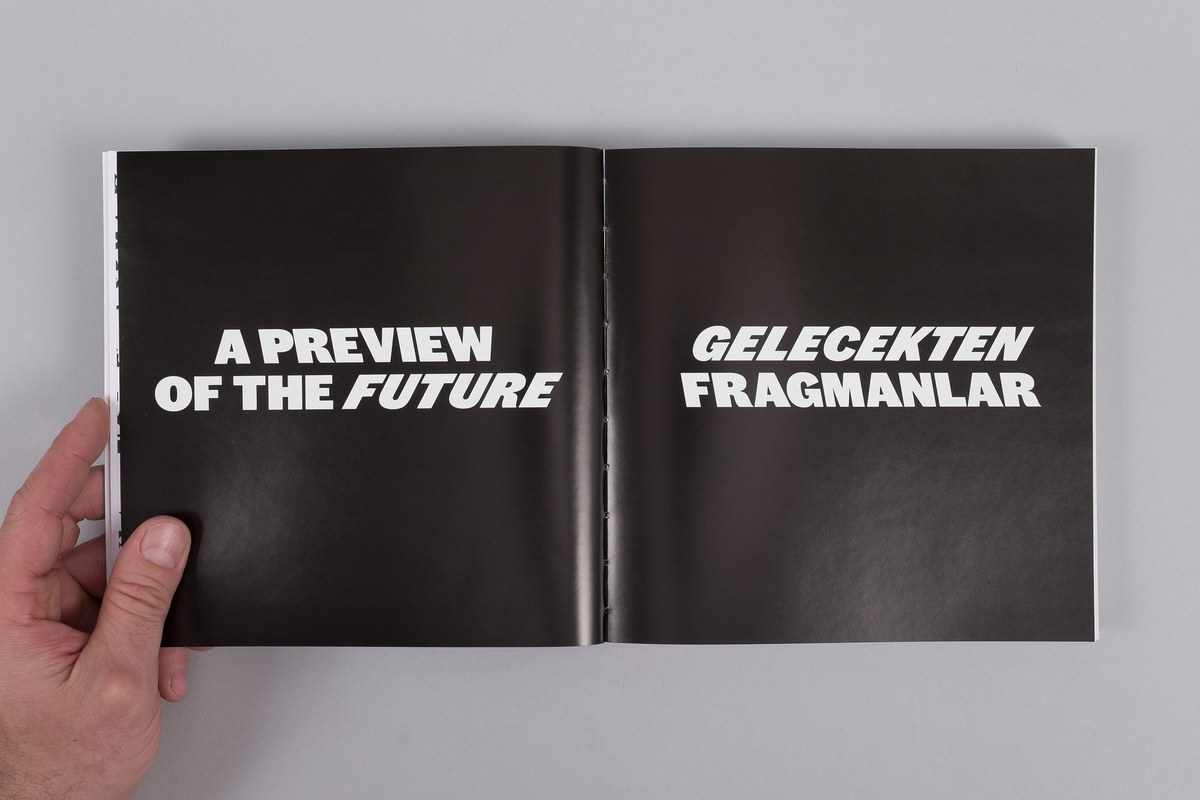
From the press release: “Organised by the Istanbul Foundation for Culture and Arts (İKSV), curated by Zoë Ryan and associate curator Meredith Carruthers, the theme of this year’s edition is The Future Is Not What It Used To Be.
Under this overarching title, Zoë Ryan revisits the manifesto as a platform and catalyst for critical thinking in design. The biennial asks, how can we reclaim the manifesto for the 21st century and beyond, not only in the production of texts, but through actions, services, provocations, or objects and seize the potential to incite inventive outcomes?”
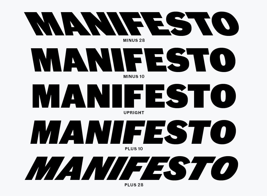
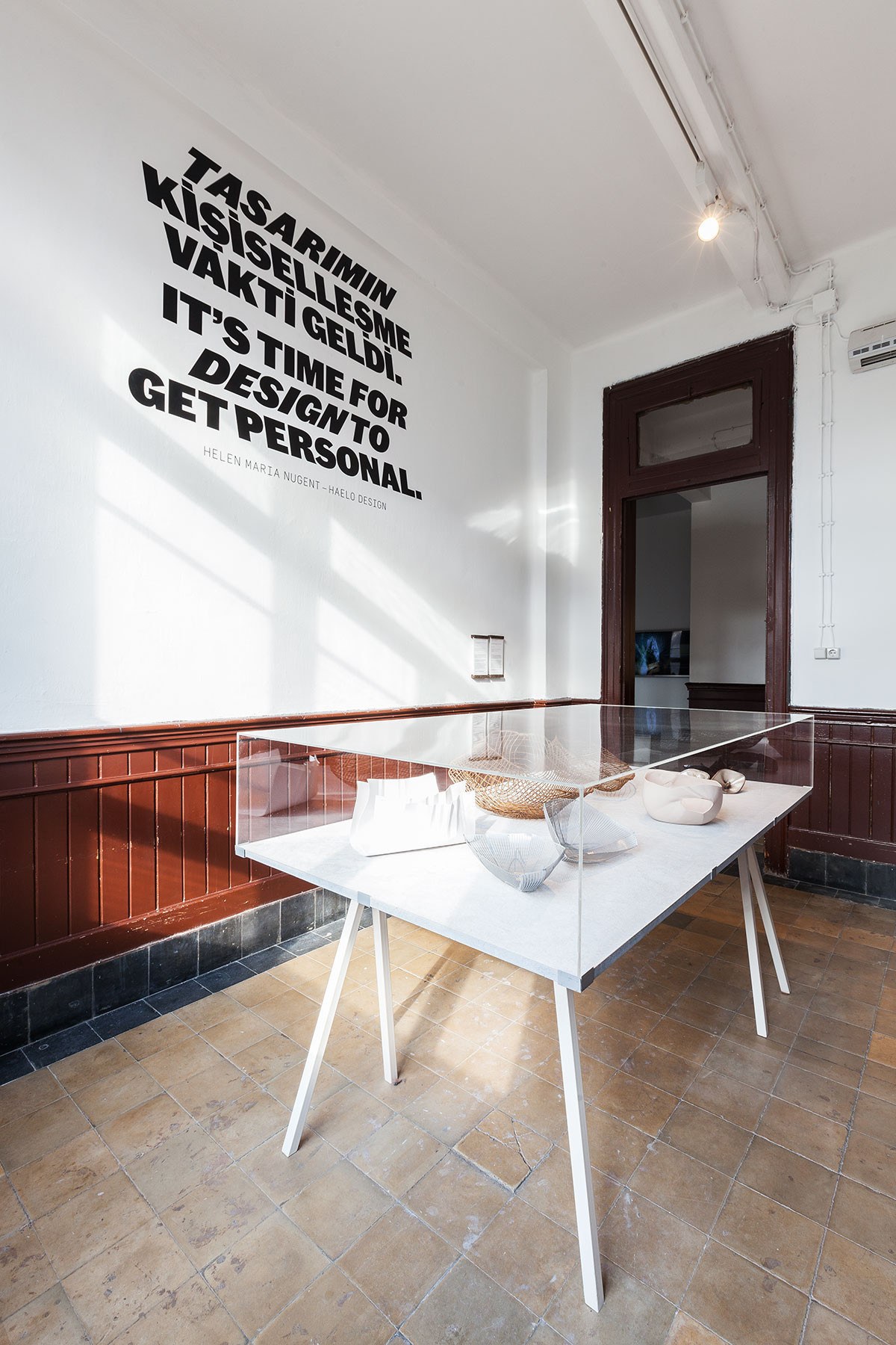
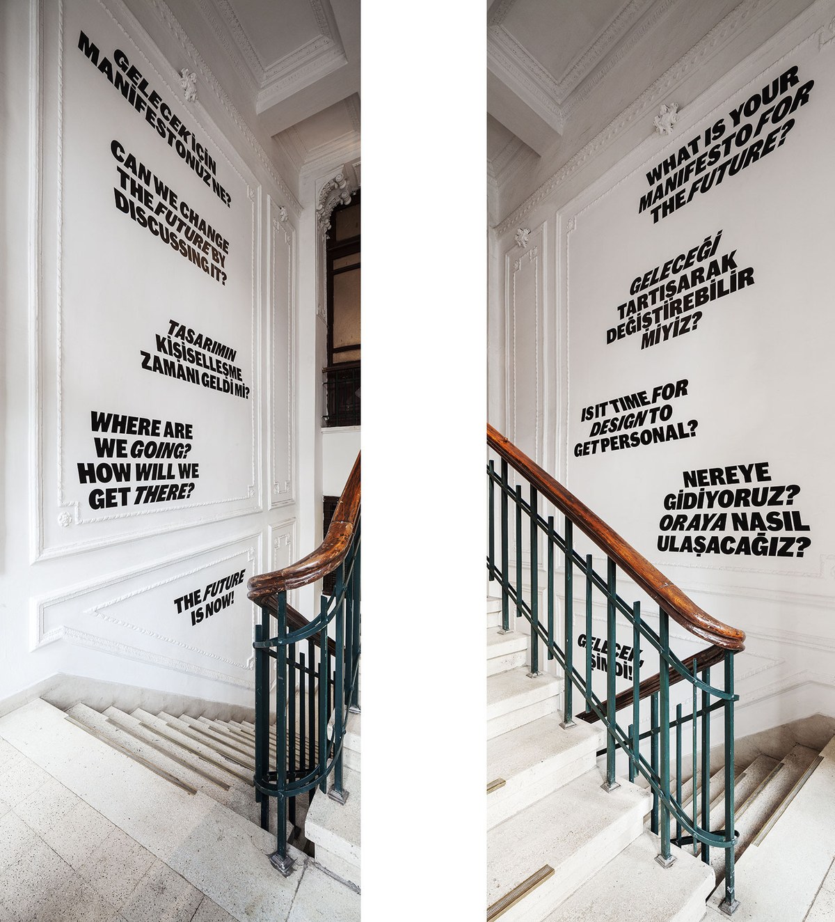
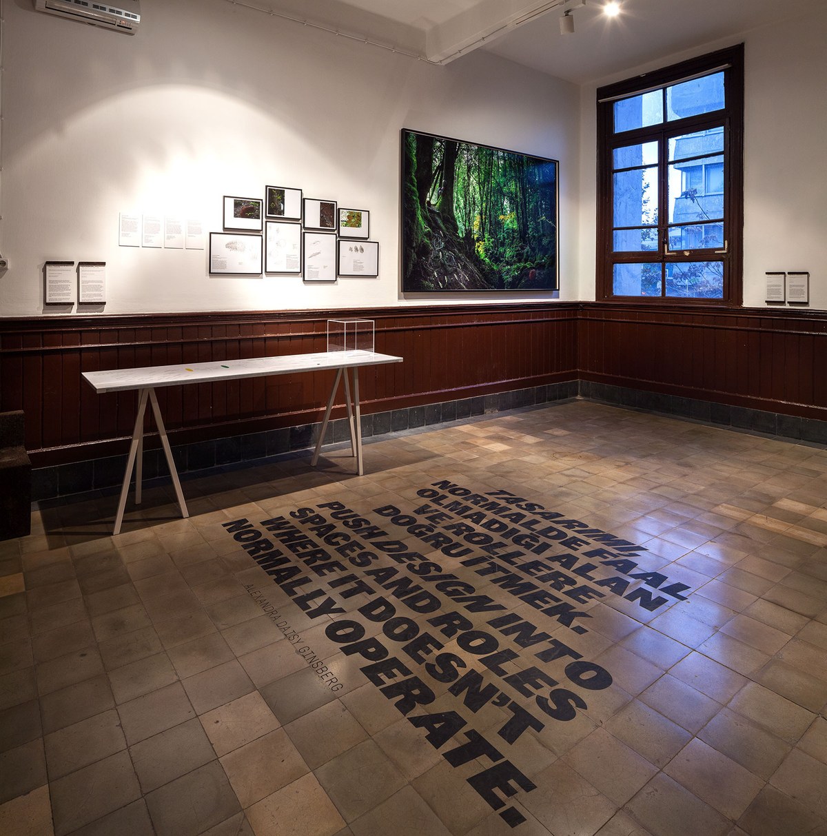
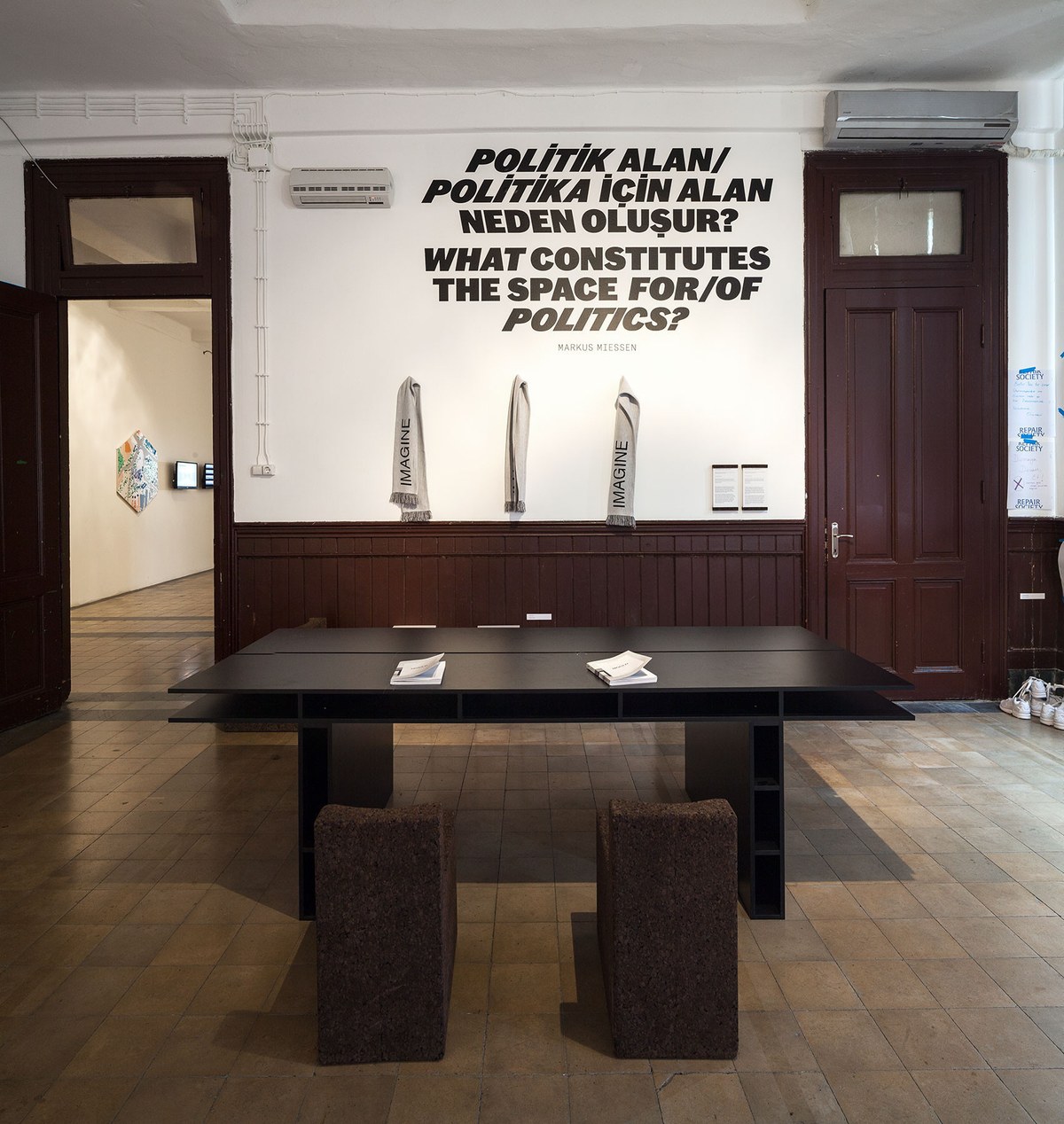
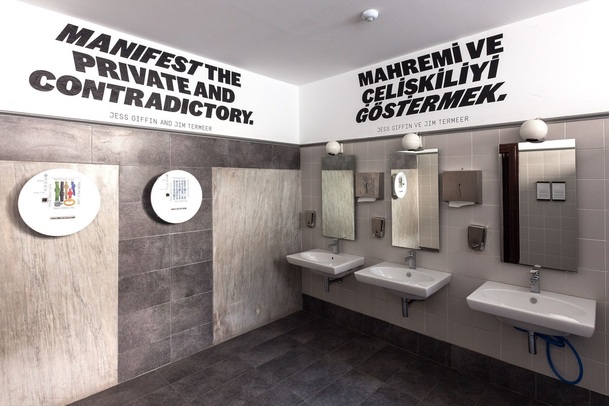
Inspired by old political tracts, the typeface has four italic styles in total: more and less urgent angles, each slanted both forward and back. This allows the designers to use shifting emphasis to draw different meanings out of the text. The typeface is used to ask provocative questions in both English and Turkish on the interior and exterior of the Galata Greek Primary School, the main venue for the biennial.
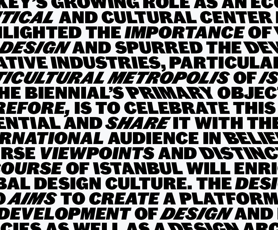
The Turkish accents have been aggressively simplified. The breve over Ğ, typically a curved form, is instead a flat stroke, and the accents below Ç and Ş are reduced to simple dots, matching the dot over İ. These simplifications have been taken from lettering and sign painting styles common in Turkey, and allow for the tight line spacing the designers needed to create a very dense texture.
Atlas Grotesk was also used
Atlas Grotesk was also used
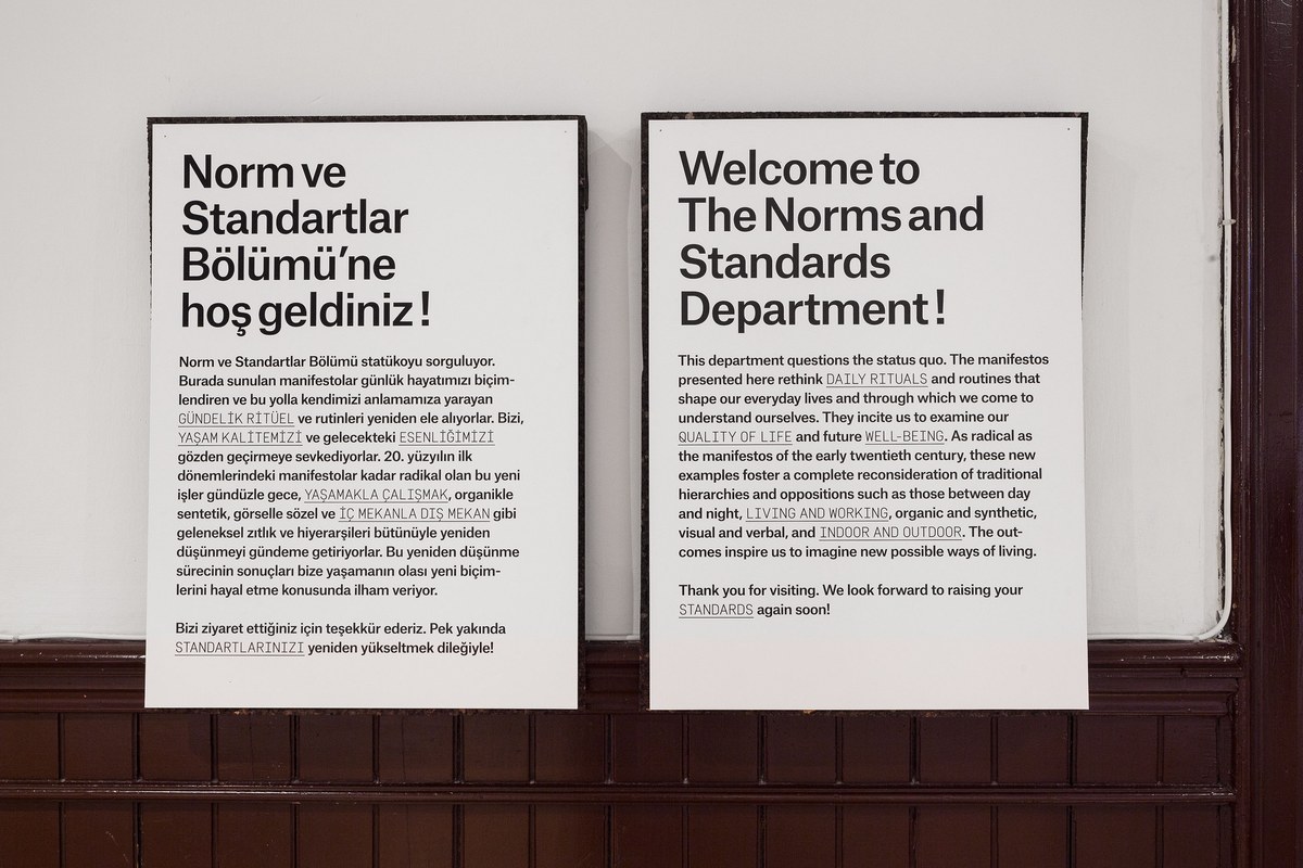
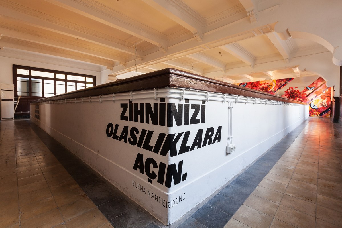
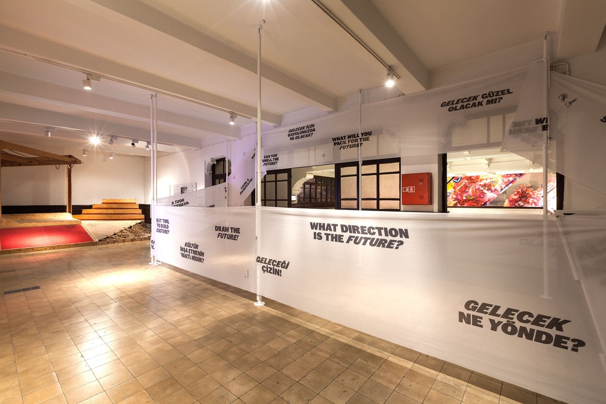
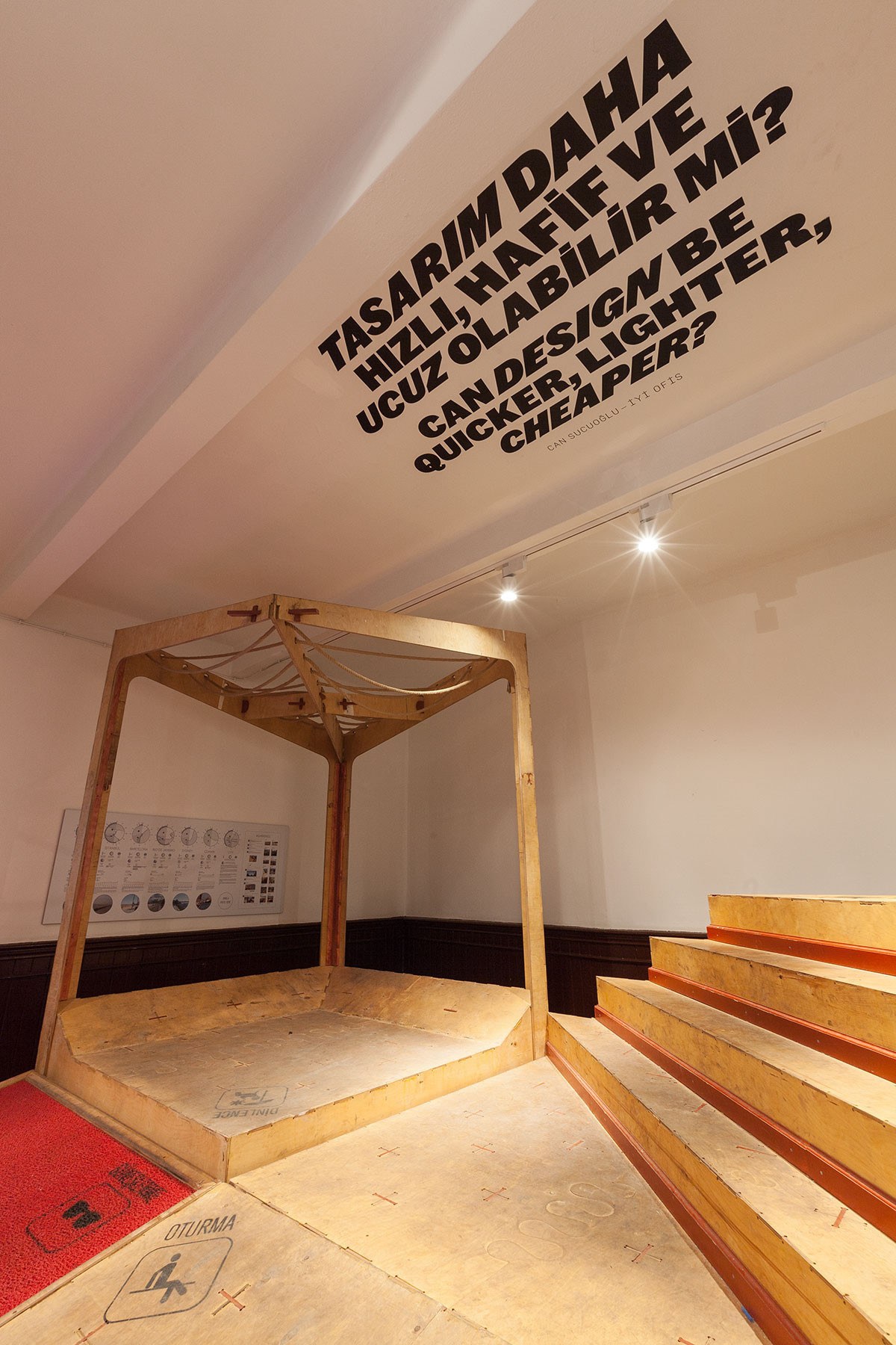
Project Projects used the typeface extensively throughout the show, from the exterior to every kind of surface in the venue: stairwells, walls, ceilings, and floors. Atlas Grotesk also appears in some wall texts and in the book that accompanies the show.
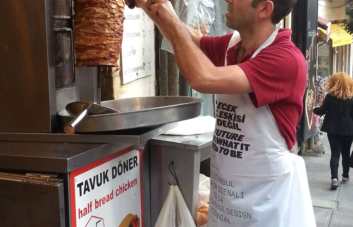
A döner vendor’s apron
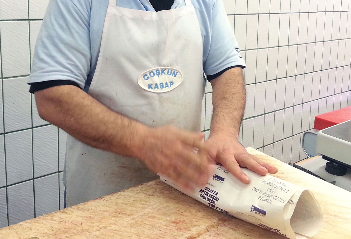
Wrapping paper at a butcher shop
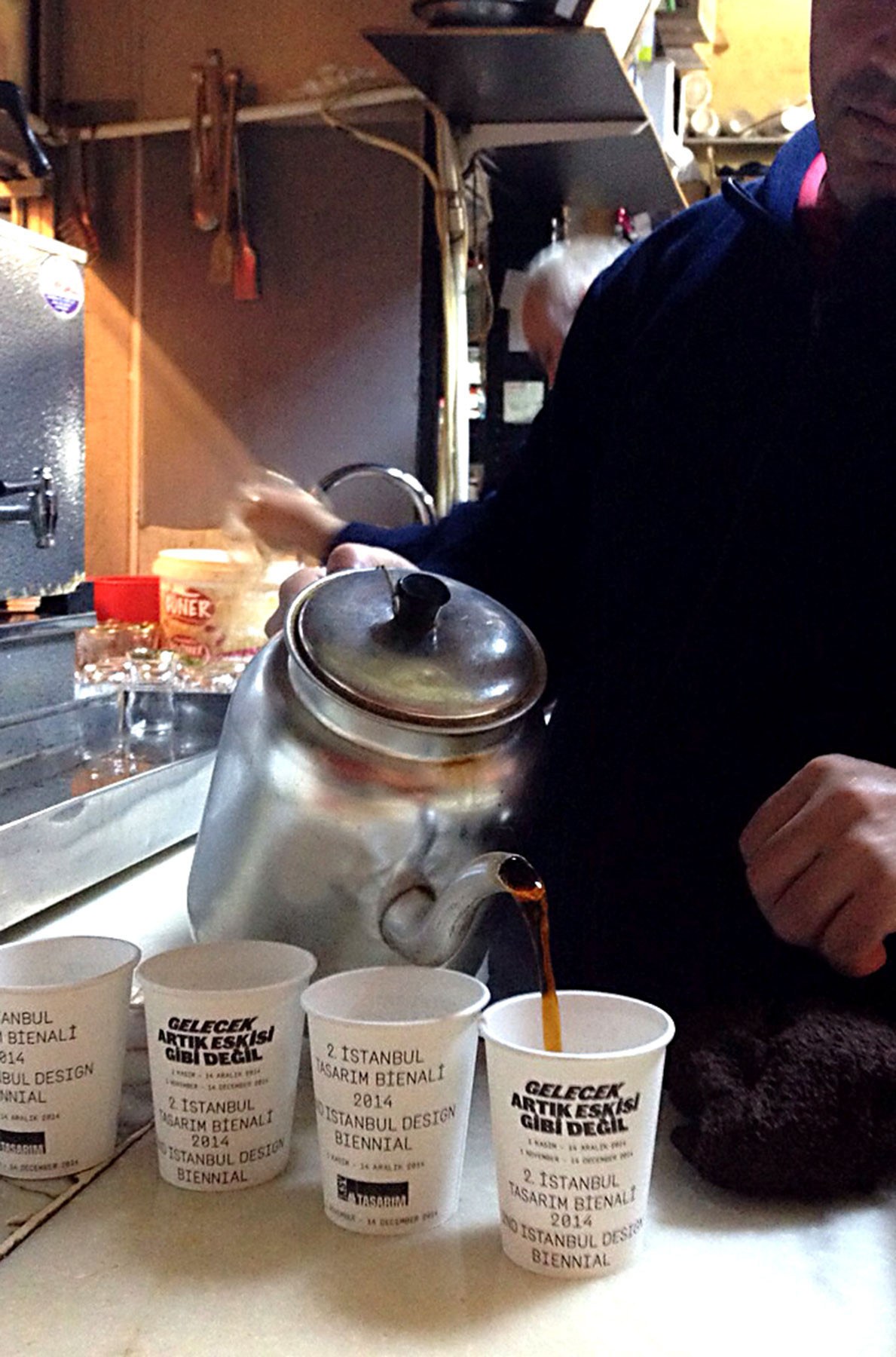
Coffee cups
A döner vendor’s apron
Wrapping paper at a butcher shop
Coffee cups
A pattern combining the name of the exhibition with additional information, set in Swiss Typefaces' Simplon, was applied throughout the city.
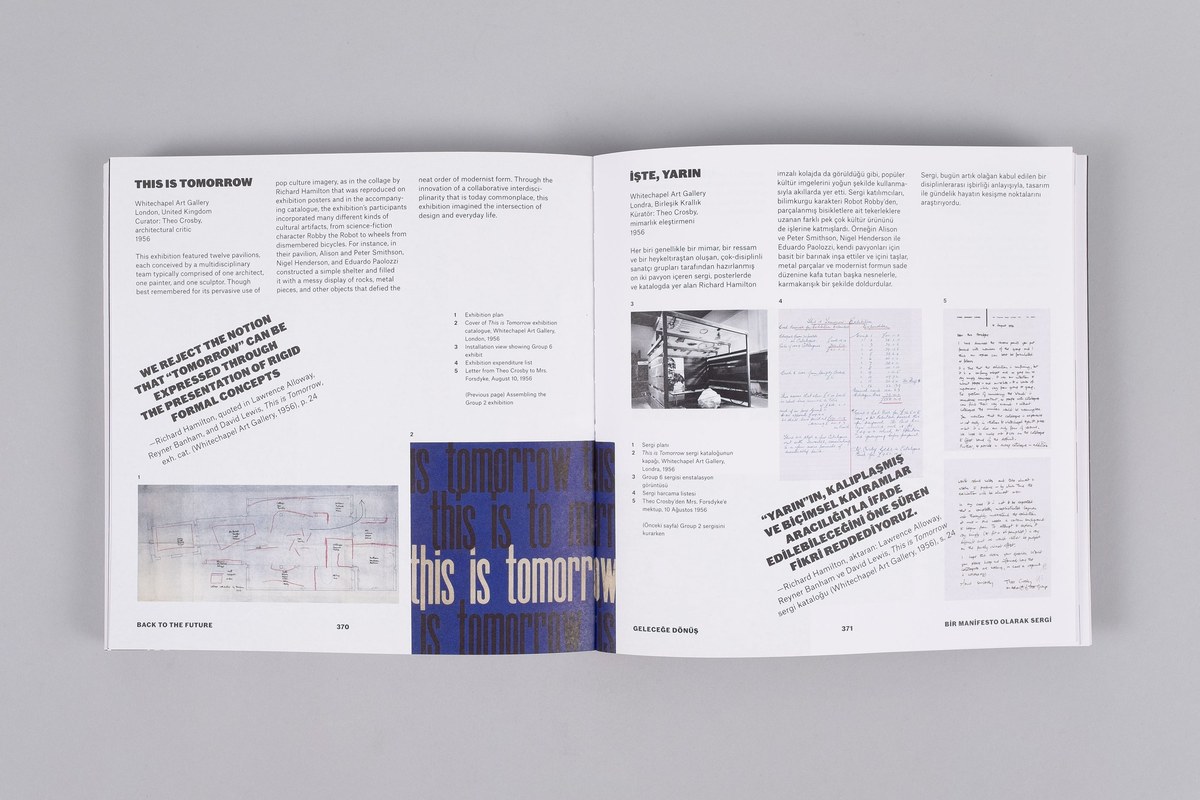
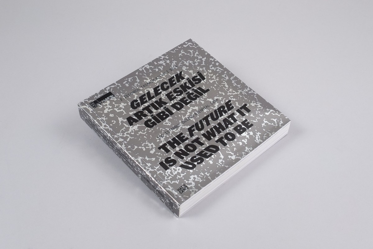
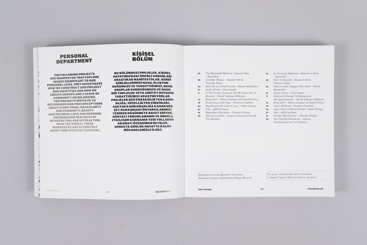
Project projects also designed the catalogue for the show, which expands on many of the ideas and pieces in the show in a small, square-format softcover book.