Multiplexed typefaces for 29 daily newspapers published by McClatchy
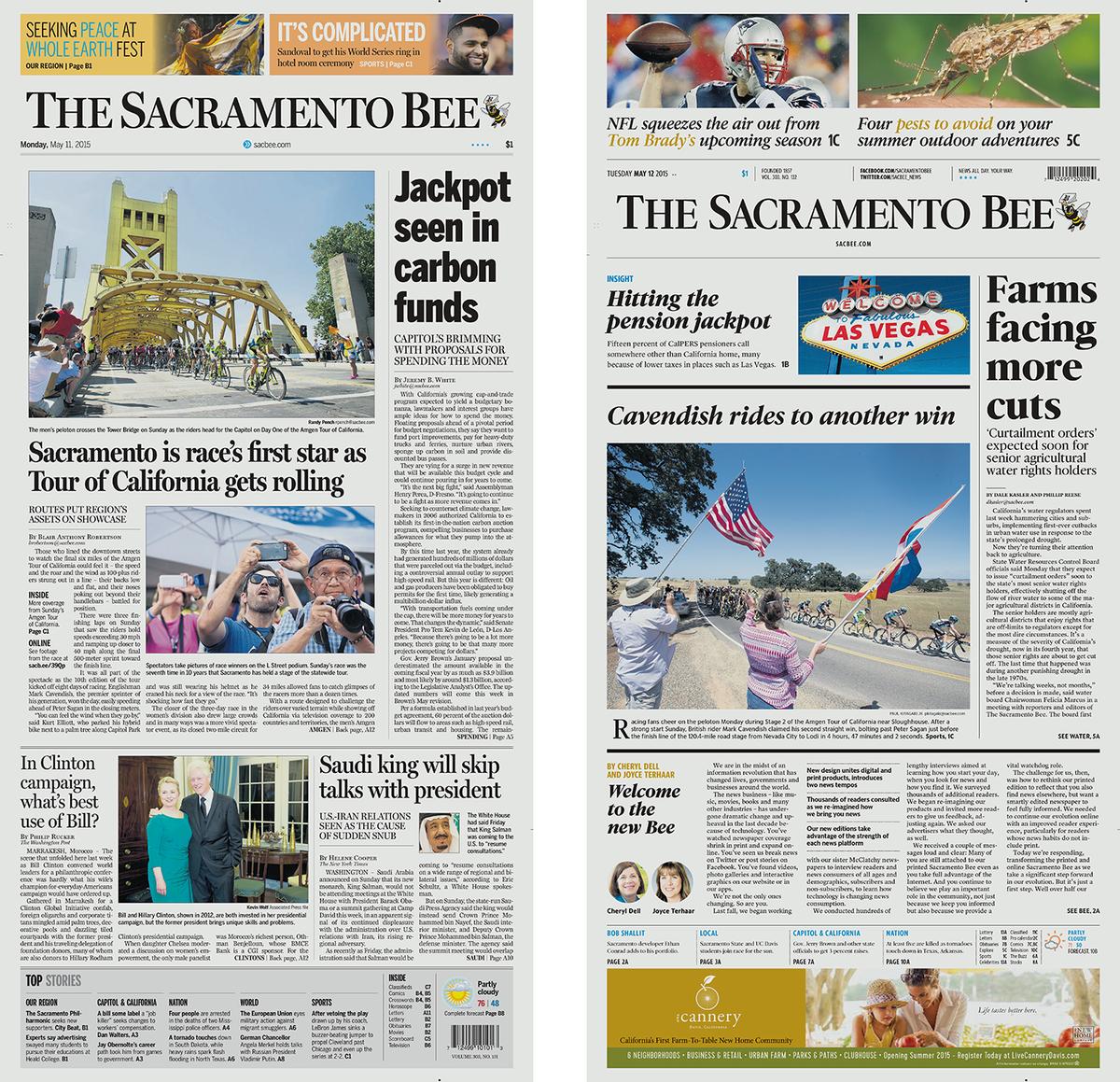
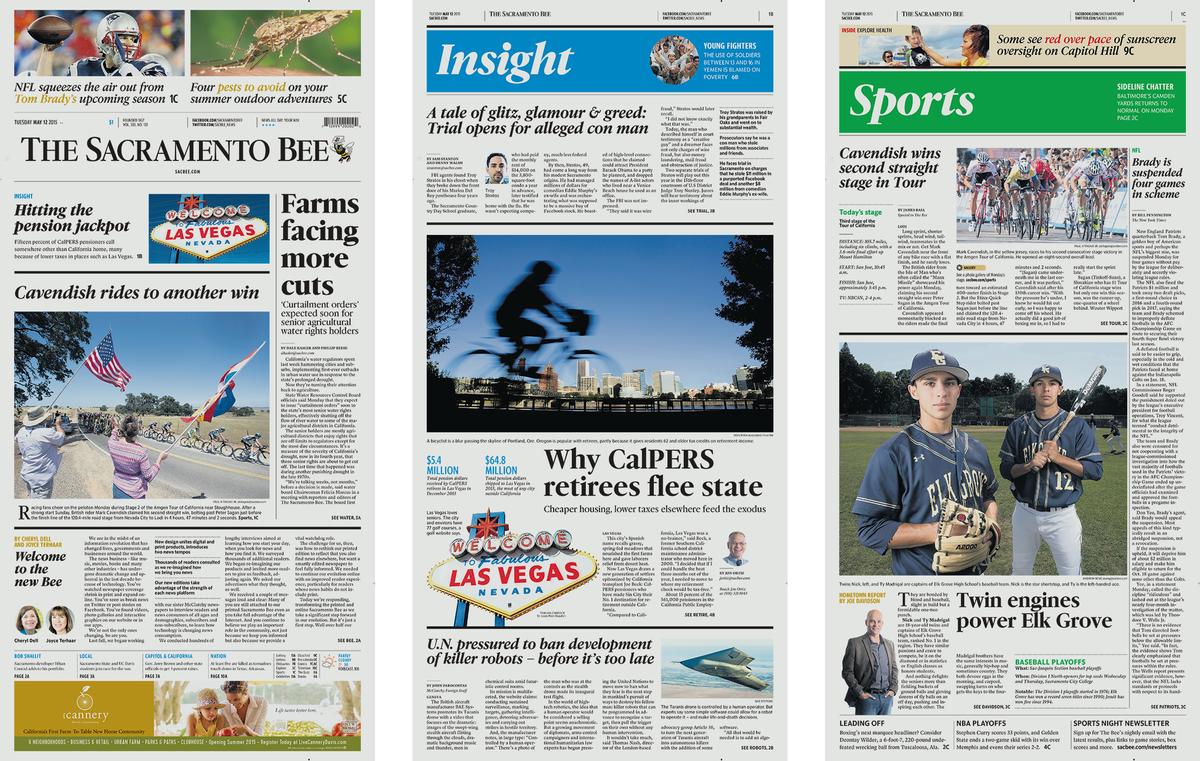
The Sacramento Bee, before and after the redesign.
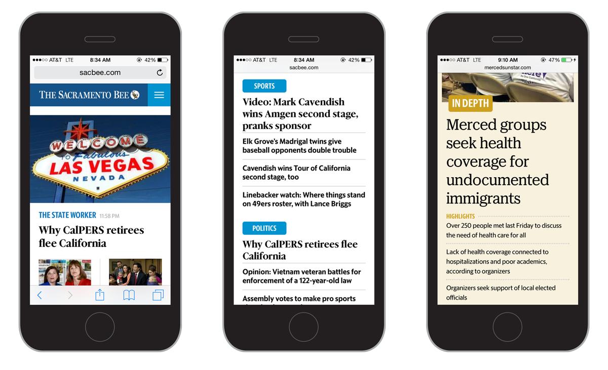
The websites are all fully responsive, reformatting on the fly for different screens.
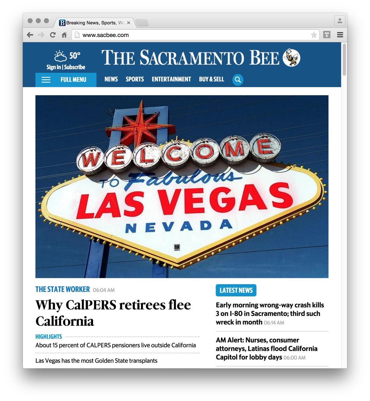
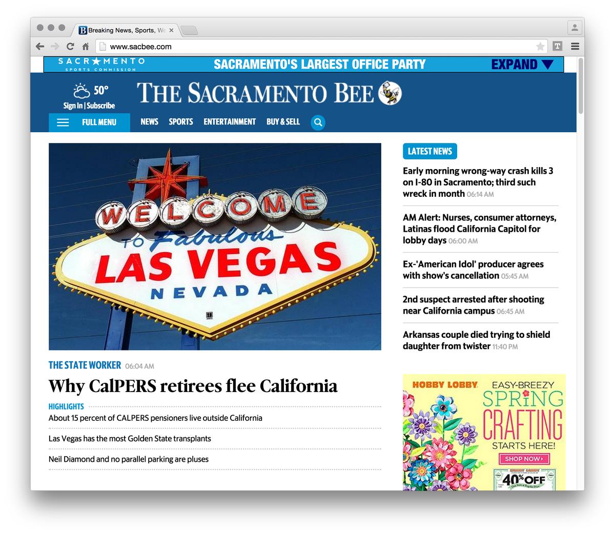
The Sacramento Bee, before and after the redesign.
The McClatchy Company publishes twenty-nine daily newspapers across the US, from Washington, to California, to Kansas, Florida, and the Carolinas, in both large and small markets. Working with Garcia Media, they have spent the past year developing a unified design language that will bring together the print papers, mobile apps, and web editions with a more consistent overall look. However, it was important that the newspapers retain a measure of individuality, rather than all looking exactly the same. Directed by Garcia Media’s Reed Reibstein and Mario García, we designed a set of typefaces that will help bridge the gap between design consistency and individual character. For more information on the redesigns and their underlying strategy and philosophy, please see this excellent post on the Garcia Media blog. And to learn more about McClatchy’s fundamental rethinking of their publishing process, see this article at the Poynter Institute.
The first set of newspapers to follow this new design paradigm are the Sacramento Bee, the Modesto Bee, and the Merced Sun-Star, with the Fresno Bee to follow next week. The remaining twenty-five dailies will roll out their redesigns in the coming year or so.
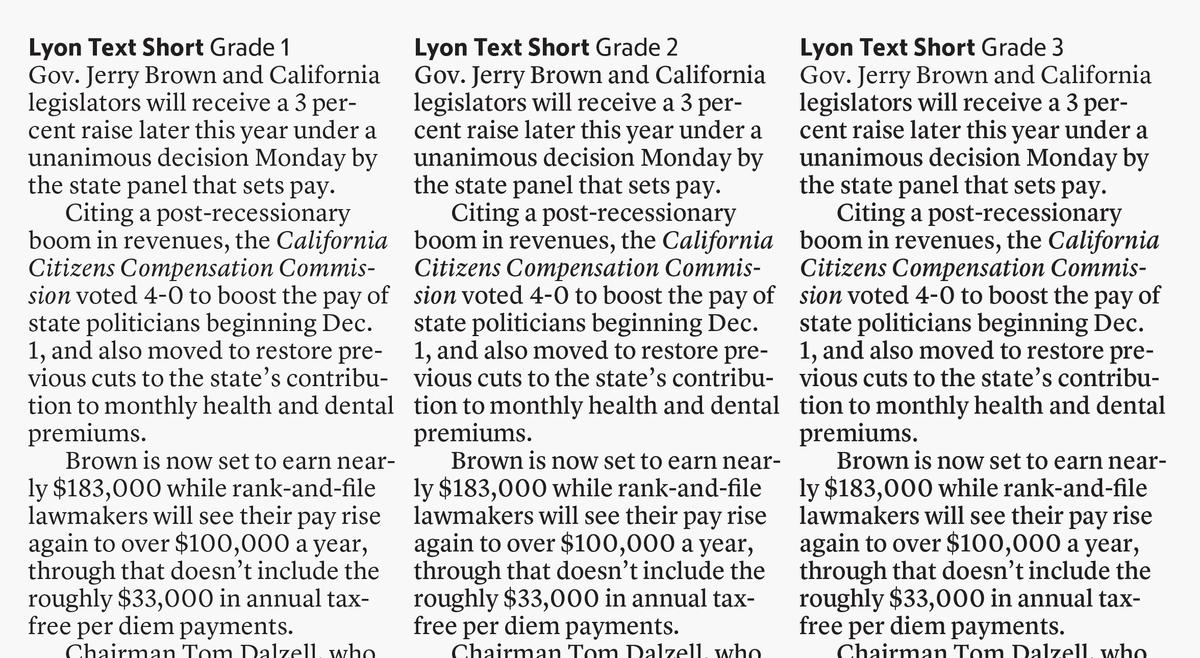
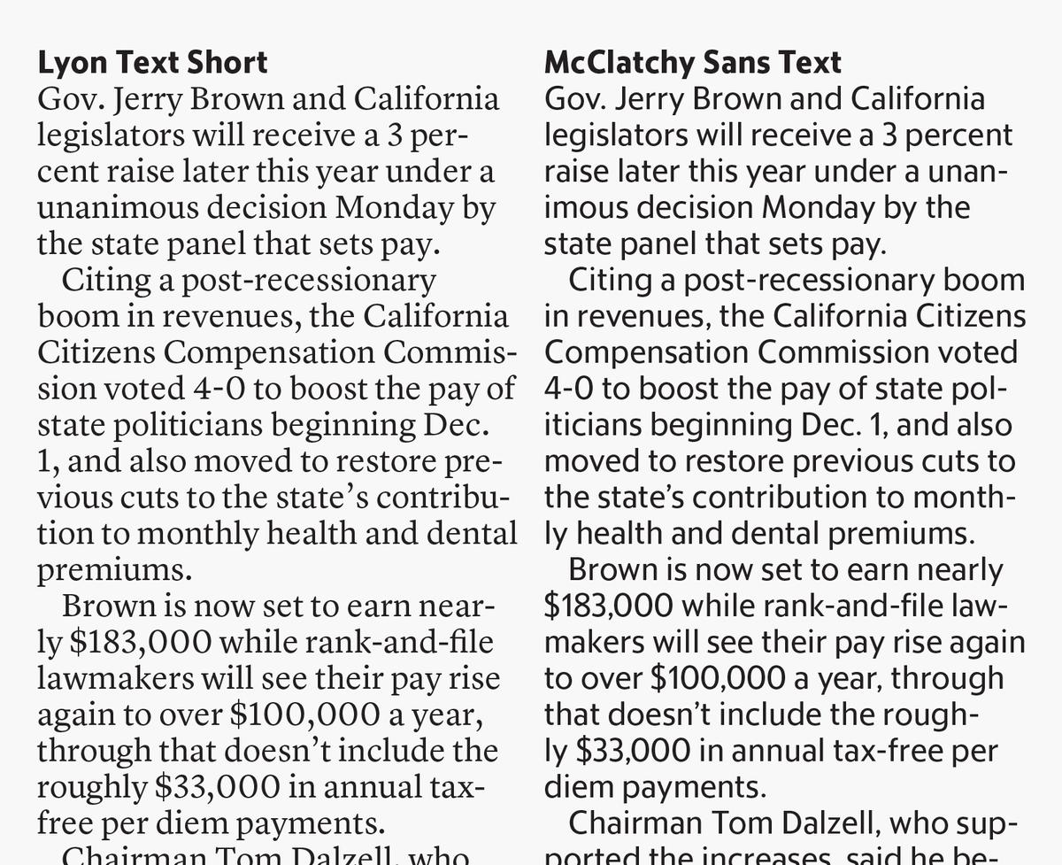
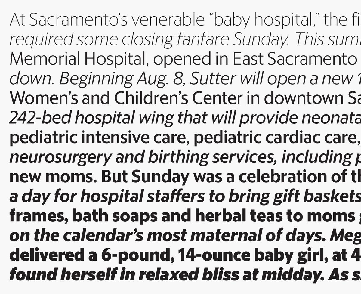
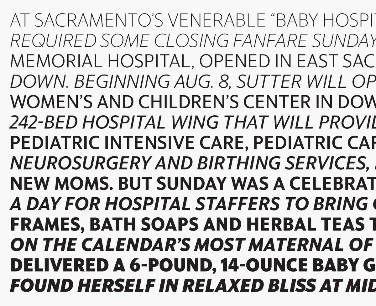
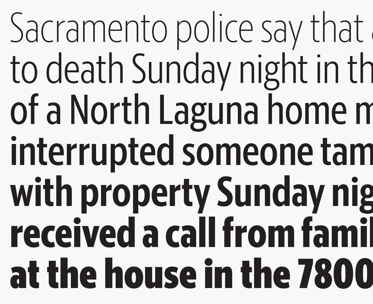
The quiet, hardworking core of this new set of typefaces is the text face, common to all twenty-nine dailies: a modified version of Kai Bernau's Lyon Text, with shortened ascenders and descenders to fit better with the tight leading of newspaper text typography. The italics are slightly less angled and a bit wider, keeping the counterforms and arches from clogging up on newsprint. Three grades were produced for this family, slightly different weights to compensate for different inking on different presses across the country. Though the schedule was highly accelerated, we were able to receive press tests from all twenty-nine newspapers, which helped to determine how heavy the different grades should be, as well as the right range of weights for the headline faces.
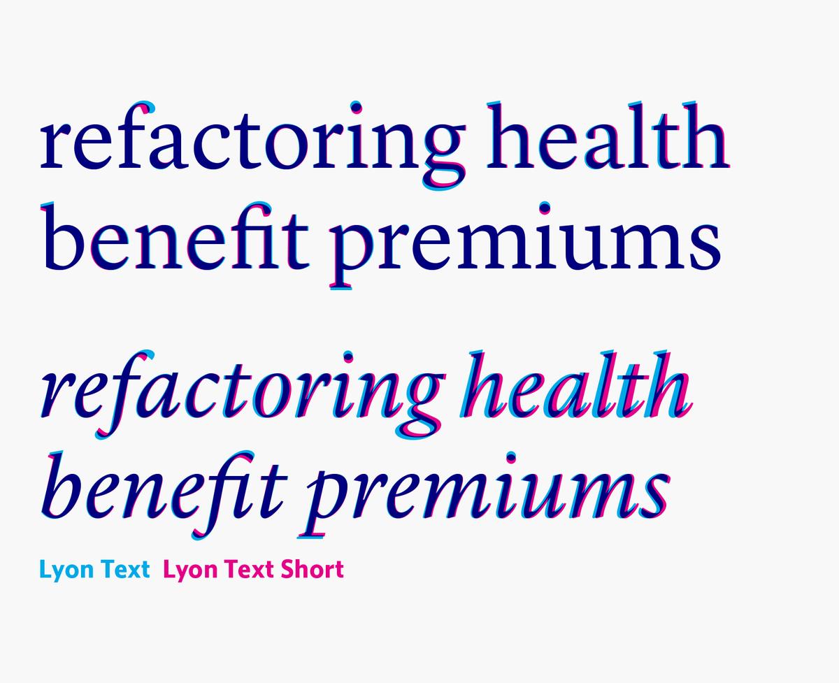
Overlaid, the differences between Lyon Text and Lyon Text Short are clear: abridged extenders and a more upright italic.
McClatchy Sans, Slab, and Serif overlaid
McClatchy Sans, Slab, and Serif overlaid
The Demi weight is shown here in all three families.
McClatchy Sans, Slab, and Serif overlaid
McClatchy Sans, Slab, and Serif overlaid
The Demi weight is shown here in all three families.
McClatchy Sans, Slab, and Serif overlaid
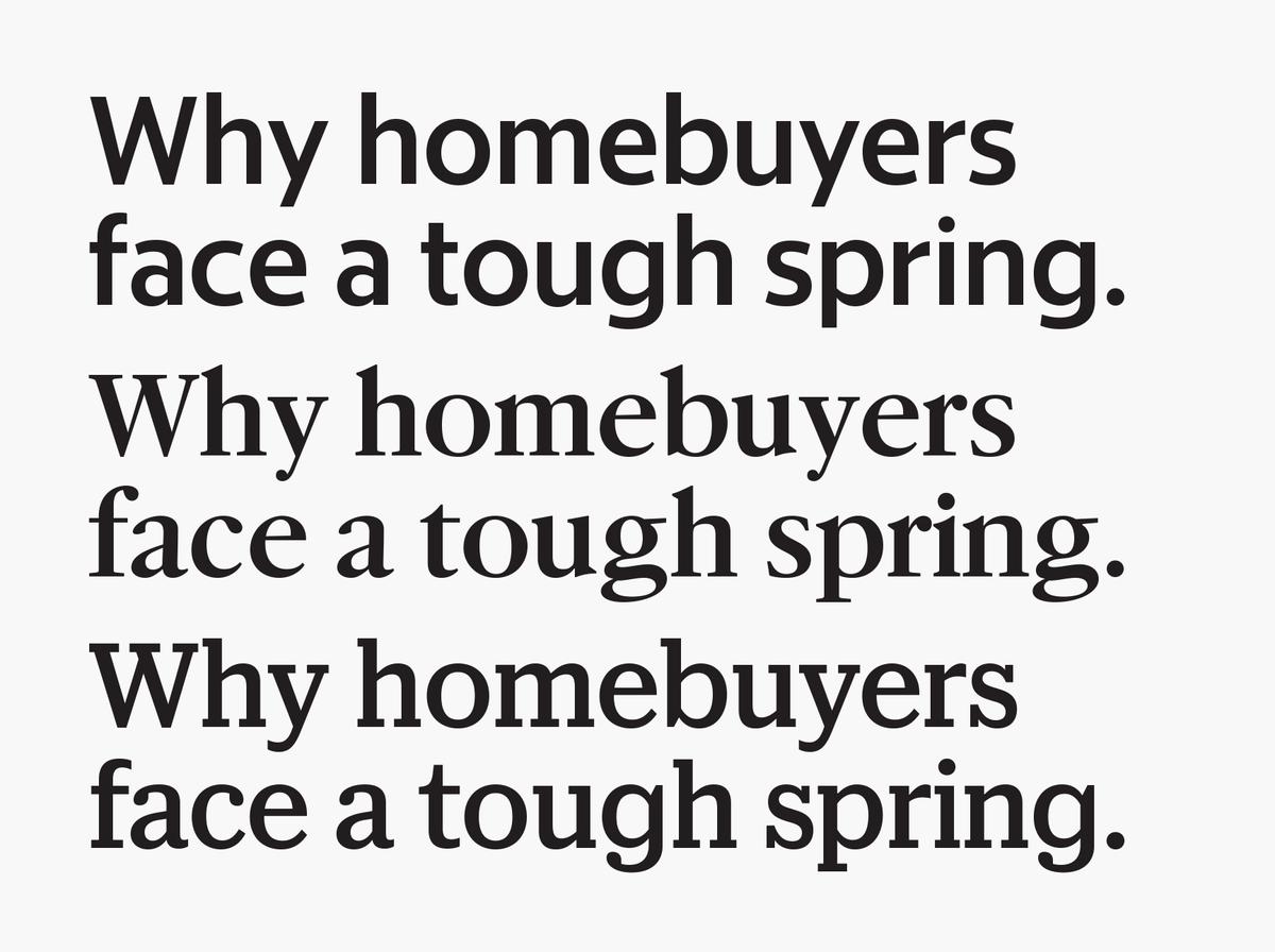
The more visible part of this project is a set of three headline families, all drawn on the same character widths and sharing kerning so that they can be substituted seamlessly for one another without changing copyfit. We have aimed for a friendly, sophisticated, and distinctly American look for the three families. McClatchy Sans was drawn by Christian Schwartz, McClatchy Serif was drawn by Miguel Reyes, and McClatchy Slab was drawn by Greg Gazdowicz. These headline families build on the ideas explored in Berton Hasebe’s Duplex family, designed for Ribergård + Munk's redesign of a family of newspapers in Sweden published by MittMedia. This project matched a serif and a sans on the same widths, but the addition of a third family added exponentially to the complexity. The designers at Garcia Media and a handful of the McClatchy papers tested Duplex but felt it appeared too European. With this in mind, we looked for sources that would feel unambiguously American, landing on a set of typefaces from the Ludlow Type Foundry. Ludlow’s typesetting machines were very popular for setting headline type at newspapers throughout the US in the first half of the twentieth century, before the rise of phototype.
Because these families are designed for differentiation, they needed to look different, while complementing one another when they are used together.
McClatchy Sans
McClatchy Serif
McClatchy Slab
McClatchy Sans Italic
McClatchy Serif Italic
The Sans Condensed is mostly found in info graphics and labels.
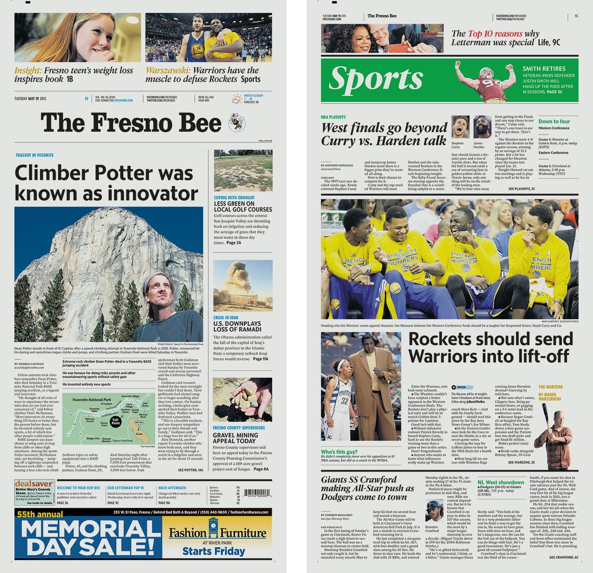
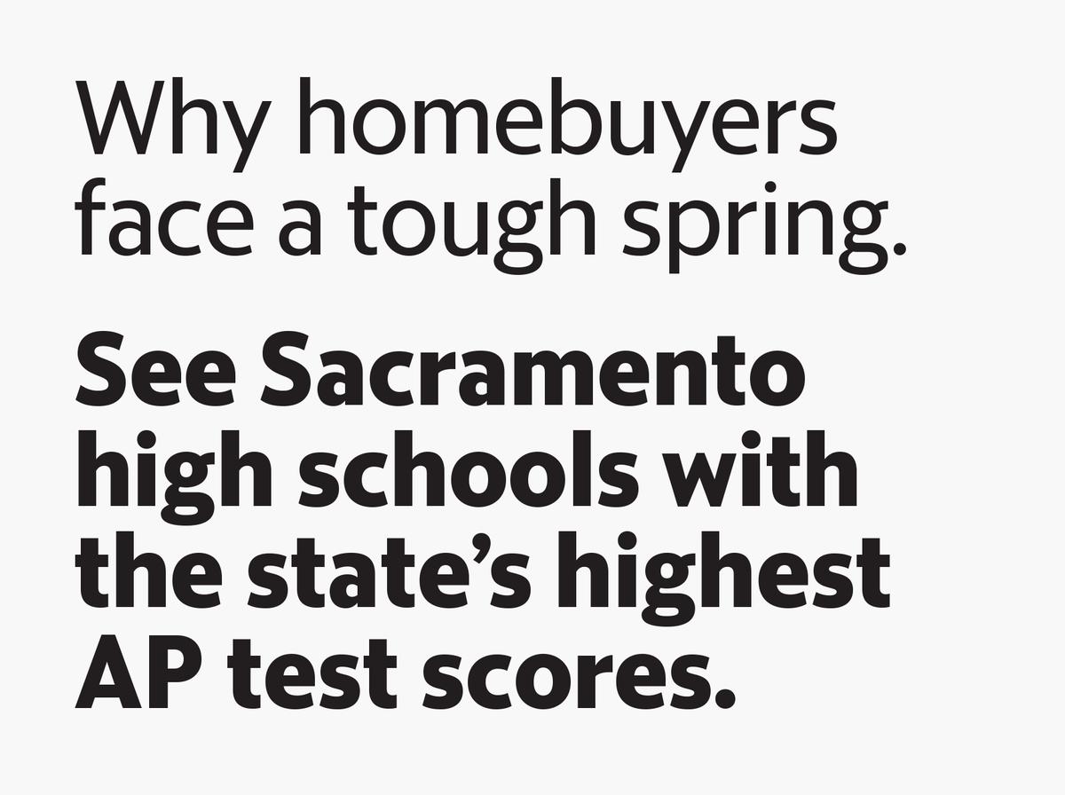
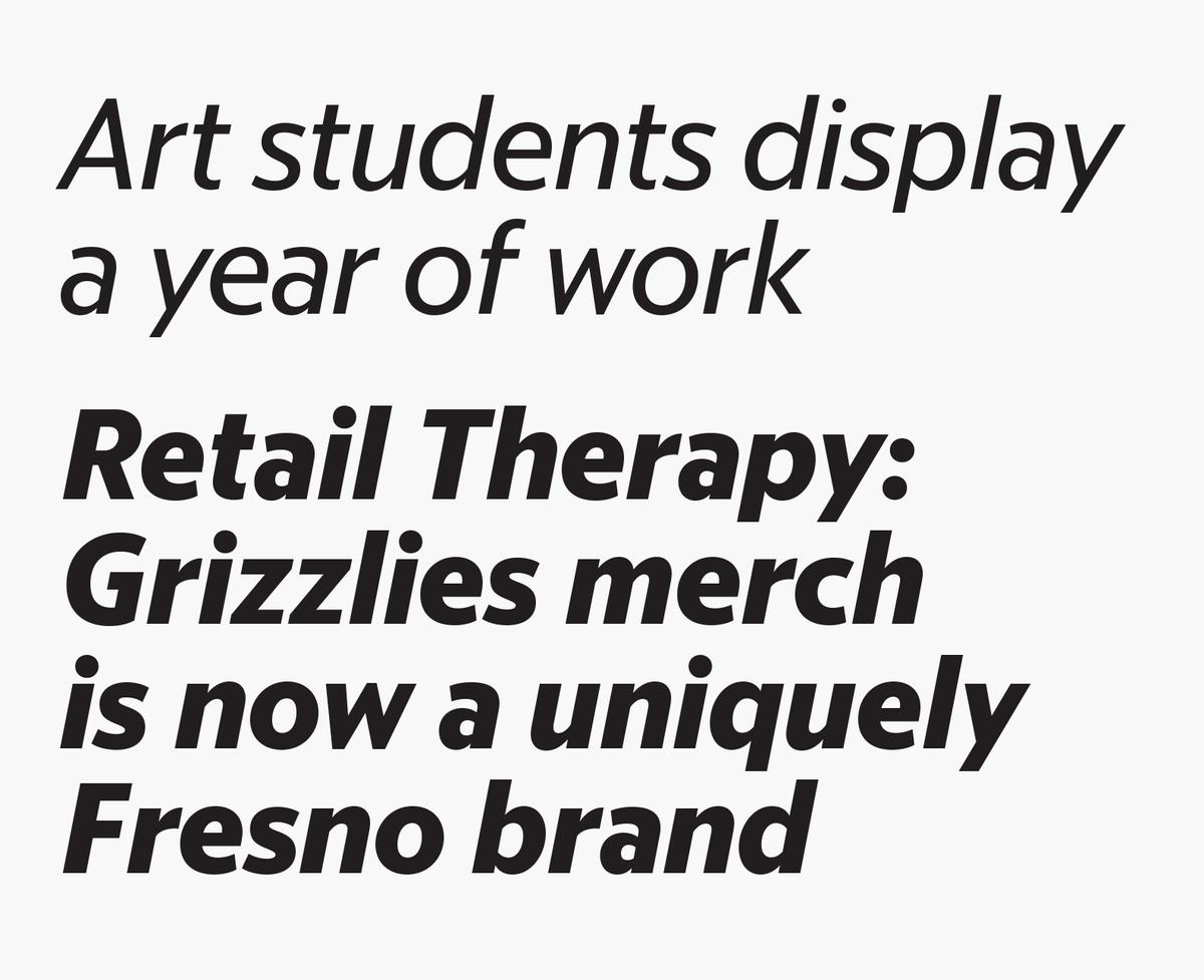
The Fresno Bee uses the Sans as its primary headline face.
The Sans Condensed is mostly found in info graphics and labels.
The Fresno Bee uses the Sans as its primary headline face.
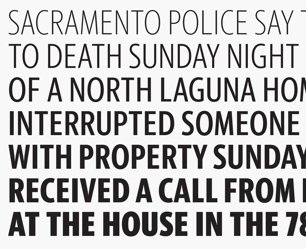
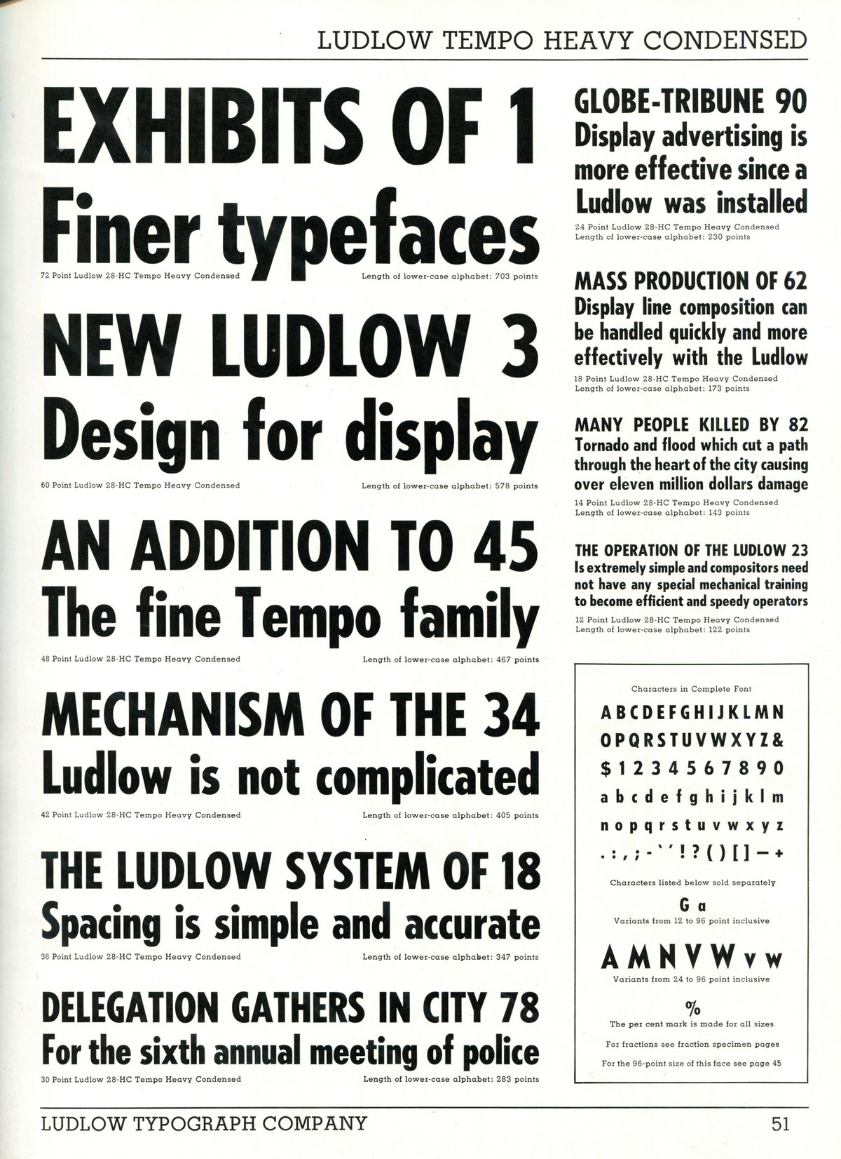
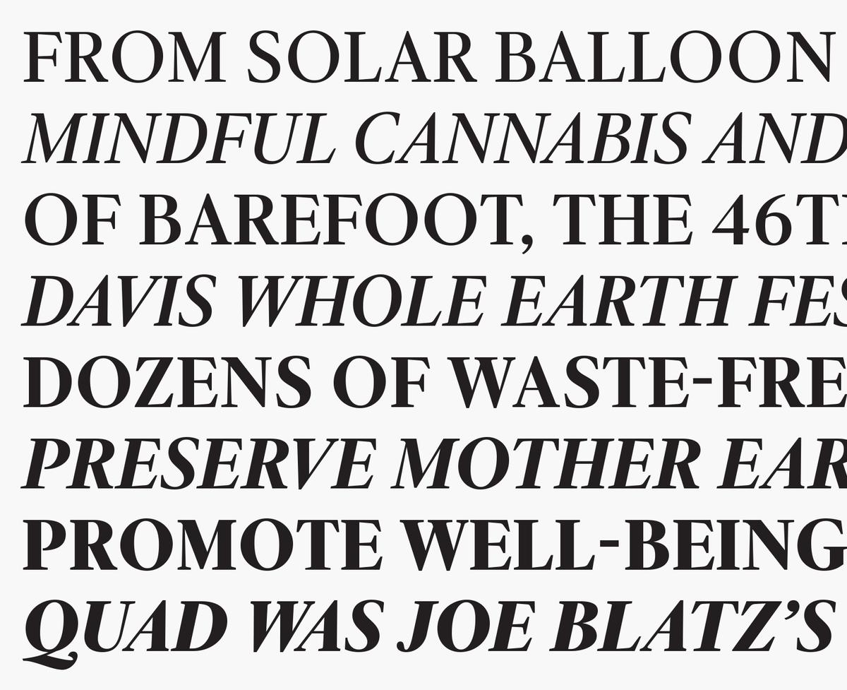
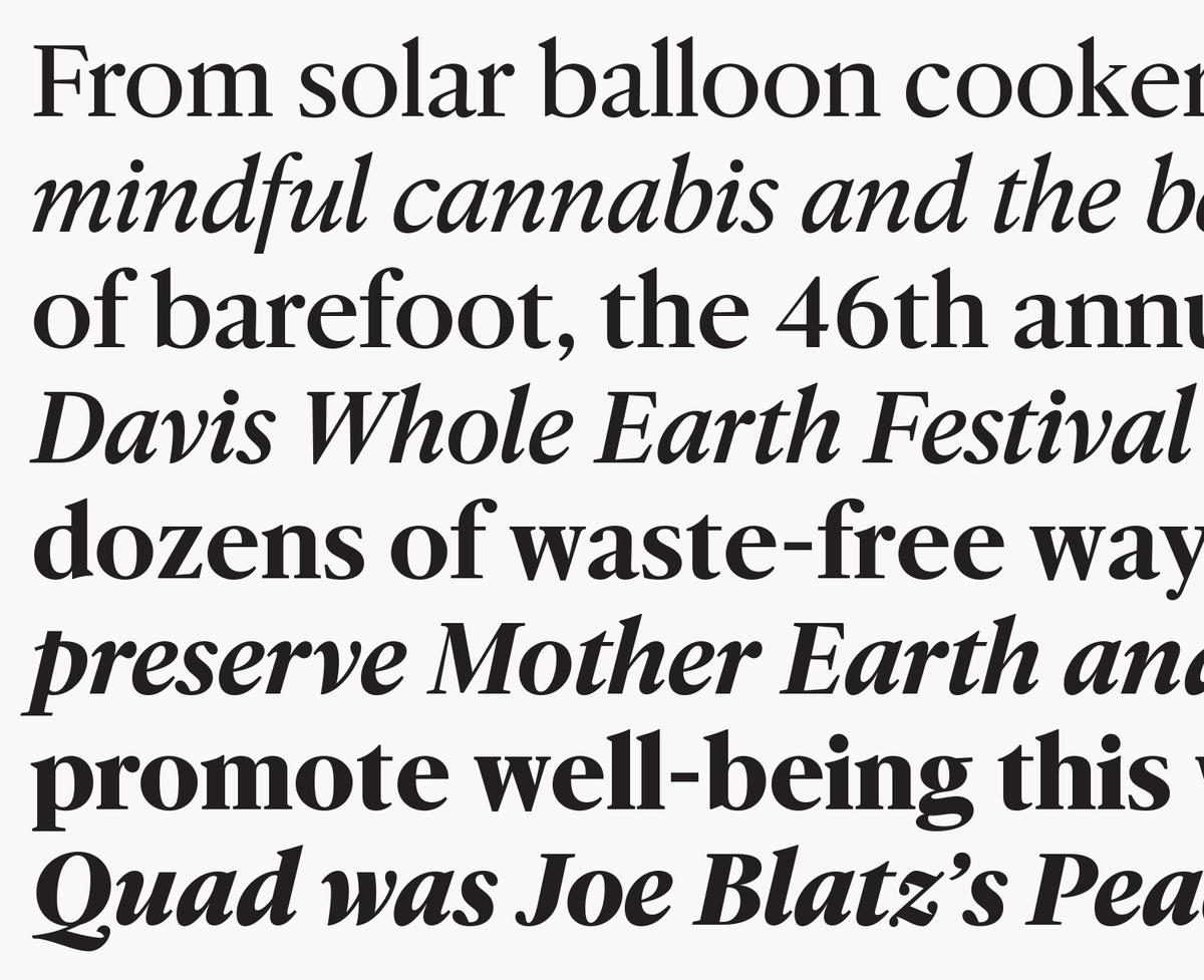
McClatchy Sans takes a number of design cues from Tempo, R. Hunter Middleton’s Americanized take on the geometric sans, which seems to borrow as much from sign painters’ Gothics as it does from Futura. Since many of the papers had been using Font Bureau’s Benton Sans, derived from Franklin Gothic and News Gothic, we felt we had to rule out the American Gothic genre. Angled terminals make the face look warm and approachable, while also adding flexibility in tweaking the character widths to match the other families. McClatchy Sans is the largest of the headline families, with seven weights, duplexed italics (drawn by Greg Gazdowicz), and a full range of Condensed styles that are used for labels and larger headlines. McClatchy Sans also serves as a workhorse beyond headlines, with a looser Text version in use for captions, weather maps, and other secondary applications.
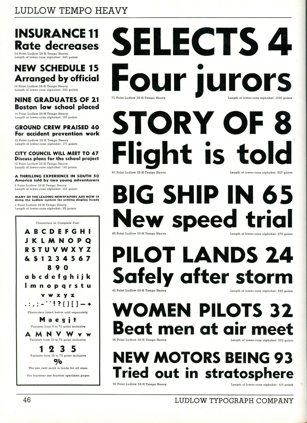
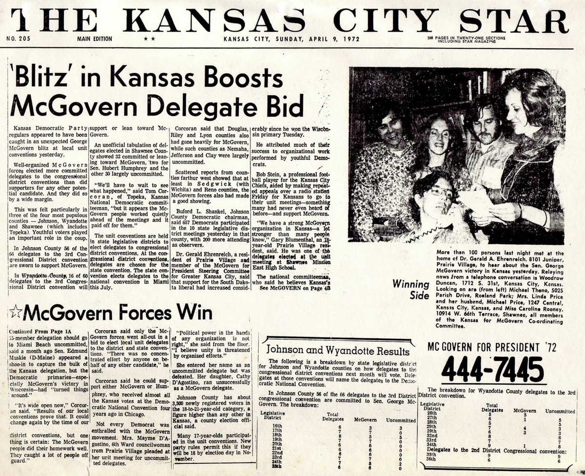
The Kansas City Star, 1972, with headlines in Tempo
Serif italics are also used for section headers in all four papers.
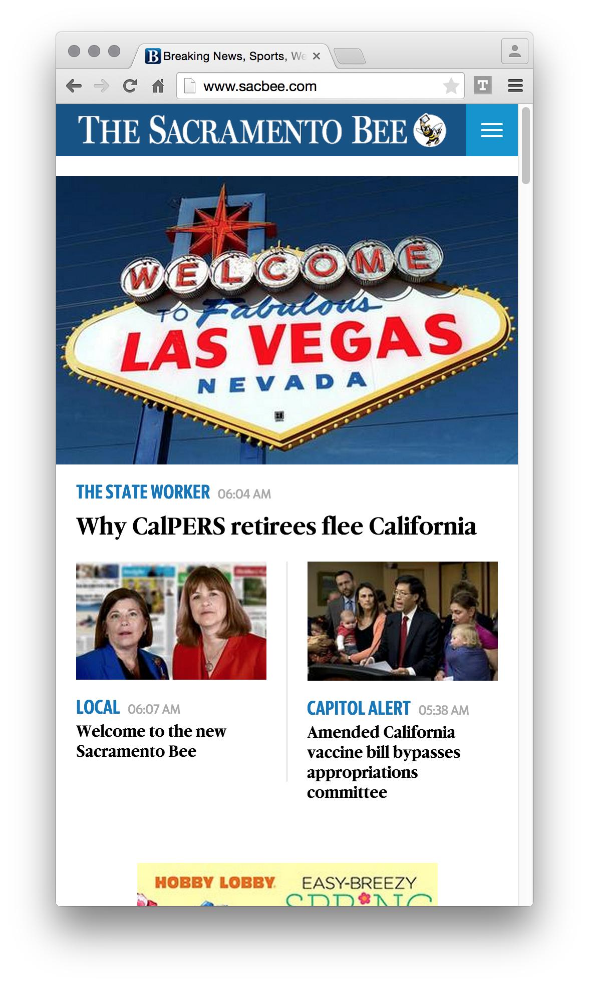
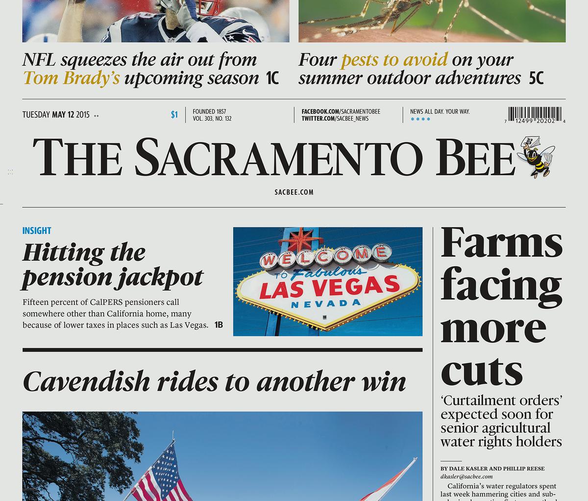
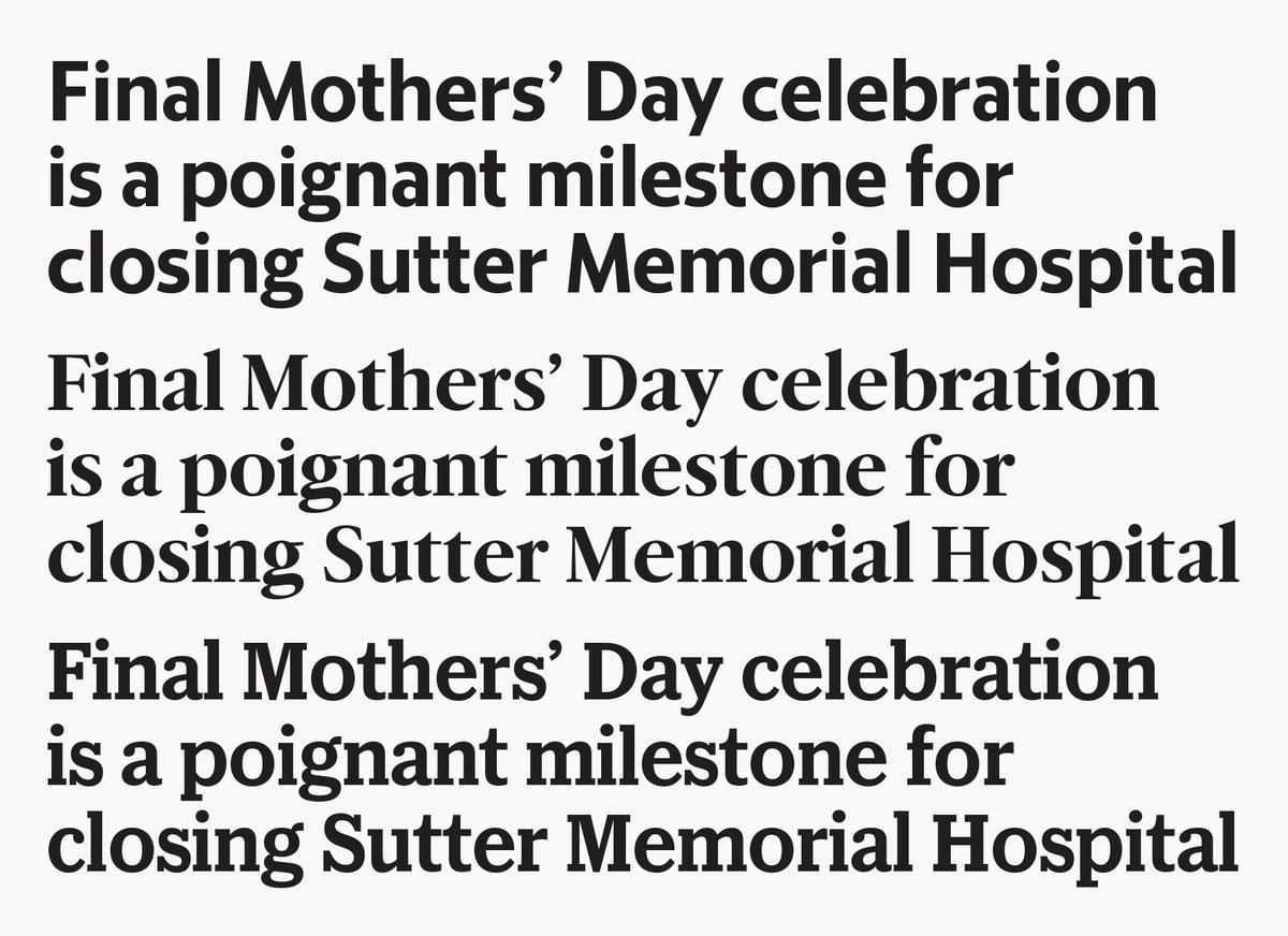
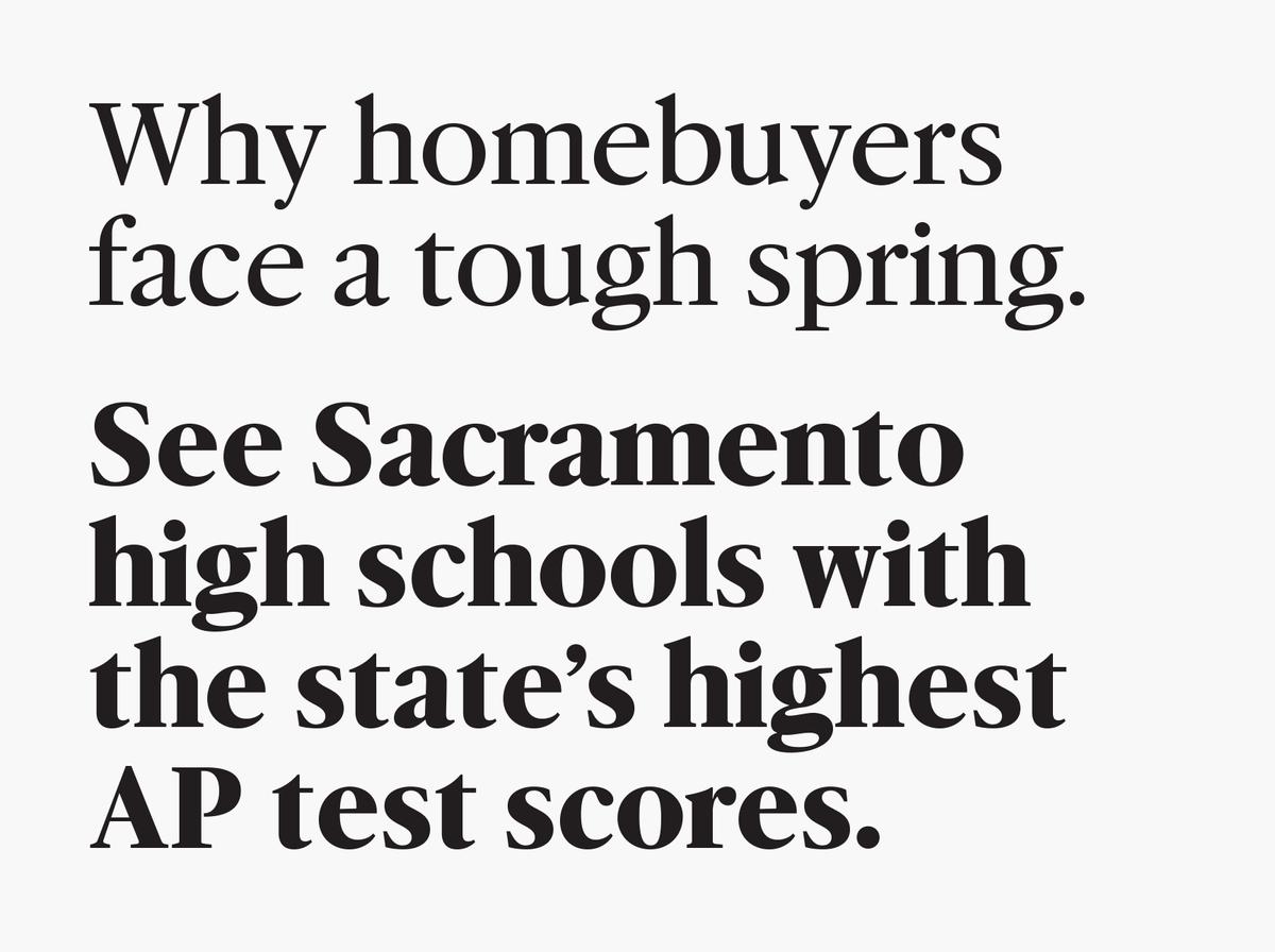
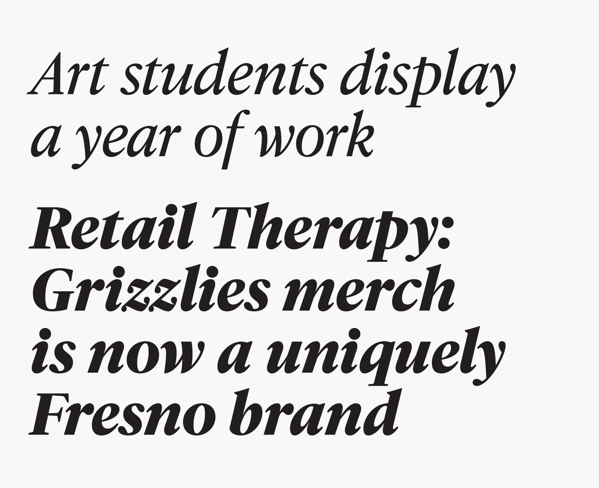
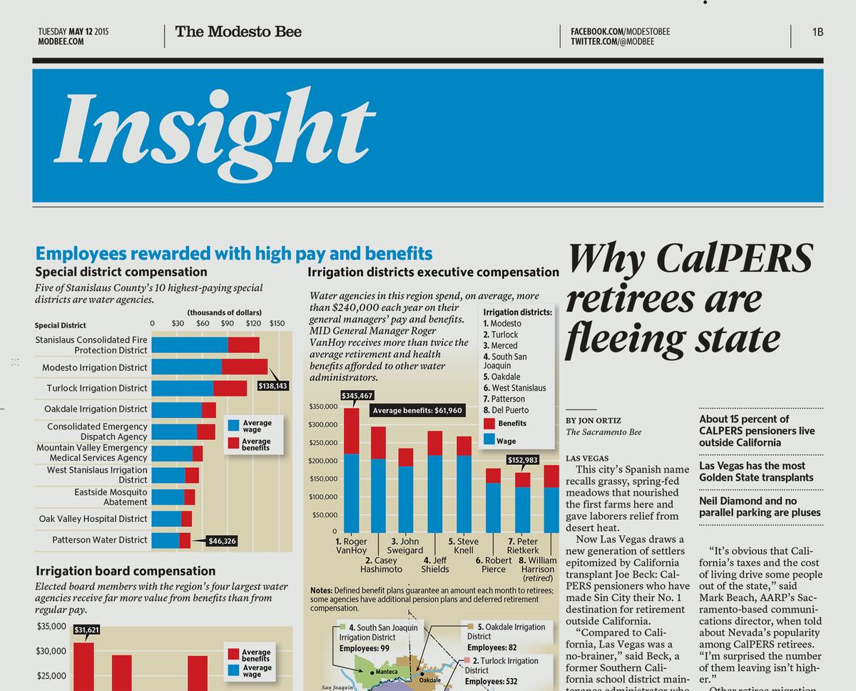
The Sacramento Bee uses the Serif as its primary headline face, with secondary headlines in the Serif italics.
Serif italics are also used for section headers in all four papers.
The Sacramento Bee uses the Serif as its primary headline face, with secondary headlines in the Serif italics.
McClatchy Serif is based on Ludlow Garamond, Middleton’s quirky take on French Renaissance types. We felt that an oldstyle face would be a more distinctive and interesting option than a Modern, which seemed like a more overtly historical choice. Miguel Reyes also looked at Sabon, which has more contemporary proportions and a crisper italic; and the peculiar version of Caslon used by some of McClatchy’s California dailies in the 1980s. McClatchy Serif has four weights, with true cursive italics for all. It is the most visually sophisticated of the three families, with higher contrast and a smaller x-height than the other two, making it feel less compact.
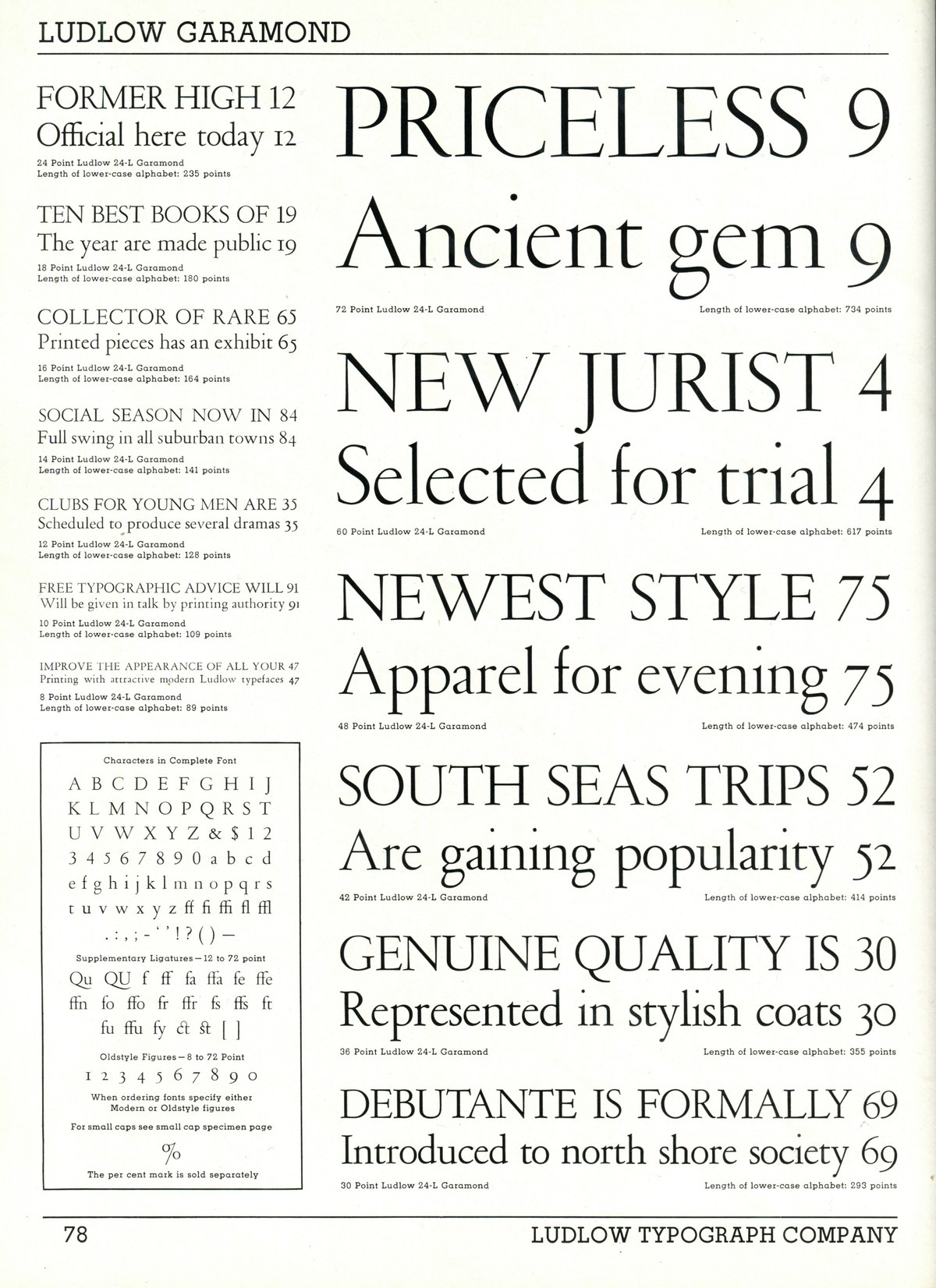
Ludlow Garamond by R. Hunter Middleton, 1930s
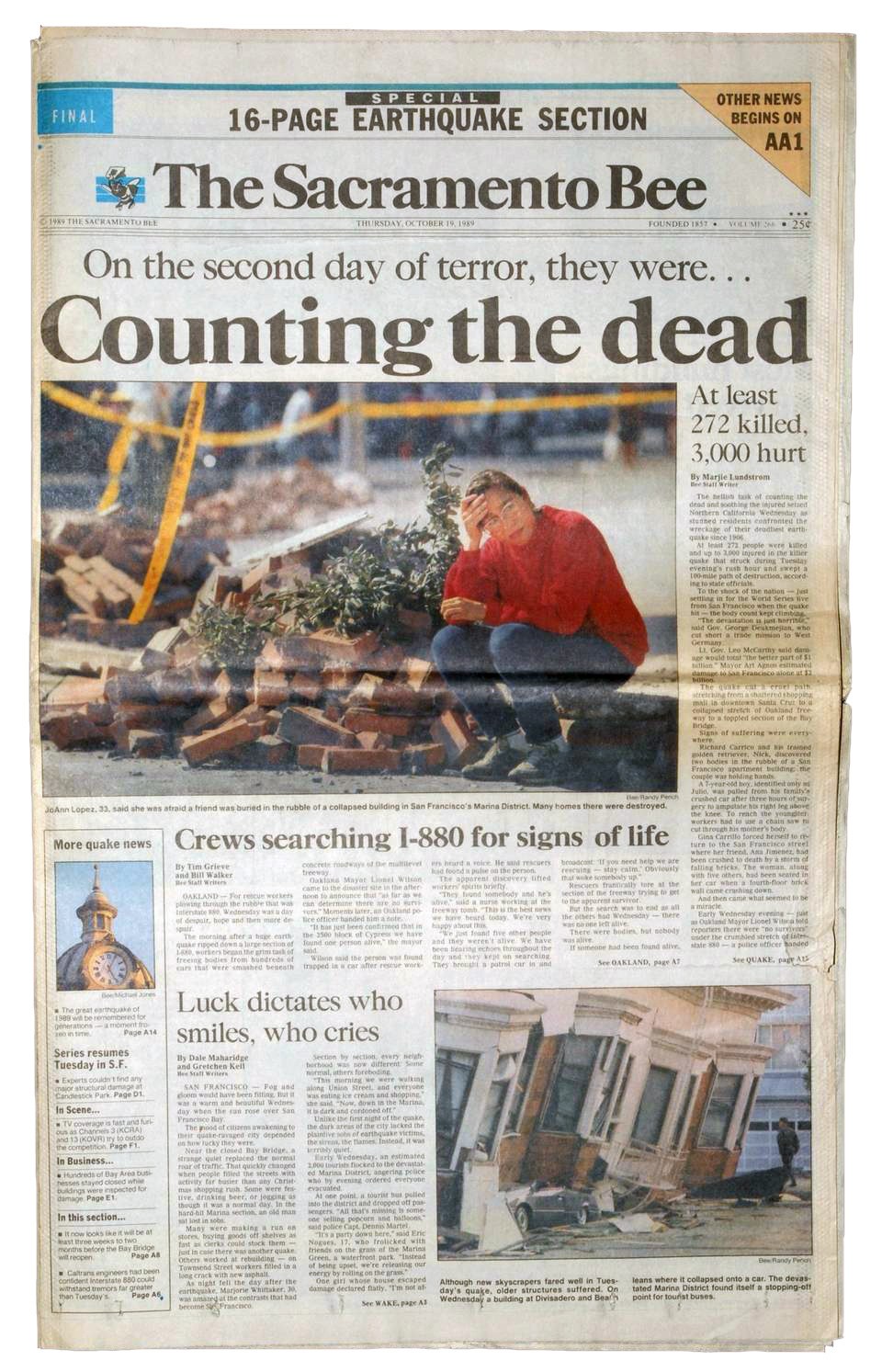
Sacramento Bee front page with headlines in a strange large x-height version of Caslon, 1989.
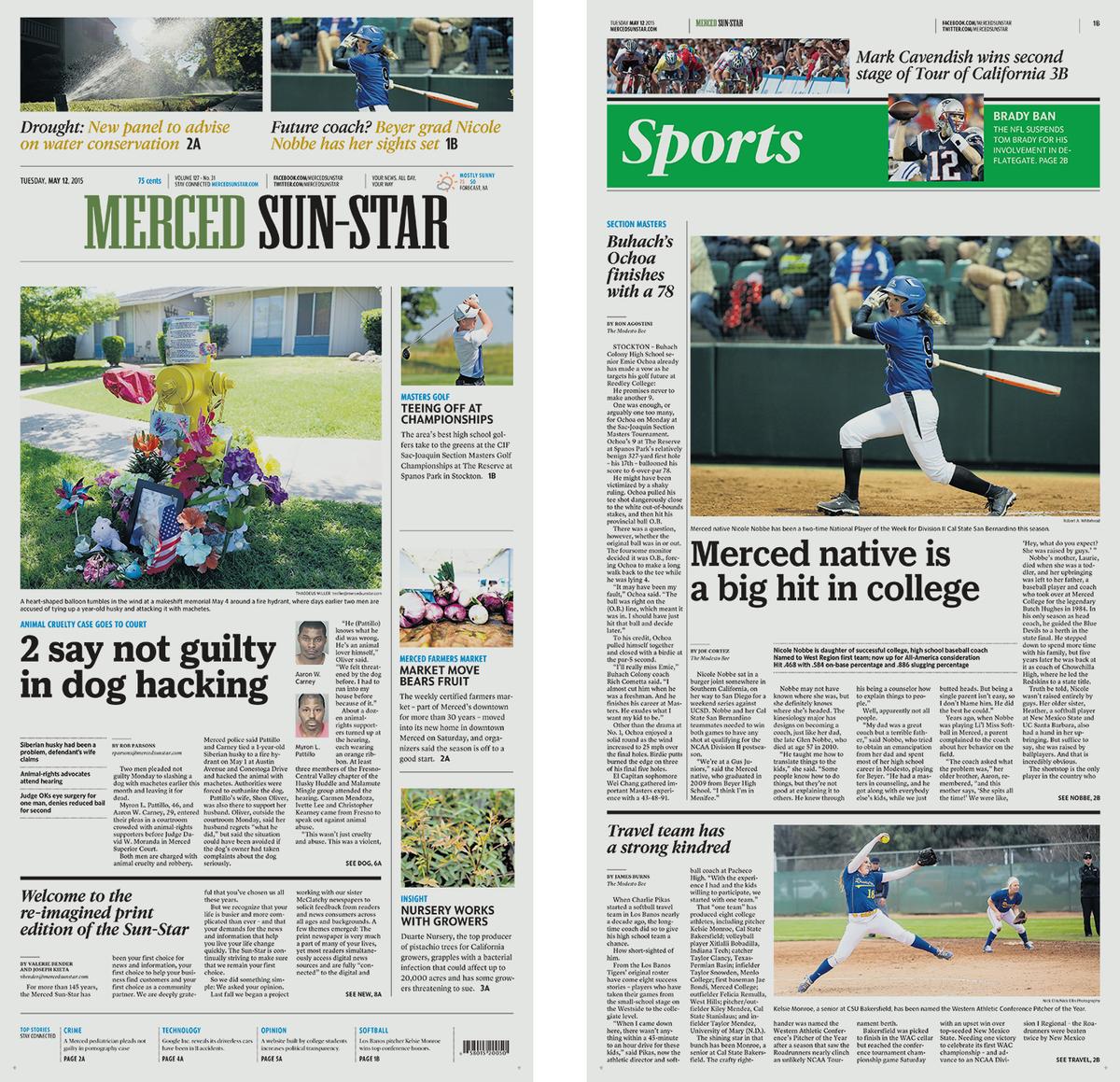
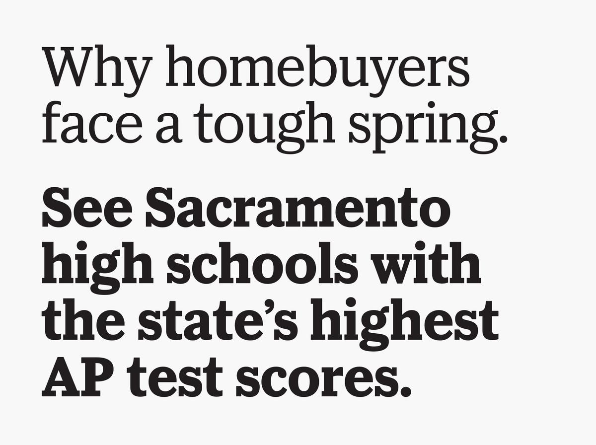
McClatchy Slab is the primary headline face in Merced.
McClatchy Slab is the primary headline face in Merced.
McClatchy Slab started out as a loose interpretation of Ludlow Bookman, the primary headline face in the New York Times throughout most of the twentieth century, until the 2005 refresh that replaced it with Matthew Carter's extensive Cheltenham family. However, the character widths of the other two families forced the serifs to become shorter and shorter until McClatchy Slab ended up looking more like a slab serif interpretation of Cheltenham, in the process taking on elements from Ludlow Cushing Antique. This family is a bit friendlier than the other two, but the crisp detailing on the serifs keeps it newsy and energetic.
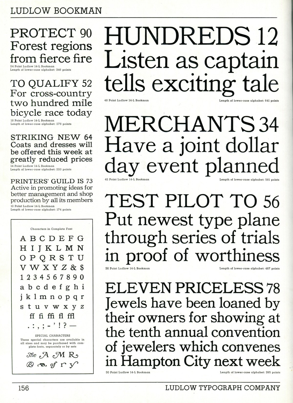
Ludlow Bookman by R. Hunter Middleton, 1920s
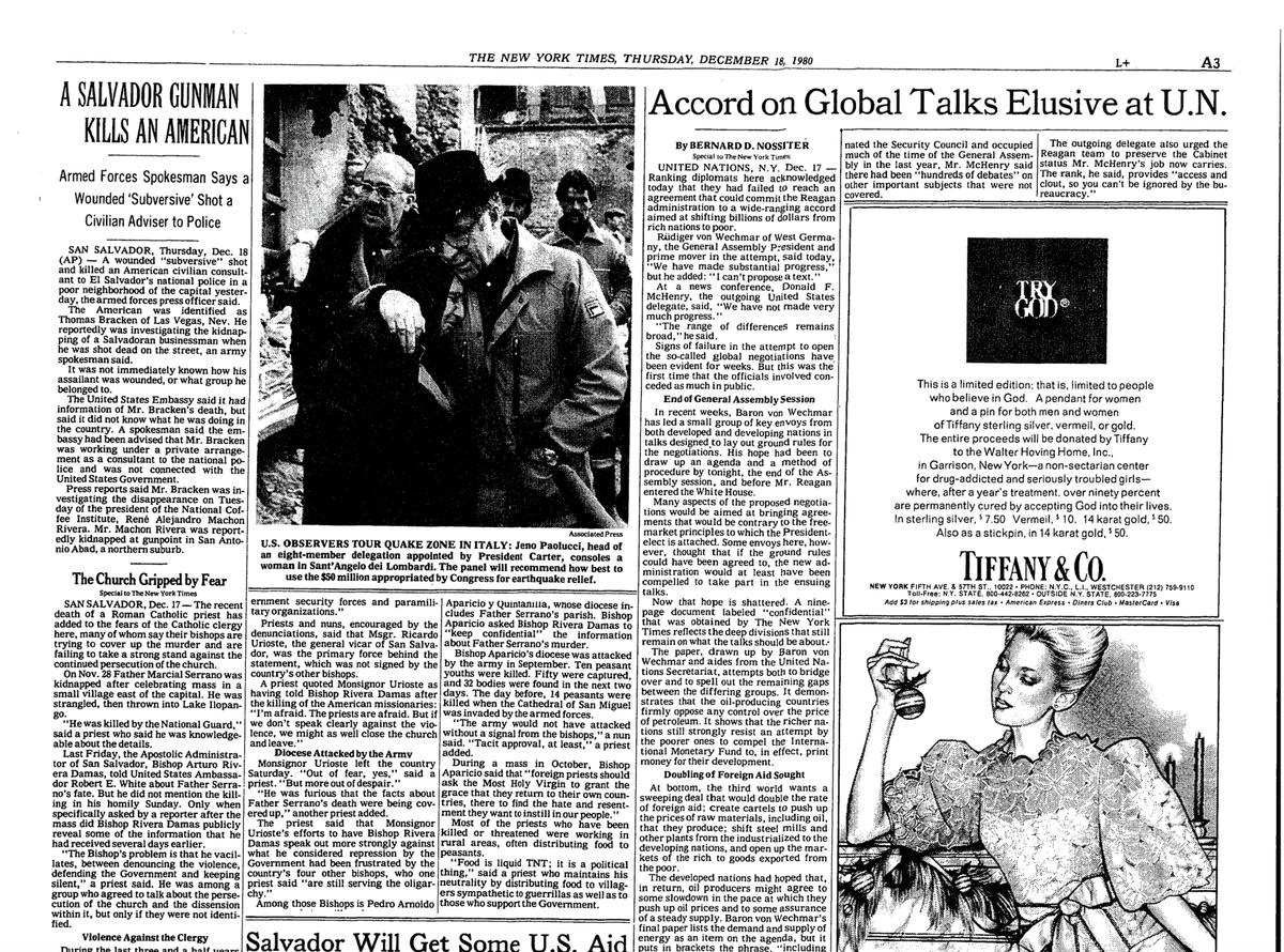
The New York Times, headlines in Bookman and Cheltenham Condensed, 1980
Ludlow Cushing Antique by R. Hunter Middleton, 1920s

A small number of alternates, such as a single-story g (which looked far too silly to include in the Serif), allow for further flexibility and differentiation.
The design process for these three families was far from straightforward. Schwartz drafted the Sans first, so Reyes and Gazdowicz would have widths to work with, but it was important not to think of any one of the three families as the “primary” typeface. As work on the three families progressed, the designers would periodically sit down together to discuss which characters they were having the hardest time fitting onto the widths and where the compromises were most visible, then negotiate changes.
Reibstein and García describe their approach to using these three families as follows:
In practice, each newspaper will select a type palette emphasizing certain of the headline faces across platforms. In print, there are four options for the primary and secondary headlines: #1, Serif and Sans; #2, Slab and Sans; #3, Sans and Serif; and #4, Sans and Slab. At launch on the web, papers using the Serif will have the Serif as their primary headline face, while those using the Slab will have that as their primary face... Palette #1, emphasizing the Serif, is the most elegant and conservative. #2 is more approachable but still serious. #3 and #4 are the boldest and most newsy.
The McClatchy family is available in the Commercial Type Vault.