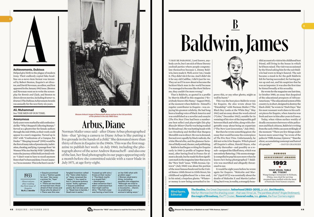
Stag, Granger, and Gingrich for Esquire
During his tenure at Esquire between 2005 and 2016, Creative director David Curcurito had a restless appetite for new typefaces. Over the years he commissioned a number of project: first Stag, which grew from a small family of slab serifs to include a sans, a rounded sans, and a stencil; then Granger (released as Algebra); and finally Gingrich, for the magazine’s 1000th issue.
2005–2011: Stag, Stag Sans, Stag Stencil, and Stag Sans Round

Stag Sans Round debuted in September 2009. Creative director David Curcurito, art director Darhil Crooks.
September 2009 feature spread. Creative director David Curcurito, art director Darhil Crooks.
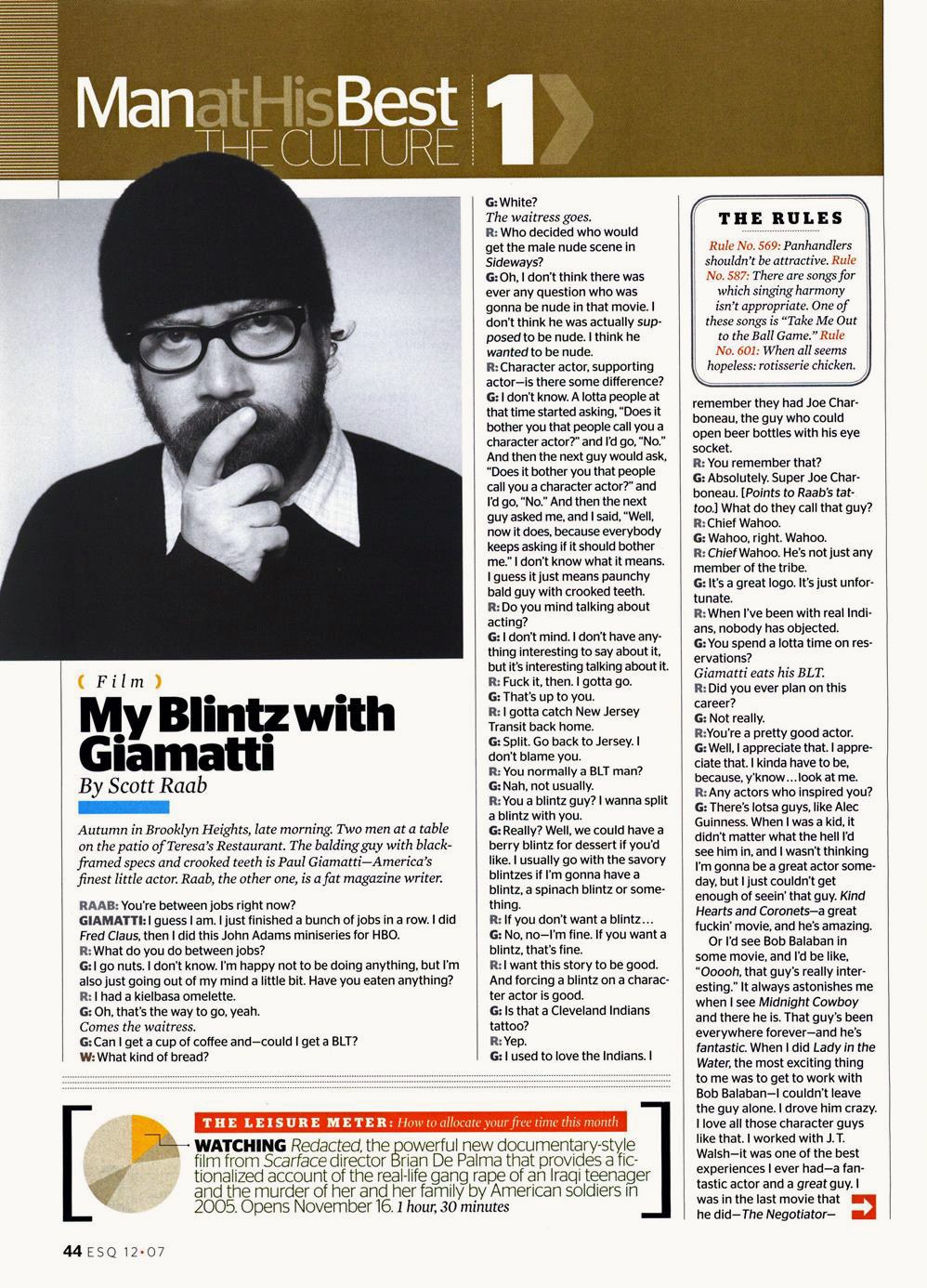
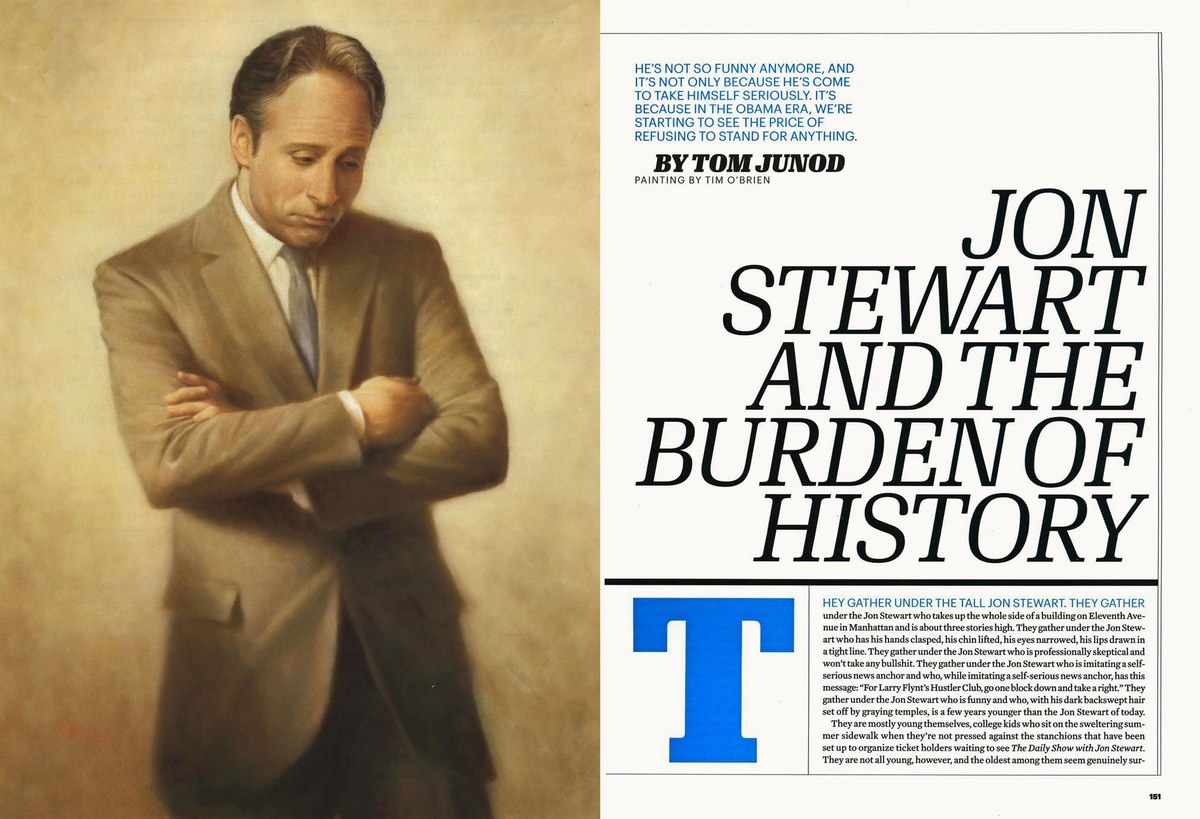
Stag debuted in the Setember 2005 issue. The first thing I noticed was the slightly misaligned terminals on e and s, which I fixed in time for the next issue.
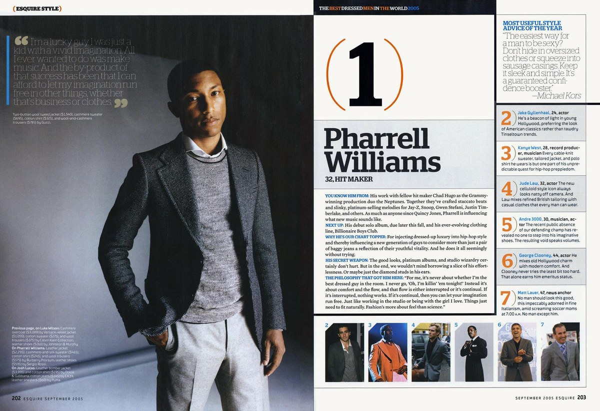
September 2005 fashion soread. Creative director David Curcurito, art director Darhil Crooks. The basic weight range from Thin to Black was in place from the first issue, though Italics hadn’t been drawn yet.
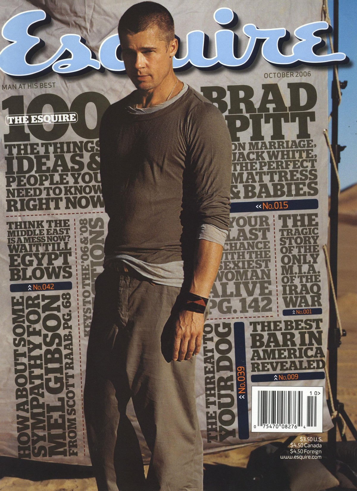
October 2006 cover. Creative director David Curcurito, art director Darhil Crooks.
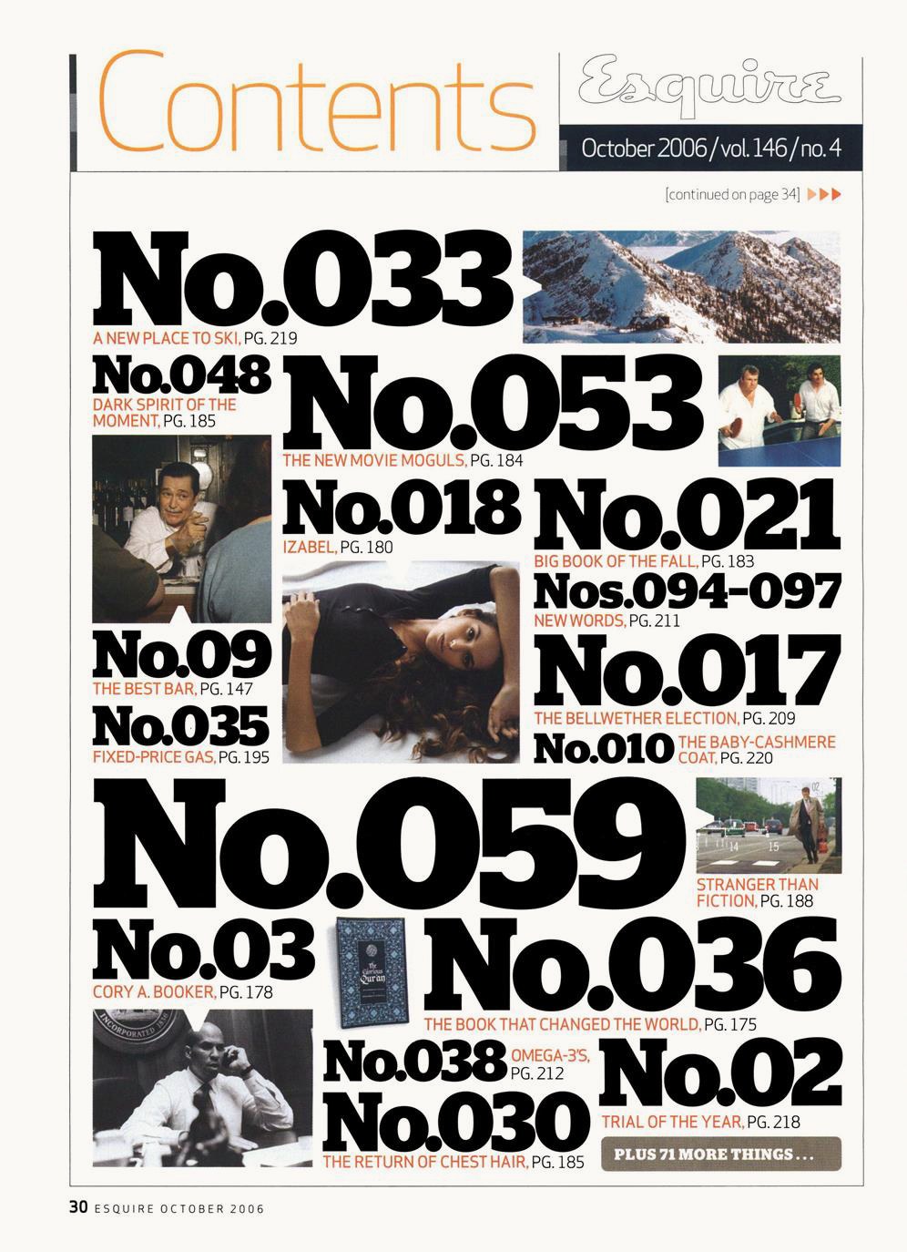
October 2006 table of contents. Creative director David Curcurito, art director Darhil Crooks. For a while the table of contents became a playground for the new typefaces.
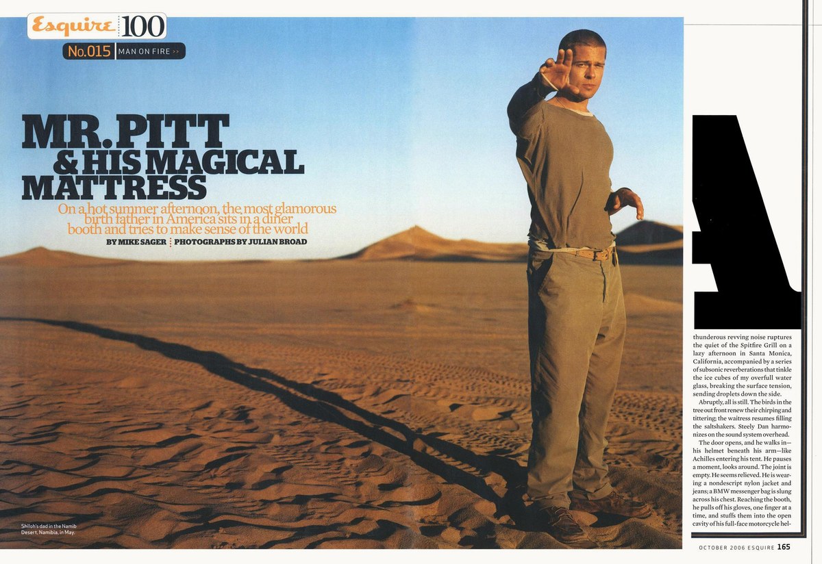
October 2006 feature spread. Creative director David Curcurito, art director Darhil Crooks.
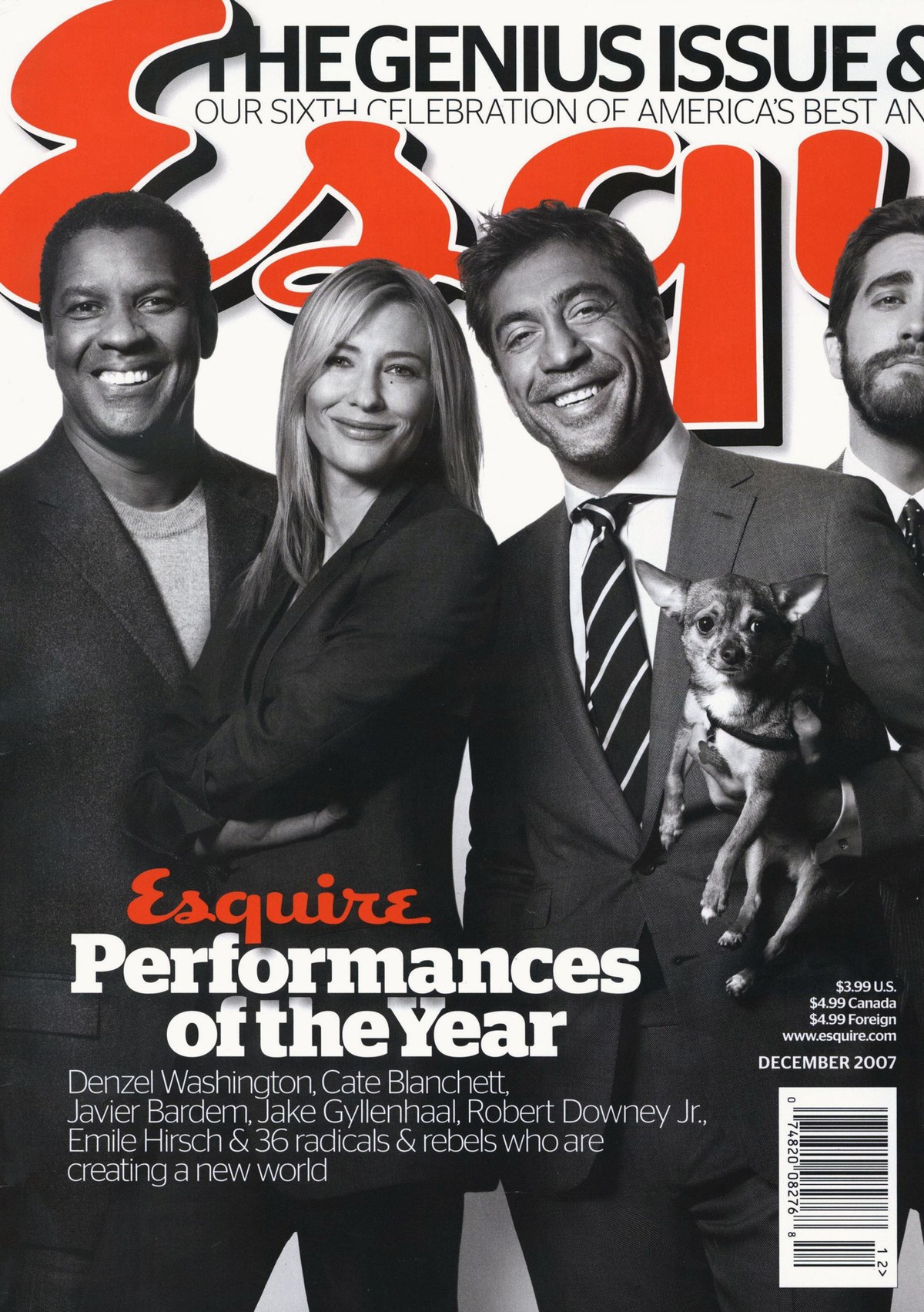
Stag Sans debuted in December 2007. Creative director David Curcurito, art director Darhil Crooks.
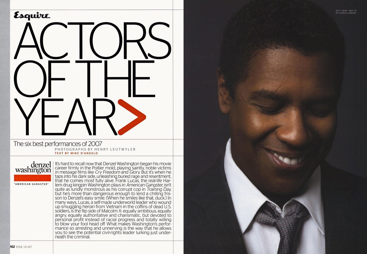
December 2007 feature spread. Creative director David Curcurito, art director Darhil Crooks.
December 2007 front of book page. Creative director David Curcurito, art director Darhil Crooks.
Stag Stencil on the March 2009 cover. Creative director David Curcurito, art director Darhil Crooks.
March 2009 style section page. Creative director David Curcurito, art director Darhil Crooks.
Stag Sans Round debuted in September 2009. Creative director David Curcurito, art director Darhil Crooks.
September 2009 feature spread. Creative director David Curcurito, art director Darhil Crooks.
Stag debuted in the Setember 2005 issue. The first thing I noticed was the slightly misaligned terminals on e and s, which I fixed in time for the next issue.
September 2005 fashion soread. Creative director David Curcurito, art director Darhil Crooks. The basic weight range from Thin to Black was in place from the first issue, though Italics hadn’t been drawn yet.
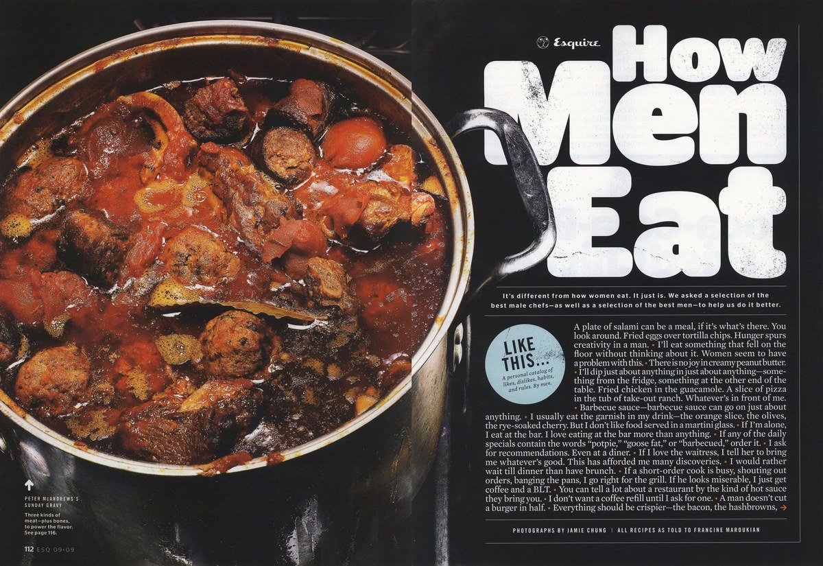
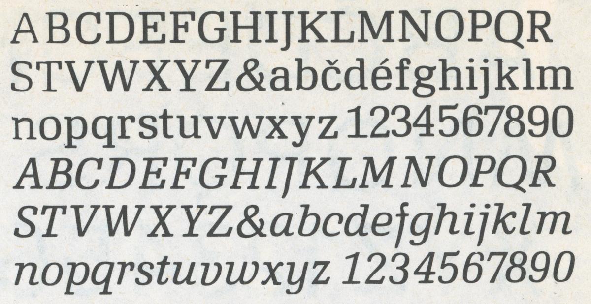
Early in 2005, while finishing the last remaining work on the typefaces for the Guardian, art director Darhil Crooks got in touch. He and Curcurito had just started at Esquire and were interested in commissioning a new slab serif, in a handful of heavy weights from Medium to Black. The magazine had commissioned Esquire Display and Text (later released as Mercury) under former creative director Robert Priest, using it with by Crank 8 by Greg Lindy and Henk Elenga. Neither of these had the heft that Curcurito and Crooks were looking for—the ability to flood a page with ink and let a single word have a huge presence. To add visual interest, I added bracketing on outer serifs, while leaving sharp corners where inner serifs connected to the stems to have make the lengths easier to vary. Notches are softened, to keep the forms from looking too severe. Terminals are blunt and chunky, to maximize weight while keeping the forms simple: no pointiness, no rounding.
Once these decisions were approved, they asked to expand the weight range to include a Thin, which could be useful for fashion stories. The typeface seemed to lose too much of its personality when the bracketing and blunt terminals were removed, so I exaggerated them instead, allowing the unusual effect they had on the texture to become a salient feature of the typeface.
A working beta version of Stag (its name taken from the list of potential titles founding editor Arnold Gingrich had proposed for the magazine) debuted in the September 2005 issue. Seeing how it worked in layouts was invaluable for making final refinements to the typeface—especially learning that the Medium would be used far more frequently than the other weights.
Crank 8 was soon replaced by Chester’s Apex New, which worked well alongside Mercury, but its smaller x-height and narrower proportion made it difficult to mix with Stag at similar sizes, so Curcurito and Crooks got in touch about a new sans serif. Paul proposed that I cut the serifs off of Stag, and they were thrilled with the result, so Stag Sans was added to the typographic palette at the end of 2007. I retained many of the quirks of the slab, with the blunted terminals and soft corners on ascenders and notches enhancing the family’s readability at text sizes, and later on screen. I had inadvertently landed on some of the same tricks Matthew Carter used to make Bell Centennial and Verdana so legible.
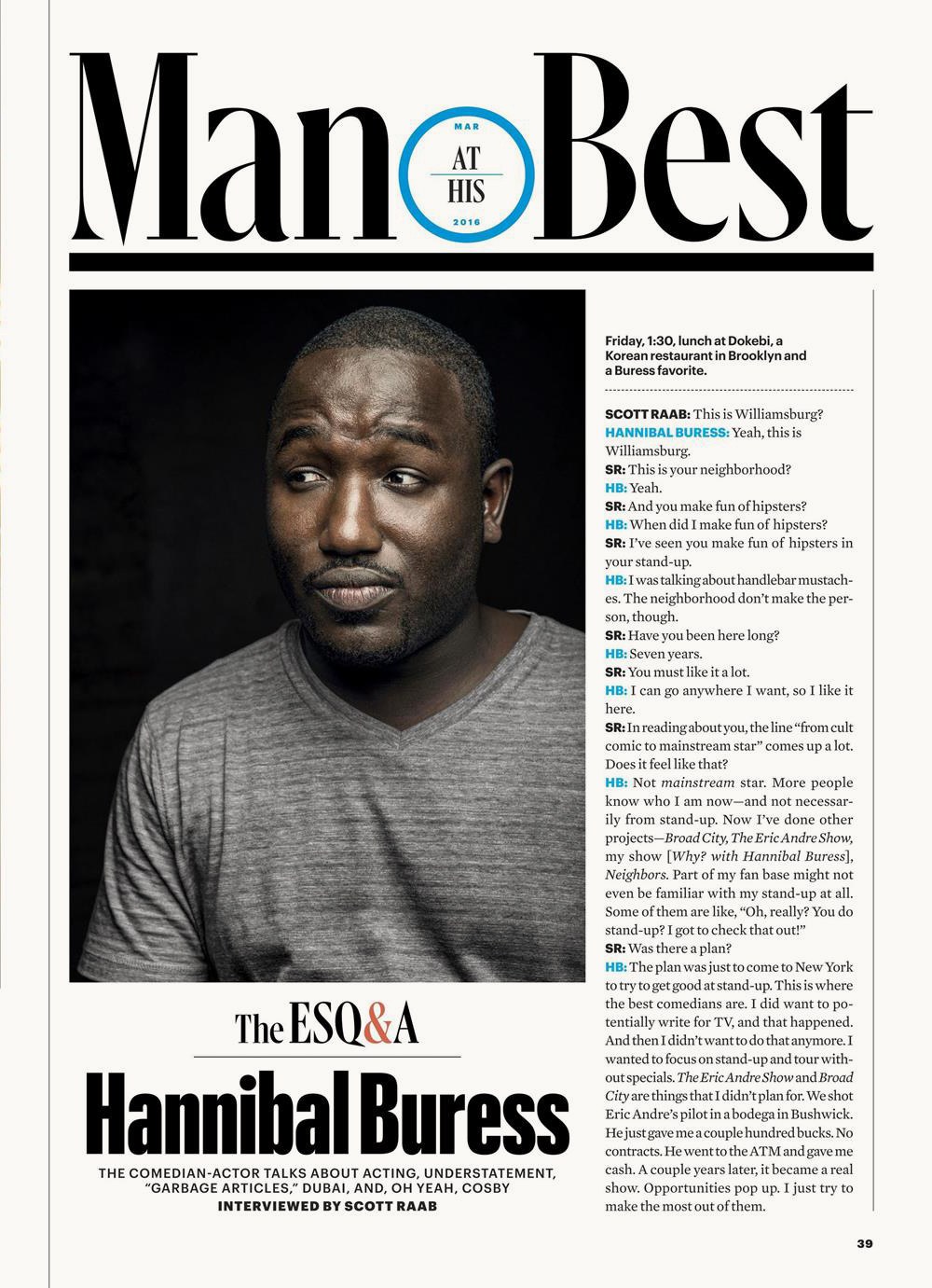
Special-effect versions soon joined the mix. Stag was transformed into a stencil by Berton Hasebe, to give the front of book style section a stronger identity of its own, and Stag Sans Round, drawn by Ross Milne, was added to make the Man at His Best section feel a little softer and more conversational.

Stag Black

Stag Thin

Stag Medium, Stag Sans Medium

Bell Centennial Address and Sub-Caption. Matthew Carter, 1978
2011: Granger
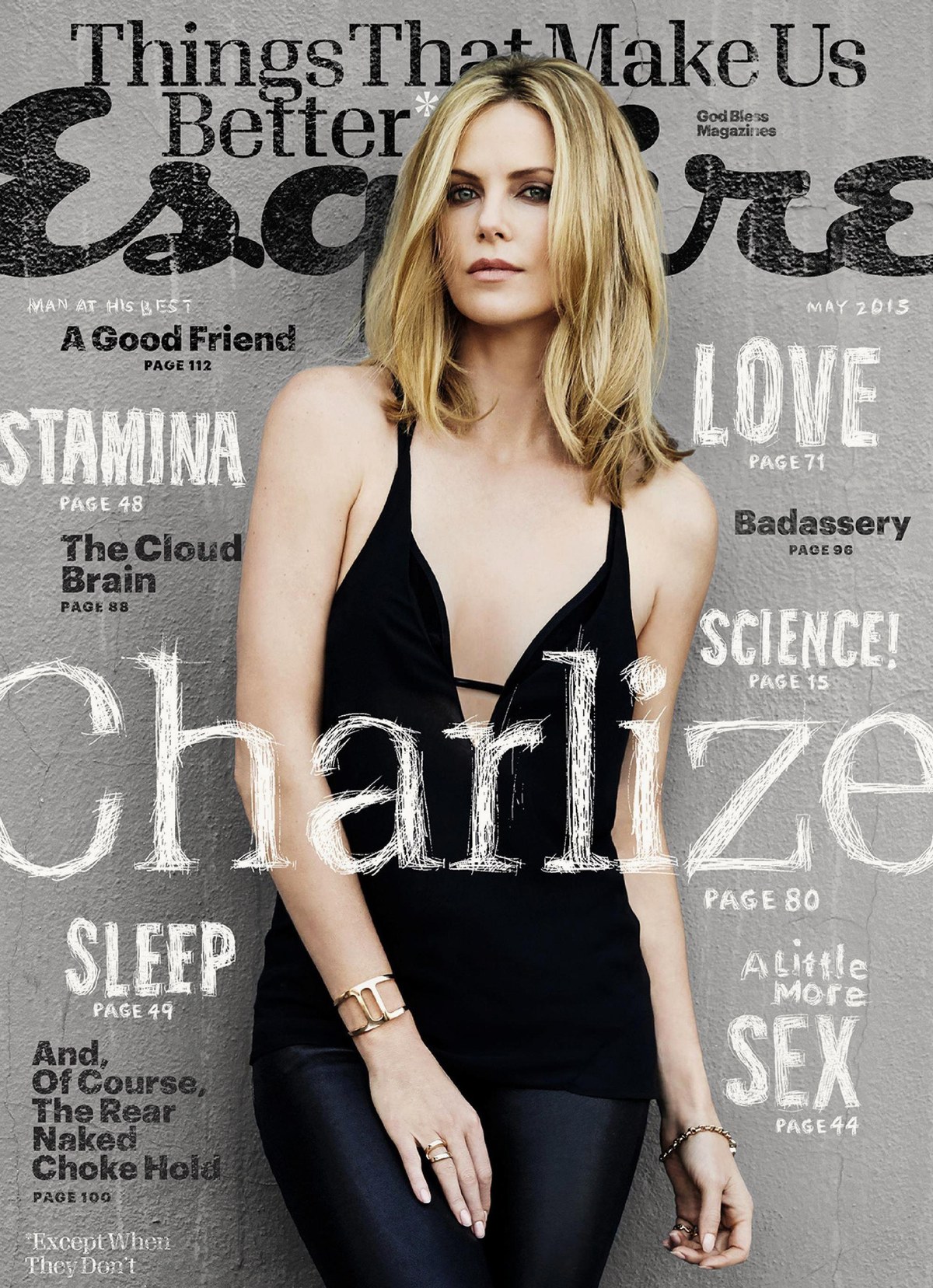
May 2015 cover. Creative director David Curcurito, art director Stravinski Pierre.
May 2015 cover. Creative director David Curcurito, art director Stravinski Pierre.
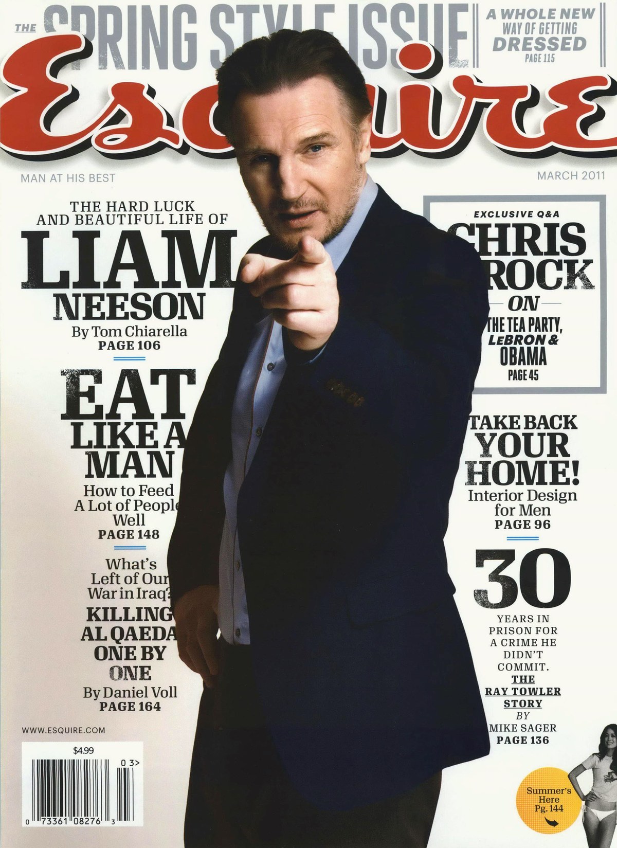
March 2011 cover. Creative director David Curcurito, art director Darhil Crooks.
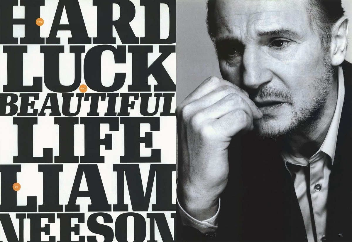
March 2011 feature spread. Creative director David Curcurito, art director Darhil Crooks.
March 2011 front of book page. Creative director David Curcurito, art director Darhil Crooks.
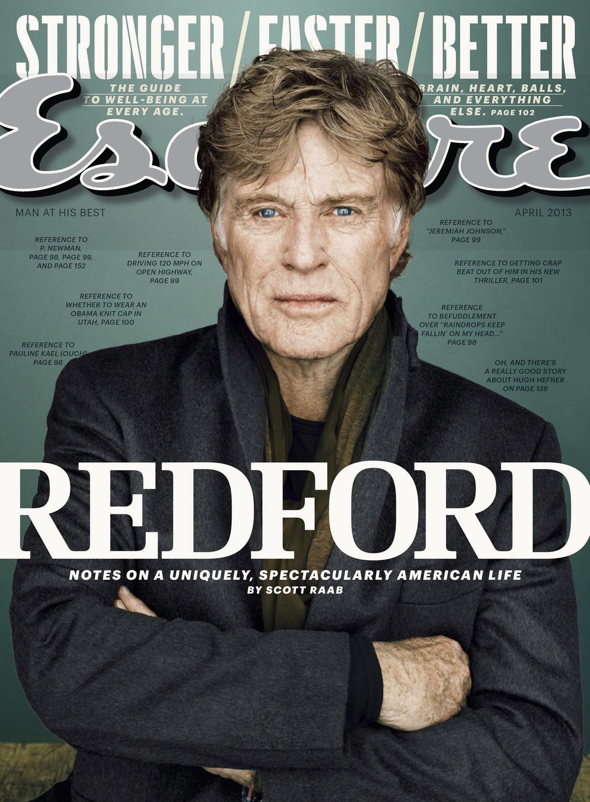
April 2013 cover. Creative director David Curcurito, art director Stravinski Pierre.
April 2013 cover. Creative director David Curcurito, art director Stravinski Pierre.
October 2011 cover. Creative director David Curcurito, art director Stravinski Pierre.
October 2011 cover. Creative director David Curcurito, art director Stravinski Pierre.
May 2015 cover. Creative director David Curcurito, art director Stravinski Pierre.
May 2015 cover. Creative director David Curcurito, art director Stravinski Pierre.
March 2011 cover. Creative director David Curcurito, art director Darhil Crooks.
March 2011 feature spread. Creative director David Curcurito, art director Darhil Crooks.
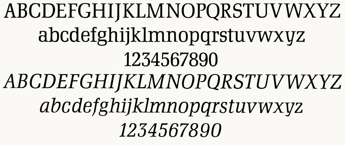
After 5 years with Stag, Curcurito and Crooks were ready for a change. In additon to adding two new sections and replacing Stag Sans with Graphik, including its many condensed widths, they also commissioned a new serif display face called Granger, designed by Kai Bernau and Susana Carvalho of Atelier Carvalho Bernau.
The immense influence of Mad Men had touched all parts of American visual culture, reigniting interest in all things midcentury modernist. Curcurito and Crooks wanted a serif display face that could replace both Stag and Mercury—enough contrast to be elegant, and enough heft to be powerful. Kai and I had been talking about our shared admiration for Hermann Zapf’s Melior and other squarish serif typefaces that also came from the time and general place, like Stanislav Maršo’s Public and Johann Schweitzer’s Dominante, released in Germany and Czechoslovakia in the 1950s, all sharing superelliptical round forms and medium contrast, enough to feel elegant without going into Walbaum territory. Granger, named for editor in chief David Granger, first appeared in the magazine in early 2011, and was soon joined by a higher contrast display variant. Granger had soft terminals to balance the crisp slabs, resembling the 1950s typefaces the designers had referenced. When the family was eventually reworked and released as Algebra, these soft terminals were blunted off, giving the crisp feeling of a grotesk that happens to have slabs.
Public, Stanislav Maršo, 1956. Sample from Písmo ve Výtvarné Výchově

Melior, Hermann Zapf, 1952
Dominante, Johann Schweitzer, 1959
2015: Gingrich
December/January 2015-16, spread. Creative director David Curcurito, art director Stravinski Pierre.
February 2016, page. Creative director David Curcurito.
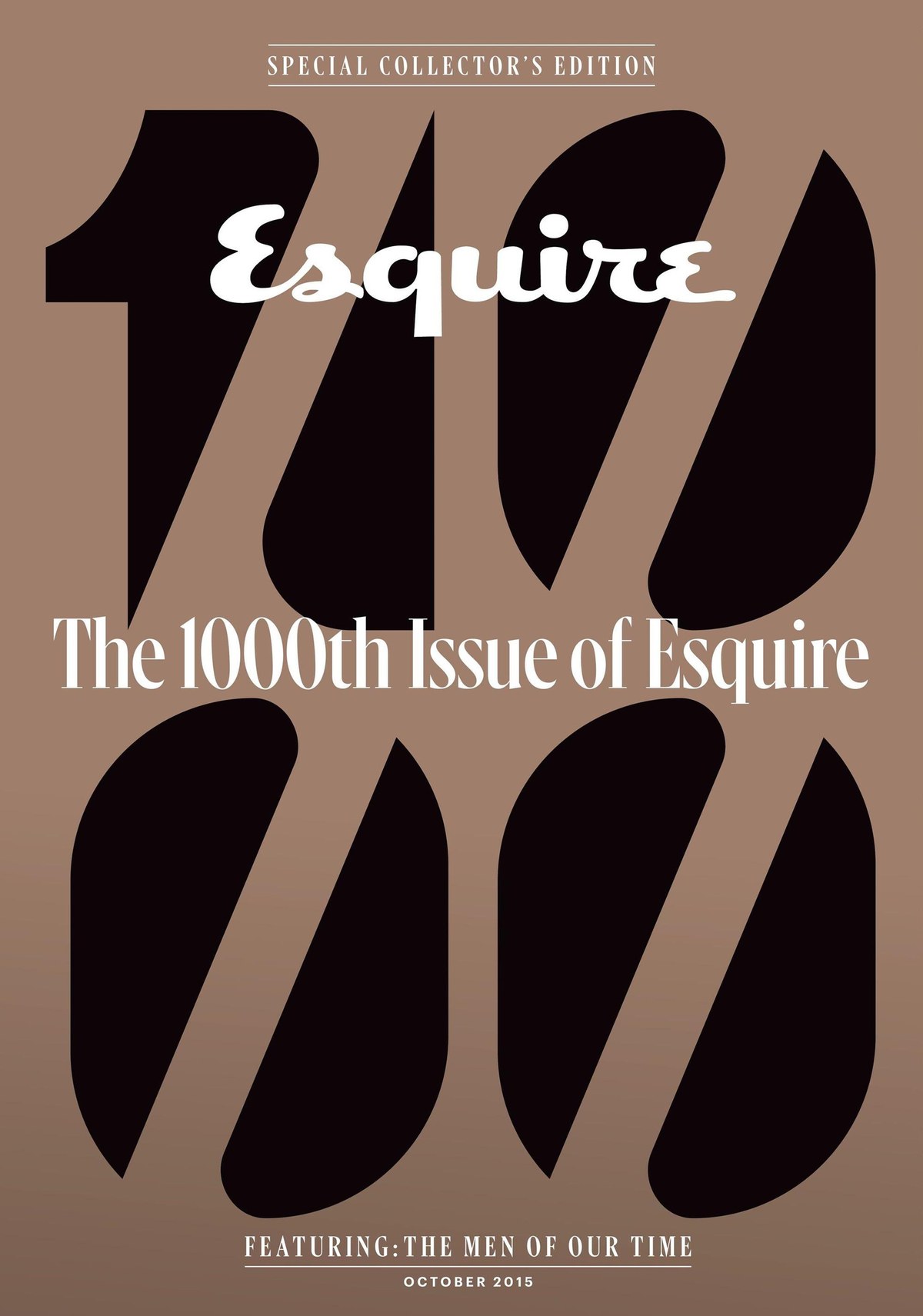
Cover “1000” lettering by Sawdust in London.
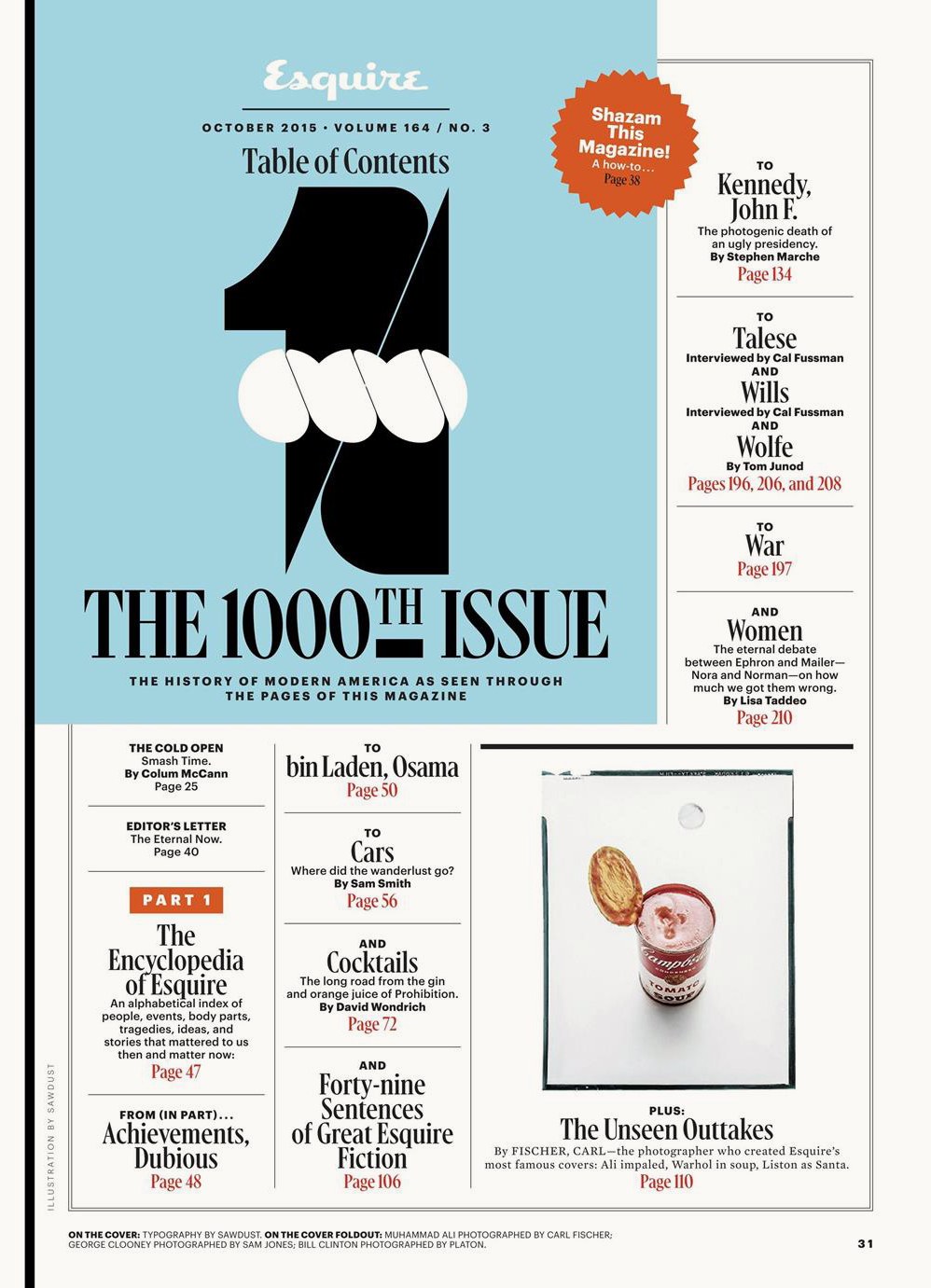
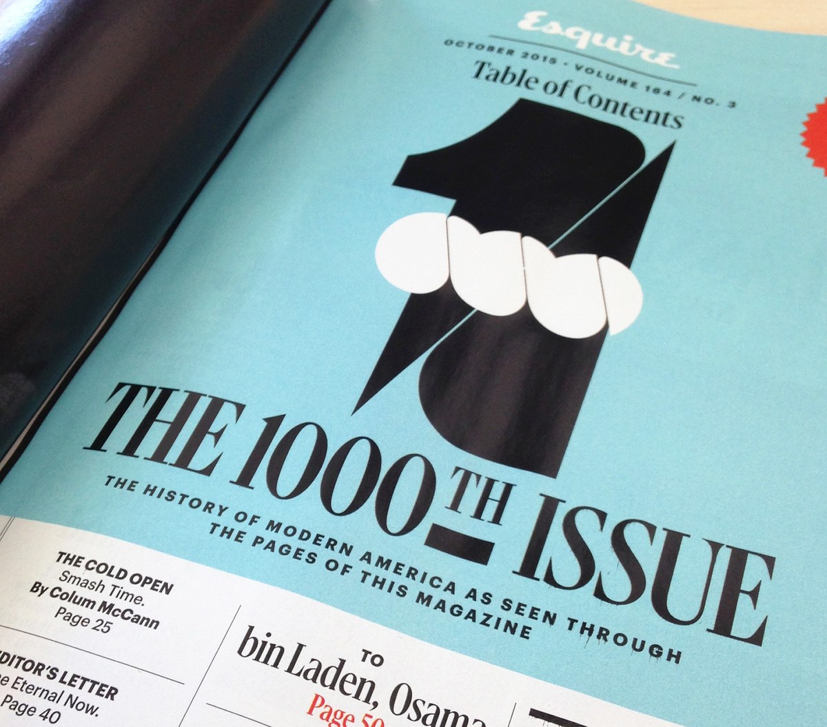
Table of Contents. “1000” lettering by Sawdust.
October 2015, spread. Creative director David Curcurito, art director Stravinski Pierre.

To relate the family to Granger, some serifs are chopped off.
October 2015, spread. Creative director David Curcurito, art director Stravinski Pierre.
December/January 2015-16, spread. Creative director David Curcurito, art director Stravinski Pierre.
February 2016, page. Creative director David Curcurito.
Cover “1000” lettering by Sawdust in London.
Table of Contents. “1000” lettering by Sawdust.
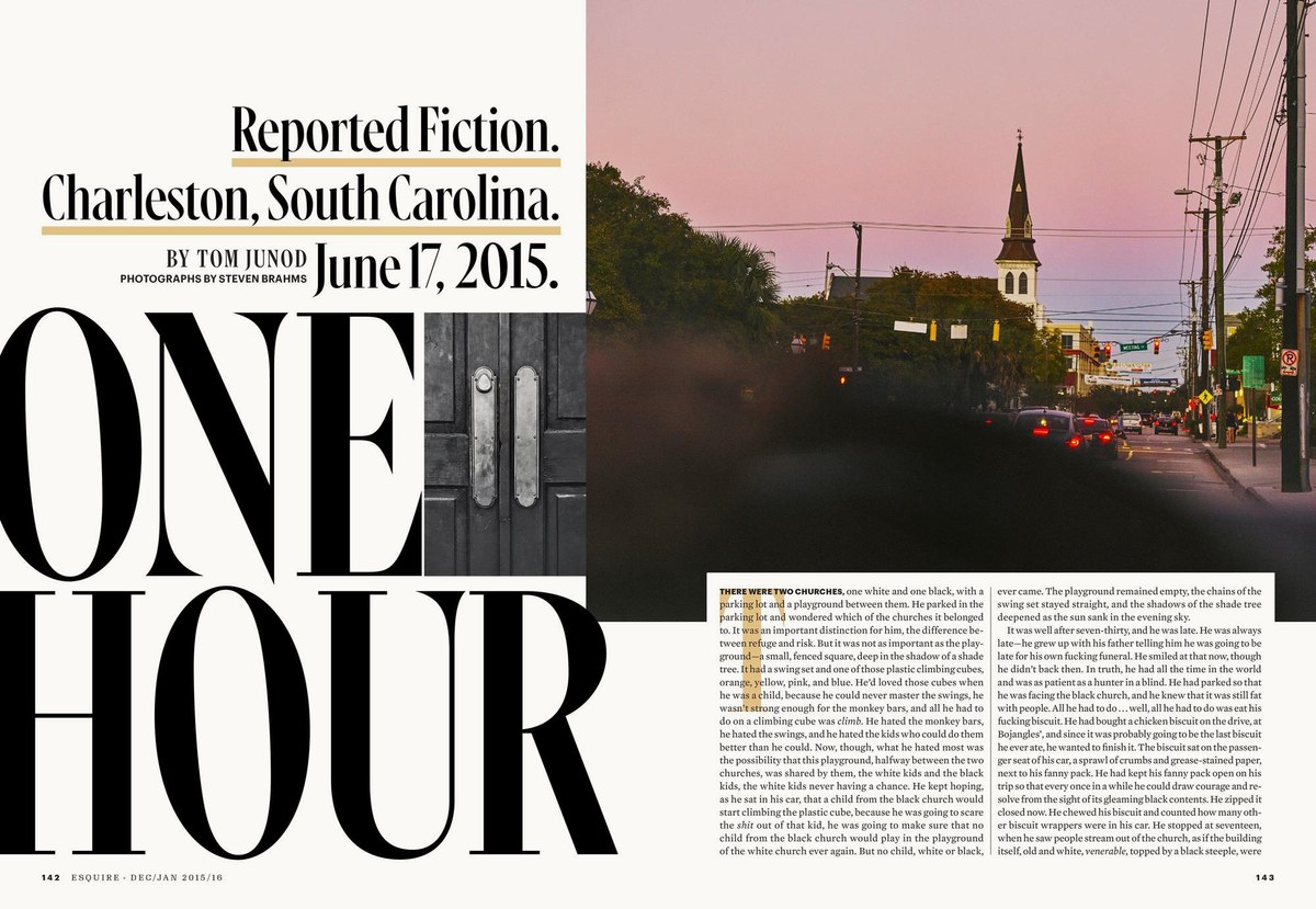
Curcurito and art director Stravinski Pierre commissioned a serif headline face for the magazine’s special 1000th issue. Named Gingrich, after founding editor Arnold Gingrich (and completely unrelated to any current or former politicians), this face was designed to combine with Granger, Graphik, and Esquire Text. Since Granger is made of square forms and Graphik is built on circular forms, it seemed logical to make Gingrich as sharp and triangular as possible. I also wanted it to be condensed, so it could be set very large. I looked back at the various Moderns used throughout Esquire’s past and at the version of Times New Roman used during its New Journalism period in the late ’60s, synthesizing these into a sharp, tight headline face.
Where Times has ball terminals, Gingrich has spikes, but the angled stress of Times keeps the face from looking too stiff and static. Confident and aggressive in all caps, the curves and elegance of the lowercase keep the face from becoming overbearing. Gingrich is comprised of 4 optical sizes in a single weight. Like the issue, it’s meant to nod to the magazine's past while looking relentlessly forward.
Gingrich became a primary display face in the magazine after it was introduced in the 1000th issue, finally being retired after David Granger and David Curcurito departed the magazine in 2016.
Kara Gordon expanded the family to include italics in 2018, and the family can now be found in the Vault.