Royal Gothic: All in the family
Royal Gothic – emphatic, compact, contrasted, boxy – shows a different side of the British sans serifs of the nineteenth century.
Despite its apparent simplicity, the sans serif has assumed many styles: grotesque, humanist, geometric, contrasted, and rounded, for example. And within these appear variants such as squarer forms, where the circumferences of the round characters expand from a round to a more oval shape and fill the space accordingly. The best-known squarish sans is probably Aldo Novarese’s Eurostyle,1 designed in the early 1960s, but the form dates back to the previous century in Britain, Germany, and the United States.
The latest addition to our Classics collection, Royal Gothic is an early example, drawn by me and expanded with the help of Luke Charlsey and Tim Ripper. We’ve taken a single bold style and extended its reach from a delicate, almost monolinear thin to an emphatic, punchy fat with matching italics. It has a no-nonsense, gritty, industrial appearance, with narrow capitals and an increased contrast. Royal Gothic complements other Classics faces from this period like Caslon Ionic, Ionic Modern, and Antique No. 6. Because they share similar proportions, they can be mixed by designers looking for similar – but not identical – design traits.
Faces from the second half of the nineteenth century combine well with a gritty dynamic. Antique No. 6, Caslon Ionic, Ionic Modern, and Royal Gothic capture this spirit.
Royal Gothic Medium used for emphasis in texts set in (from top to bottom) Ionic Modern Text, Caslon Ionic, and Antique No. 6.
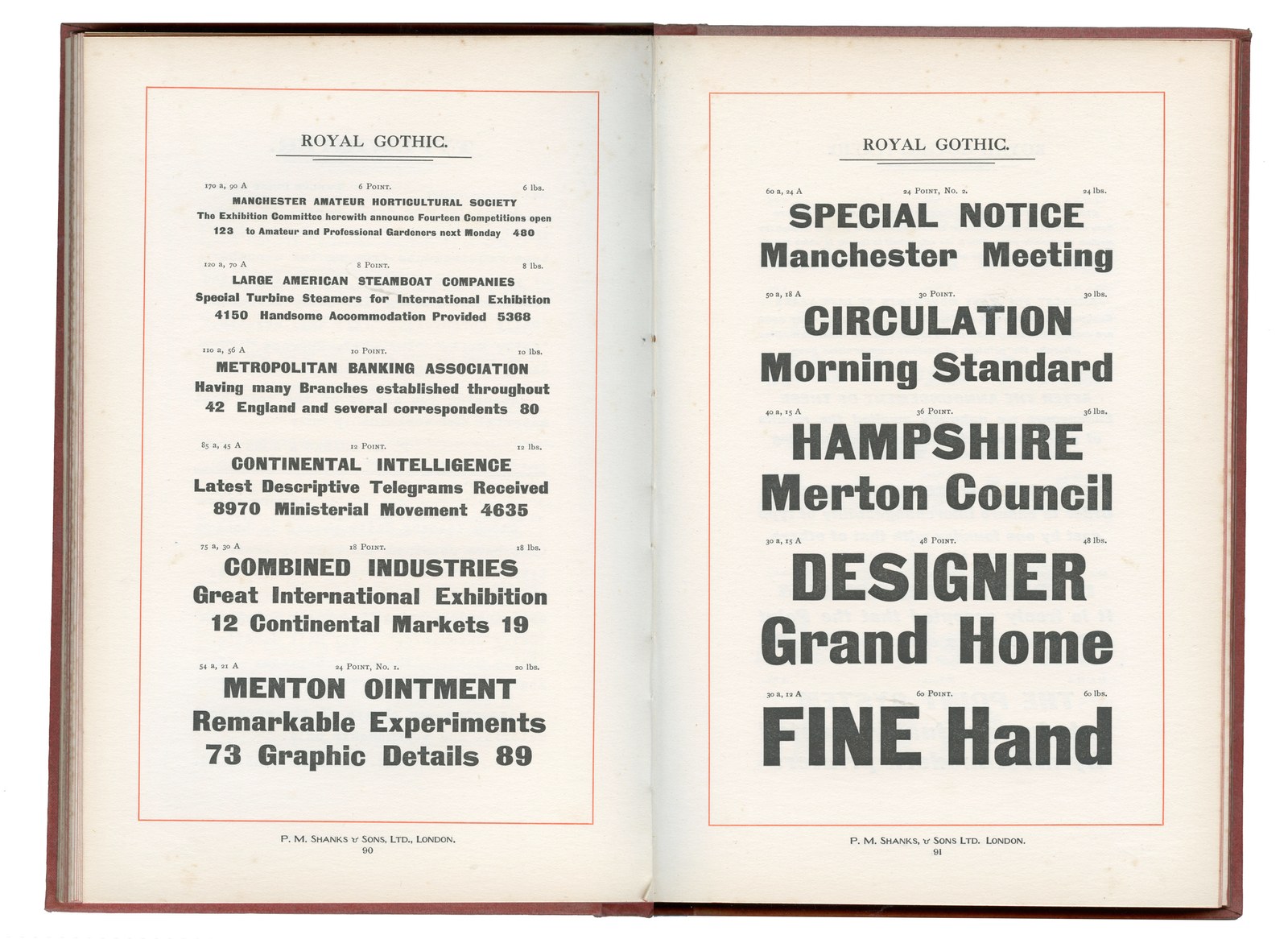
Royal Gothic as shown in Specimens of Type by P.M. Shanks & Sons, London (1911).
Royal Gothic appeared in 1880 in a specimen from the Patent Type Foundry in London. Cast in sizes from six to sixty points, it would have been used wherever emphasis was needed: to set personal names and business names on cards, heads and subheads in pamphlets, journals and newspapers, and timetables for transport. It would have been mixed with other sans serifs, slabs, and serif faces. It came in a single weight and was never adapted to later technologies; like Antique No. 6, though, it was still being cast into the early 1980s by Stevens, Shanks & Sons in London.
I first came across Royal Gothic as a student, spotting it in the cases of metal type at what was then known as Lanchester Polytechnic in Coventry.2 Later I rediscovered it in a single size in an Atlas of Typeforms, the classic volume published in 1968 by James Sutton and Alan Bartram. I realised that my bank, the now-defunct Midland Bank, had long used another square sans, Folio Extra Bold, which must have lodged in my memory.
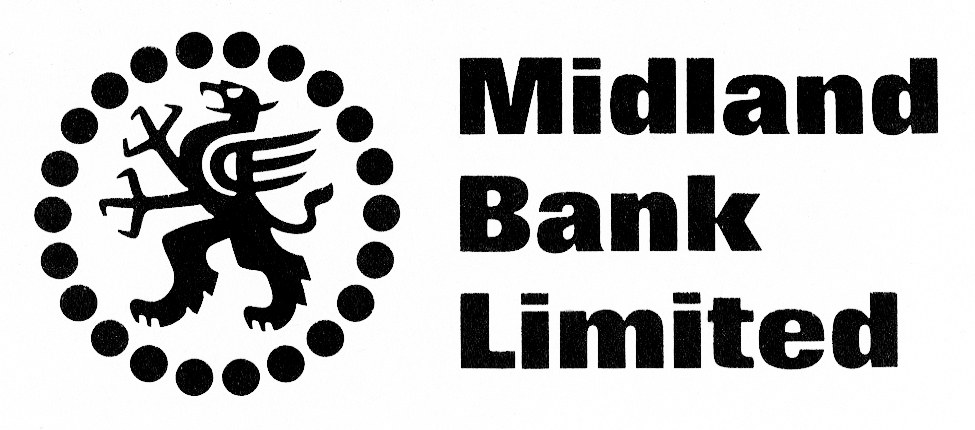
Midland Bank logo designed by Peter Pickard, 1965.
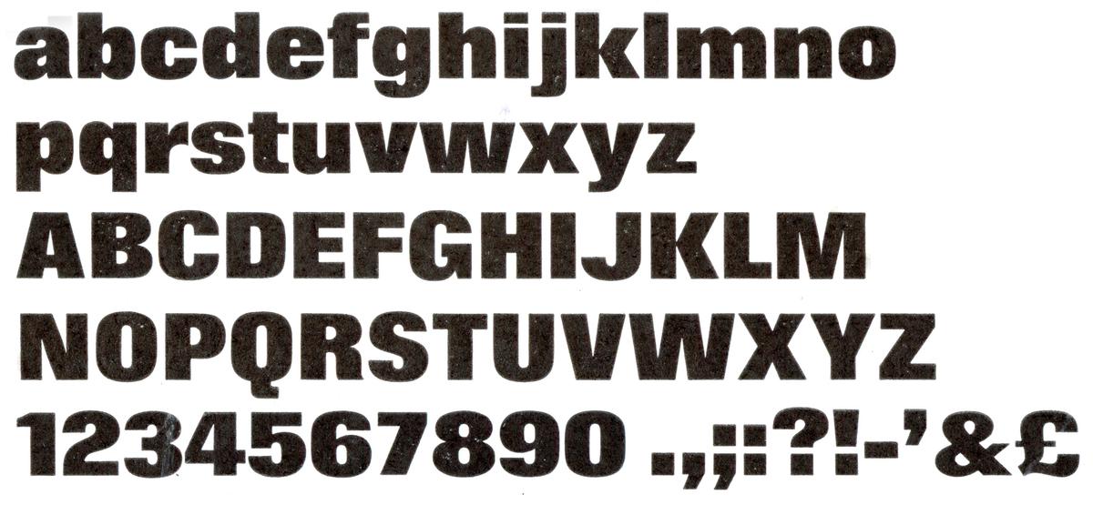
Folio Extra Bold, designed by Konrad Friedrich Bauer and Walter Baum, and published by Bauer in 1957.
British sans serifs from this period, such as Caslon’s Doric No.4, were round in design and regular in weight, whereas Royal Gothic moved towards a more compact oval style in a bolder weight. And though it’s heavier than the Doric, it also has more contrast. The design’s boxiness gives a squashed appearance to the exterior of the round characters, offsetting the flatter counters. Terminals end mostly on the horizontal. The f, j, t, and y terminate in flat strokes, and the g has a single storey. The r is hooked, with a horizontal terminal that matches the end of the a. In the original version, the lowercase t rises noticeably higher than expected to the height of the ascender; we reduced this in the new version. The capitals are similarly compact in design, with flat horizontal terminals. Numerals are consistent in approach, bar the distinctive 4 with its curved-to-the-upper-left stroke and its open counter. The capital and lowercase S, whose diagonal terminals are grotesque in style, add a distinct, idiosyncratic quality to the face. Quotes and commas are simple, angular forms. The x-height varies in proportion from the larger sizes, where it is unusually small, to a more expected relationship at smaller sizes. This gives Royal Gothic an even narrower appearance when used in headlines.
Caslon Doric is a normal-width sans with a roundness of form; Royal Gothic is more compact, with box-like proportions.
Key characteristics of Royal Gothic:
Orange: flat horizontal terminals
Blue: flat end strokes
Green: single-storey g
Brown: hooked r
Pink: open-countered 4
Lilac: angle-terminal S and s
Key characteristics of Royal Gothic:
Orange: flat horizontal terminals
Blue: flat end strokes
Green: single-storey g
Brown: hooked r
Pink: open-countered 4
Lilac: angle-terminal S and s

Similar but not the same: Royal Gothic a at 6pt, 8pt, 10pt, 12pt, 14pt, 18pt, 24pt no. 1, 24pt no. 2, 30pt, 48pt, and 60pt.
Cut by hand, the design is consistent, but the quality of rendering varies among sizes, giving some a more crude style. When I started working on my interpretation of Royal Gothic in the early 2000s, I consulted the illustration in the Atlas of Typeforms of the 30pt, as well as several specimens that Stevens, Shanks issued in the 1950s and 1960s, when famed modernist designers Anthony Froshaug and Desmond Jeffery produced several eye-catching designs for the foundry.
The boxy nature of the design may in part be explained by a desire for a change in style, as well as for a reduction in the space between letters to gain greater blackness on the page. A tendency towards this can be seen in some of the earliest slabs, such as those cut by Thorowgood. It’s also apparent in Vincent Figgins’s first condensed sans serifs, which are not only flat-sided, but also have inflated curves. Before this, of course, Walbaum’s moderns had box-like qualities, but their main purpose was more to effect a stylistic differentiation than to gain maximum impact.
The first regular-width bold sans (consisting of capitals only), published by Figgins in the late 1820s, remained decidedly round and tied to geometry. Later examples, such as Caslon’s Doric No. 1, retain a normal width and round shapes.
Royal Gothic seems to be the first non-condensed bold sans with a lower case in Britain to have this style, though in Germany a similar design appeared in 1874. In ‘Imperial-Era Germany’s Definitive Heavy Sans’, Dan Reynolds chronicles a design that many founders cast in the nineteenth and twentieth centuries under various names: Zeitungs-Grotesk, Fette Grotesk, Kompakte Grotesk, Elephant-Schriften, and Fette Steinschrift, among others. The design is similar to Royal Gothic; the two typefaces share, for instance, the idiosyncratic 4 and S – but they are not the same. Did the designer of Royal Gothic know of the German design? This seems possible. The name also confuses matters. The design appears in the United States in 1887, but use of the word ‘Gothic’ to describe sans serifs3 in Britain was unusual,4 suggesting that it perhaps was originally an American design, though no predated examples have been found.
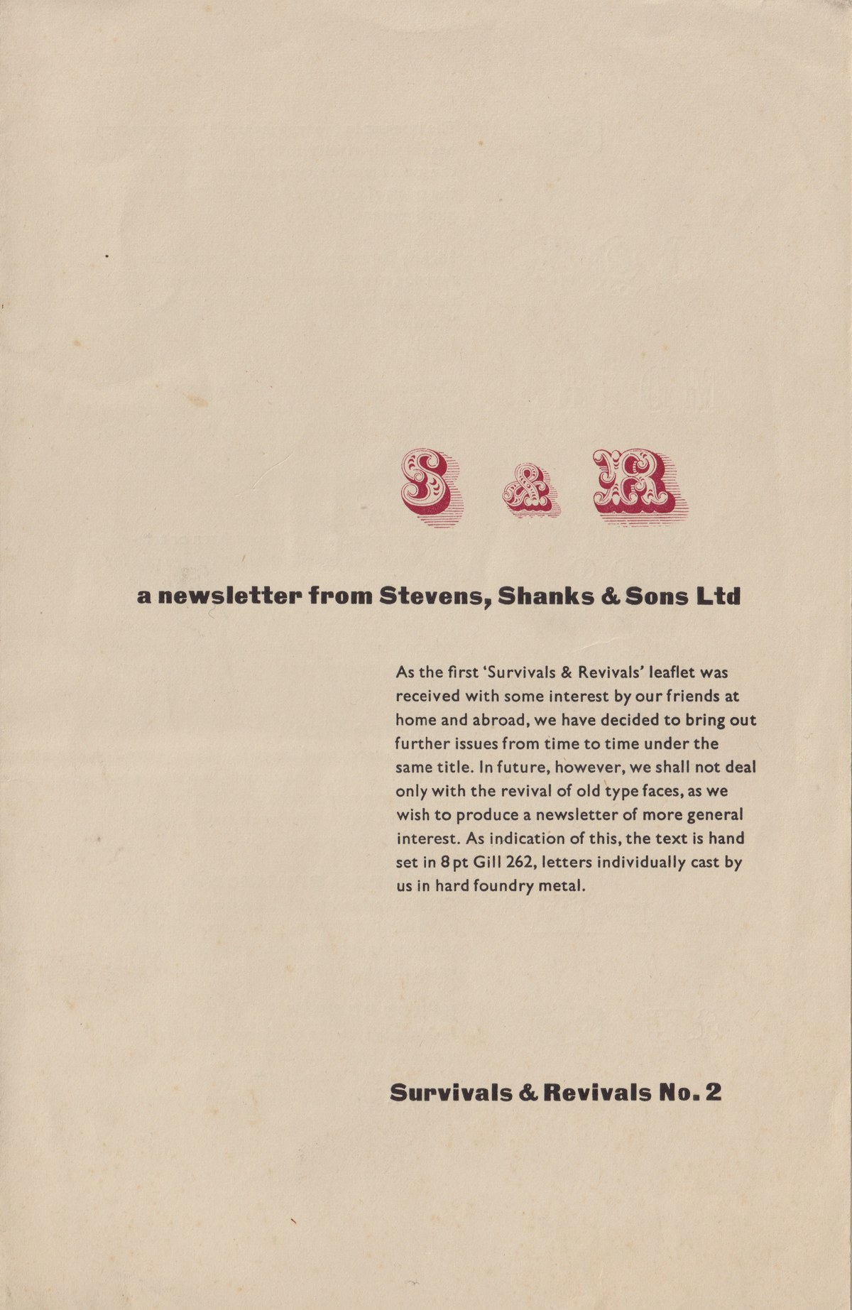
Stevens, Shanks: Survivals & Revivals No. 2, designed and printed by Desmond Jeffery, 1956.
As characters become boxier, the inter-character spacing contracts.
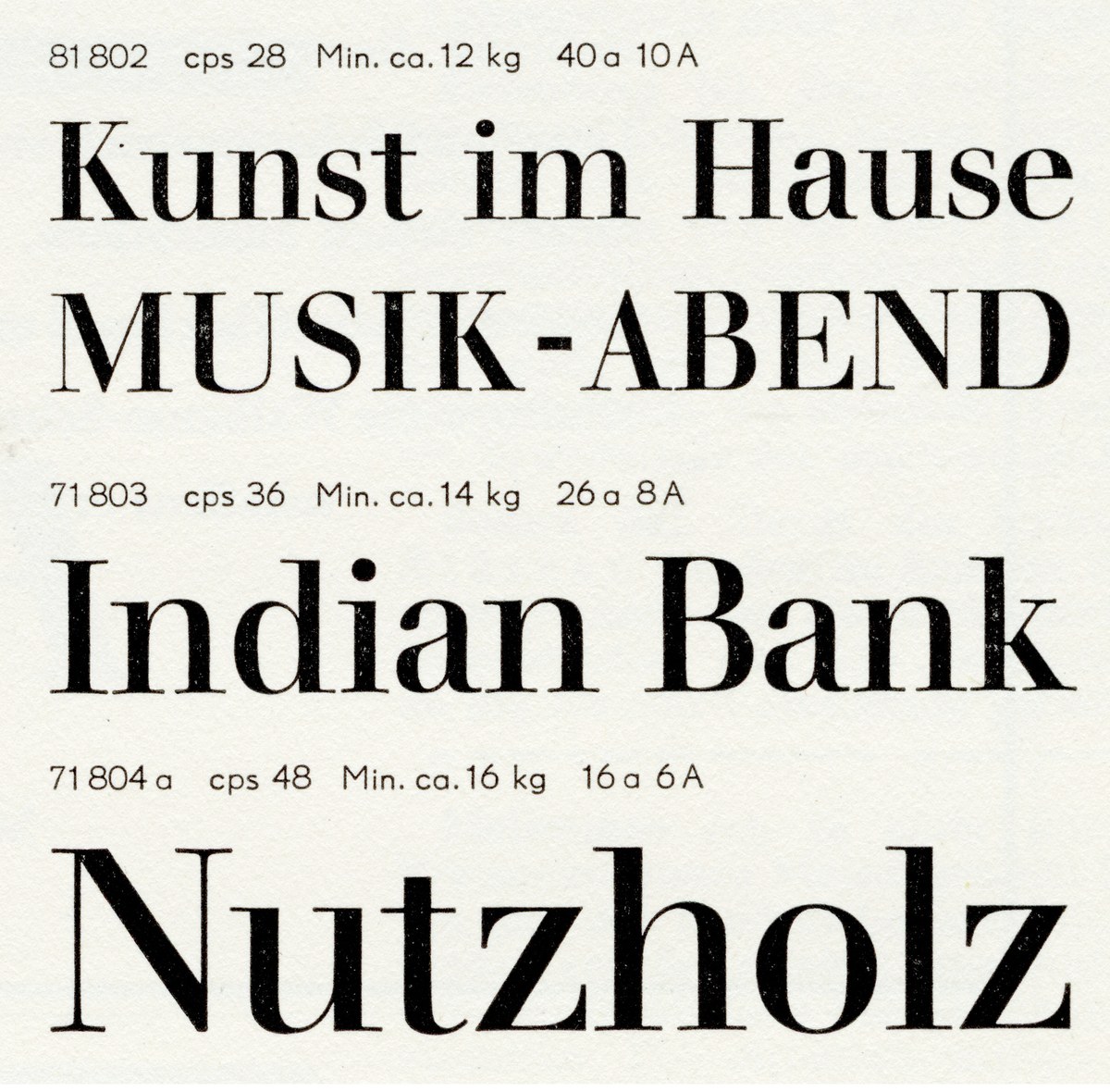
The elegant moderns of Walbaum, cut originally by Justus Erich Walbaum in the early nineteenth century. Round characters become boxier, and terminals squarer. As shown in Berthold Schriften, Schriftprobe, No. 405. Berlin, n.d.
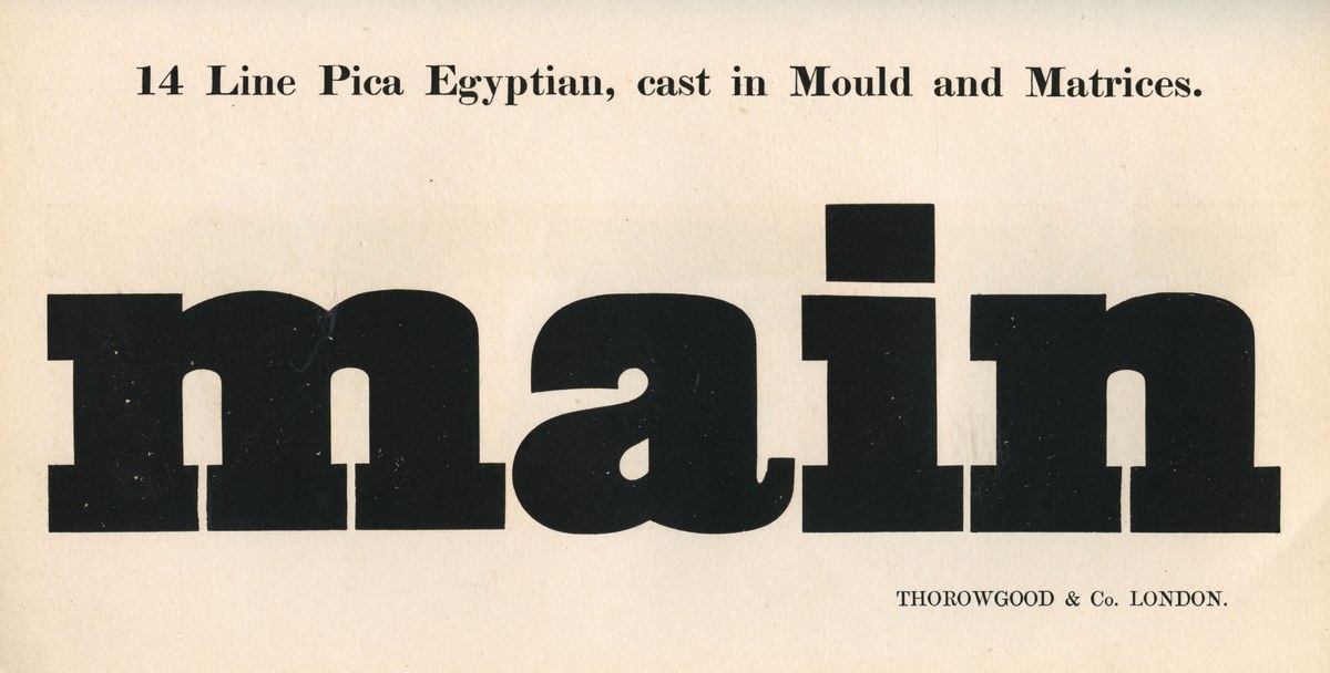
Thorowgood’s early slab designs often take on square-like proportions, as with 14 Line Pica Egyptian, cut in the 1820s. As shown in Thorowgood & Co. Specimen of Printing Types, London (1840).
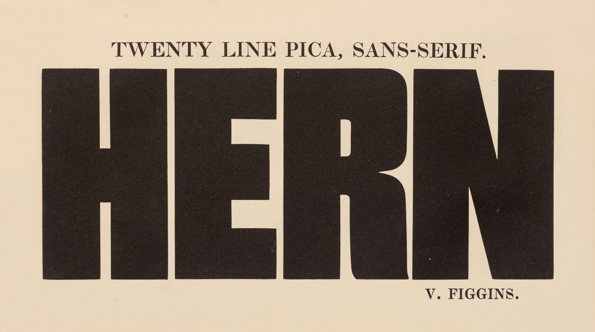
A bold, boxy, condensed sans serif: Figgins’s Twenty Line Pica, Sans-Serif, as shown in Specimen of Printing Types, 1833. St Bride Library.
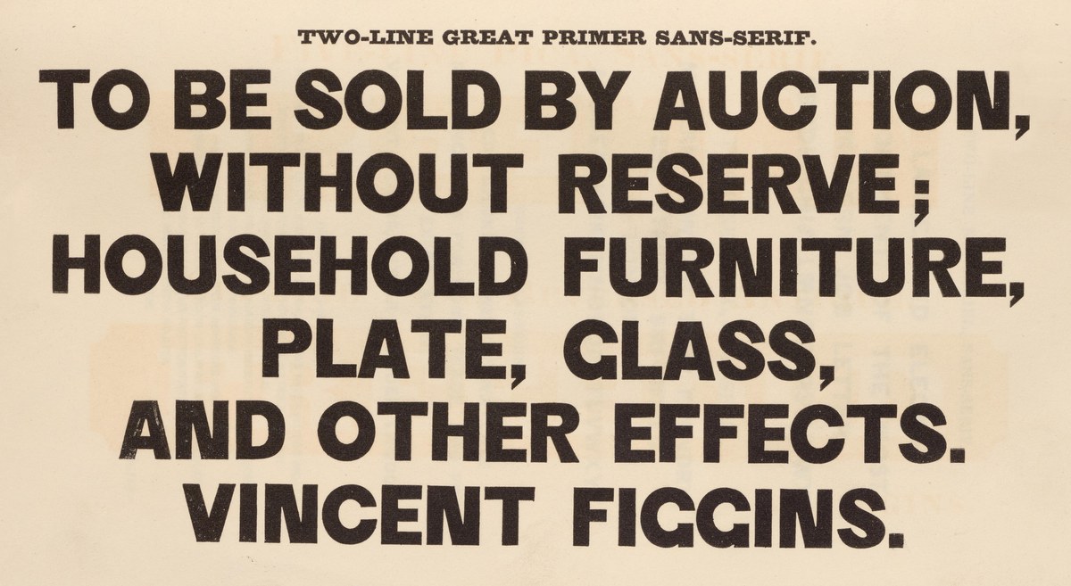
Geometry dominates the first of Figgins’s bold regular-width sans serifs, seen here in the Two-Line Great Primer Sans-Serif, which we revived as Original Sans Three. As shown in Specimen of Printing Types, 1833. St Bride Library.

Caslon’s Doric, later Doric No. 1, the classic British style sans serif of the mid-nineteenth century. Bold, round, and confident. As shown in Specimen of Printing Types by Henry Caslon, 1842.
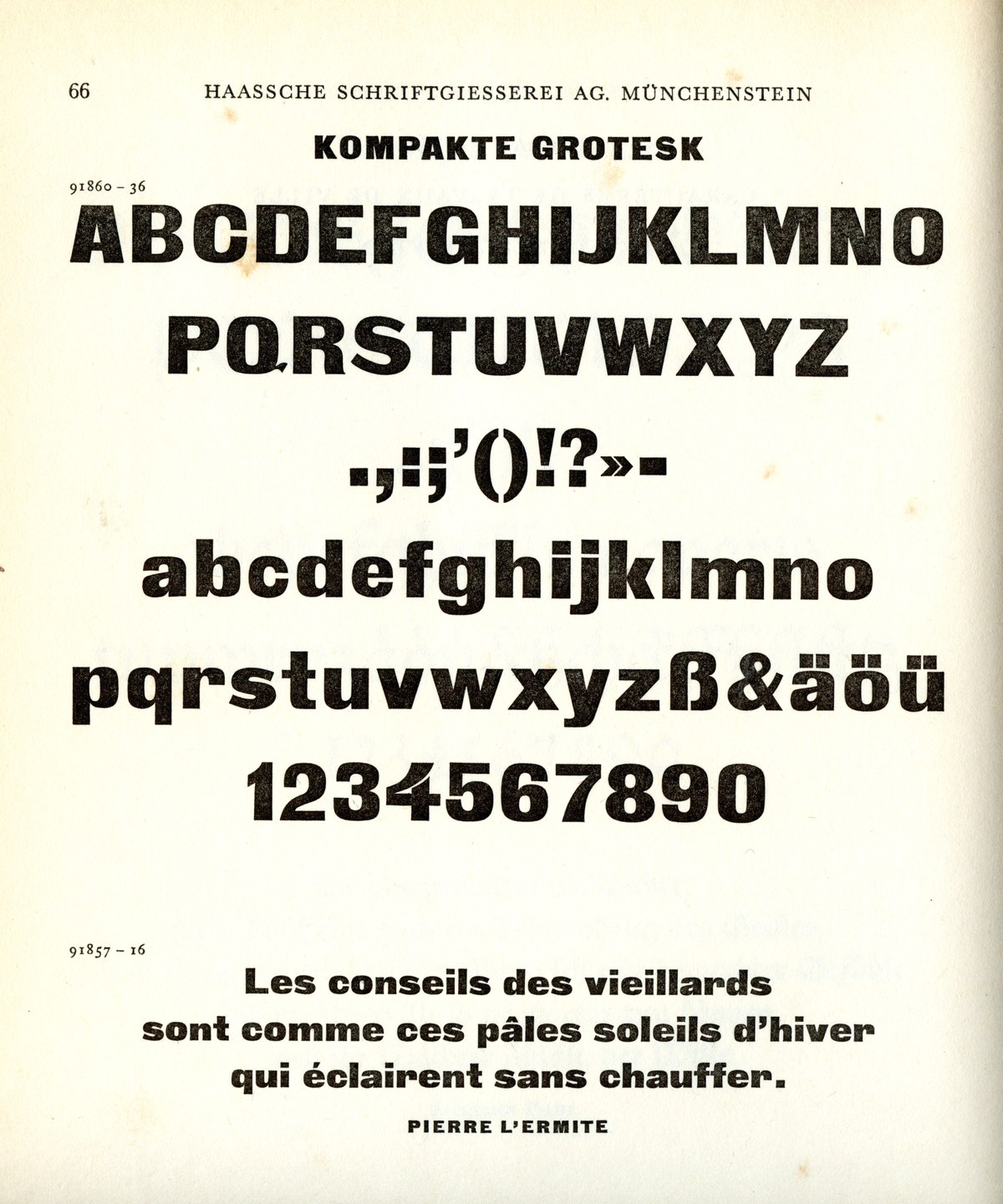
Zeitungs-Grotesque, perhaps the first normal-width boxy sans serif, was shown by the Francke Foundry in Danzig, Germany, in 1874. It was cast well into the twentieth century by various foundries, as shown here as Kompakte Grotesk, cast by the Haas Type Foundry of Switzerland. As shown in Type by Rudolf Hostettler, SGM Books, 1949.
Expanding the design
Because of its relatively shallow angle, the italic can either complement the roman or be used as a standalone face.
Royal Gothic must have had some initial success: In the early part of the twentieth century, more sizes were added, along with a companion italic. The italic was probably not made by P.M. Shanks, successors to the Patent Type Foundry, but by the Keystone Type Foundry, which called the design ‘Charter Oak’. Though both weigh about the same, they have noticeable design differences. The varying capital and lowercase sizes suggest they are not a matching design. The dot of the i is round, the S and s end on the horizontal flat, and the tail of the R is not flat. It feels less charming in its execution, albeit more consistent. Royal Gothic was created after the invention of the pantograph, but on close inspection one sees that the characters are not identical through the size range, suggesting that it was cut by hand.
Stevens, Shanks also released a version of the roman called Regal Gothic, which adds, curiously, swashes to certain characters. These seem singularly unsuccessful or unsympathetic to the original design. They are, however, the parts of the family that have survived; the matrices are at St Bride Library.
When Commercial Type decided to create an italic to match Royal Gothic’s bold design, we chose to start from scratch and match it to the roman. So it’s effectively a slanted form at a relatively shallow 11 degrees – less steep than Antique No. 6, Caslon Ionic, or Ionic Modern, but suitable for a sans design.
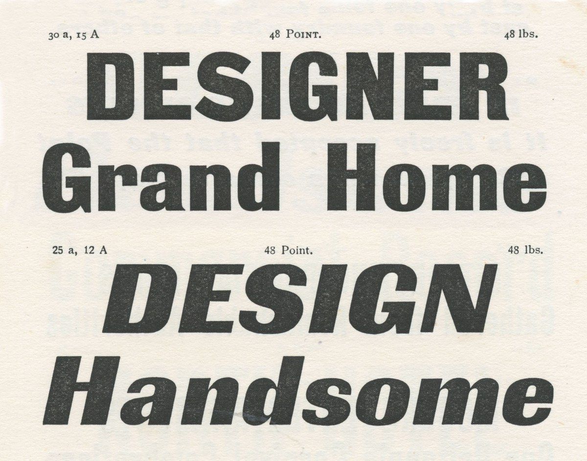
Royal Gothic roman and italic as shown in Specimens of Type by P.M. Shanks & Sons, London (1911). The italic has a large capital and lowercase height and is less compact. The S is an entirely different form.
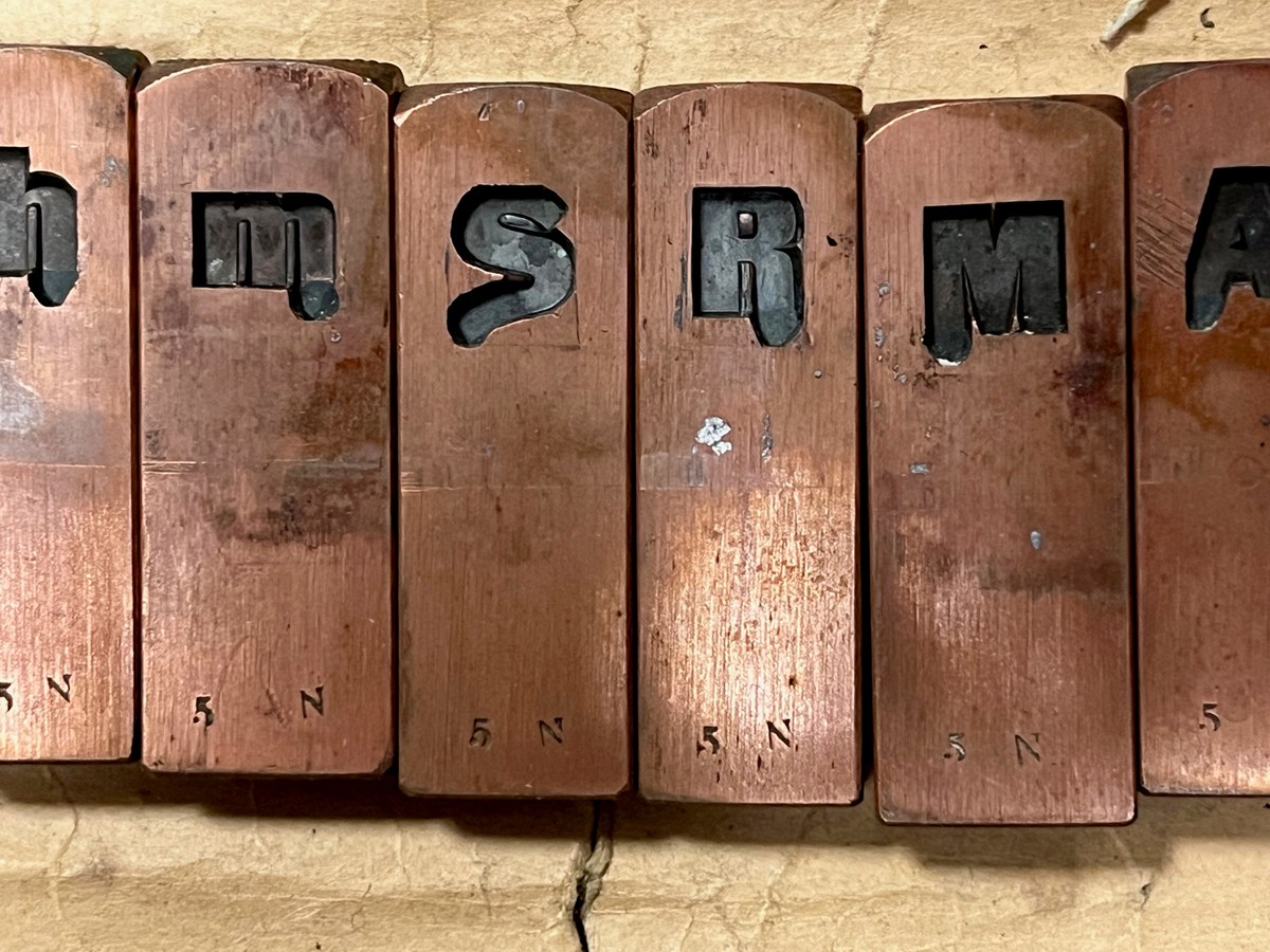
Regal Gothic matrices from Stevens, Shanks. Note the droopy swashes. St Bride Library.
Royal Gothic has a shallower angle than its contemporaries.

Normal Grotesk in 12pt. This was a classic design first seen in Germany, and then across Europe under various names. Jan Tschichold used it in his classic Die neue Typographie, 1928. As shown in Type by Rudolf Hostettler, SGM Books, 1949.
We also saw the potential in expanding the weight range to increase the face’s usability, taking it even bolder not only to a weighty fat, but also, more intriguingly, to lighter weights better suited for text. This recalls the classic German square-like grotesk seen in Jan Tschichold’s manifesto Die neue Typographie, published in 1928.5 The face was widely cast across Europe under various names: Normal Grotesk, Moderne Grotesk, Planeta, Aurora, Klassiche Grotesk, Aurora Grotesk, and even Akzidenz-Grotesk (Haas).6
In Royal Gothic’s fat weight, the spacing is tight for display and the x-height increases noticeably. The squareness of the design becomes most apparent in the b, d, p, and q, while the counters become almost flat. Contrast remains high, and the face has a remarkable presence with short descenders, facilitating tight setting. The lighter weights offered a different challenge: striking a balance between flatness on the outside and flatness on the interior. Because it was designed for smaller sizes, the spacing is looser; and in the lighter weights the contrast is lowered to give an even impression on the page, making it a legible and readable face for continuous text.
An alternative S and s were added which are square in design; they recall Caslon’s Doric No. 5, a latter square sans cut in the 1890s. We also added a simpler four with a closed counter.
For much of its life Royal Gothic stayed in the shadows, cut by one of the lesser-known foundries in just a single weight. Significantly, though, it endured long after many more ‘successful’7 designs had disappeared. In recreating it and attempting to realise its full potential, we have tried to capture the spirit and grit of the original while making it a more utilitarian face that has a wide appeal to today’s designers, with virtually no limit to its applications.
Royal Gothic with alts for S, s, and 4.
Royal Gothic with default forms for S, s, and 4.
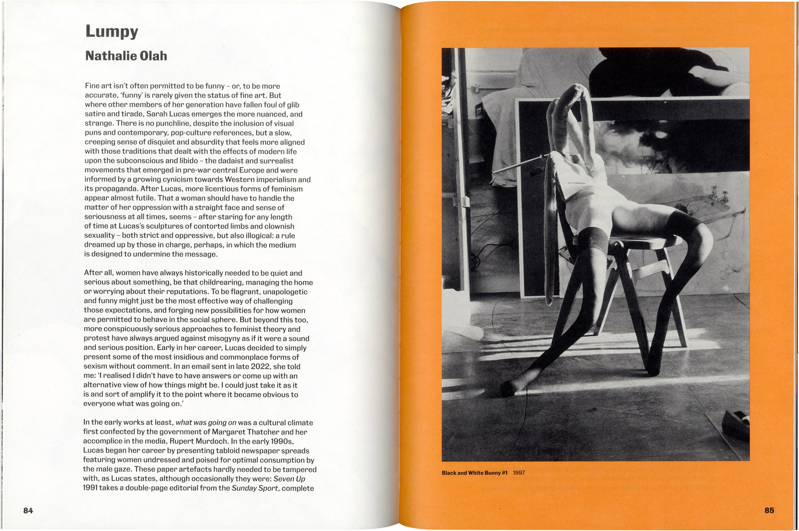
Fraser Muggeridge studio used Royal Gothic throughout Happy Gas, a monograph on Sarah Lucas published by the Tate in 2023.
Other notable squarish faces from the twentieth century include Georg Trump’s City (Berthold, 1930) and Hermann Zapf’s Melior (Stempel, 1952).
Now Coventry University.
The Patent Type Foundry used both ‘Doric’ and ‘Sans Serif’, as well as the ‘Gothic’ name.
Miller & Richard seem to have used the name in 1863, and Wood in 1865.
Tschichold chose the face based less on aesthetics than on what the printer had available: ‘In the particular choice of type for this book I was limited to what the printer held’.
In 2020, Forgotten Shapes revived the face as Neue moderne Grotesk / Normal-Grotesk, with an accompanying essay by Indra Kupferschmid.
Successful in the short term, at least.