A New Doric
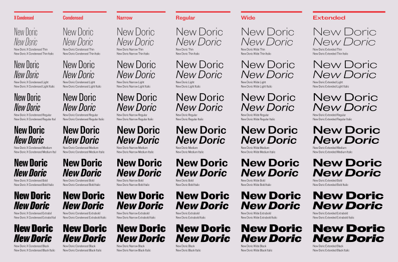
Typefaces are never finished. Even when they make their way into the world and start being used, we can’t help but feel a nagging need to go back and tinker with them. Luckily, the sheer amount of work that goes into a typeface and the constant pull of something new drive us away. From time to time we open up a file, play with it a little, and then close it in haste. Maybe all we do is add a prefix like “New,” “Neue,” or “Nouveau.” The file is forgotten again, and hopefully gets buried in the sands of time. Occasionally, though, the push of a client is enough to lodge a thought in our heads. A request to make some changes to a few characters can make us stop and reconsider, and the what-ifs start to mount.
When we launched Commercial Classics in 2019, a few typefaces sat at the heart of the concept: the modern Brunel, the robust Caslon Ionic, and, of course, a large sans family, Caslon Doric. This was a reimagining of the late-nineteenth-century British sans through the twentieth-century lens of Univers (though perhaps not with Frutiger’s rigour, to retain some of the original eccentricities). So not just multiple weights, but multiple widths. Not just light to extra bold, condensed to extended, but hairline to fat, condensed to super extended. And in this we made compromises: forms changed between weights and widths. The condensed, which was flat-sided, underwent some subtle and not-so-subtle adjustments in the regular and wider widths. Caslon Doric had all the tools we thought a modern design would need, and its slight, quirky inconsistencies were a positive for us.
After its release, designers discovered a face that had more character than, say, Helvetica — but was it perhaps at times too much? Designers would say how much they liked it, but could we perhaps make it a little less challenging? Clients wanted something simpler and less characterful. And a comment from the Commercial Classics launch party stuck in our heads: “When is the variable font coming out?” To which we replied that it wasn’t possible, given the variety within the family. Besides, that wasn’t really the original vision we had intended.
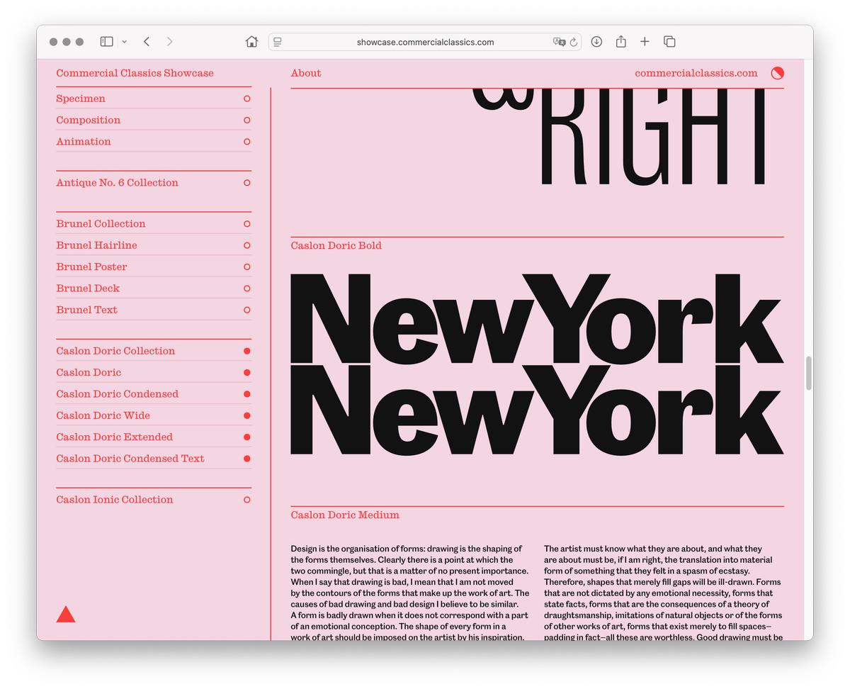
The Commercial Classics Showcase, designed by Jonny Sikov and Britt Cobb with Michael Bierut at Pentagram, showed the four core families from the collection in a context far removed from their nineteenth-century origins.
A few years passed. One client liked Caslon Doric enough to commission us to make some changes. Of course it was still Doric, but the terminals got flattened, and it started to seem as if the Caslon Foundry had, at some point in the fifties, looked at what was happening in Switzerland and at Haas, and decided to modernise its workhorse sans. Could you take designs that spanned from the late 1840s into the early 1900s and condense them into a singular vision? Of course, the Caslon Foundry had gone bankrupt in the thirties, but it was nevertheless a provocative idea that lingered. And so did the thought of making a variable version of Caslon Doric, where the condensed would merge seamlessly with the regular and extended. It seemed an exciting challenge: to see if we could get these parts to fit together, to try a simplified form, yet at the same time retain the charm of the original.
So we reviewed the original design and defined the space we were working in. Though we had taken great pride in the number of weights we had created for the regular widths, we understood that as the design narrowed, the number of weights had to decrease — which led us to the realisation that, in a more refined family, we would go not from a hairline but from a thin, and would stop at black rather than fat. And as the design extended, we needed to add italics that had been missing in the original, thus filling in all the edges of our design space.

From top: Breite Grotesk, Schelter & Giesecke, c. 1870–94;
Akzidenz Grotesk, Berthold, c. 1989;
Neue Haas Grotesk, Haas Typefoundry, 1957.
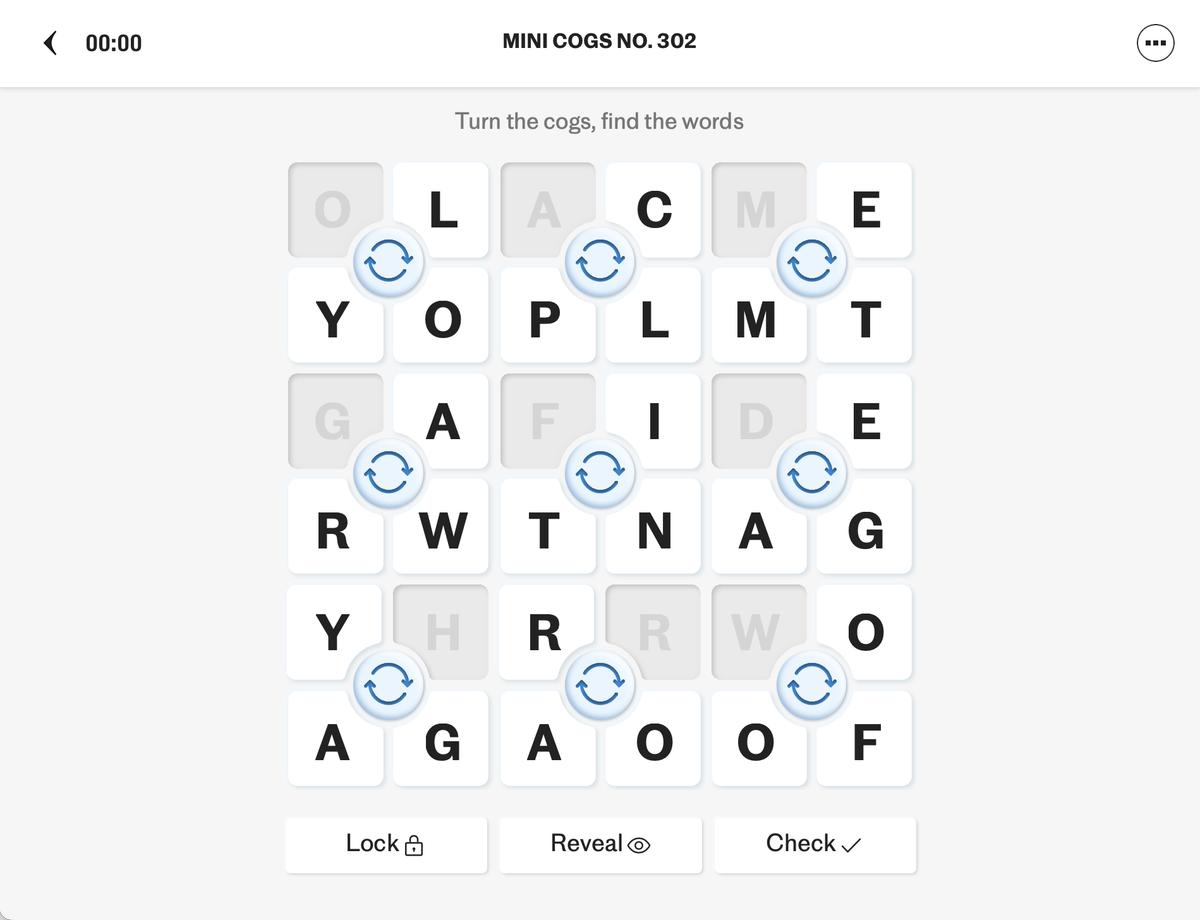
This puzzle shows the commissioned version of the updated Doric in use, before we pushed the simplification and systematisation further.
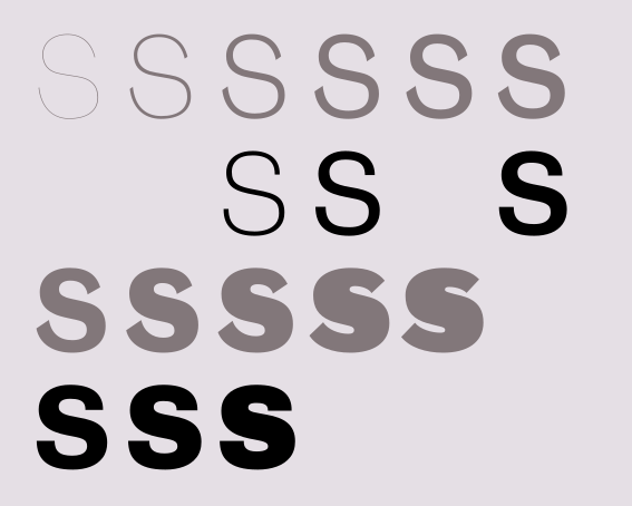
The shape of the S changes across the wide weight range of Caslon Doric, whereas New Doric is unified throughout.
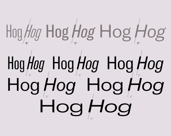
Italic angles are standardised across all widths in New Doric, compared to the changing angles in Caslon Doric.
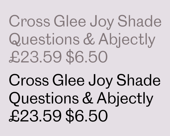
Caslon Doric Regular (top) compared to New Doric Regular
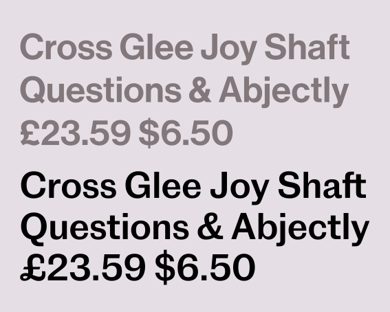
Neue Haas Grotesk 65 Medium at top, compared to New Doric Medium below. Despite the modernisation of Doric, it retains the character of the original: a tail on the a, a loop on the £.
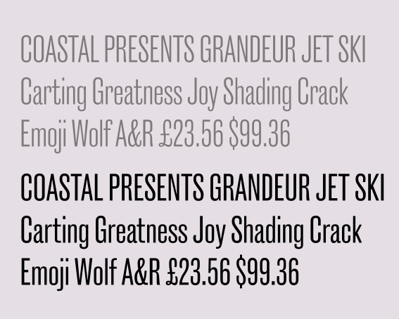
Caslon Doric Condensed compared to New Doric X Condensed. Simplification comes with flat terminals and streamlined characters like t, y, and &.
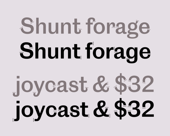
The terminals of Caslon Doric (angled) compared to New Doric (flat)
The shape of the S changes across the wide weight range of Caslon Doric, whereas New Doric is unified throughout.
Italic angles are standardised across all widths in New Doric, compared to the changing angles in Caslon Doric.
Caslon Doric Regular (top) compared to New Doric Regular
Neue Haas Grotesk 65 Medium at top, compared to New Doric Medium below. Despite the modernisation of Doric, it retains the character of the original: a tail on the a, a loop on the £.
But beyond this, we streamlined the design. For example, we chose to end terminals on flat horizontals rather than diagonals, much as Neue Haas Grotesk did with Akzidenz Grotesk’s angled terminals. The retention of barely perceptible inward turns on the top terminal of a or the loop of g produces a delicate but noticeable hint of something. The fishhook-like strokes of Caslon Doric’s f, j, r, t, and y are simplified. The double-storey g gives way to a single-storey form (the original becomes an alternate), while the distinctively beautiful, loopy tail of Q is reduced to a straightforward line. These changes give New Doric a new taste. Too bland? Perhaps for some. But we prefer to think of this new flavor as more versatile and adaptable.
With New Doric, the gap between the more rounded form of Caslon Doric’s regular width and the flat-sided X Condensed has been filled in with two new, useful widths — a Condensed and a Narrow — that offer the flexibility and freedom lacking in the original design. Though such a design variation is a problem in the roman, in the italic it posed a much more complicated challenge: to maintain, at all widths and weights, a smooth transition from flat sides to the roundness of the regular and extended widths. That this all appears seamless has much to do with the skill of designer Tim Ripper.
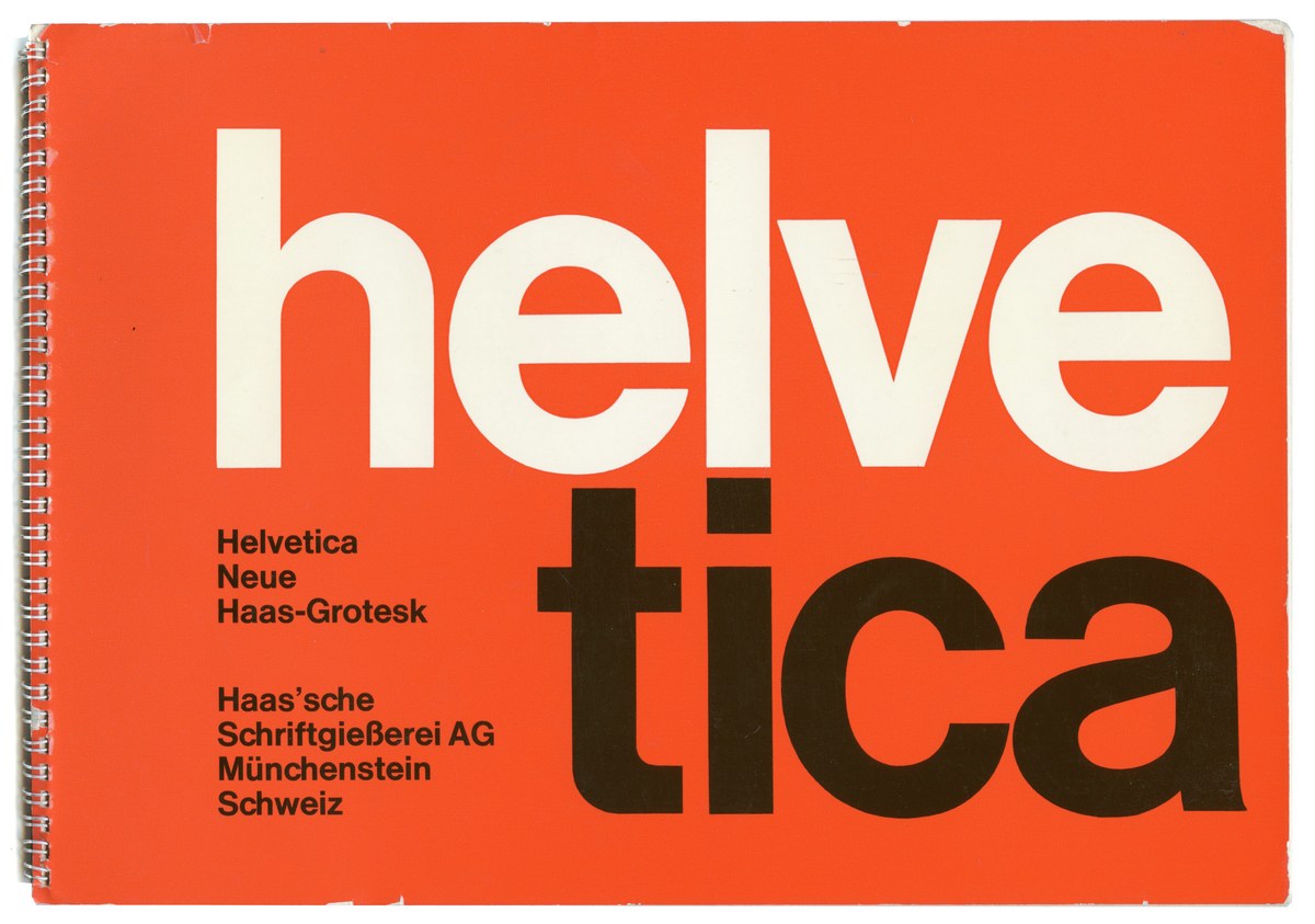
Printed specimen for Neue Haas Grotesk from 1968, by then renamed to Helvetica, designed by Hans Neuberg and Nelly Rudin
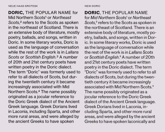
Neue Haas Grotesk Text (left) and New Doric (right) have a similarly even texture in running text
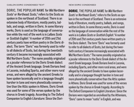
Caslon Doric Condensed Text (left) vs New Doric Condensed (right) in text.
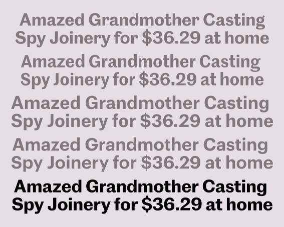
A range of “vanilla” sans serifs from our library: Caslon Doric, Marr Sans, Atlas Grotesk, Graphik, and New Doric
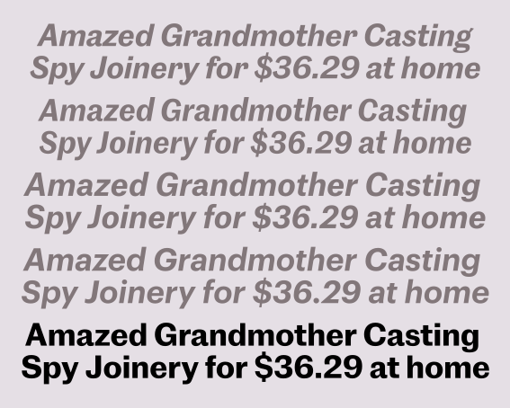
A range of “vanilla” sans serifs from our library: Caslon Doric, Marr Sans, Atlas Grotesk, Graphik, and New Doric, all in italic
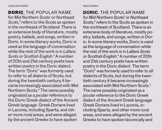
Caslon Doric (left) is considerably noisier and more characterful in text than New Doric (right)
Neue Haas Grotesk Text (left) and New Doric (right) have a similarly even texture in running text
Caslon Doric Condensed Text (left) vs New Doric Condensed (right) in text.
A range of “vanilla” sans serifs from our library: Caslon Doric, Marr Sans, Atlas Grotesk, Graphik, and New Doric
A range of “vanilla” sans serifs from our library: Caslon Doric, Marr Sans, Atlas Grotesk, Graphik, and New Doric, all in italic
New Doric is a modernised rendition of the nineteenth-century form. It retains enough of the past to feel warm and human, and enough of the modernity of the new grotesques to feel contemporary. Caslon Doric was a well-made tool, but one that still needed a little care in how it was used. New Doric feels less complicated in its system, easier to use, with the spaces left in the old design all filled in. It’s a design from the Victorian era, remade in the twentieth-century tradition for the demands of the twenty-first.