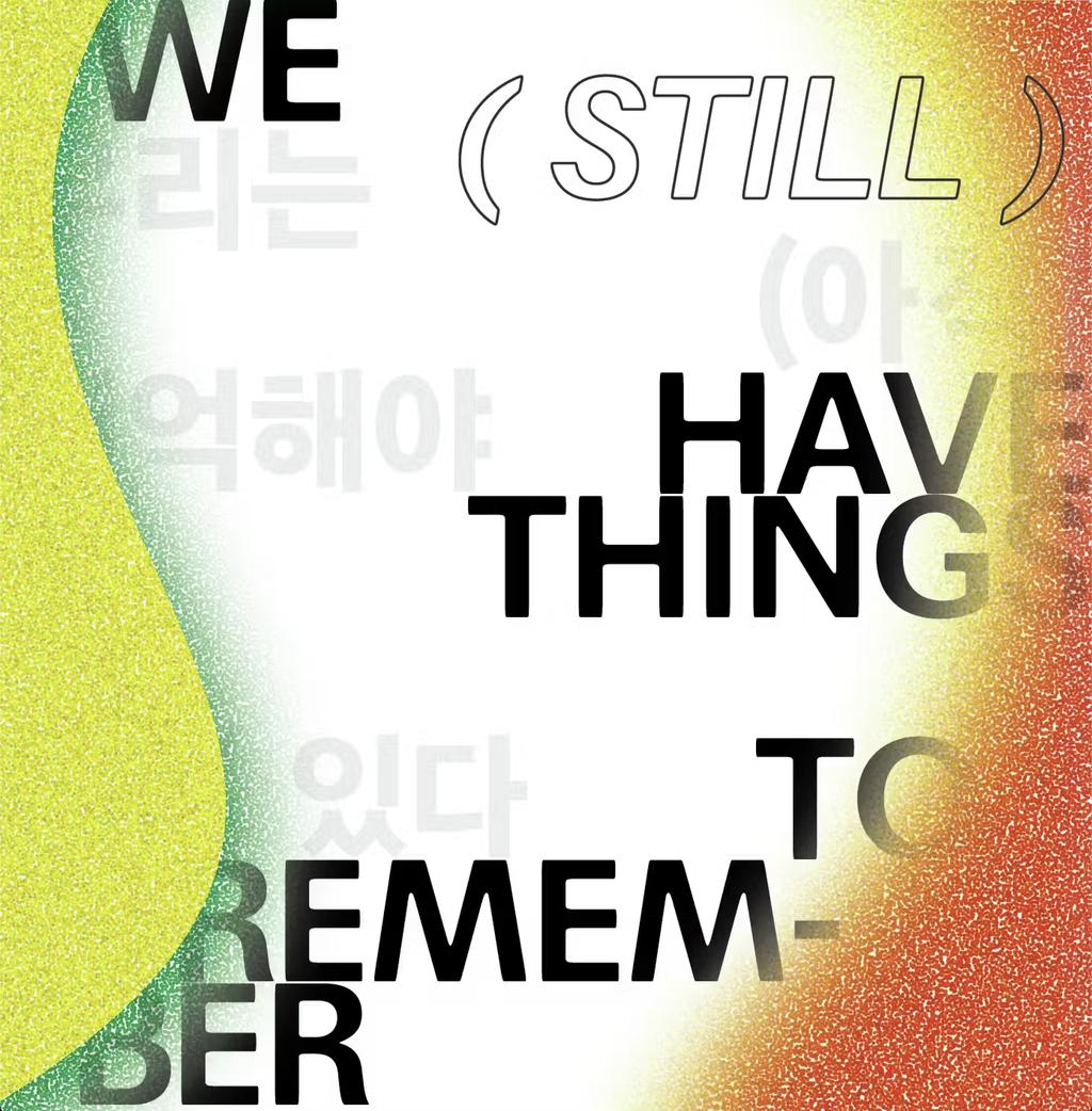
Focal, a sans serif in the uncanny valley of softness
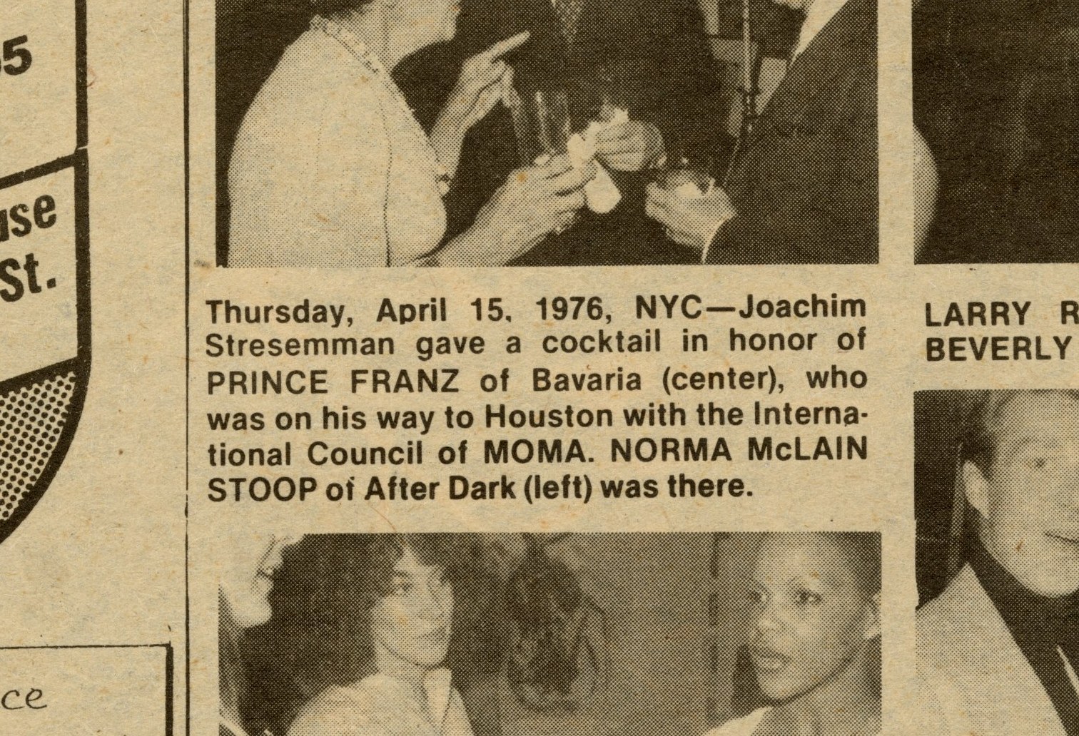
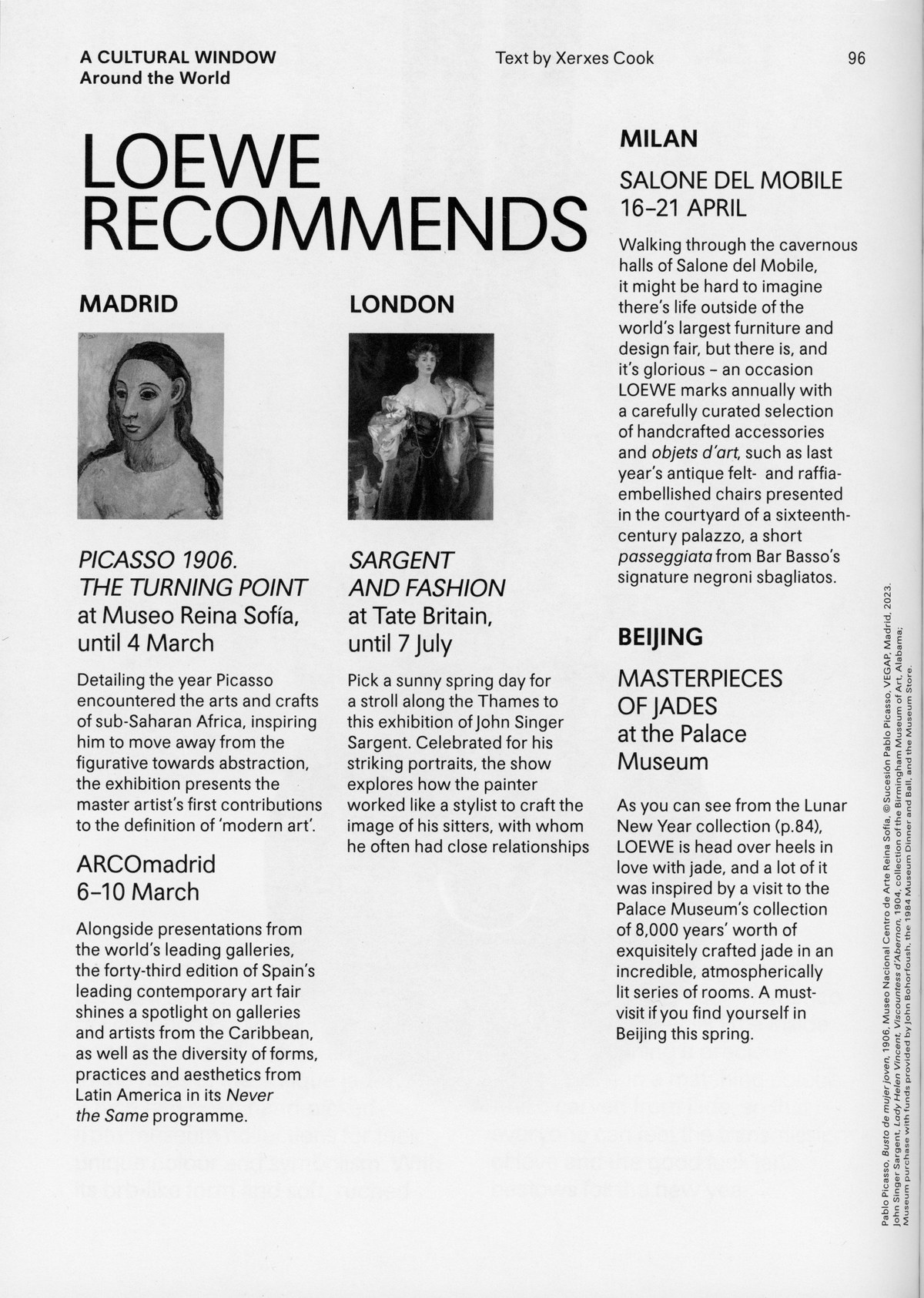
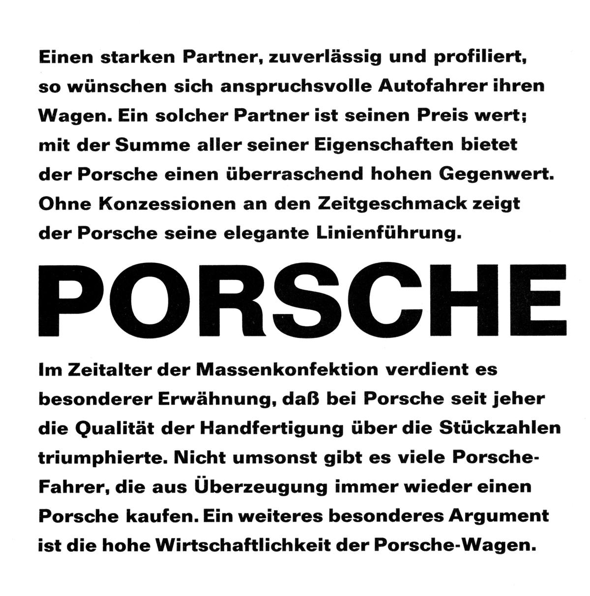
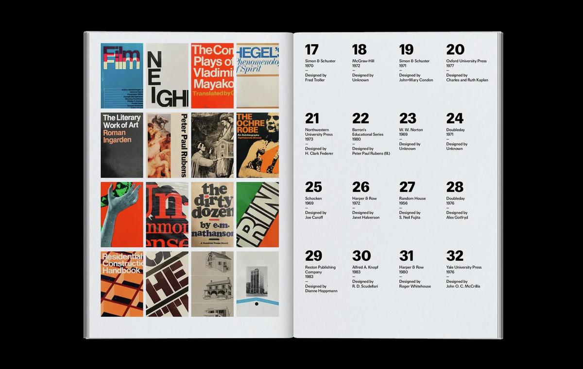
This page from Interview magazine in 1976, typeset in Helvetica, is a good example of the particular kind of softness seen in the typesetting of the era.
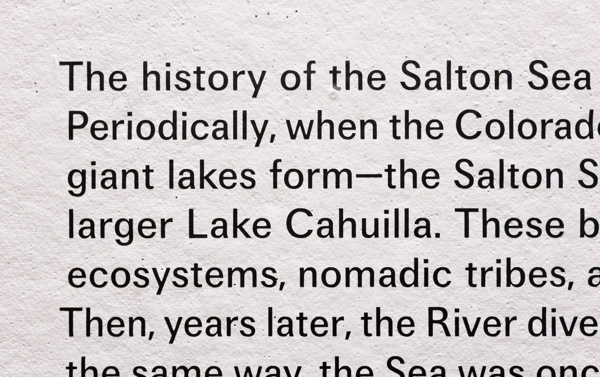
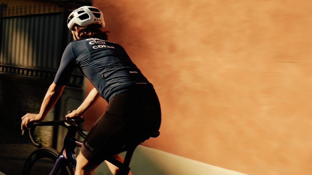
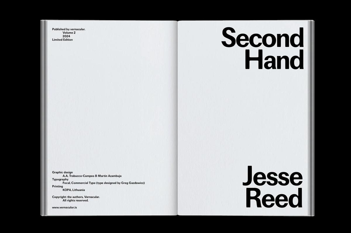
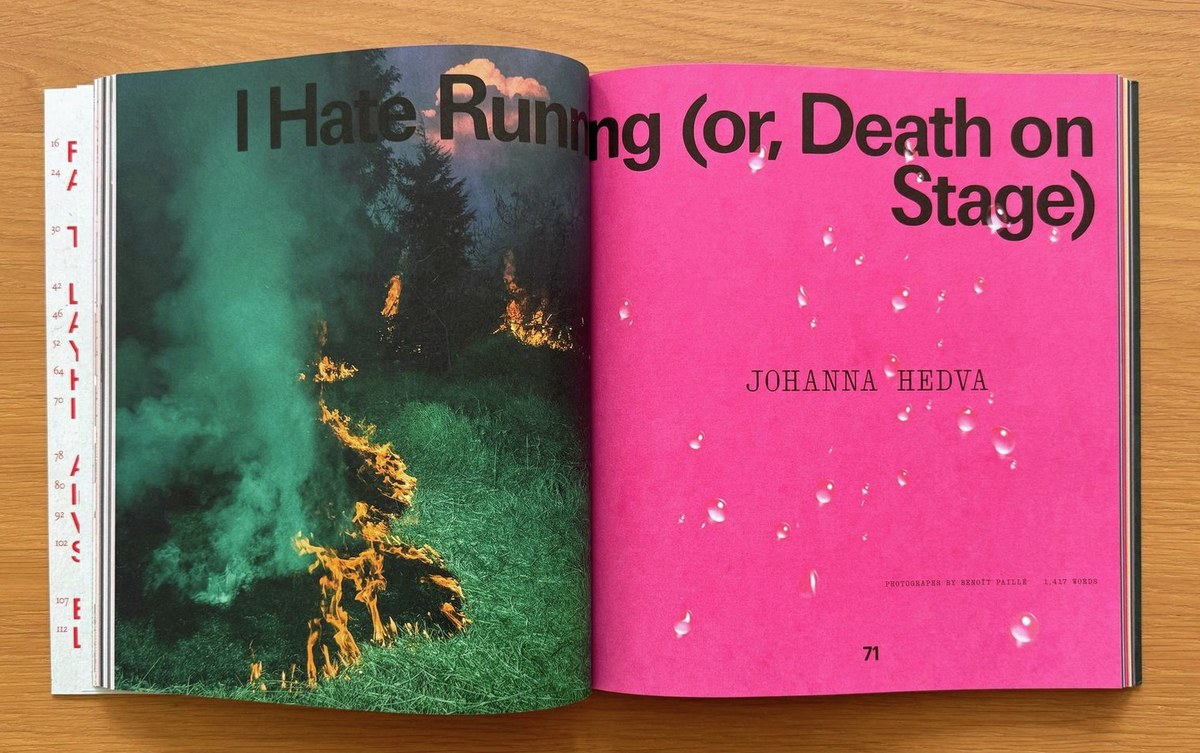
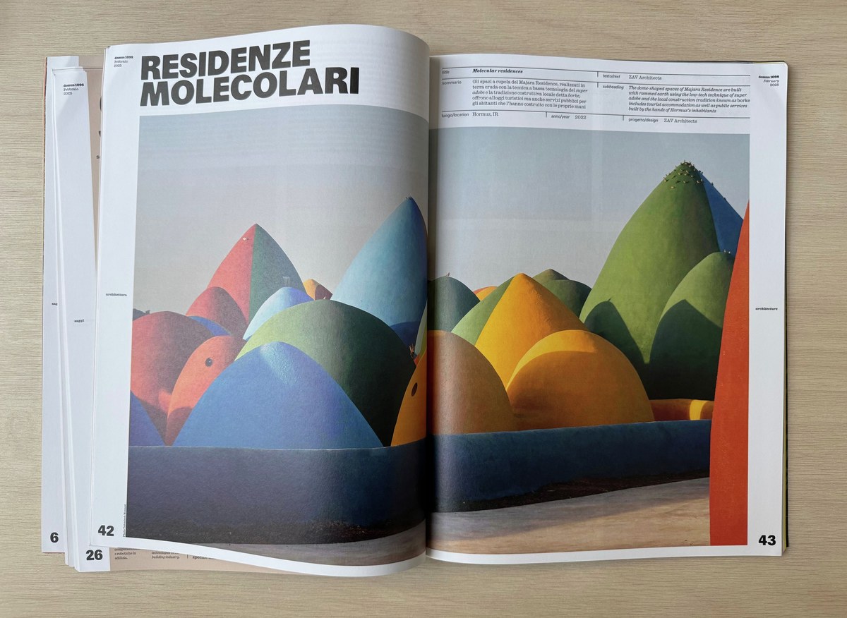
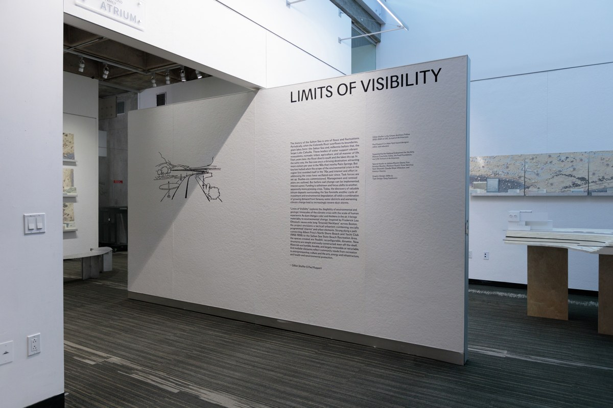
Fairly early on, Focal found an audience. Influential journalist-turned-creative director Francesco Franchi put it to work in La Repubblica and Domus; and Andrea Trabucco-Campos and Martin Azambuja decided that it was a perfect fit for their design of Jesse Reed’s book Second Hand. At a certain point, Gazdowicz also noticed that people were setting Focal quite large: Willy Ip used it for wall text for an architecture exhibition at the University of Southern California; Chloe Scheffe chose it for titles and other big text in Elastic Magazine. And that works: Focal’s soft corners and other structural idiosyncrasies give it a strange, out-of-scale quality at display sizes.
Nevertheless, Gazdowicz found himself wanting to create a nervier complement to Focal. A client project for lifestyle platform Emcee with Richard Turley of FOOD offered an opportunity to test the waters. Emcee needed a workhorse sans that would perform well at a range of sizes for its website and app; Gazdowicz initially proposed Focal, precisely because of its “small can be big” properties, but it was too polite: it felt small and timid in the image-heavy interface and wasn’t assertive enough for a wheat-paste campaign.
Gazdowicz started thinking about ways he could make Focal more functional for interface elements, while also giving it a bit of an attitude. It occurred to us that Frutiger’s Vectora might offer useful lessons in this regard, as would Futura Maxi, the family Victor Caruso designed for PLINC in 1960 to adapt Paul Renner’s Futura for changing tastes. I had long admired Frutiger’s final typeface, an early-nineties meditation on American gothics drawn for classified ads in newspapers; in fact, I drew a custom thin weight of it for O, The Oprah Magazine when I was at Font Bureau. In a way this brought us back full circle to Focal, which began as a study of Franklin Gothic, Trade Gothic, and News Gothic before swerving into more conceptual territory.

Focal Maxi was originally designed for the social shopping platform Emcee.
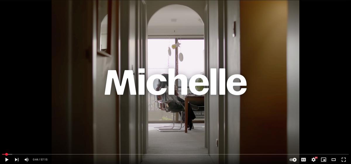
Jonny Sikov chose Focal Maxi as the primary typeface for Derrick Gee’s Solid Air.
