Eugenio Serif and Sans, two basic typefaces
In 1991, Massimo Vignelli famously wrote: “Out of the thousands of typefaces, all we need are a few basic ones, and trash the rest.” This was part of a provocative invitation to an exhibition of sixteen pieces of his work, using just four typefaces: Bodoni, Century, Garamond, and Helvetica. Taking such a dogmatic public stance yielded attention, but many other typefaces also appear across Vignelli’s body of work: Standard (better known as Akzidenz Grotesk), Univers, Melior, and—memorably—a whole lot of Futura.
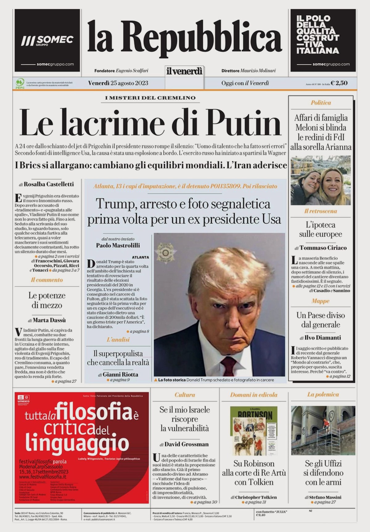
In 2017, the popular daily newspaper La Repubblica in Rome undertook a major redesign, headed up by then-new managing editor Francesco Franchi, a contemporary icon of publication design thanks to his years at IL, a monthly magazine published in Milan; and Angelo Rinaldi, art director of La Repubblica since 1996. Franchi had a crisp, modern look in mind and needed new typefaces to execute his vision of “looking to the past to go into the future,” so he contacted Commercial Type. We provided separate, complementary sans and serif headline families, inspired in part by Vignelli’s use of Bodoni and Futura, along with a new text face later released as Darby Serif. The two families are named for Eugenio Scalfari, cofounder of La Repubblica and its editor in chief, from its founding in 1976 to 1996.
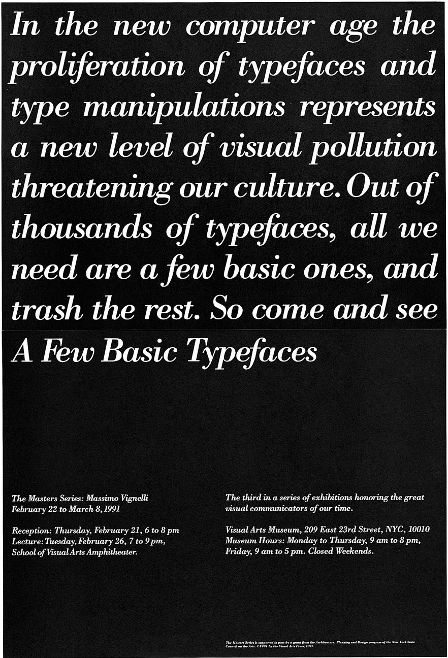
Massimo Vignelli, exhibition poster, 1991.
A fresh take on Bodoni
The design was reworked in 2023, keeping the same type palette but restructuring pages and introducing a shadow motif.
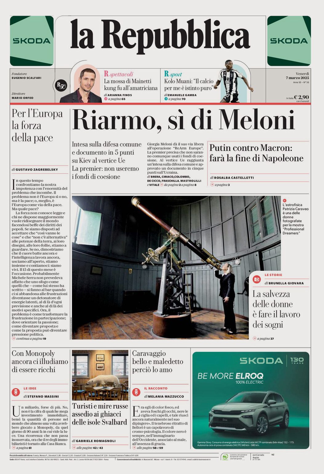
Another redesign launched in March 2025, using fewer rules and introducing Eugenia for sections.
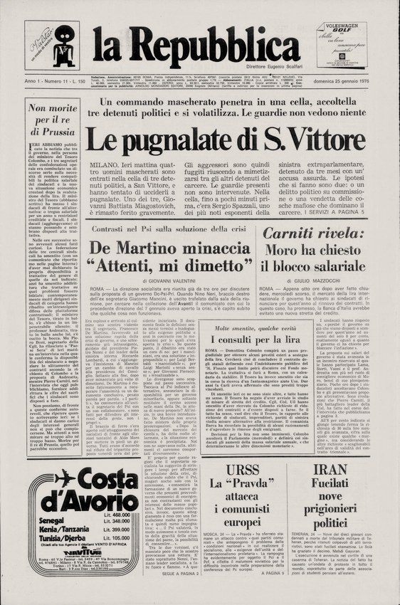
La Repubblica front page from 1976 (Biblioteca Nazionale Centrale di Roma). The largest headline is in an unidentified variant of Times; smaller headlines are set in Bodoni.
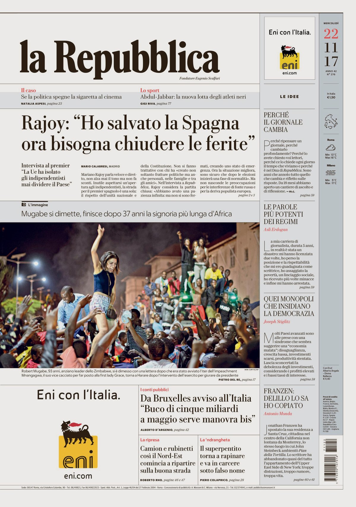
The redesign using Eugenio Serif and Sans debuted in November 2017.
The design was reworked in 2023, keeping the same type palette but restructuring pages and introducing a shadow motif.
Another redesign launched in March 2025, using fewer rules and introducing Eugenia for sections.
La Repubblica front page from 1976 (Biblioteca Nazionale Centrale di Roma). The largest headline is in an unidentified variant of Times; smaller headlines are set in Bodoni.
The redesign using Eugenio Serif and Sans debuted in November 2017.
The primary voice of La Repubblica is Eugenio Serif, used for headlines throughout the newspaper. Designer Miguel Reyes (assisted by Hrvoje Živčić and Christian Schwartz) took inspiration from the history of the newspaper itself: When launched, La Repubblica used Bodoni and Times New Roman as its primary typefaces, so a fresh take on Bodoni, then out of style for news, seemed like a good approach for setting La Repubblica apart in the competitive world of Italian dailies.
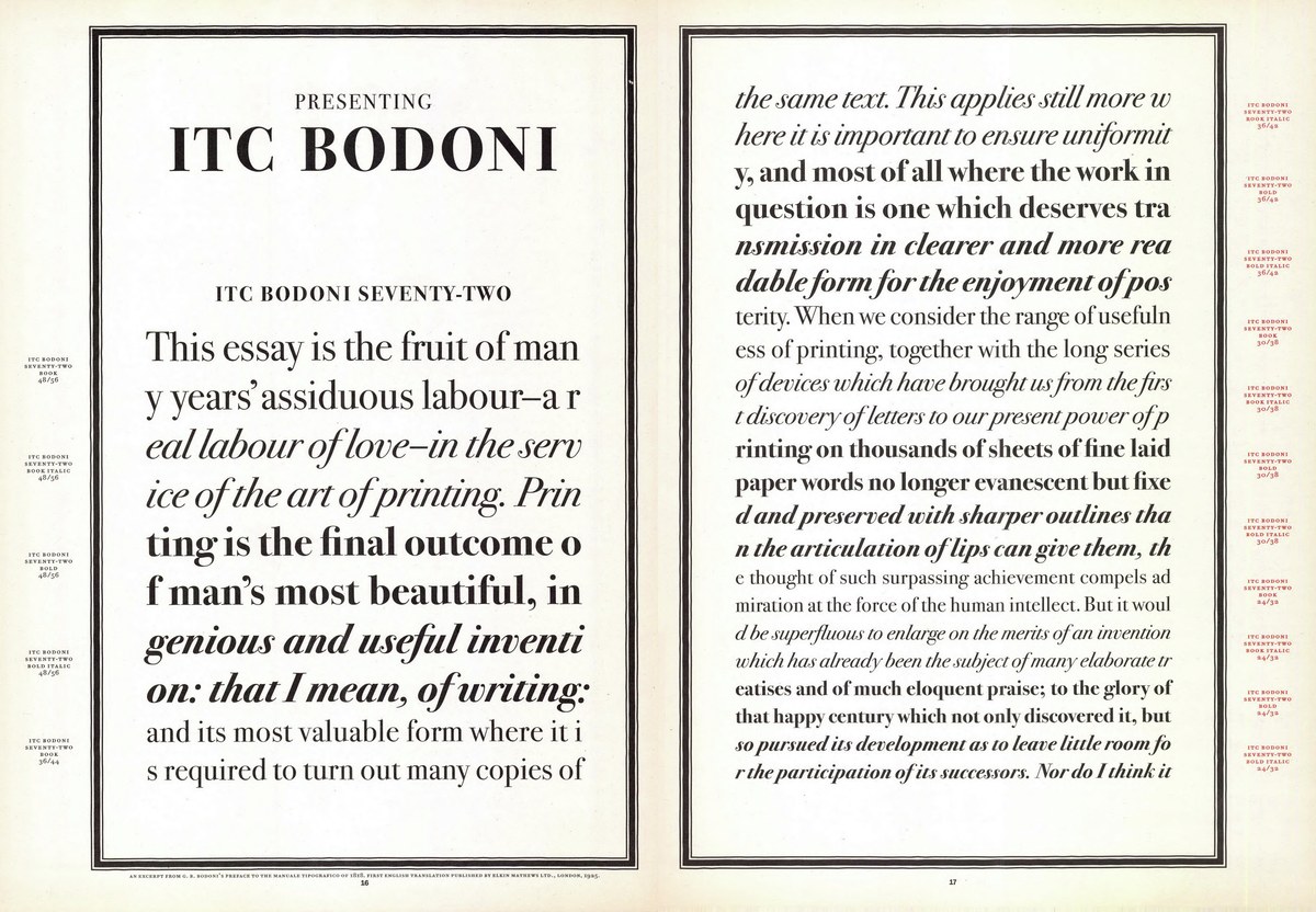
The Museo Bodoniano in Parma has a collection of 407 Latin types cut by Giambattista Bodoni in his lifetime, including 146 roman and italic pairs, plus 155 titling and script faces, documented in the two-volume Manuale Typografico printed by his widow Margherita Dall’Aglio Bodoni five years after his death in 1813. Though these typefaces all follow the same recognizable high-contrast style, there is considerable variation, giving ample room for interpretation in later revivals. Many of these cleaned up its quirks, such as the crisp, clean ATF Bodoni at the beginning of the twentieth century, or Vignelli and Tom Carnase’s WTC Our Bodoni (drawn with vertical proportions to match Helvetica) for the World Typeface Catalog in 1989. Zuzana Licko’s wonderful Filosofia is her own idiosyncratic take, soft but constructed. Gert Weischer and Günter Gerhard Lange both embraced the organic looseness of Bodoni’s shapes in their takes on the genre. Though it didn’t make much of a splash when it first appeared, ITC Bodoni by Jim Parkinson, Holly Goldsmith, and Sumner Stone evokes the sculptural qualities of Giambattista Bodoni’s punches, and is the rare Bodoni revival that preserves his careful approach to modifying his letterforms to best work at different sizes.
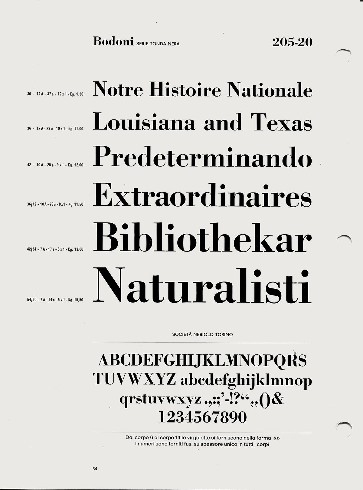
Bodoni Bold shown in a Nebiolo specimen from around 1969. A phototype adaptation appears to be the version of Bodoni used by La Repubblica in the 1970s, but the design is indistinguishable from ATF Bodoni and it is not clear which came first.
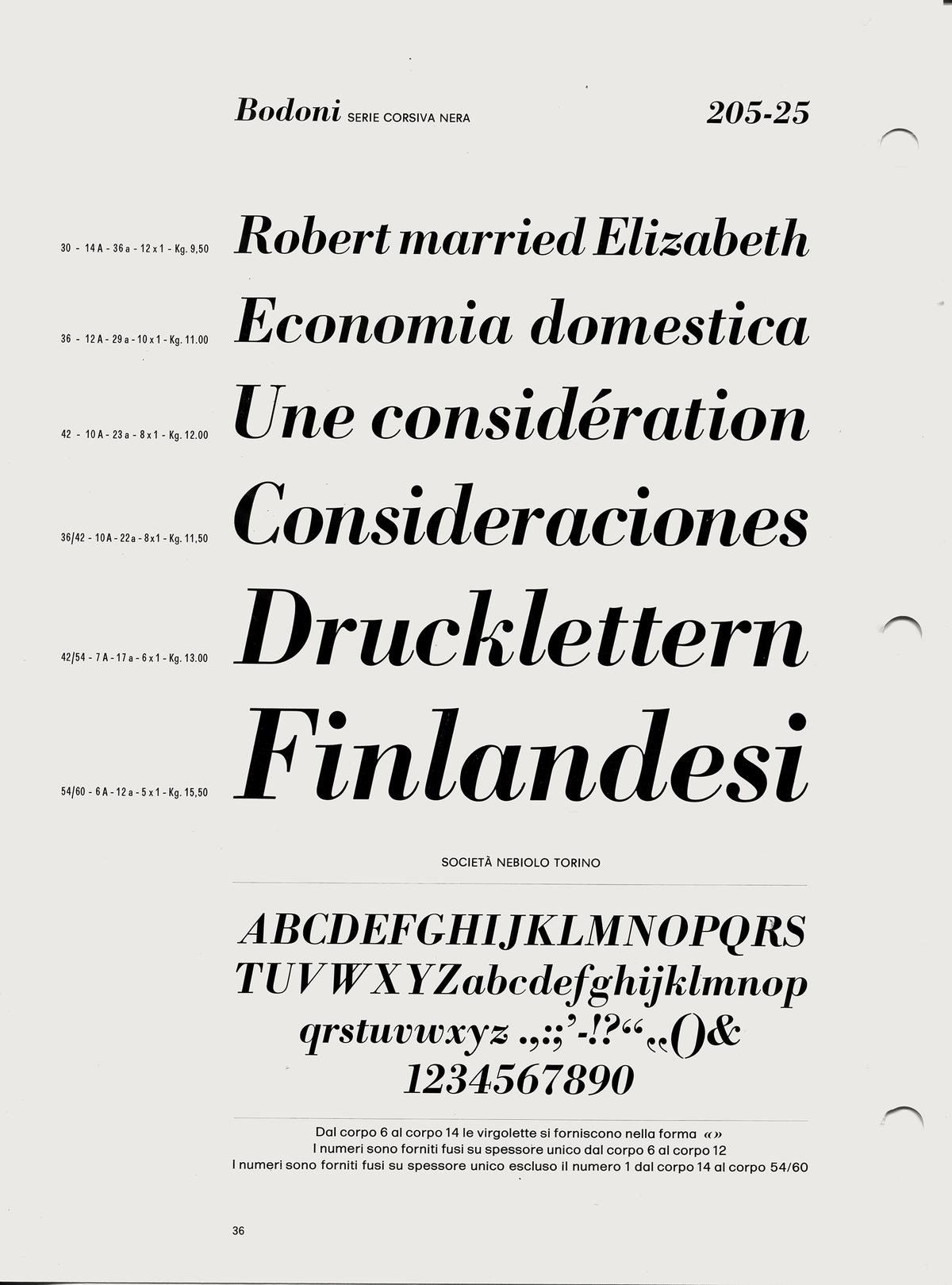
Bodoni Bold Italic shown in a Nebiolo specimen from around 1969. The stiffness informed Miguel Reyes’s approach to the italics for Eugenio Serif.
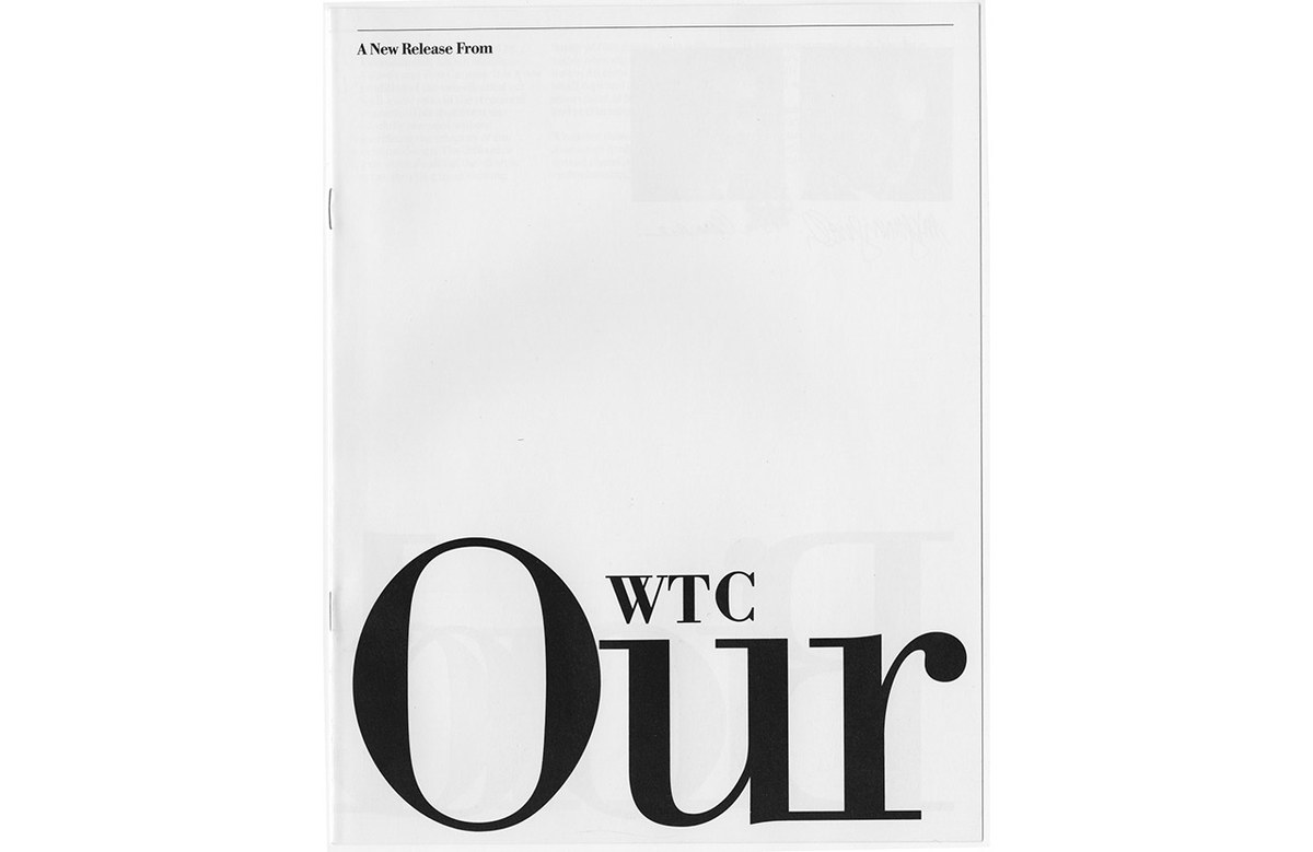
Cover of WTC Our Bodoni specimen, Massimo Vignelli and Tom Carnase, 1989.
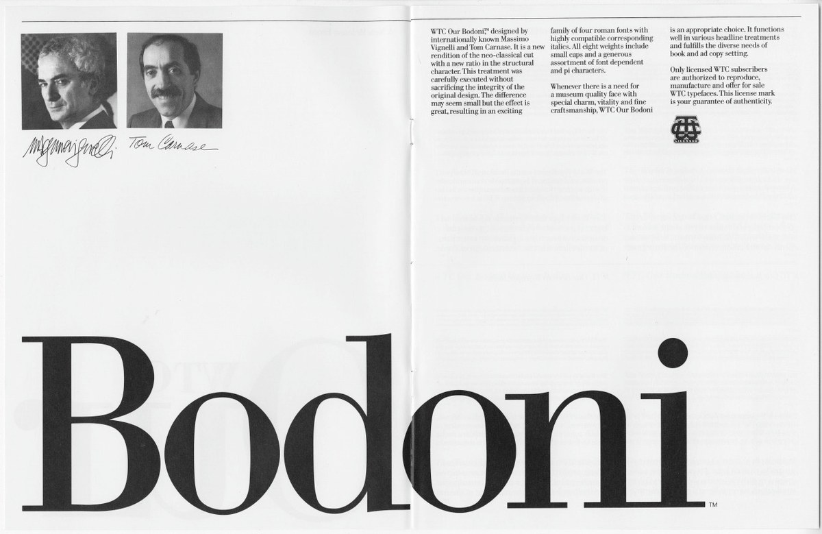
Spread from WTC Our Bodoni specimen, Massimo Vignelli and Tom Carnase, 1989.
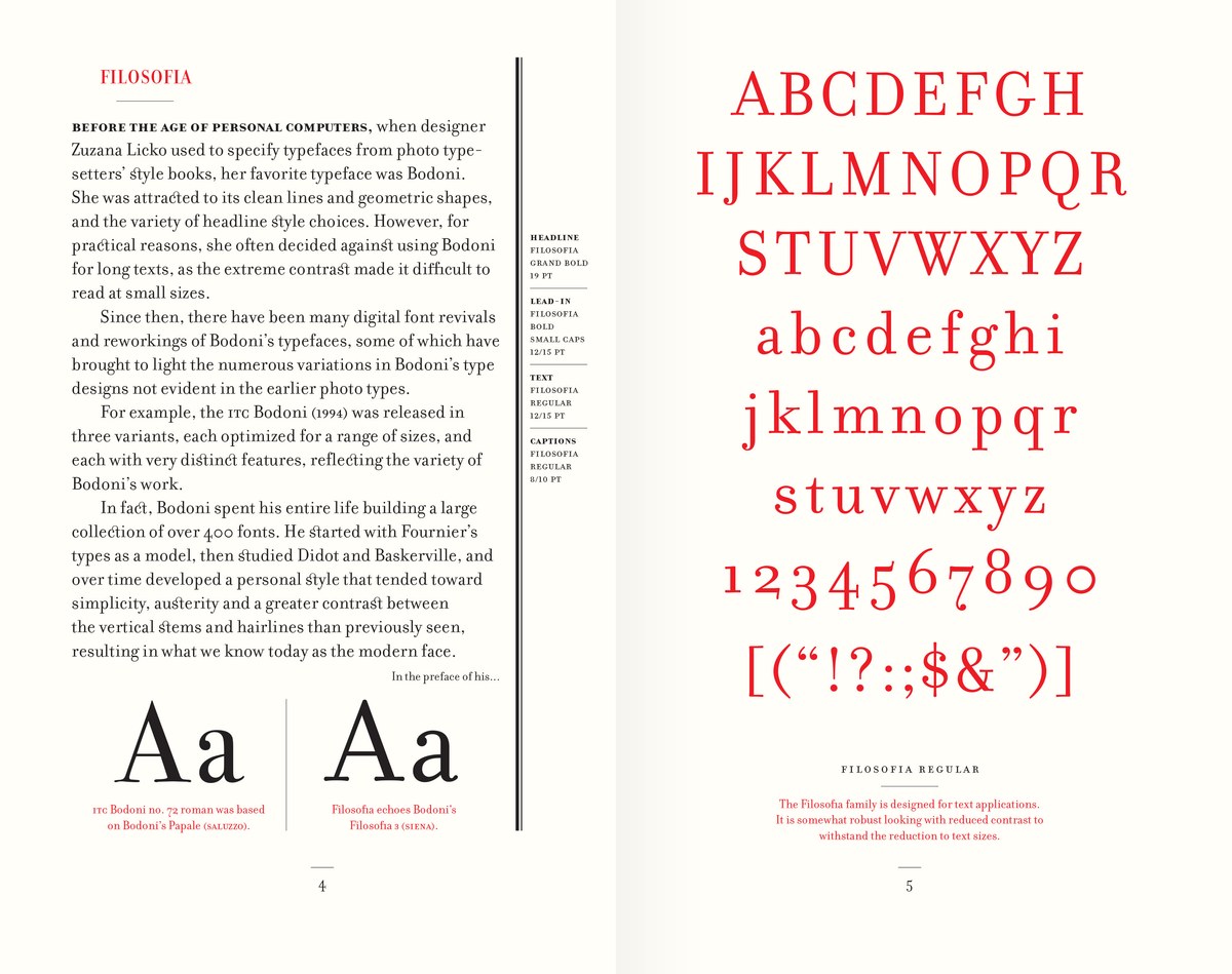
Spread from Notes on Filosofia, Zuzana Licko and Rudy VanderLans, 2019.
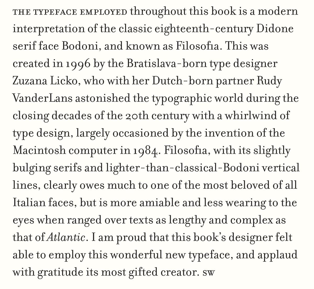
Excerpt from the Notes on Filosofia specimen booklet, reprinting a text written by Simon Winchester from the colophon of one of his books.
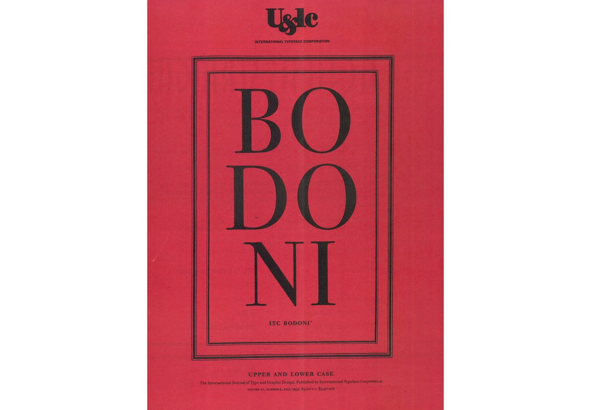
Cover of U&lc volume 21, no.2, published by the International Typeface Corporation, fall 1994. Designed by Roger Black and Paul Barnes.
Spread from U&lc volume 21, no. 2, published by the International Typeface Corporation, fall 1994. Designed by Roger Black and Paul Barnes.
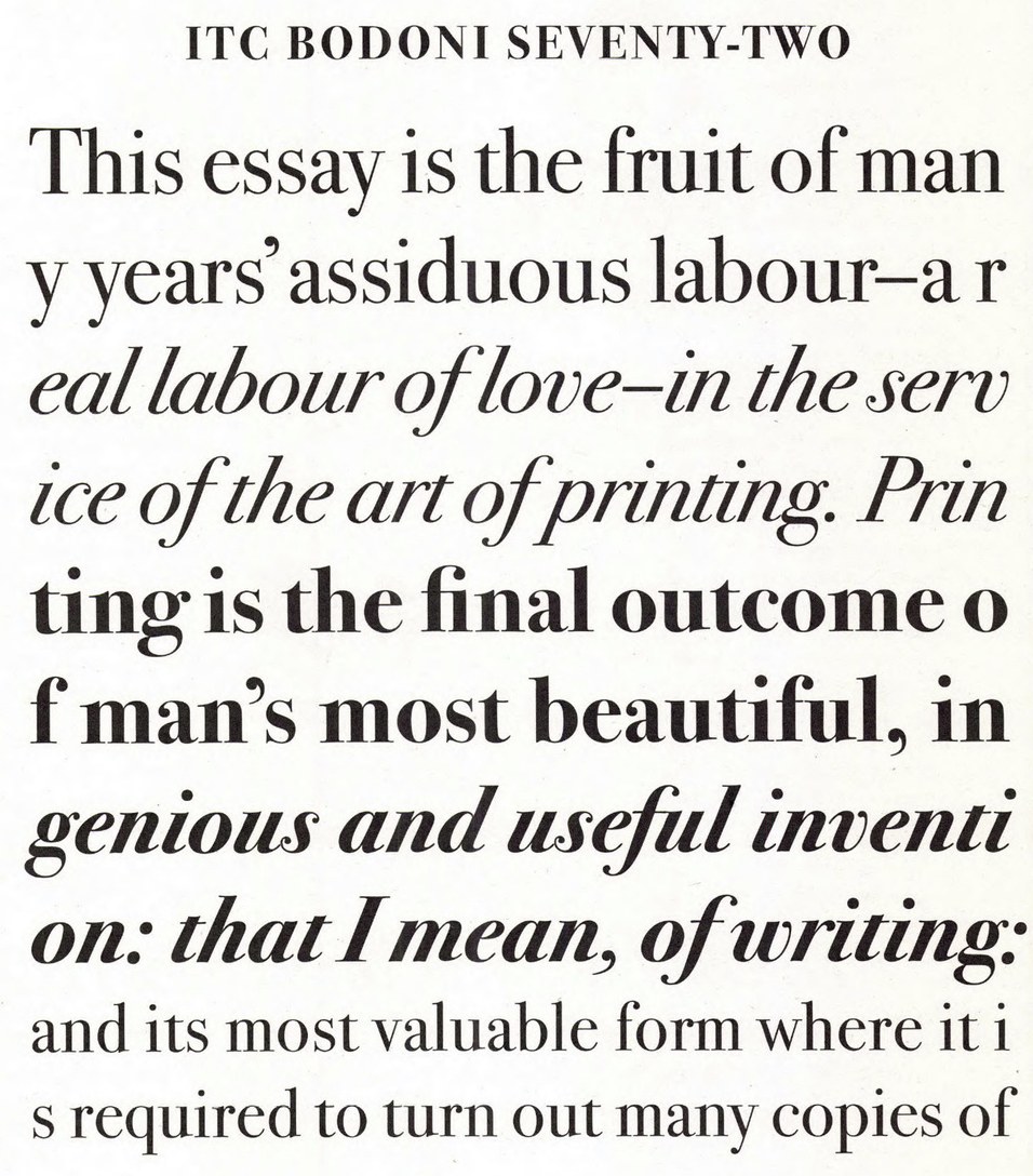
ITC Bodoni 72 is based closely on the Papale size, the largest types cut by Bodoni, around 72pt.
Looking specifically at the smaller 16pt and 24pt specimens from a facsimile of Giambattista Bodoni’s definitive 1818 Manuale Typographico, Reyes was drawn to the warmth and softness of the forms, reminiscent of how Bodoni appeared in La Repubblica’s pages in the 1970s. Without reducing the contrast as we did with our earlier exploration of Bodoni’s work, Caponi, Reyes introduced enough softness to make Eugenio Serif feel lived-in, but avoided the historical eccentricities in the source material—at least at first—by drawing a structured italic with a regular rhythm. Eugenio Serif Poster has higher contrast and less softness for larger headlines, primarily in print.
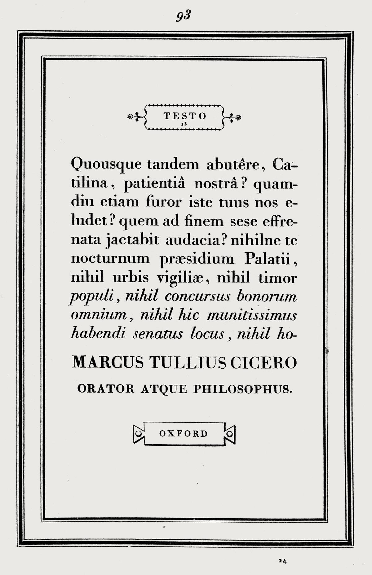
Testo, around 16pt, shown in a facsimile edition of Bodoni’s Manuale Tipografico, Holland Press, London, 1960.
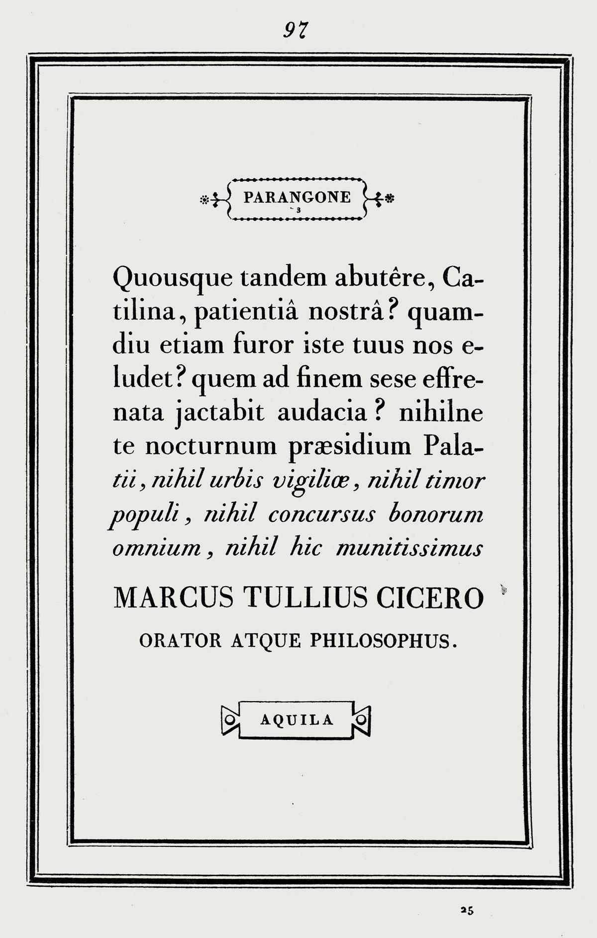
Parangone, around 20pt, shown in a facsimile edition of Bodoni’s Manuale Tipografico, Holland Press, London, 1960.
A geometric counterpoint
To complement Eugenio Serif, designer Greg Gazdowicz created a sans that can be either stylish or pragmatic, as needed. Early in the process, he and Franchi settled on a geometric sans serif, partially inspired (again) by Vignelli’s use of Futura. Eugenio Sans appears in the newspaper at many sizes: from big drop caps to small captions, sidebars, and infographics. It also serves as the primary headline typeface for Sports and other feature sections, with Eugenio Serif earmarked for news headlines.
Though the geometric sans genre is remarkably crowded, Gazdowicz found that by focusing on the technical constraints of newsprint and complementing Eugenio Serif, he wound up with a fresh design. Strokes terminate at flat verticals, creating open apertures and clean spaces between letters, which makes the typeface highly readable and keeps it from feeling nostalgic. Eschewing the sharpness of Futura, the blunt stroke endings and apexes of Eugenio Sans provide a strong contrast with Eugenio Serif. Each of the typefaces is everything the other is not.
Eugenio Sans’s plain, readable nature has proven to be useful far beyond news in print and on screen. The Memorial Sloan Kettering Cancer Center in New York commissioned a customized version of the typeface in 2022 that works ably across signage, marketing, websites, and even digital medical records.
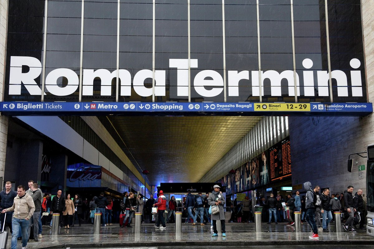
Vignelli Associates used Futura for the signage at Roma Termini station.

Top: Futura Medium, Paul Renner, 1929.
Bottom: Eugenio Sans Regular.
An extra addition
The Papale size (around 72pt) informed our approach to head serifs and bowls in Eugenia Poster.

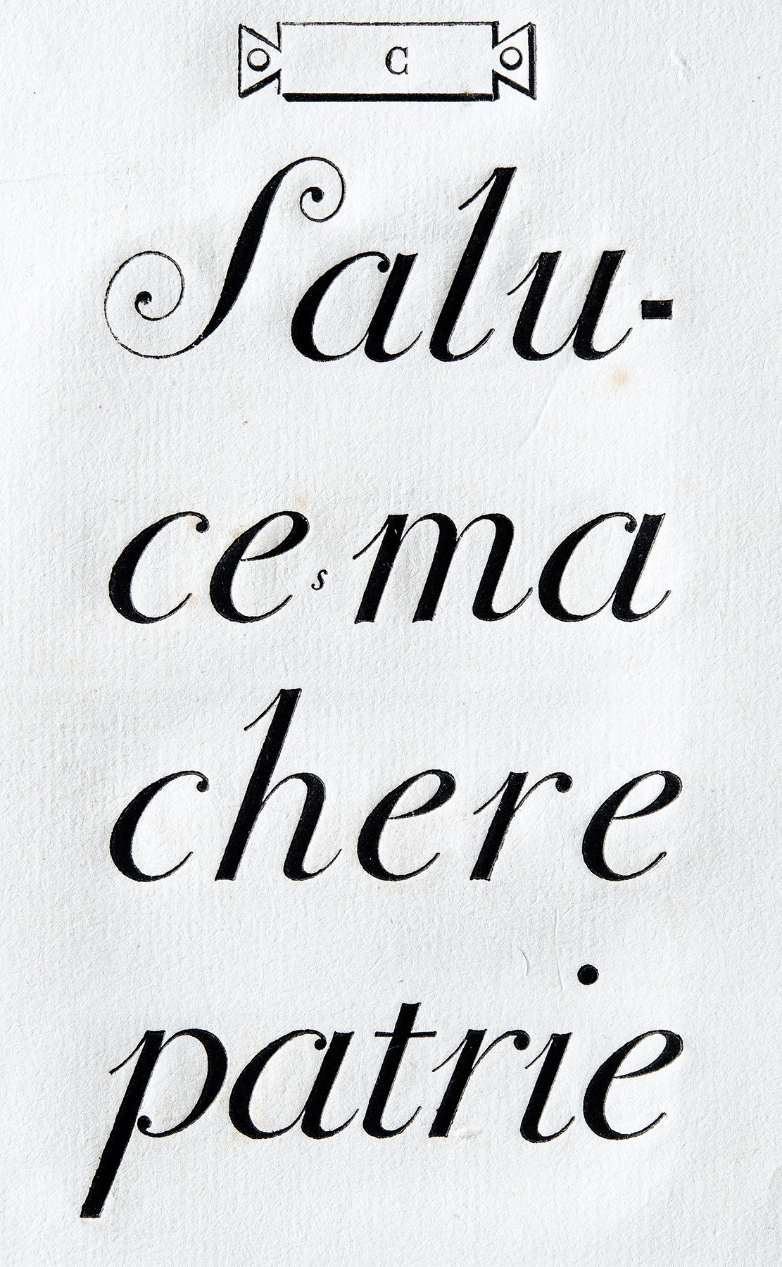
This page of German text was a primary reference for the swash caps in Marian 1800 Italic.
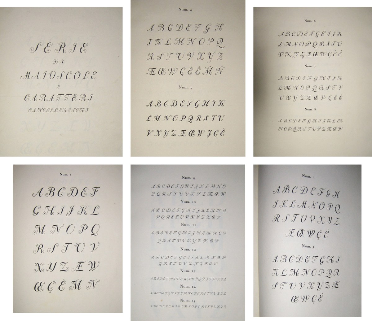
Paul Barnes provided snapshots of swash caps in Bodoni’s Manuale, showing a dizzying variety of constructions.
The Papale size (around 72pt) informed our approach to head serifs and bowls in Eugenia Poster.
This page of German text was a primary reference for the swash caps in Marian 1800 Italic.
Paul Barnes provided snapshots of swash caps in Bodoni’s Manuale, showing a dizzying variety of constructions.
The Papale size (around 72pt) informed our approach to head serifs and bowls in Eugenia Poster.
The 2021 relaunch of La Repubblica’s women’s magazine D gave Reyes an opportunity to dive headfirst into Giambattista Bodoni’s italics, many of which have exuberant swashes and exist at various points on a continuum between traditional italics and connecting scripts. These are a far cry from the crisp precision of ATF Bodoni or Bauer Bodoni, and previous revivals such as Sumner Stone’s ITC Bodoni 72 Swash and Gert Weischer’s Bodoni Classic Chancery have only scratched the surface. Reyes’s interpretation, Eugenia, has since taken on a more prominent role in La Repubblica, appearing throughout the 2025 refresh.
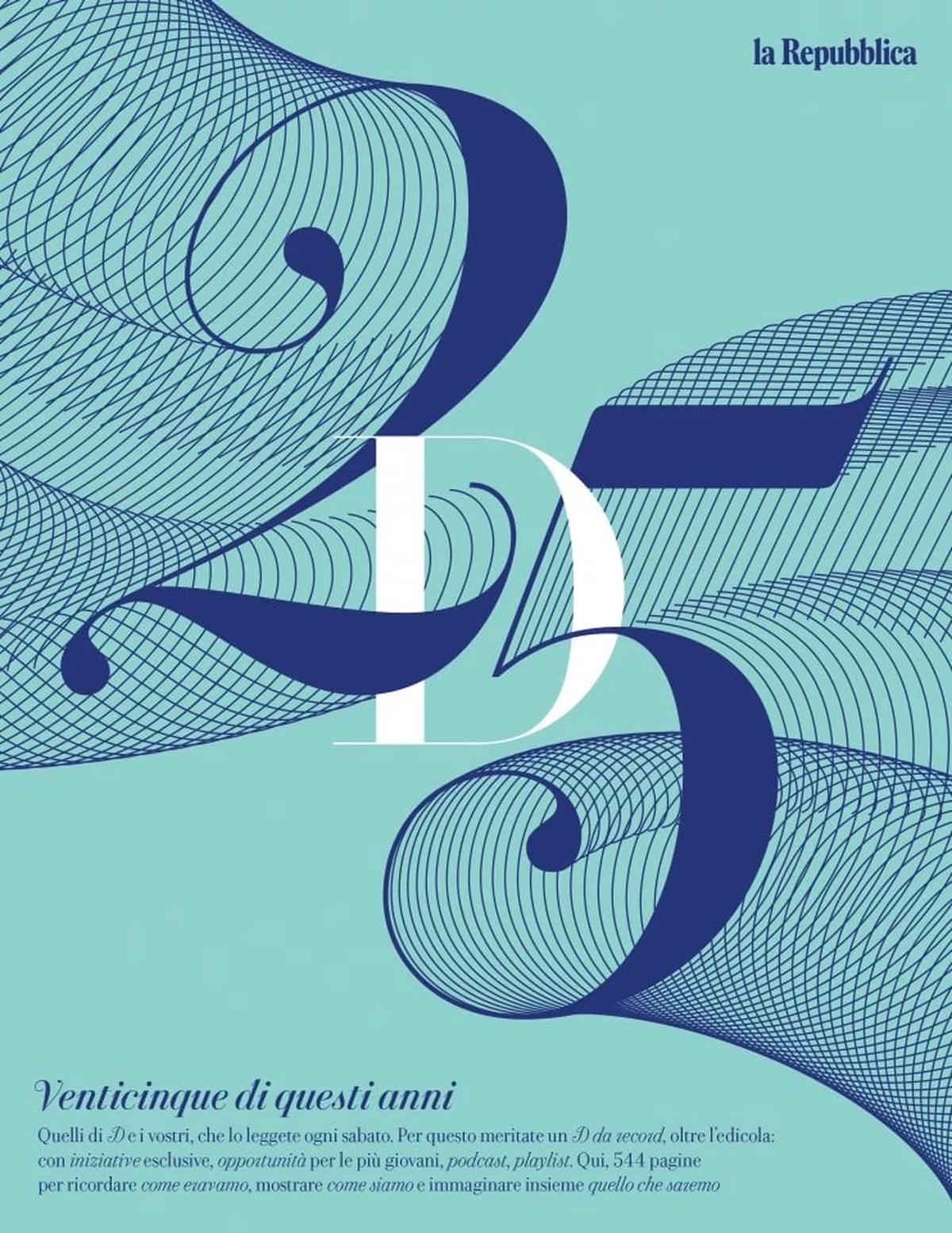
Cover of the first redesigned issue of D, October 2021. Lettering by Miguel Reyes and Christian Schwartz.