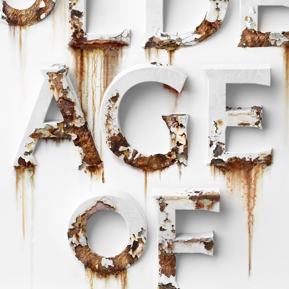
Punch

| Designer | Paul Barnes |
| Designed | 2023 |
| Last updated | 4 Jan, 2024 |
| Styles | 2 |
| Price | $60.00 style $90.00 family |
| Character set | Standard character set |
Punch Family

Punch Family


Punch Family
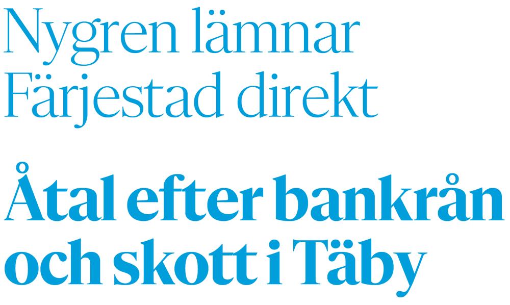
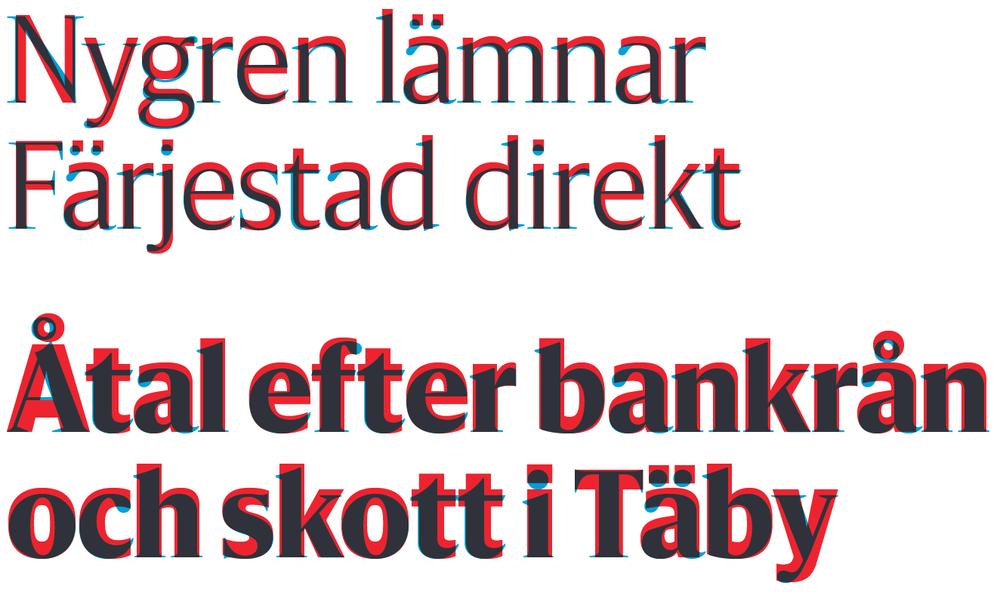
Punch is a revisiting of Miller & Richard’s News Bill series, a display face made in the 1880s. Paul Barnes added a roman to the italic for Fraser Muggeridge studio’s exhibition and publication design for ‘Yayoi Kusama: You, Me and the Balloons’ at Factory International, Manchester.
Punch Family

Book cover designed by Fraser Muggeridge studio, 2023

Book designed by Fraser Muggeridge studio, 2023
Feature Flat

| Designers | Christian Schwartz, Berton Hasebe |
| Last updated | 5 Dec, 2023 |
| Styles | 28 |
| Price | $50.00 style $200.00 family |
| Character set | Standard character set |
Feature Flat Collection


Feature Flat Collection

Feature Flat Display and Deck

Feature Flat Display and Deck

Feature Flat Text

Feature Flat Text
Feature Flat Collection
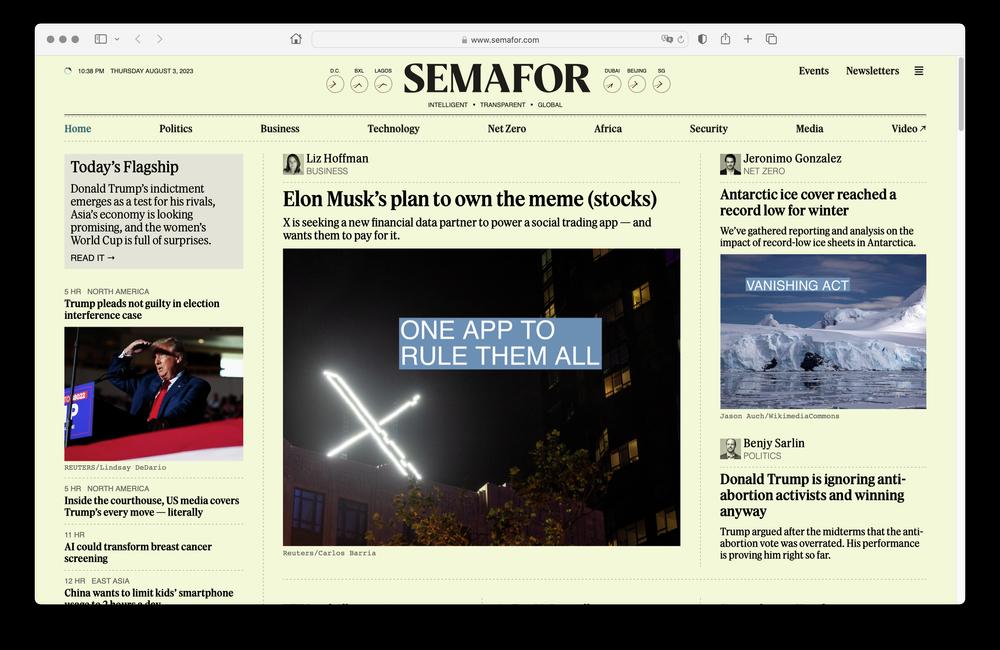
Feature Flat was originally created for Semafor, as a calmer and more newsy variant on Feature, with flat rather than angled head serifs.
Feature Flat Collection

Control

| Designers | Christian Schwartz, Miguel Reyes |
| Last updated | 4 Oct, 2023 |
| Styles | 18 |
| Price | $50.00 style $200.00 family |
| Character set | Standard character set |
Control Collection


Control Collection

Control Upright and Italic

Control Cursive
Control Collection
Control was designed by Christian Schwartz and Miguel Reyes, using the sans serif lettering examples in Walter Käch’s 1949 lettering manual Schriften Lettering Écriture as a basis. Schwartz has taken the idea of the lettering manual literally: Control has axes for weight, contrast, and apertures, and users are meant to find the right combination of these for any application. There is no “correct” version—the typeface is meant to be fine-tuned for each situation. The Cursive is loosely inspired by Van Dijk, drawn by Jan van Dijk for Letraset in 1982. The family first appeared in Interview, and the super tight TNT versions were inspired by the magazine’s archive. The magazine’s unique blend of high fashion and downtown trash culture was the catalyst for the Cursive, which leavens the serious modernism of the upright with strip mall hair salon vibes.
Control Collection
Spread from special issue of Interview from Art Basel Miami, 2023
Royal Gothic

| Designers | Tim Ripper, Paul Barnes |
| Designed | 2023 |
| Last updated | 3 Oct, 2023 |
| Styles | 14 |
| Price | $60.00 style $450.00 family |
| Character set | Standard character set |
Royal Gothic Family

Royal Gothic Family

Royal Gothic Family
Originally from Stevens, Shanks & Sons, revived in 2020 by Paul Barnes, assisted by Luke Charsley. Used by Fraser Muggeridge.
Updated 15 Sept 2021: refined kerning, added Heavy Italic style.
Expanded October 2023 with a full range of weights by Tim Ripper.
Royal Gothic Family
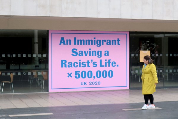
Jeremy Deller, An Immigrant Saving a Racist’s Life x 500,000, designed by Fraser Muggeridge studio. Part of Everyday Heroes at Southbank Centre, London, September – November 2020
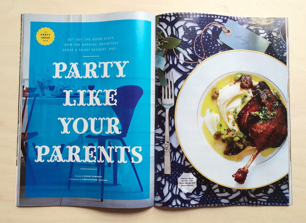
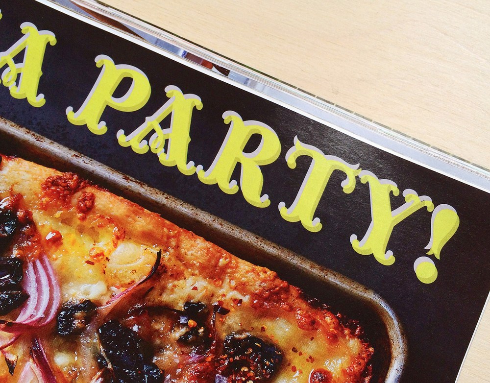
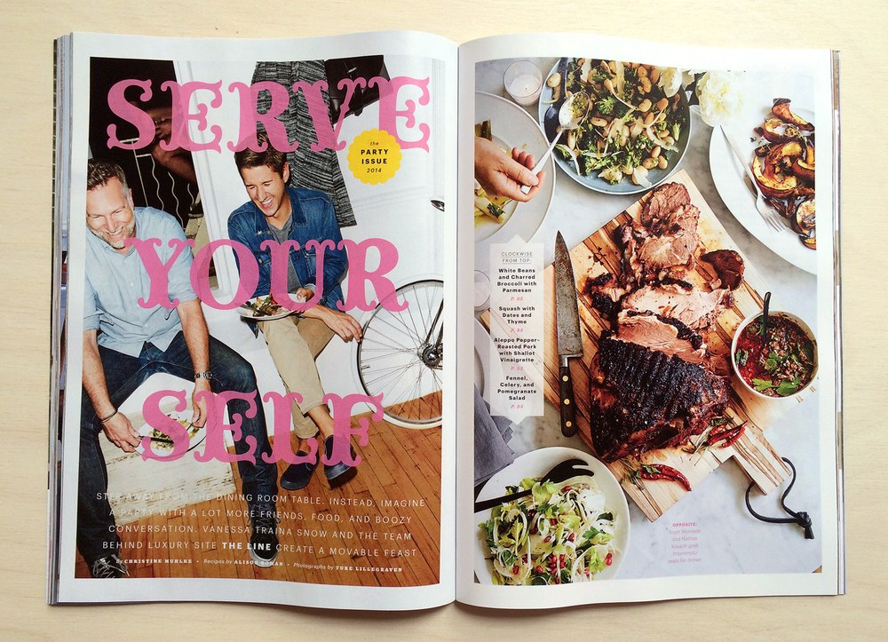
Lovesong

| Designer | Miguel Reyes |
| Designed | 2022 |
| Last updated | 23 Aug, 2022 |
| Styles | 1 |
| Price | $50.00 |
| Character set | Upper and lowercase, figures, basic punctuation, contextual alternates, swash capitals |
Lovesong Regular Style

Lovesong Regular Style

Lovesong Regular Style
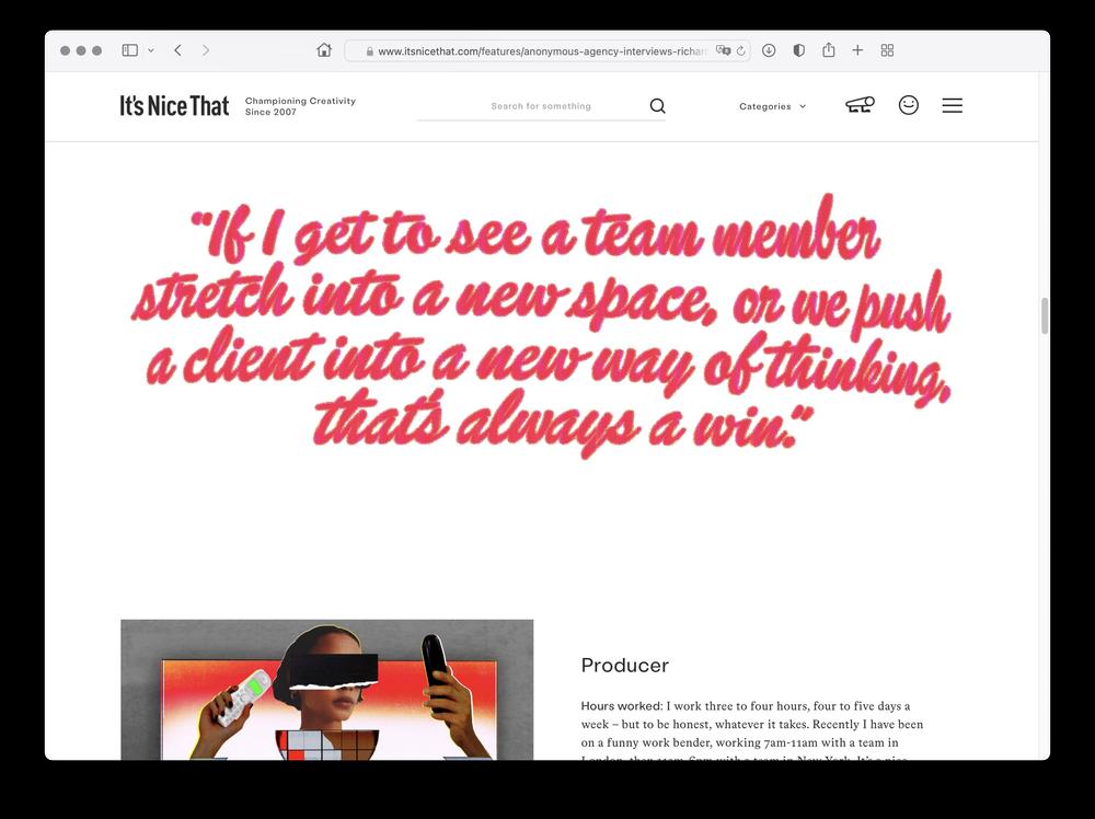
An homage to Brush Script by Miguel Reyes, started as a custom project that was cancelled amid a corporate reshuffle, and later finished for Richard Turley’s guest editorship of Its Nice That in August 2022. Miguel’s update draws on his experience with signpainting, toning down the bouncy baseline and facilitating use in all caps. Brush Script was designed by Robert E. Smith in 1942; a different Robert Smith provided the name.
Lovesong Regular Style
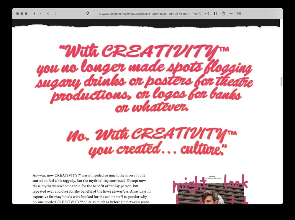
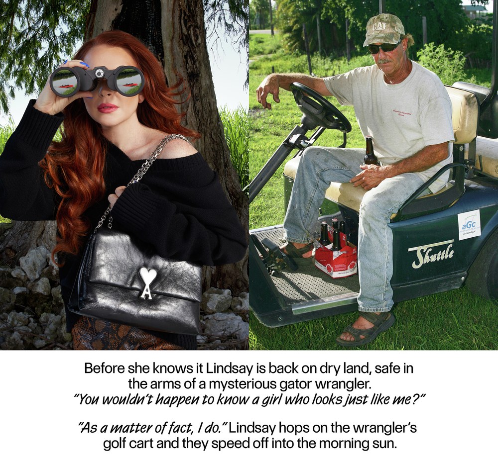
“Us Vs. Them” in Its Nice That, August 2022
“Us Vs. Them” in Its Nice That, August 2022
Eugenia

| Designer | Miguel Reyes |
| Designed | 2022 |
| Last updated | 19 Mar, 2022 |
| Styles | 4 |
| Price | $50.00 style $200.00 family |
| Character set | Standard character set |
Eugenia Family

Eugenia Family

Eugenia Poster Regular

Eugenia Poster Regular

Eugenia Poster Regular

Eugenia Headline Regular

Eugenia Headline Regular
Eugenia Family
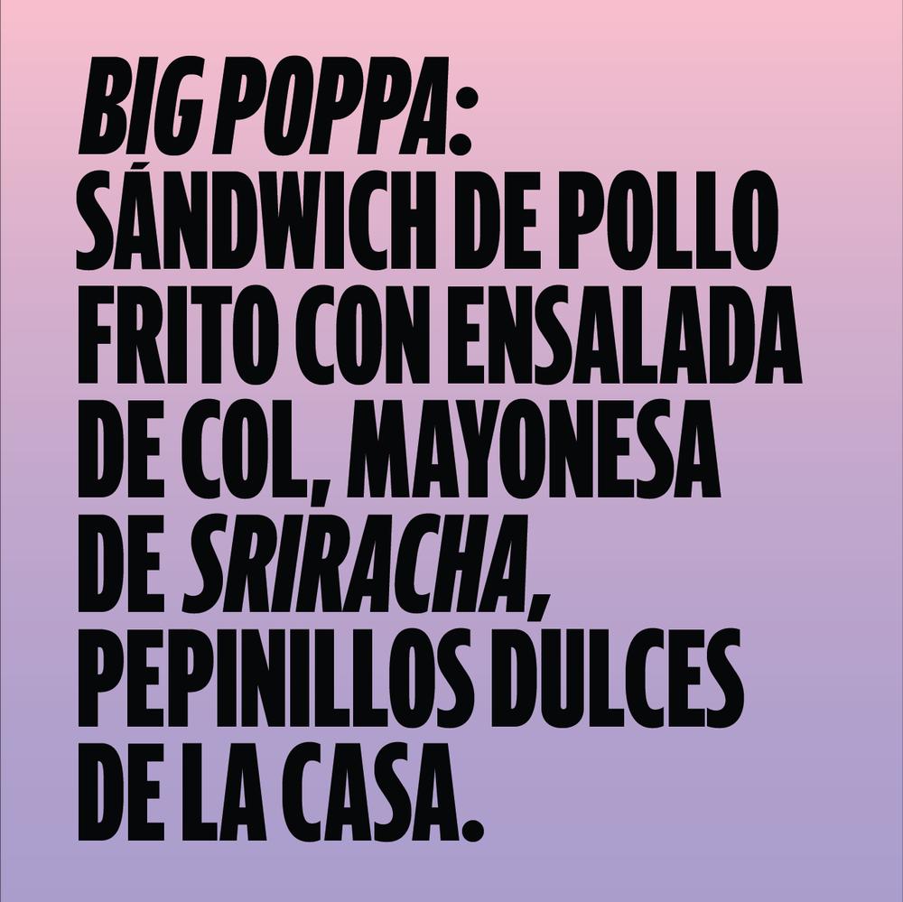
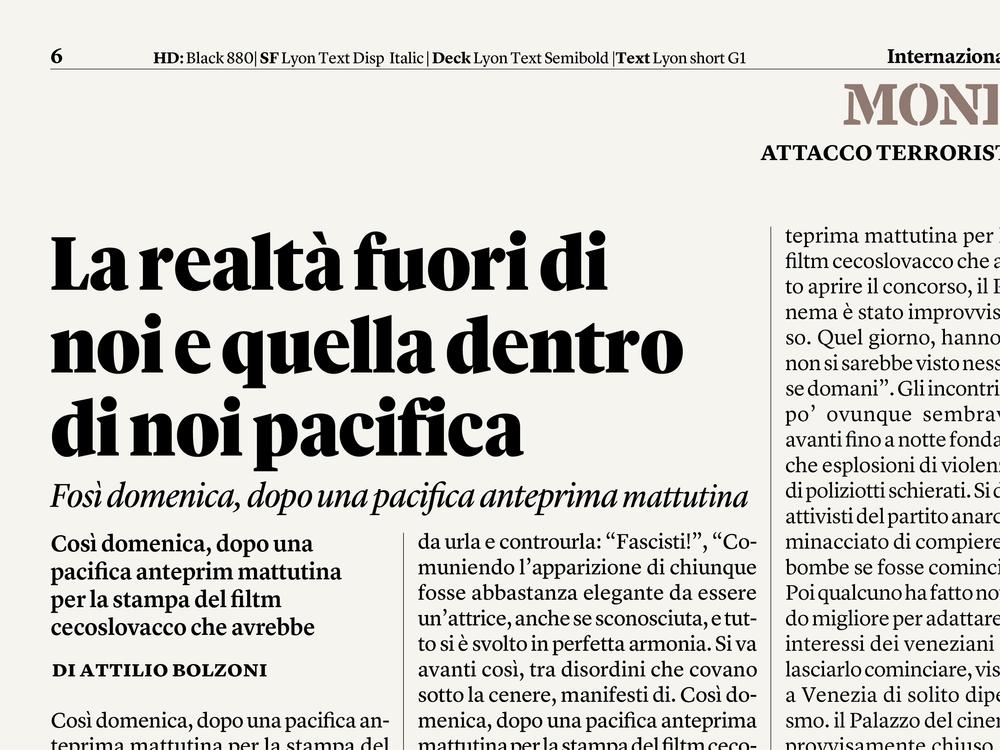
Commissioned for the La Repubblica weekly women’s magazine D, Eugenia by Miguel Reyes draws on all sorts of bizarre italic and script letterforms that Giambattista Bodoni cut in the 18th century. It was drawn to accompany Eugenio Serif, which Miguel drew for La Repubblica in 2018. Eugenio and Eugenia were both commissioned by Francesco Franchi.
Eugenia Family
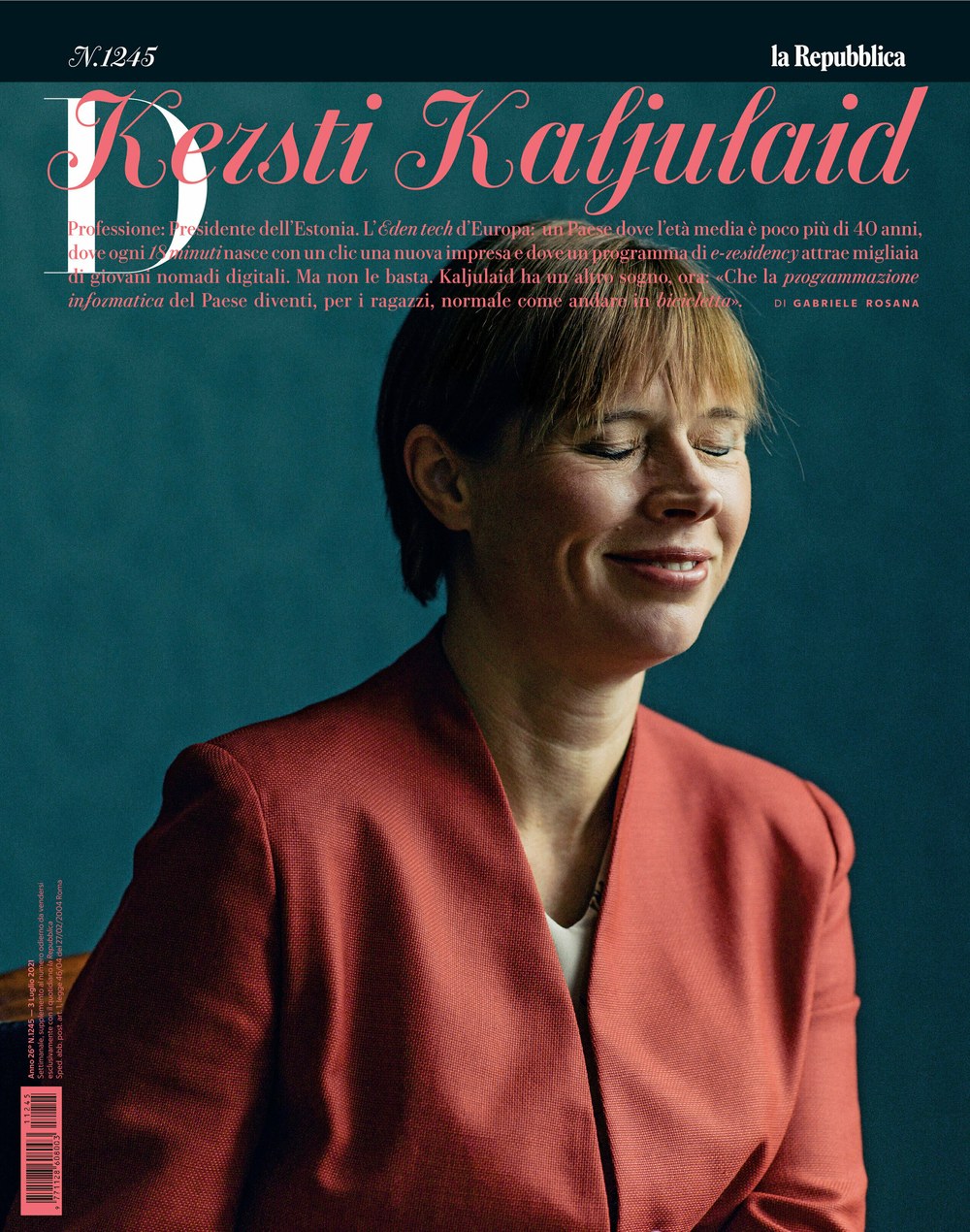
D cover, 3 July 2021
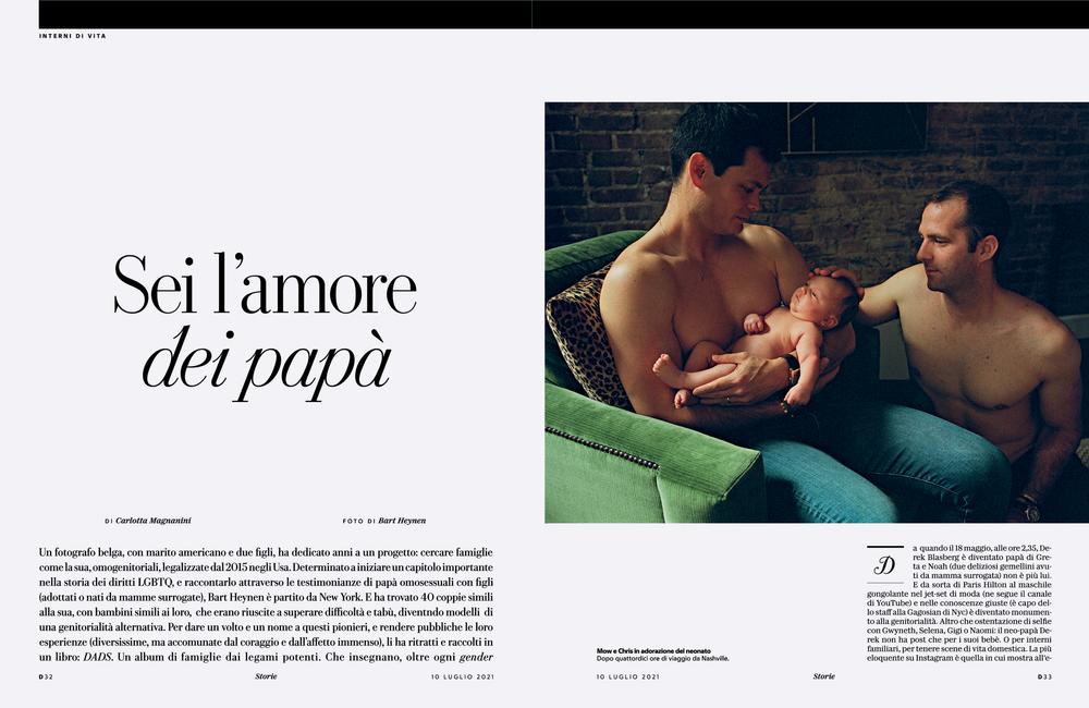
D spread, 3 July 2021
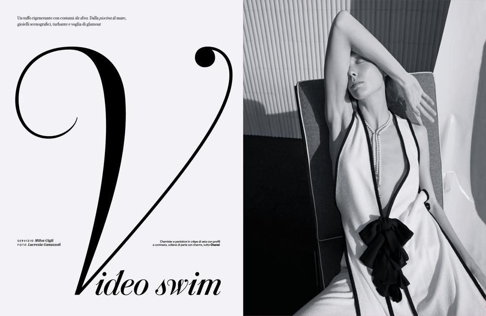
D spread, 3 July 2021
Produkt Condensed

| Designers | Kara Gordon, Berton Hasebe, Christian Schwartz |
| Designed | 2022 |
| Last updated | 9 Mar, 2022 |
| Styles | 18 |
| Price | $50.00 style $400.00 family |
Produkt Condensed Family


Produkt Condensed Family

Produkt Condensed Family
Narrower width of Produkt, drawn by Kara Gordon.
Produkt Condensed Family

Produkt Condensed Medium + Medium Italic
Canela Blackletter

| Designer | Miguel Reyes |
| Designed | 2021 |
| Last updated | 23 Nov, 2021 |
| Styles | 2 |
| Price | $50.00 style $70.00 family |
| Character set | Full upper and lowercase, limited accents and punctuation |
Canela Blackletter Family

Canela Blackletter Family

Canela Blackletter Family
Miguel Reyes drew this blackletter companion to Canela inspired by the long tradition of blacketter in Mexico, particularly on signage for small, casual restaurants called fondas. The first sketches became the logotype for his own family’s restaurant, Raíz, and the character set has since been filled out, including two kinds of capitals: a simplified set, and a more complex set that are evocative of newspaper nameplates.
Canela Blackletter Family

The initial idea for Canela Blackletter came about when Miguel drew the logotype for Raíz Cocina Contemporanea in Cholula, PUE.
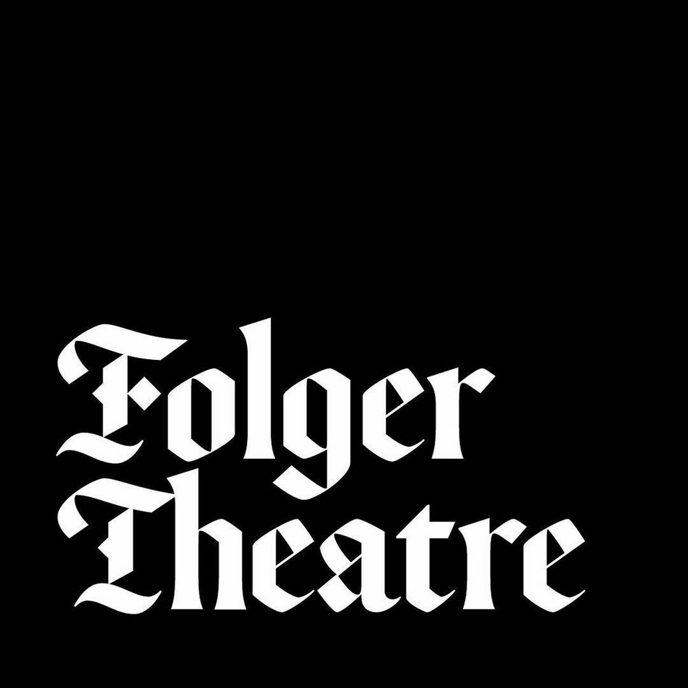
An early draft of the typeface was used in a proposal for the theater attached to the Folger Shakespeare Library in Washington DC.

An early draft of the typeface was used in a proposal for the theater attached to the Folger Shakespeare Library in Washington DC.
Candy Darling

| Designer | Miguel Reyes |
| Last updated | 23 Nov, 2021 |
| Styles | 1 |
| Price | $60.00 |
| Character set | Uppercase with 2 sets of swashes, lowercase with swashes for ascenders and descenders, numbers, currency, basic punctuation |
Candy Darling Regular Style

Candy Darling Regular Style


Candy Darling Regular Style
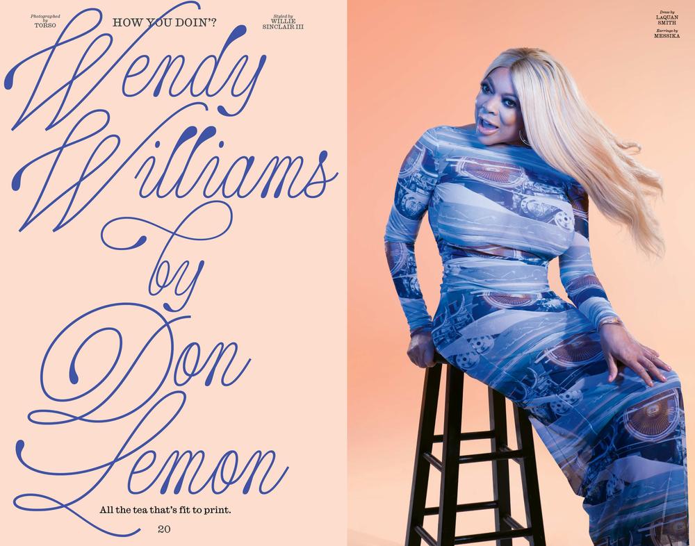
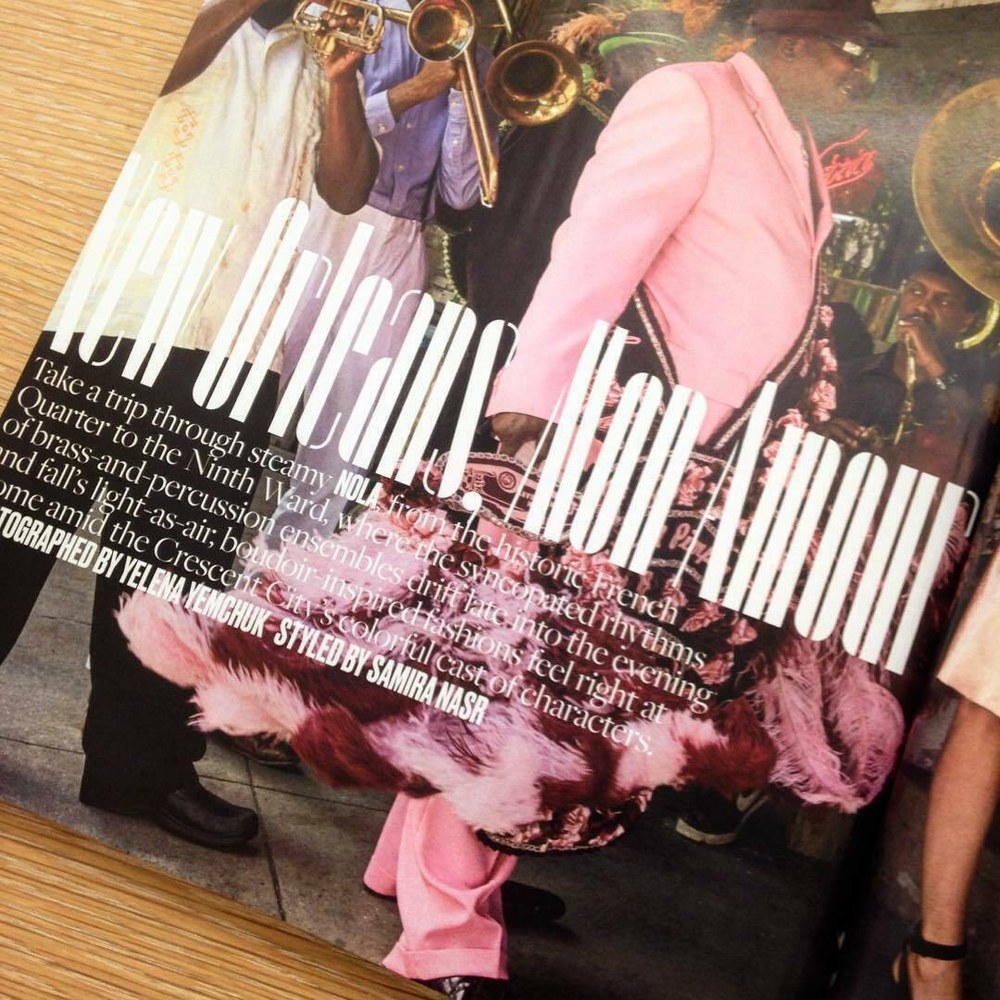
Candy Darling is a script typeface drawn by Miguel Reyes, commissioned by Richard Turley for Interview magazine in 2021. Named for one of Interview founder Andy Warhol’s superstars, this typeface sits at the intersection of chaos and careful engineering, good and bad taste, peep show neon and the formal script lettering of Doyald Young, with some bizarre forms and a wild set of swash capitals. Kurt Woerpel and Jack Vhay made it look incredible during its year in the magazine.
Candy Darling Regular Style
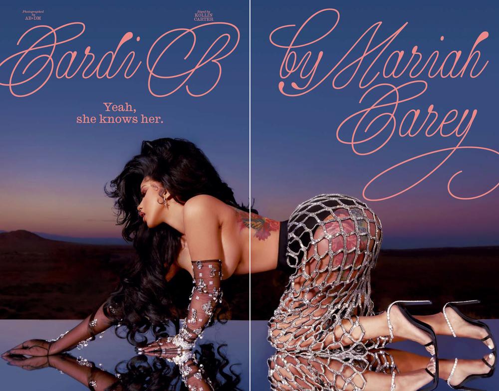
Spread from Interview, March 2021
Spread from Interview, Summer 2021, also using Caslon Ionic
Spread from Interview, Summer 2021, also using Caslon Ionic

Spread from Interview, Summer 2021
Spread from Interview, Summer 2021

Spread from Interview on the Wendy Williams Show.
Lyon Hebrew

| Designers | Kai Bernau, Daniel Grumer, Yanek Iontef |
| Designed | 2021 |
| Last updated | 19 Nov, 2021 |
| Styles | 20 |
| Price | $60.00 style $400.00 family |
Lyon Hebrew Collection


Lyon Hebrew Collection

Lyon Hebrew Text Regular No. 2

Lyon Hebrew Text Regular No. 2 Italic

Lyon Hebrew Display Regular

Lyon Hebrew Display Regular Italic
Lyon Hebrew Collection
Daniel Grumer and Yanek Iontef drew Lyon Hebrew based loosely on broad nib models from the 15th and 16th centuries. As in the Latin, details have been simplified, streamlined, and stripped away, leaving crisp and decisive forms with unabashedly digital detailing. The italics are particularly interesting, as they manage to keep the same balance of free cailligraphic gestures and structured repetition of forms seen in Kai Bernau’s original.
Lyon Hebrew Collection

Lyon Hebrew Text Regular

Lyon Hebrew Display Bold
Orlando

| Designer | Paul Barnes |
| Designed | 2021 |
| Last updated | 10 Oct, 2021 |
| Styles | 2 |
| Price | $50.00 style $75.00 family |
| Character set | Standard character set |
Orlando Family

Orlando Family

Orlando Family
Designed in 2021 by Paul Barnes for the In’Ei art gallery in Florence, Orlando adapts the lightest weight of Orleans and its italic with flared strokes, for a more overtly calligraphic appearance.
Orlando Family

Advocat

| Designer | Christian Schwartz |
| Designed | 2021 |
| Last updated | 20 Sep, 2021 |
| Styles | 3 |
| Price | $50.00 style $100.00 family |
| Character set | Standard character set without fractions and sub/superscripts |
Advocat Family

Advocat Family

Advocat Family
Christian Schwartz spent most of 2020 on an extended parental leave that made it hard to find time or energy to concentrate on type design. Scattered hours while the kids were in bed went to this typewriter face, a sufficiently low-stakes project, based on a low-res scan of an old IBM Selectric ‘golf ball’ alphabet called Advocate, designed by Howard “Bud” Kettler (best known as the designer of Courier). Rough source material led to a very loose interpretation. Richard Turley has used it for a few small publications with Civilization. Updated 23 Sep 2021: Apologies to Matthew Butterick, who already published a typeface called Advocate.
Advocat Family
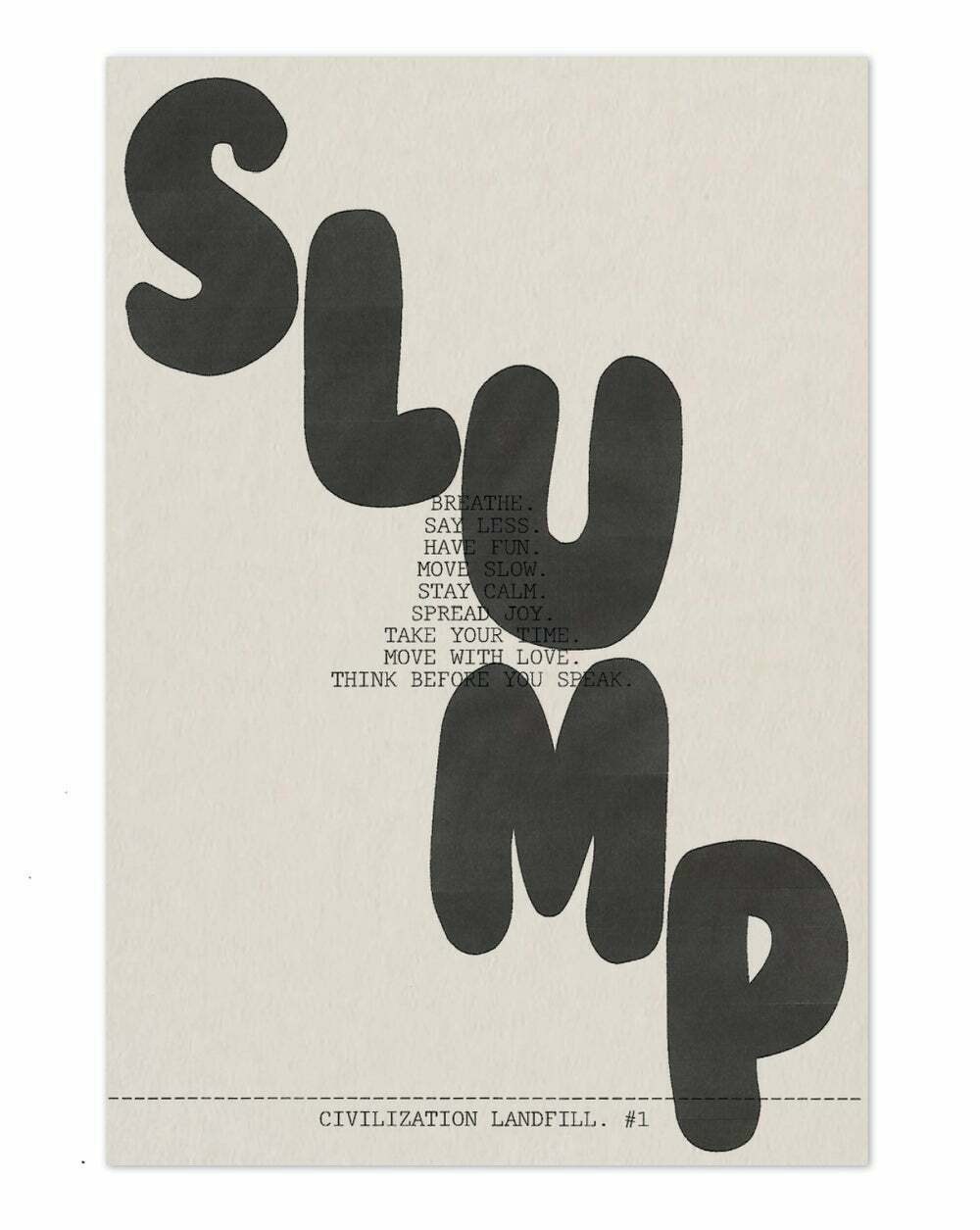
Civilization Landfill #1, October 2020, by Lucas Mascatello & Jayson Mittman. Designed by Richard Turley.
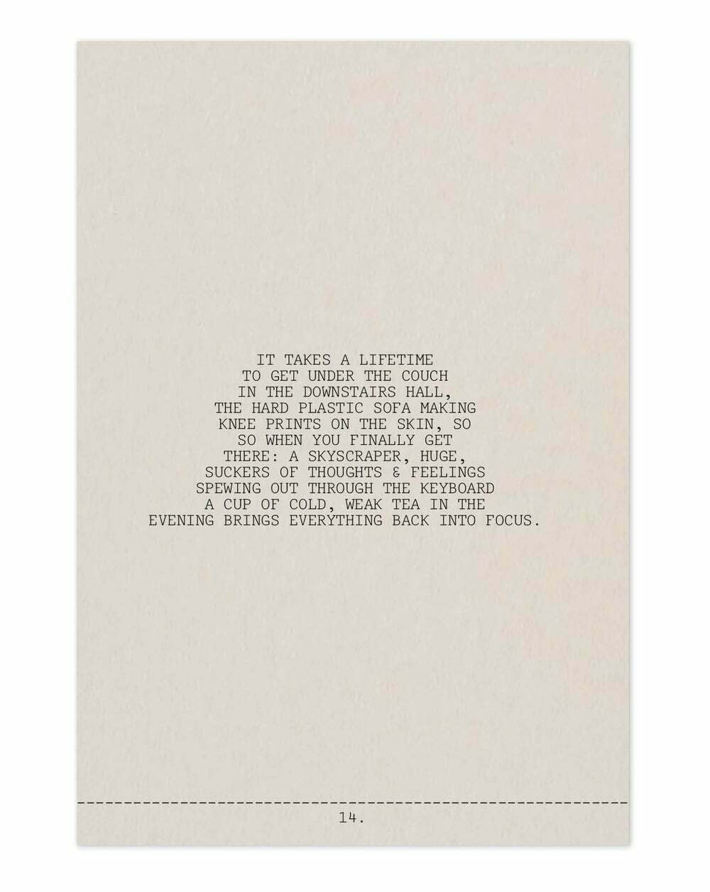
Civilization Landfill #1, October 2020, by Lucas Mascatello & Jayson Mittman. Designed by Richard Turley.
Analog X Condensed

| Designer | Miguel Reyes |
| Designed | 2021 |
| Last updated | 17 Sep, 2021 |
| Styles | 2 |
| Price | $40.00 style $60.00 family |
| Character set | Standard character set |
Analog X Condensed Family

Analog X Condensed Family

Analog X Condensed Family
Miguel Reyes drew this extra condensed sans with 90s vibes for his restaurant in Cholula.
Analog X Condensed Family
Analog includes an alternate set of accents for extra tight leading.
Eugenio Sans

| Designer | Greg Gazdowicz |
| Designed | 2017 |
| Last updated | 12 Sep, 2021 |
| Styles | 24 |
| Price | $50.00 style $250.00 family |
| Character set | Standard character set |
Eugenio Sans Collection


Eugenio Sans Collection

Eugenio Sans Collection
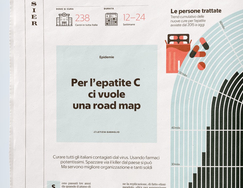
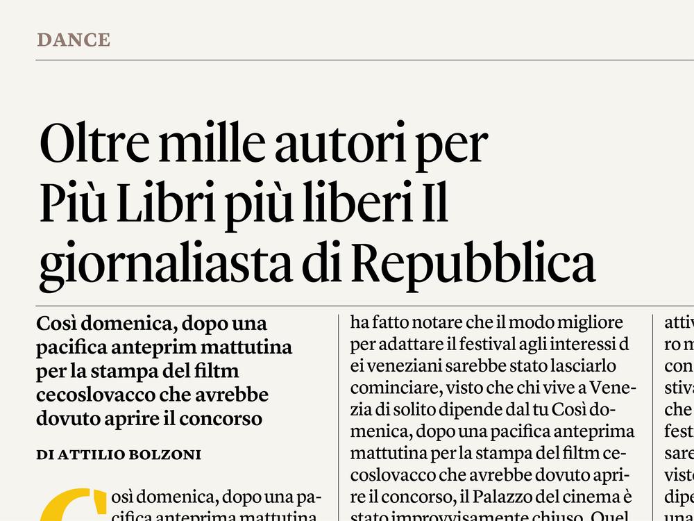
To compliment Eugenio Serif in Francesco Franchi’s redesign of La Repubblica, designer Greg Gazdowicz created a sans can be both stylish and pragmatic as needed. He and Franchi settled on a geometric sans serif, partially inspired by the classic combination of Bodoni and Futura which was popularized in the 20th century by famed Modernist Massimo Vignelli. Eugenio Sans serves the newspaper at many sizes: from big drop caps to small captions, sidebars, and info graphics. It is also the primary headline typeface for the Sport and other feature sections, reserving Eugenio Serif for news. Though the geometric sans genre is remarkably crowded, Gazdowicz found that by focusing on the technical constraints of newsprint and complementing Eugenio Serif, he wound up with a fresh design in the process. The terminals end at flat verticals, making for open apertures and clean spaces between letters, giving a straightforward and newsy tone.
Eugenio Sans Collection
Eugenio Sans in use in La Repubblica.

Eugenio Sans in use in La Repubblica.
Eugenio Sans in use in La Repubblica.

Eugenio Sans in use in La Repubblica.

Eugenio Sans in use in La Repubblica.
Eugenio Sans in use in La Repubblica.
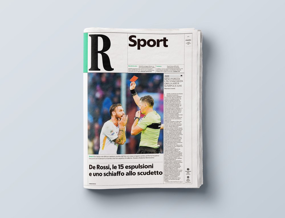
Eugenio Sans in use in La Repubblica.
Eugenio Sans in use in La Repubblica.
Eugenio Serif

| Designers | Hrvoje Živčić, Miguel Reyes |
| Designed | 2017 |
| Last updated | 22 Aug, 2021 |
| Styles | 28 |
| Price | $50.00 style $300.00 family |
| Character set | Standard character set |
Eugenio Serif Collection

Eugenio Serif

Eugenio Serif Poster

Eugenio Serif Collection

Eugenio Serif Collection
Eugenio Serif was drawn by Miguel Reyes, assisted by Hrvoje Živčić, for Francesco Franchi’s redesign of La Repubblica, and remains the main headline face after a reworking of the newspaper. It’s a fairly faithful rendition of Bodoni, but the softness of the serifs and subtly rounded corners give it warmth, making it feel more like phototype than crisp, perfect digital letterforms. The primary historical source that Miguel referenced was 16pt and 24pt specimens in a facsimile of Giambattista Bodoni’s definitive 1818 Manuale Typographico.
Eugenio Serif Collection
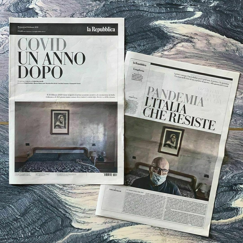
Eugenio Serif Poster on the cover of a special supplement to La Repubblica.

Eugenio Serif in La Repubblica.
Eugenio Serif & Serif Poster in La Repubblica.
Seance

| Designer | Tim Ripper |
| Designed | 2021 |
| Last updated | 13 Aug, 2021 |
| Styles | 2 |
| Price | $25.00 style $40.00 family |
| Character set | Uppercase, lowercase, oldstyle figures, basic punctuation |
Seance Family

Seance Family

Seance Ornate

Seance Graphic
Seance Family
Seance comprises two blackletter styles based on the outlandish designs of French lettering artist Jean Midolle (1794–?). Midolle’s Fracture Midolline and Gothique Brisée, published in his 1835 Spécimen des écritures modernes, are thoroughly gothic in multiple senses of the word. In Seance, Tim Ripper has reworked these standalone alphabets as typefaces while attempting to preserve as much as possible of their creepy—and campy—peculiarities.
Seance Family

Proxy

| Designer | Christian Schwartz |
| Last updated | 28 Jul, 2021 |
| Styles | 5 |
| Price | $50.00 style $150.00 family |
| Character set | Character sets vary between styles, See images for details. |
Proxy Family

Proxy Family

Proxy Medium, High Medium, and High Bold

Proxy Medium, High Medium, and High Bold

Proxy Condensed

Proxy Micro Bold
Proxy Family
Condensed reverse contrast typeface initially inspired by Swiss roadway lettering, but ended up wandering off into its own territory. Drawn for Richard Turley and used for Barneys, Good Buys, Interview…
Proxy Family
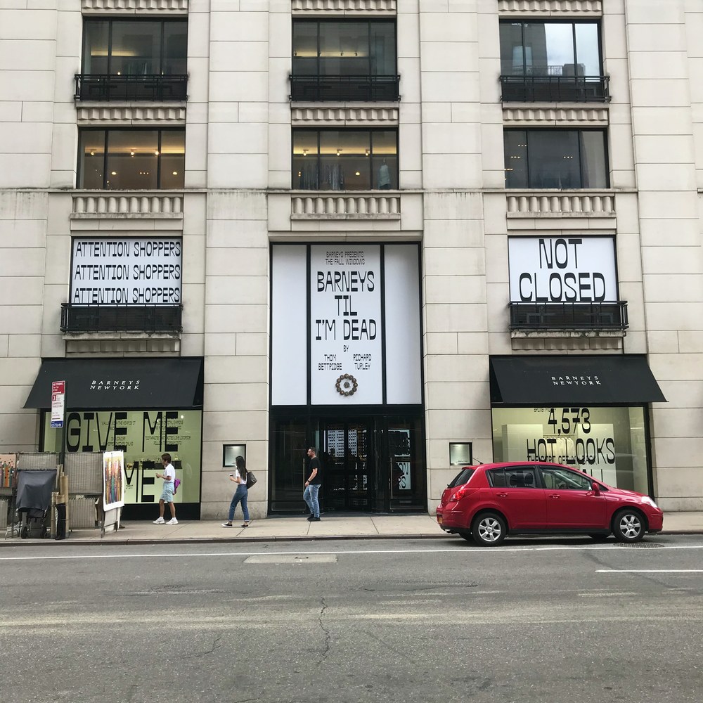
Windows at Barneys New York on Madison Avenue, Sept 2019, by Richard Turley and Thom Bettridge.
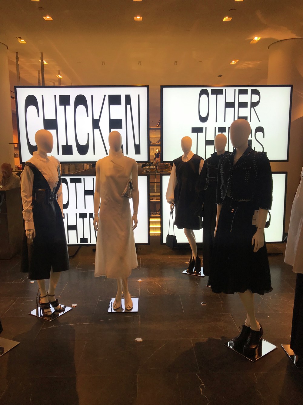
Display at Barneys New York on Madison Avenue, Sept 2019, by Richard Turley and Thom Bettridge.
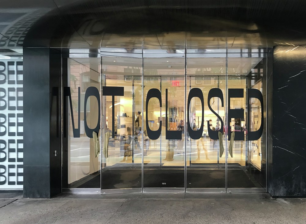
Windows at Barneys New York in Chelsea, Sept 2019, by Richard Turley and Thom Bettridge.
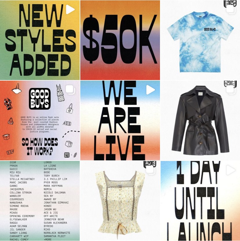
@goodbuysfoundation Instagram feed. This flash sale raised $100k for the National Domestic Workers Alliance and the Movement For Black Lives in July 2020.
Spread from Interview magazine, Sept 2019. Editorial and design director Richard Turley, art director Kurt Woerpel, designer Jack Vhay.
Spread from Interview magazine, Sept 2019. Editorial and design director Richard Turley, art director Kurt Woerpel, designer Jack Vhay.
Spread from Interview magazine, Sept 2019. Editorial and design director Richard Turley, art director Kurt Woerpel, designer Jack Vhay.
Spread from Interview magazine, Sept 2019. Editorial and design director Richard Turley, art director Kurt Woerpel, designer Jack Vhay.
Spread from Interview magazine, March 2021. Editorial and design director Richard Turley, art director Kurt Woerpel, designer Jack Vhay.
Spread from Interview magazine, Summer 2021. Editorial and design director Richard Turley, art director Kurt Woerpel, designer Jack Vhay.
Spread from Interview magazine, Summer 2021. Editorial and design director Richard Turley, art director Kurt Woerpel, designer Jack Vhay.
Gabriello

| Designers | Paul Barnes, Miguel Reyes |
| Designed | 2014 |
| Last updated | 18 Jul, 2021 |
| Styles | 5 |
| Price | $50.00 style $150.00 family |
| Character set | Standard character set |
Gabriello Family

Gabriello Family

Gabriello Family
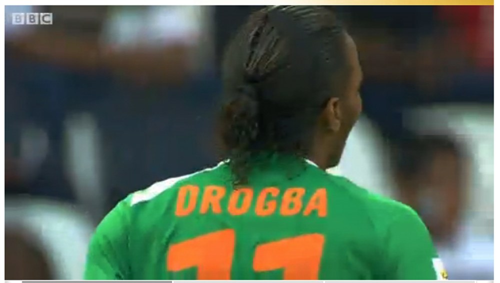
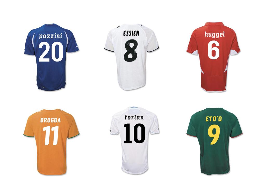
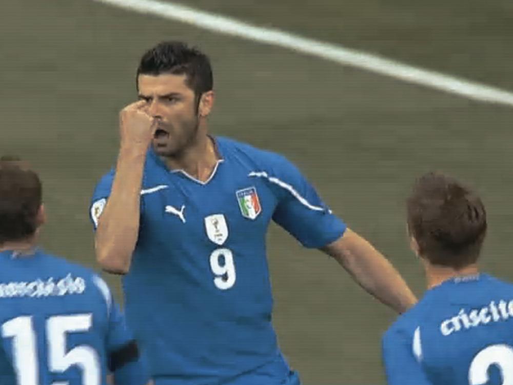
Football numbers are an exercise in balancing style with functionality. Inspired by brush lettering, Puma commissioned the Bold weight of Gabriello for the shirts of their sponsored teams in the 2010 Africa Cup of Nations, and also used it for their African teams in that year’s World Cup: Algeria, Cameroon, Ghana, and Côte d’Ivoire. Far more organic than the typical straight-sided octic athletic letters, Gabriello is slanted on two axes, both horizontally and vertically, giving the energy of a script without causing production problems for the shirts.
Gabriello Family

Produkt Typewriter

| Designers | Christian Schwartz, Berton Hasebe |
| Designed | 2018, 2021 |
| Last updated | 28 Jun, 2021 |
| Styles | 9 |
| Price | $50.00 style $200.00 family |
| Character set | Standard character set |
Produkt Typewriter Family

Produkt Typewriter Family

Produkt Typewriter Family
Drawn for Project Projects, for the 2018–2019 Carnegie International, and later finished for the interface of this site.
Produkt Typewriter Family
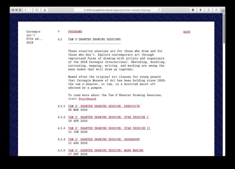
Archival website for the 2018–19 Carnegie International, designed by Project Projects/Wkshps
Lyon Hed

| Designers | Kai Bernau, Robin Mientjes |
| Designed | 2020 |
| Last updated | 13 Jun, 2021 |
| Styles | 7 |
| Price | $50.00 style $250.00 family |
| Character set | Standard character set |
Lyon Hed Family

Lyon Hed Family

Lyon Hed Family
Compact headline version of Lyon with a large x-height and very short extenders, originally commissioned by Mark Porter, designed by Kai Bernau with Robin Mientjes.
Lyon Hed Family
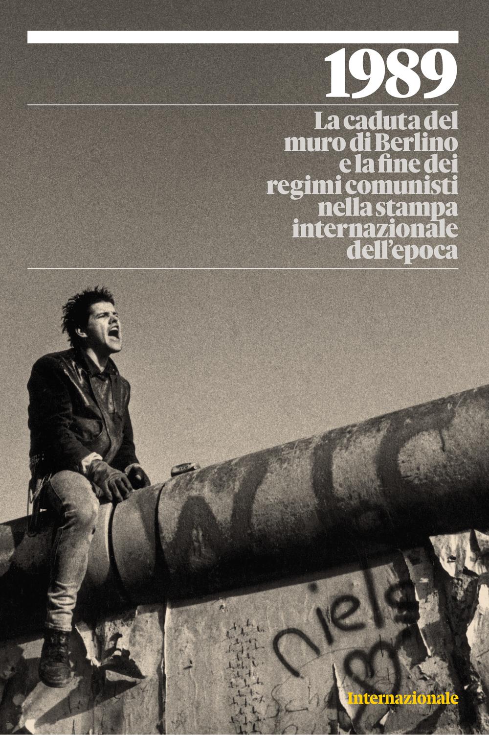
Cover of a special publication on the fall of the Iron Curatin from Italian news magazine Internazionale, 10 Nov 2019.
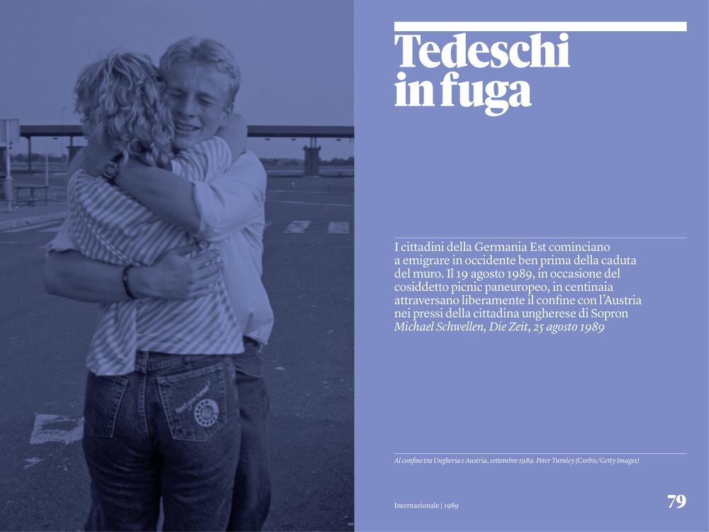
Spread from a special publication on the fall of the Iron Curatin from Italian news magazine Internazionale, 10 Nov 2019.
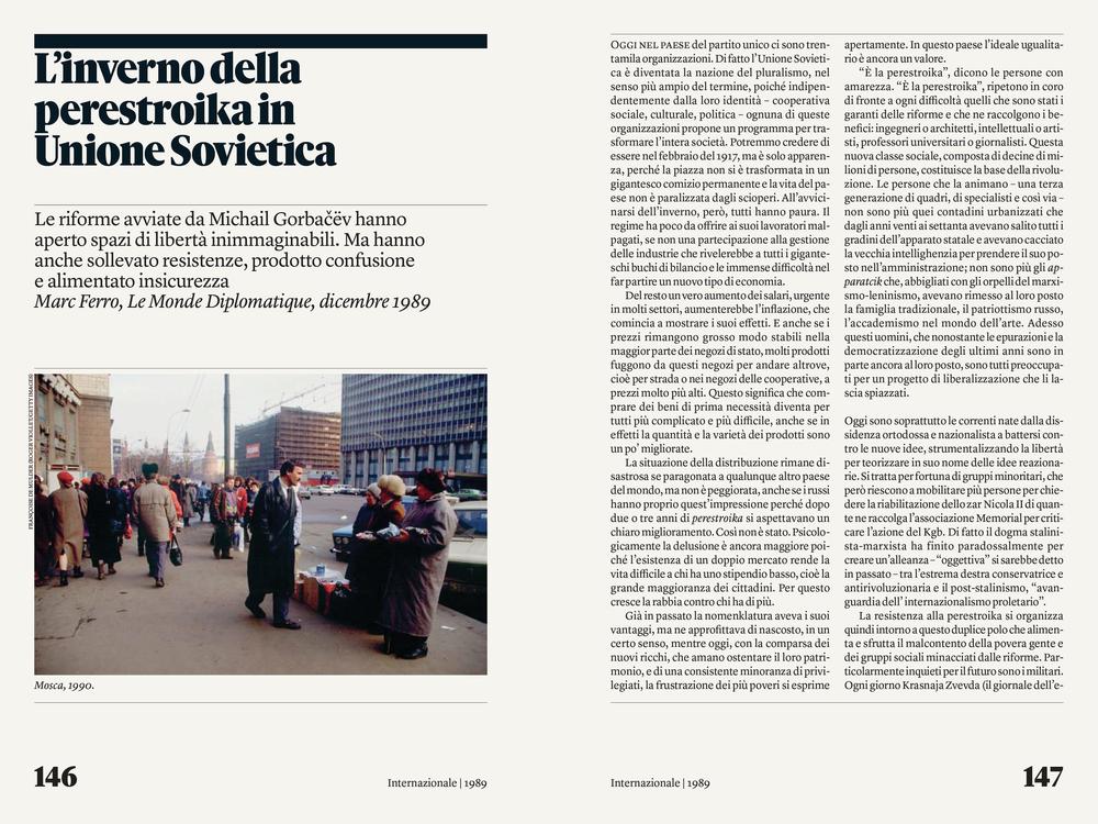
Spread from a special publication on the fall of the Iron Curatin from Italian news magazine Internazionale, 10 Nov 2019. Text in Lyon Text.
Excerpt of press test
Excerpt of press test
Produkt XX Condensed

| Designers | Berton Hasebe, Christian Schwartz, Greg Gazdowicz, Kara Gordon |
| Designed | 2016-2021 |
| Last updated | 8 Mar, 2021 |
| Styles | 18 |
| Price | $50.00 style $400.00 family |
| Character set | Standard character set |
Produkt XX Condensed Family


Produkt XX Condensed Family

Produkt XX Condensed Family
Narrower widths of Produkt, to accompany Graphik. Heavier weights of XX Condensed were initially drawn by Greg Gazdowicz for the Village Voice, but the publication closed their print edition before the redesign by Luke Hayman's team at Pentagram could be implemented. Promphan Suksumek drew light weights and Kara Gordon completed and refined the family.
Produkt XX Condensed Family

Druk Text Light

| Designer | Berton Hasebe |
| Designed | 2019 |
| Last updated | 6 Jun, 2019 |
| Styles | 1 |
| Price | $50.00 |
| Character set | Standard character set |
Druk Text Light Light Style
Druk Text Light Light Style

Druk Text Light Light Style
Light weight drawn for a theater company.druk
Druk Text Light Light Style
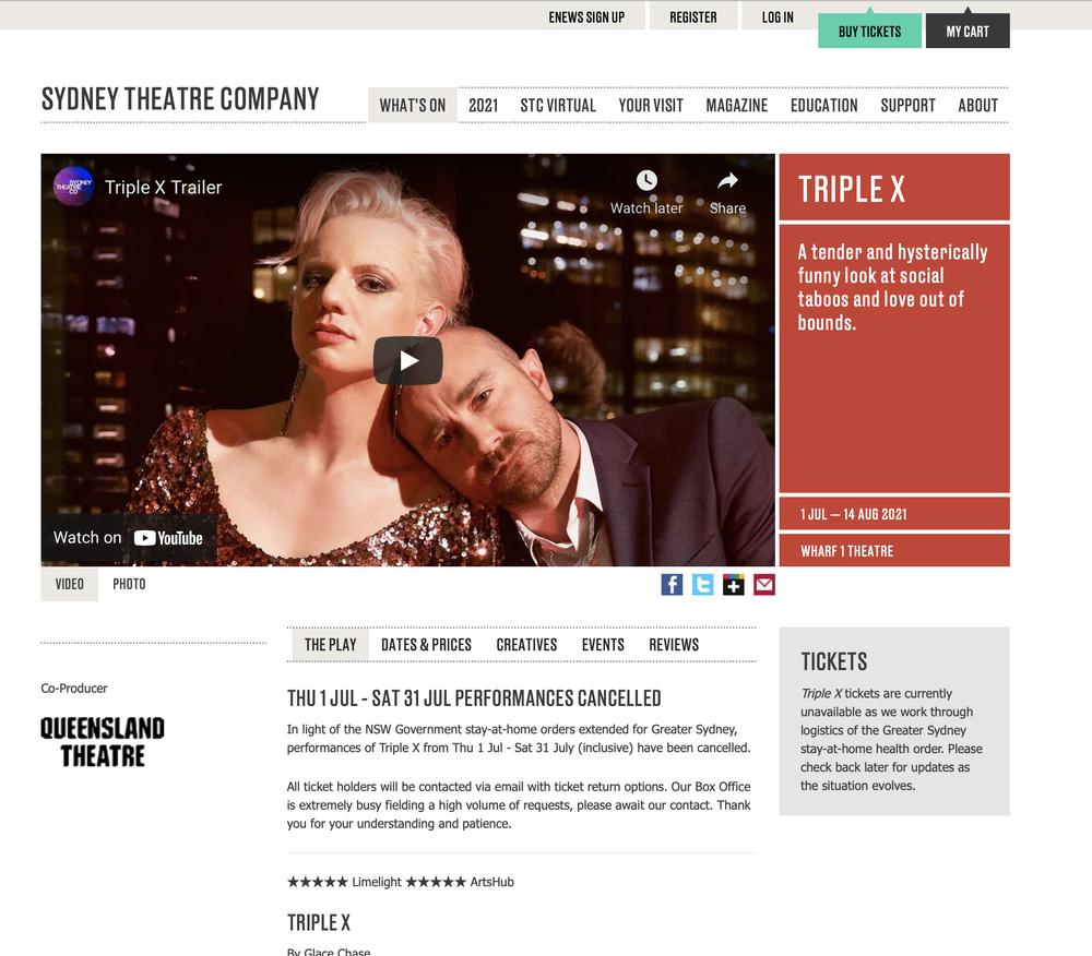
sydneytheatre.com.au
Gingrich

| Designers | Christian Schwartz, Kara Gordon |
| Designed | 2015, 2019 |
| Last updated | 12 Dec, 2018 |
| Styles | 8 |
| Price | $50.00 style $150.00 family |
| Character set | Standard character set (no fractions) |
Gingrich Family

Gingrich Family

Gingrich Family
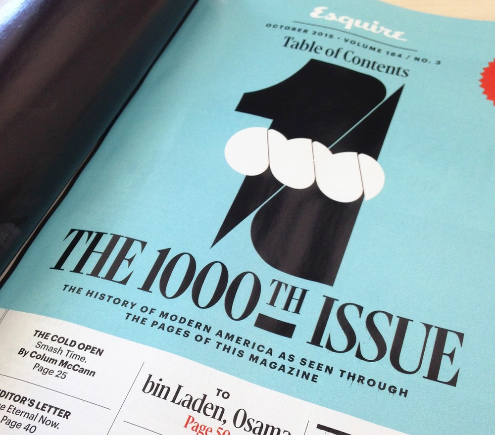
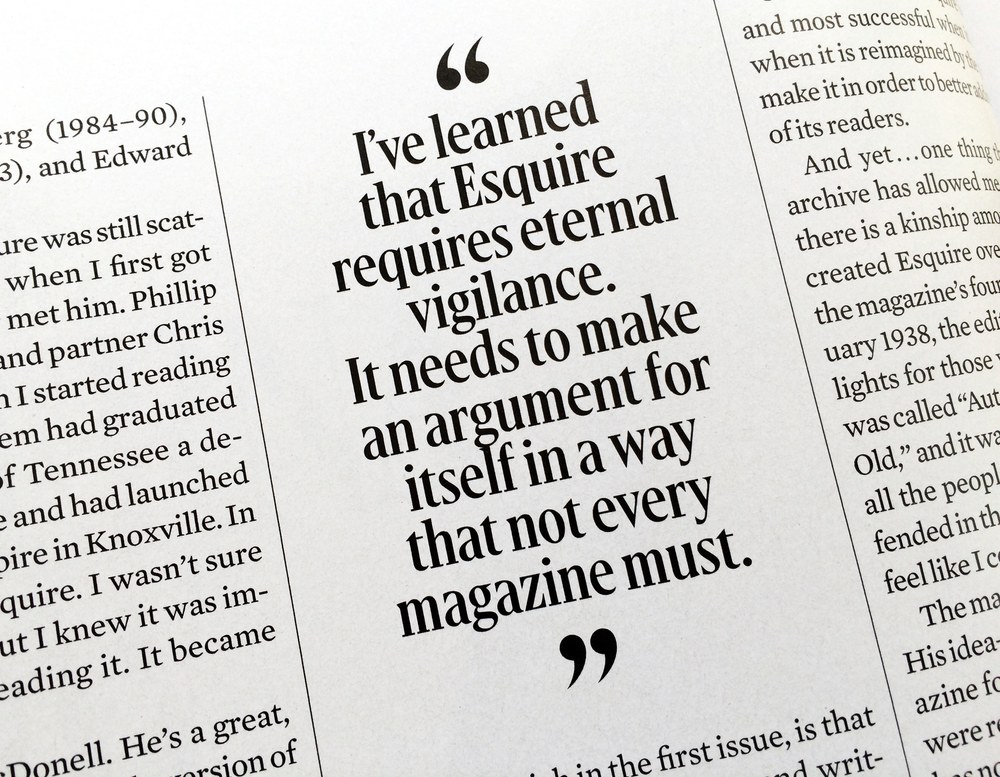
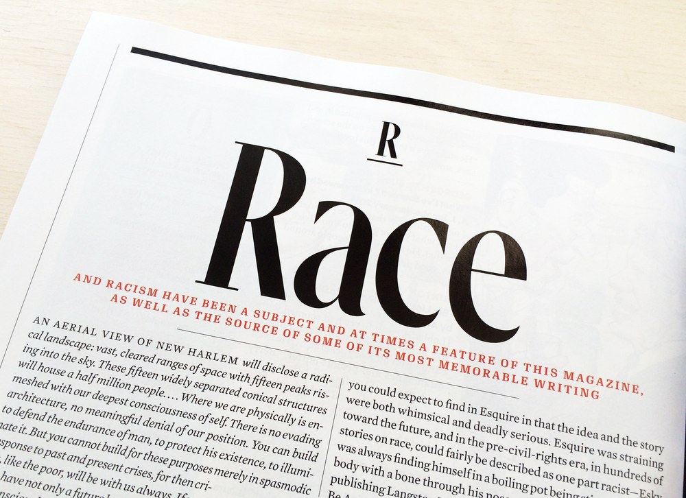
Gingrich is a condensed display serif faily in 4 optical sizes, originally drawn for David Curcurito for the 1000th issue of Esquire in 2015. Italics were added later for Barron’s by Kara Gordon.
Gingrich Family
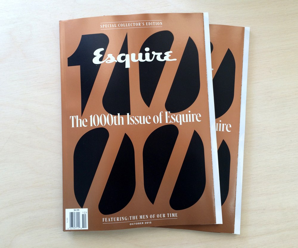
Esquire issue #1000, October 2016
Esquire issue #1000, October 2016

Esquire issue #1000, October 2016

Esquire issue #1000, October 2016
Esquire issue #1000, October 2016
Esquire issue #1000, October 2016
Esquire issue #1000, October 2016

Esquire issue #1000, October 2016
Austin Hairline Condensed

| Designers | Paul Barnes, Maria Doreuli |
| Designed | 2018 |
| Last updated | 10 Oct, 2018 |
| Styles | 2 |
| Price | $50.00 style $75.00 family |
| Character set | Standard character set |
Austin Hairline Condensed Family

Austin Hairline Condensed Family


Austin Hairline Condensed Family
Condensed width of Austin Hairline Roman, drawn by Maria Doreuli for Kuchar Swara for the Daily Telegraph's magazines.
Austin Hairline Condensed Family
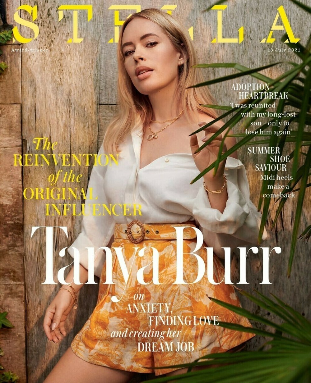
Cover of Daily Telegraph style magazine Stella, 18 July 2021
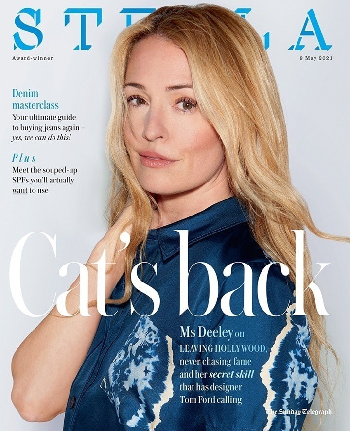
Cover of Daily Telegraph style magazine Stella, 9 May 2021
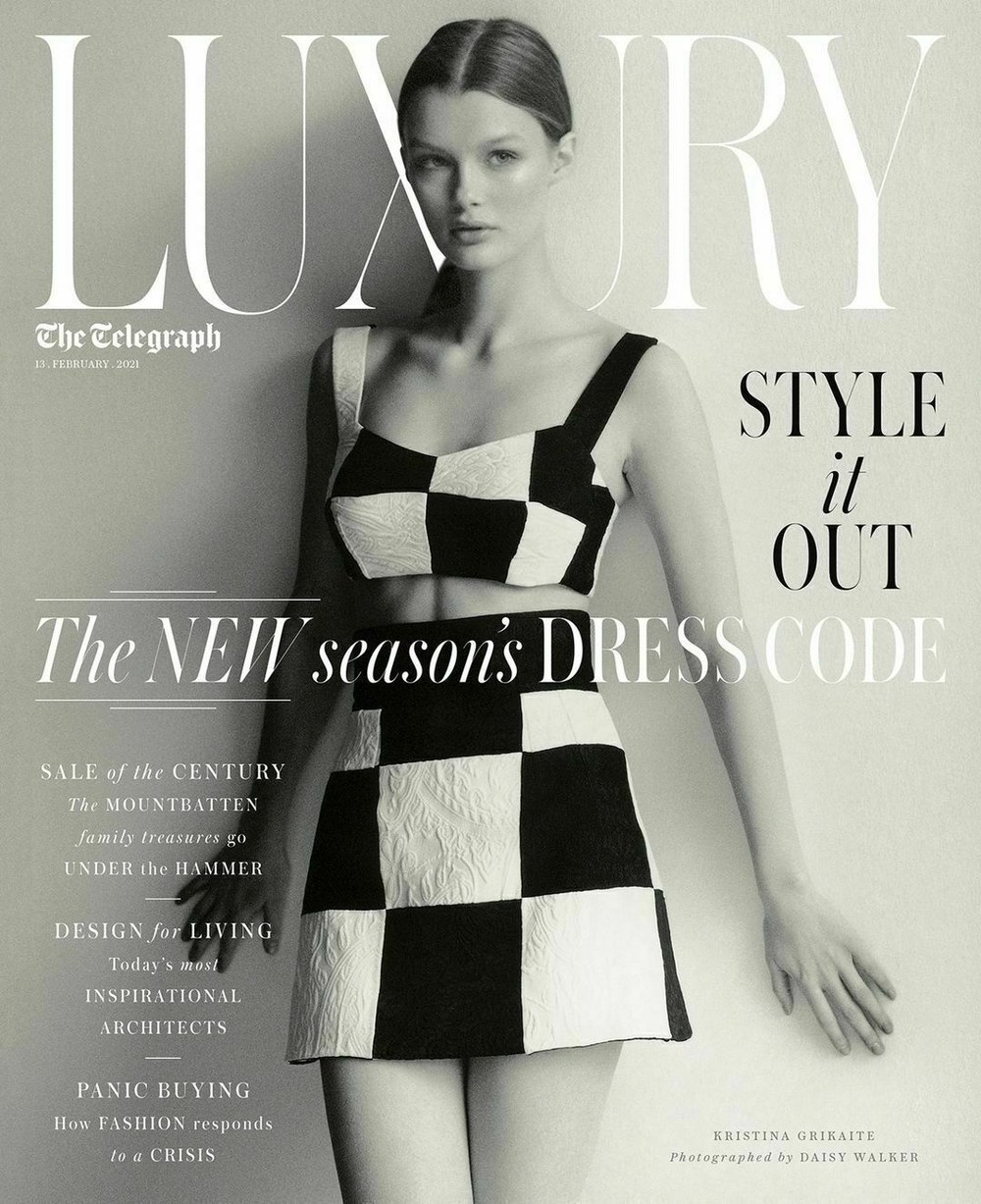
Cover of Luxury magazine in The Daily Telegraph, 13 February 2021
Viktor

| Designer | Christian Schwartz |
| Last updated | 31 Jul, 2018 |
| Styles | 1 |
| Price | $40.00 |
| Character set | Basic upper & lowercase character set with limited punctuation |
Viktor Regular Style

Viktor Regular Style

Viktor Regular Style
Incised, barely-seriffed display face drawn by Christian Schwartz. Used on a Wired cover, and in a couple of issues of Document Journal.
Viktor Regular Style
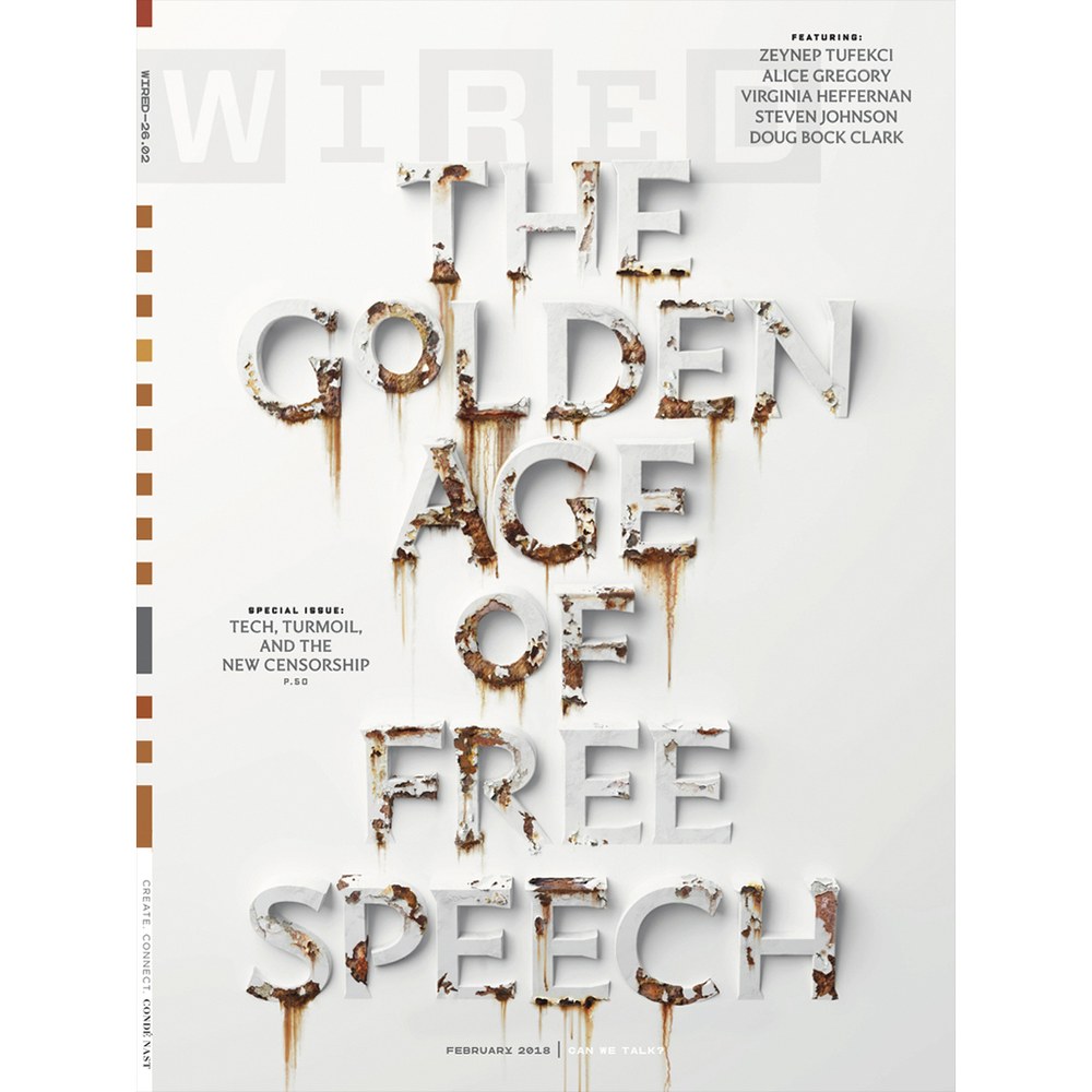
Wired issue 26.02 cover, February 2018. Photo illustration by Sean Freeman. Art direction by Davo Moretti and Frank Augugliaro.
Detail of Wired issue 26.02 cover, February 2018. Photo illustration by Sean Freeman. Art direction by Davo Moretti and Frank Augugliaro.

Viktor in use on divider spread in Document Journal No. 13, Fall/Winter 2018
Viktor in table of contents of Document Journal No. 13, Fall/Winter 2018
Viktor in divider spread in Document Journal No. 13, Fall/Winter 2018
Caponi Condensed

| Designers | Paul Barnes, Christian Schwartz |
| Designed | 2013 |
| Last updated | 17 May, 2018 |
| Styles | 2 |
| Price | $35.00 style $35.00 family |
| Character set | Uppercase, lowercase, numbers, rudimentary punctuation |
Caponi Condensed Family

Caponi Condensed Family

Caponi Condensed Family
Christian Schwartz and Paul Barnes drew this around when finishing Caponi for Entertainment Weekly. Our memory is hazy but this seems to have been sketched for their covers. They ended up sticking with a condensed sans instead, maybe because the Marlboro Man vibe was too strong.
Caponi Condensed Family

Round terminals

Flat terminals
Druk Wide Light

| Designer | Berton Hasebe |
| Designed | 2017 |
| Last updated | 15 May, 2017 |
| Styles | 3 |
| Price | $50.00 style $150.00 family |
| Character set | Standard character set |
Druk Wide Light Family

Druk Wide Light Family

Druk Wide Light Family
3 lighter weights of Druk Wide, originally drawn for Robert Vargas at Bloomberg Businessweek.
Druk Wide Light Family

Guardian Agate Sans Grades

| Designers | Christian Schwartz, Paul Barnes |
| Designed | 2009 |
| Last updated | 2 May, 2017 |
| Styles | 32 |
| Price | $50.00 style $500.00 family |
| Character set | Standard character set |
Guardian Agate Sans Grades Family


Guardian Agate Sans Grades Family

Normal character set

Duplex character set
Guardian Agate Sans Grades Family
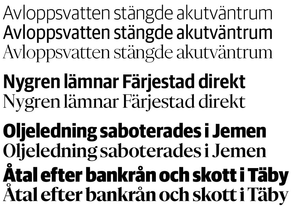
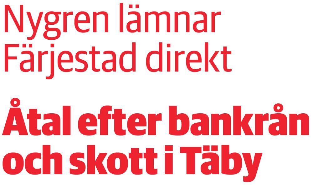
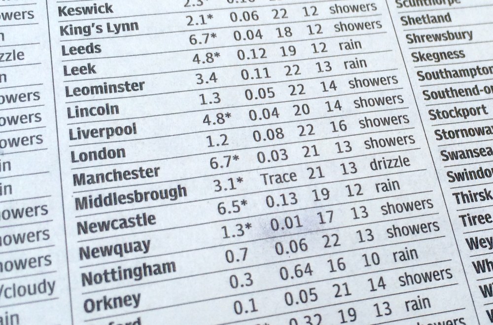
Compensating for the worst possible printing conditions, Guardian Agate Sans is designed for maximum legibility at 6 point and below on newsprint.
What are Grades?
The family features four subtly different weights, or “grades”, allowing users to find the perfect weight for a particular situation, from 1, the lightest, to 4, the heaviest. The Medium weight can be used for reversing out of a dark background, subheads, and other cases where an additional level of typographic hierarchy is needed.
What is Duplexing?
Guardian Agate Sans features two kinds of bolds. The standard Bolds are wider than the Regulars, as requested by The Guardian to make sport scores a bit more readable at 4.5pt. The Duplex Bolds set at exactly the same widths as the Regulars, useful for things like classified ads and stock listings where line length is at a premium. All numerals are tabular across all styles, so they can be freely mixed in tables of figures no matter which version is used.
Guardian Agate Sans Grades Family

Local Gothic

| Designers | Tal Leming, Christian Schwartz |
| Designed | 2005 |
| Last updated | 2 May, 2017 |
| Styles | 1 |
| Price | $50.00 |
| Character set | All caps with standard accented character set |
Local Gothic Regular Style

Local Gothic Regular Style

Local Gothic Regular Style
Local Gothic is inspired by the moveable lettering of outdoor signs in America. Its individual characters look ordinary, but in combination they appear random and irregular, giving a distressed and unusual appearance. Designed by Christian Schwartz while he was studying graphic design in the late 1990s, Local Gothic gives a surprising and uneven texture that can breathe life into both print and web projects. The characters are loosely based on the four most ubiquitous sans serifs in America: Helvetica, Futura, Franklin Gothic, and Alternate Gothic No. 2. Tal Leming developed innovative OpenType code, using theories based on quantum mechanics, to mix the mismatched letters in a way that feels truly random.
Local Gothic Regular Style

Sept Stencil

| Designer | Greg Gazdowicz |
| Designed | 2016 |
| Last updated | 21 Nov, 2016 |
| Styles | 2 |
| Price | $40.00 style $40.00 family |
| Character set | Uppercase, lowercase, partial foreign language support (no Icelandic, Sami), numbers, punctuation, extensive alternate set |
Sept Stencil Family

Sept Stencil Family


Sept Stencil Family
Originally drawn for Evan Campisi at ELLE, debuting in the September 2016 issue and used periodically for features. Greg Gazdowicz was inspired by Futura Black, Josef Albers, Paul Rand…
Sept Stencil Family

ELLE, 2016
ELLE, 2016
Neue Haas Grotesk Text Mono

| Designer | Christian Schwartz |
| Designed | 2016 |
| Last updated | 22 Jul, 2016 |
| Styles | 6 |
| Price | $70.00 style $200.00 family |
| Character set | Standard character set |
Neue Haas Grotesk Text Mono Family

Neue Haas Grotesk Text Mono Family

Neue Haas Grotesk Text Mono Family
This was originally created for Bloomberg Businessweek, for a special issue on the 2012 US presidential election, and was later extended for general use in info graphics. The idea was to make text set in the Mono look and feel like unfiltered data.
Neue Haas Grotesk Text Mono Family
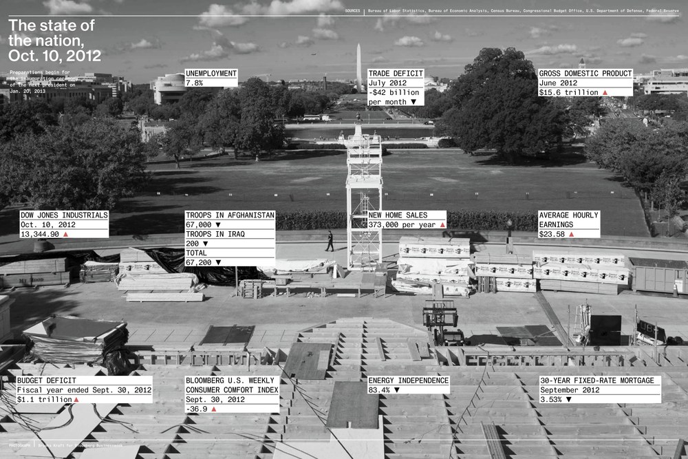
Spread from Bloomberg Businessweek, 15 October 2012 issue

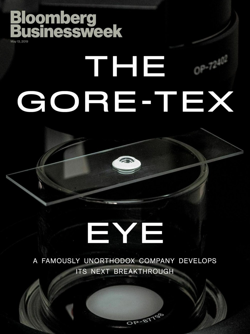
Bloomberg Businessweek cover, 18 March 2019
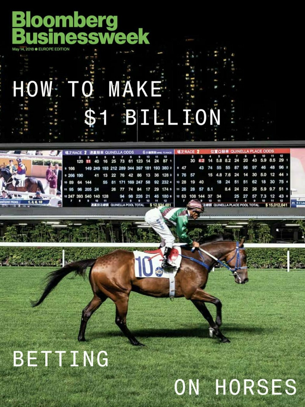
Bloomberg Businessweek cover, 14 May 2018
Poseidon Sans

| Designer | Christian Schwartz |
| Designed | 2016 |
| Last updated | 8 Jul, 2016 |
| Styles | 2 |
| Price | $50.00 style $75.00 family |
| Character set | Standard character set, without fractions |
Poseidon Sans Family

Poseidon Sans Family

Poseidon Sans Family
Loosely inspired by 20th century typewriter typefaces. Proportional but awkward. Designed for Darhil Crooks when he was at The Atlantic.
Poseidon Sans Family
Spread from The Atlantic, creative director Darhil Crooks, May 2016
The Atlantic, May 2016
The Atlantic, May 2016
Sanomat Banner

| Designers | Paul Barnes, Greg Gazdowicz |
| Designed | 2016 |
| Last updated | 21 Apr, 2016 |
| Styles | 7 |
| Price | $50.00 style $250.00 family |
| Character set | Standard character set |
Sanomat Banner Family

Sanomat Banner Family

Sanomat Banner Family
High contrast version of Sanomat, drawn by Greg Gazdowicz for Sami Valtere at Helsingin Sanomat.
Sanomat Banner Family
Sanomat Slab

| Designers | Paul Barnes, Miguel Reyes |
| Designed | 2016 |
| Last updated | 14 Apr, 2016 |
| Styles | 7 |
| Price | $50.00 style $250.00 family |
| Character set | Standard character set |
Sanomat Slab Family

Sanomat Slab Family

Sanomat Slab Family
Slab version of Sanomat, drawn for Sami Valtere at Helsingin Sanomat.
Sanomat Slab Family

Cover of HSmetro, a free daily newspaper published by Helsingin Sanomat
Graphik Decorated

| Designer | Christian Schwartz |
| Designed | 2009, 2015 |
| Last updated | 10 Aug, 2015 |
| Styles | 4 |
| Price | $20.00 style $50.00 family |
| Character set | Limited character sets, see images for details |
Graphik Decorated Family

Graphik Decorated Family

Graphik Round Black

Graphik Dot Regular

Graphik Compact Dot Thin

Graphik Compact Dot Medium
Graphik Decorated Family
Graphik Round and Graphik Dot were drawn for two one-off issues of Bon Appétit for creative director Alex Grossman. Graphik Round Black proved surprisingly useful for Commercial Studio. The other two dot styles were developed for Meirion Pritchard at Wallpaper*.
Graphik Decorated Family
Bon Appétit September 2015
Bon Appétit September 2015
Bon Appétit September 2015
Bon Appétit September 2015
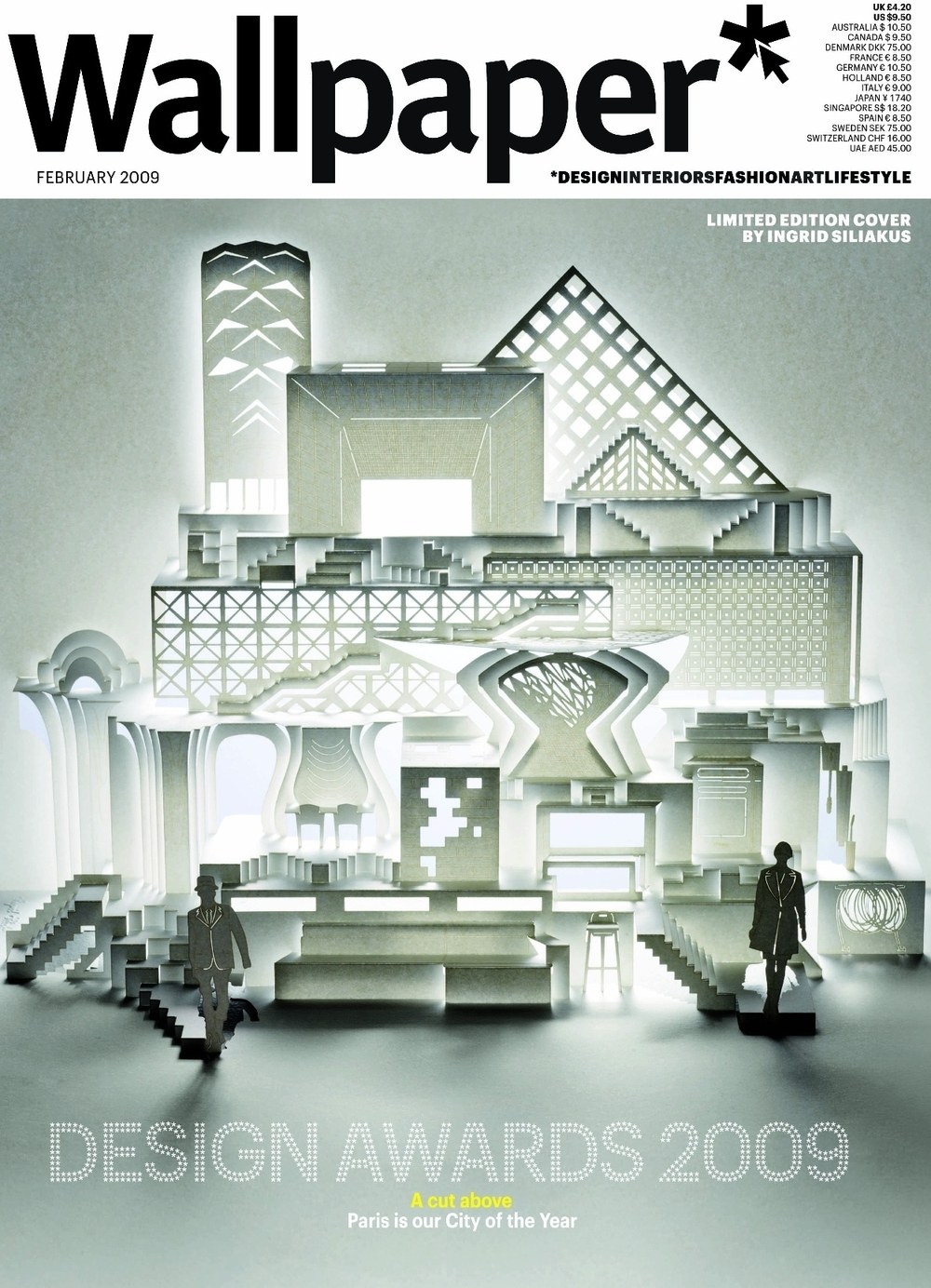
Wallpaper* February 2009 cover

Wallpaper* Design Awards 2009 event
Anker

| Designer | Greg Gazdowicz |
| Designed | 2015 |
| Last updated | 3 Aug, 2015 |
| Styles | 1 |
| Price | $25.00 |
| Character set | Uppercase only, with alternates |
Anker Medium Style

Anker Medium Style

Anker Medium Style
Originally drawn for the New York magazine Fall Fashion issue in 2015, inspired by storybook lettering from the early 20th century.
Anker Medium Style
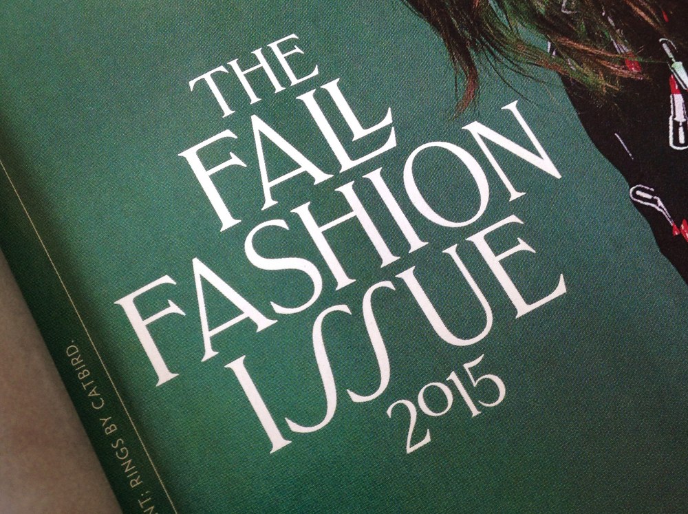
New York magazine, August 10 2015 issue.
New York magazine, August 10 2015 issue.

New York magazine, August 10 2015 issue.
New York magazine, August 10 2015 issue.
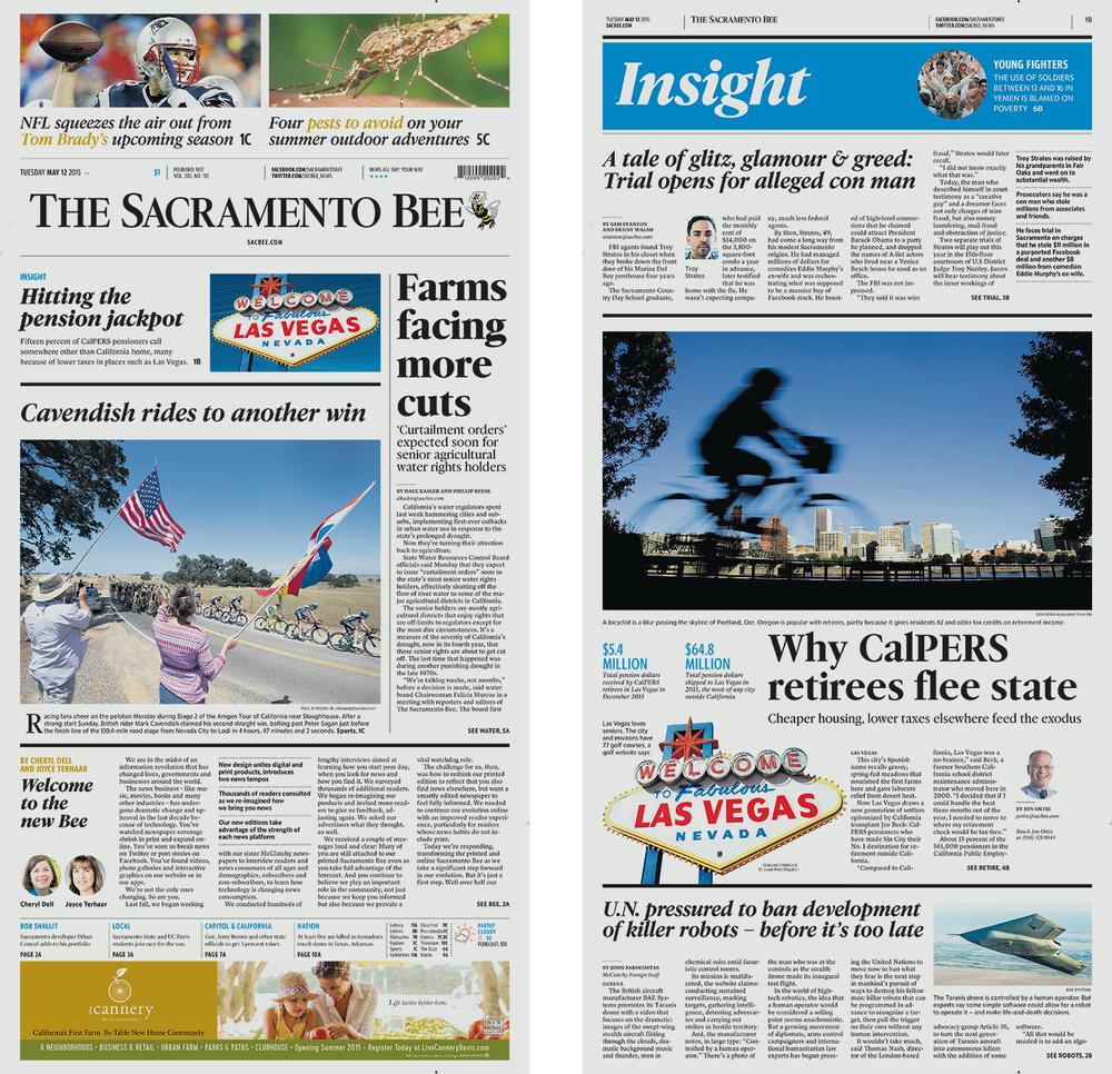
McClatchy

| Designers | Miguel Reyes, Greg Gazdowicz, Christian Schwartz |
| Designed | 2015 |
| Last updated | 12 May, 2015 |
| Styles | 43 |
| Price | $50.00 style $150.00 family |
| Character set | Standard character set |
McClatchy Collection


McClatchy Collection

McClatchy Serif

McClatchy Sans

McClatchy Sans Text

McClatchy Sans Condensed

McClatchy Slab
McClatchy Collection
The McClatchy Company publishes 29 daily newspapers across the US. Working with Garcia Media, they spent a year developing a unified design language to bring together the print papers, mobile apps, and web editions with a more consistent overall look. Greg Gazdowicz, Miguel Reyes, and Christian Schwartz designed a set of typefaces that helped to bridge the gap between design consistency and individual character.
McClatchy Collection
McClatchy Sans, Serif, and Slab overlaid to show matching metrics
McClatchy Serif
McClatchy Slab

McClatchy Sans
Royal Ascot

| Designer | Miguel Reyes |
| Designed | 2014 |
| Last updated | 21 Aug, 2014 |
| Styles | 2 |
| Price | $20.00 style $20.00 family |
| Character set | Capitals only, no punctuation or numerals |
Royal Ascot Family

Royal Ascot Family

Royal Ascot Family
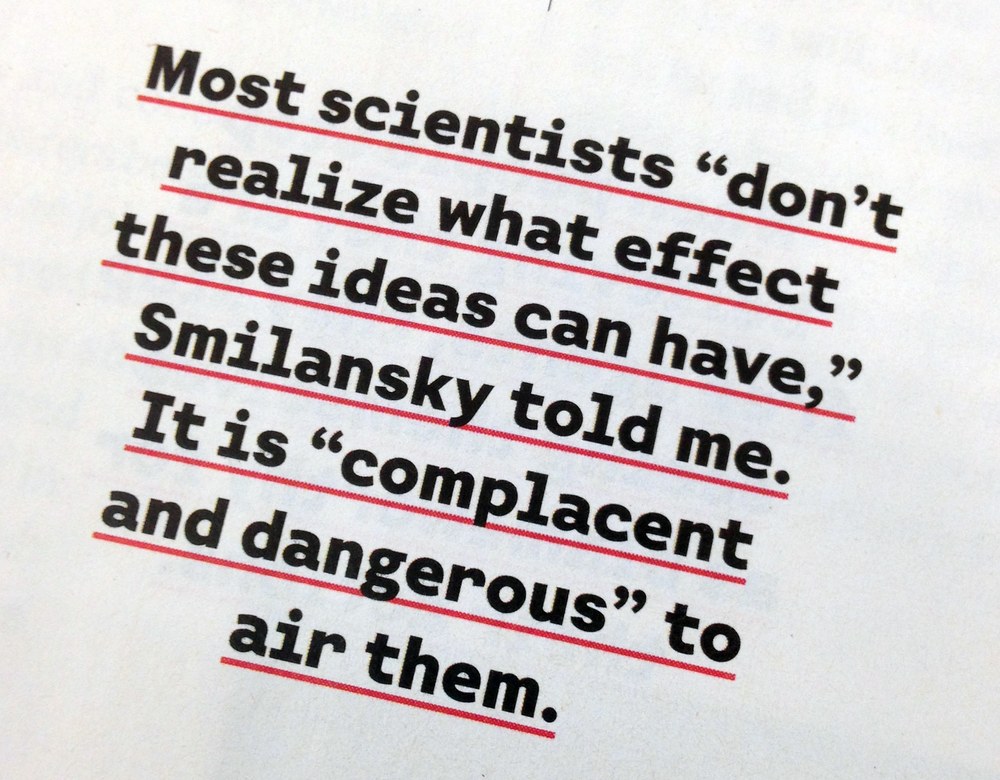
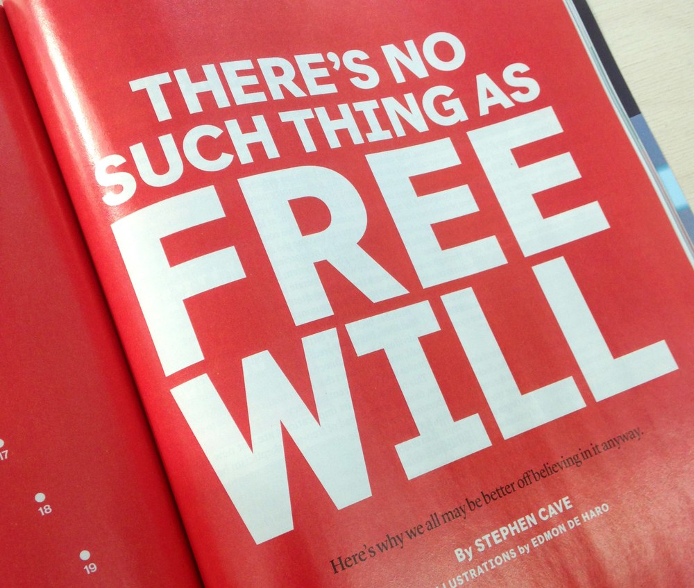
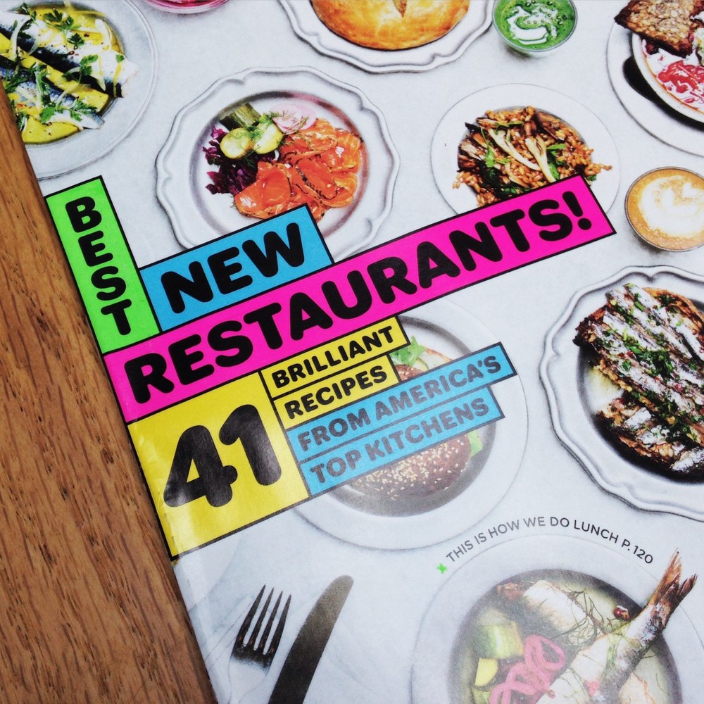
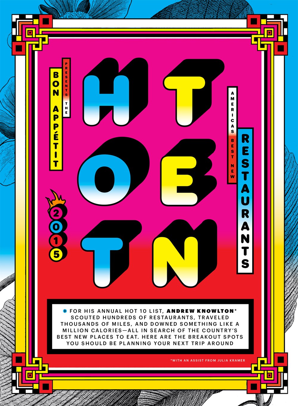
Drawn by Miguel Reyes for a package of stories on parties in a 2014 issue of Bon Appétit. Based on lettered titles from a Royal Ascot horse racing event broadcast in the 1970s.
Royal Ascot Family
Bon Appétit, October 2014 issue
Bon Appétit, October 2014 issue
Bon Appétit, October 2014 issue
Bon Appétit, October 2014 issue
Bon Appétit, October 2014 issue
Azzurri

| Designer | Paul Barnes |
| Designed | 2010 |
| Last updated | 22 May, 2014 |
| Styles | 1 |
| Price | $50.00 |
| Character set | Standard character set |
Azzurri Regular Style

Azzurri Regular Style

Azzurri Regular Style
Designed by Paul Barnes, along with Gabriello, for Puma. Azzurri is a low-contrast italic with faceted edges and no curves, designed to look both legible and stylish on the backs of football shirts. The swashes were a later addition.
Azzurri Regular Style


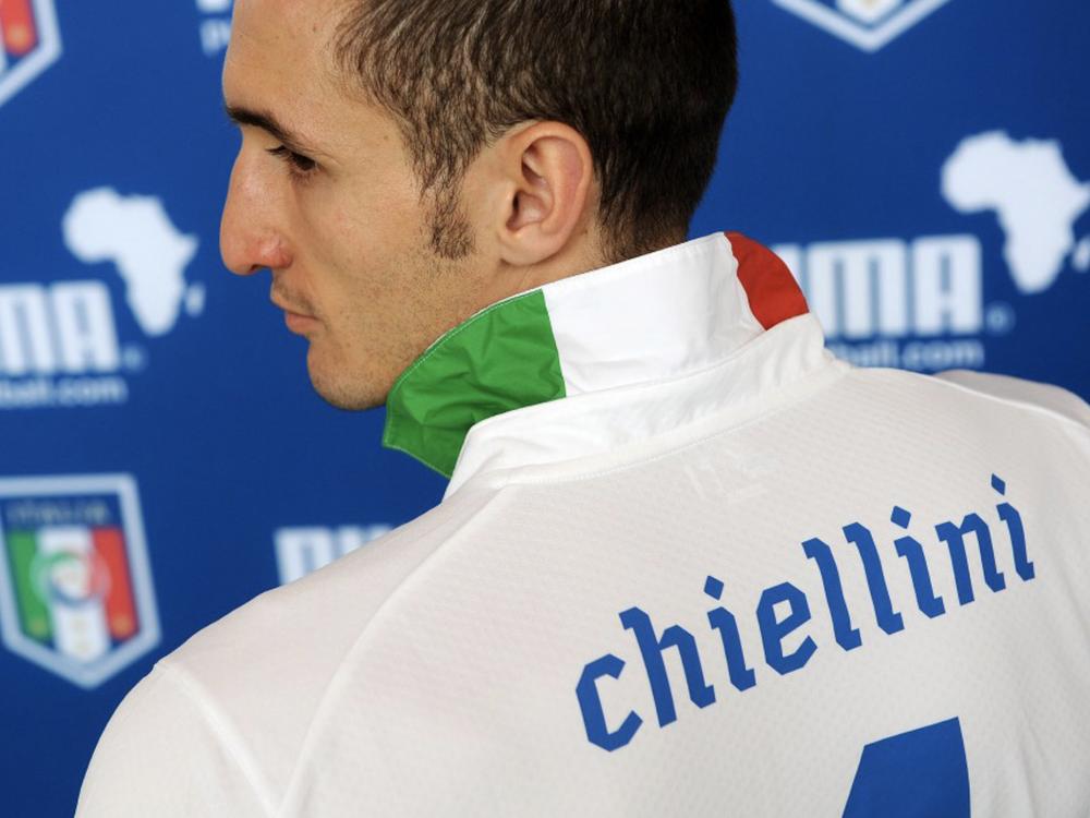
Azzurri and Gabriello in their original context
Azzurri in action in 2010
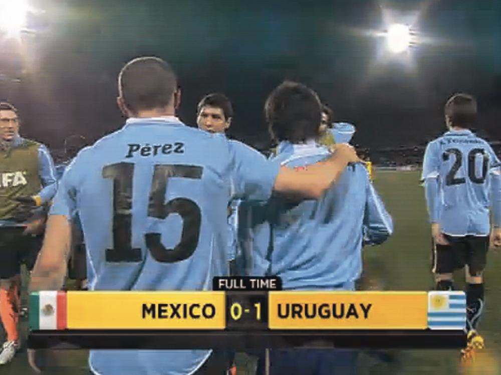
Azzurri in action in 2010
Neue Haas Grotesk Agate

| Designer | Christian Schwartz |
| Last updated | 30 Sep, 2013 |
| Styles | 10 |
| Price | $70.00 style $350.00 family |
| Character set | Standard character set, plus numbers in circles and squares |
Neue Haas Grotesk Agate Family

Neue Haas Grotesk Agate Family

Neue Haas Grotesk Agate Family
The 2013 year end issue of Bloomberg Businessweek featured a long section of very dense spreads of hard data from various industries, showing a snapshot of the current state of many companies. Creative director Richard Turley commissioned an Agate version of Neue Haas Grotesk in a number of duplexed weights, to cram tons of information into this section. Compared to the existing Text version, which is drawn for use around 8pt to 12pt, the Agate, drawn for use at 4pt to 6pt, has a larger x-height, smaller cap height, looser spacing overall, and ink traps to counteract the effects of ink on paper, which has a dramatic effect on text set at such small sizes.
Neue Haas Grotesk Agate Family
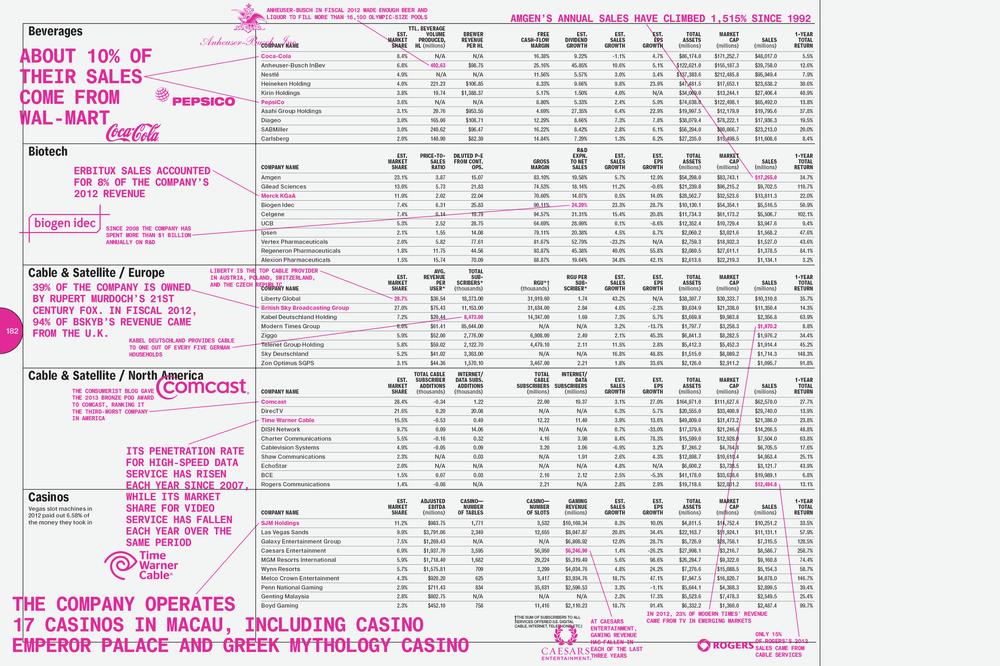
Spread from Bloomberg Businessweek, 18 November 2013 issue

Bloomberg Businessweek, 18 November 2013 issue
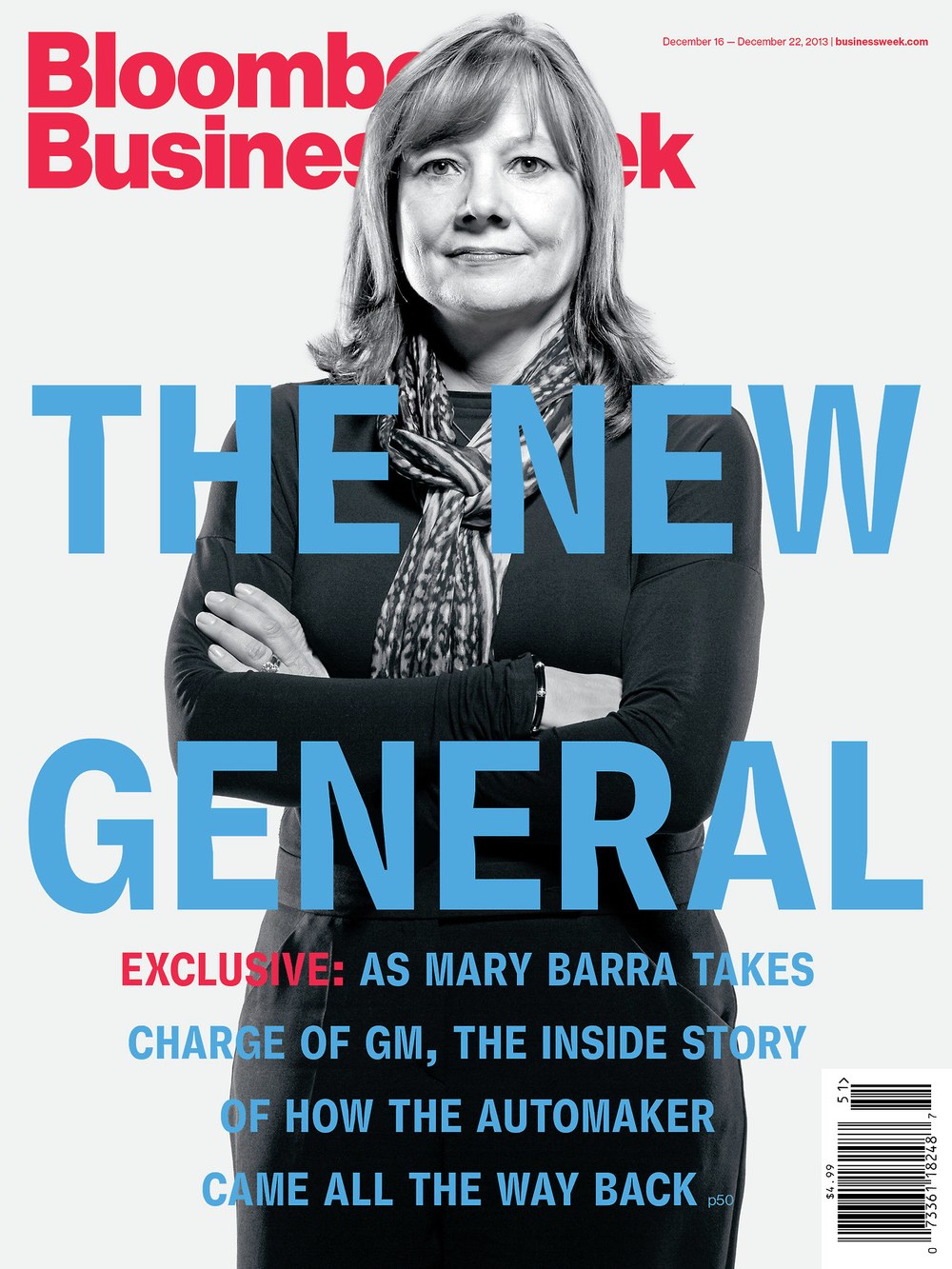
Bloomberg Businessweek cover, 13 December 2013
Kommissar

| Designers | Vincent Chan, Christian Schwartz |
| Designed | 2012, 2014 |
| Last updated | 9 Sep, 2013 |
| Styles | 21 |
| Price | $50.00 style $200.00 family |
| Character set | Standard character set |
Kommissar Collection


Kommissar Collection

Kommissar Collection
Kommissar was originally designed for Florian Bachleda’s redesign of Fast Company in 2011. The magazine needed a condensed typeface that suggested the future while referencing the past. The family is inspired by 1920s and ‘30s-era German display faces such as Plak Condensed and Vertikal. The lively texture of round and sharp corners along with a lack of notches in the arches keeps all of the “action” on the tops and bottoms of the characters. With this simplified lowercase, Kommissar gives headlines and short blocks of text an unusual, but unique visual rhythm.
Kommissar Collection
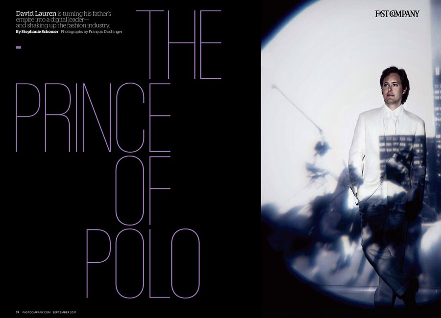
Fast Company, September 2011
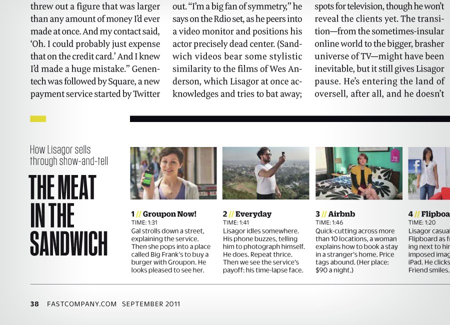
Fast Company, September 2011
Duplex

| Designers | Berton Hasebe, Paul Barnes, Christian Schwartz |
| Designed | 2013 |
| Last updated | 22 May, 2013 |
| Styles | 9 |
| Price | $50.00 style $200.00 family |
| Character set | Standard character set |
Duplex Collection

Duplex Collection

Duplex Sans

Duplex Serif
Duplex Collection
Danish newspaper design specialists Ribergård + Munk commissioned a pair of headline typefaces from us as part of a sweeping overhaul of well over a dozen daily newspapers published throughout Sweden by MittMedia. Berton Hasebe designed Duplex Serif and Sans to solve a very specific problem for this newspaper group. A new format was being developed for all of their titles, to decrease ineffeciencies in production and to allow the different titles to more easily share a portion of their stories. However, as publishers of both upmarket and downmarket papers, the owners wanted to keep the general character of each paper intact: louder volume and more of a feeling of immediacy in the downmarket tabloids, and a quieter, more respectable tone of voice in the upmarket tabloids. The solution to this problem was a set of serif and sans serif typefaces with precisely the same spacing, so they could be swapped out to change the character of a page without affecting the copyfit. Duplex Sans is adapted from Guardian Sans Headline, and the Serif is influenced by the variations on Caslon that were popular for news headlines in the early 20th century.
Duplex Collection
The weights are offset by one step, meaning that the Sans weight matches the widths of the next lightest Serif weight, i.e. Sans Semibold > Serif Regular
Duplex Serif & Sans overlaid

Telesans

| Designers | Paul Barnes, Dan Milne |
| Designed | 2014 |
| Last updated | 1 May, 2013 |
| Styles | 36 |
| Price | $50.00 style $200.00 family |
| Character set | Standard character set |
Telesans Collection


Telesans Collection

Telesans Head

Telesans Text

Telesans Agate
Telesans Collection
Compact humanist sans designed for the Daily Telegraph. The Agate is particularly useful. This family makes a very good companion to Austin News.
Telesans Collection
Schnyder Titling

| Designers | Berton Hasebe, Christian Schwartz, Jean-Frédéric Schnyder |
| Designed | 2013 |
| Last updated | 12 Feb, 2013 |
| Styles | 12 |
| Price | $80.00 style $500.00 family |
| Character set | All caps in 3 widths with standard punctuation |
Schnyder Titling Family

Schnyder Titling Family

Schnyder Titling Family
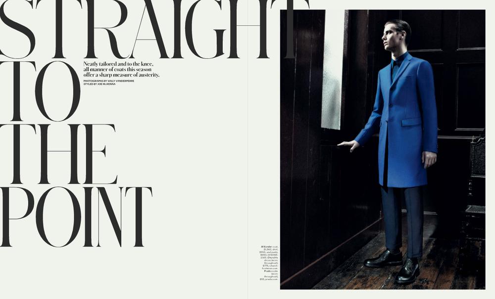
Mixing different widths in a single headline was a signature of how Patrick Li and his team used Schnyder in T, the New York Times Style magazine between 2013 and 2019. Schnyder Titling was built to make it easier to implement this effect, with three widths of capitals combined into a single font and all kerned together. Uppercase is the widest proportion, lowercase the middle, and small caps the narrowest.
Schnyder Titling Family
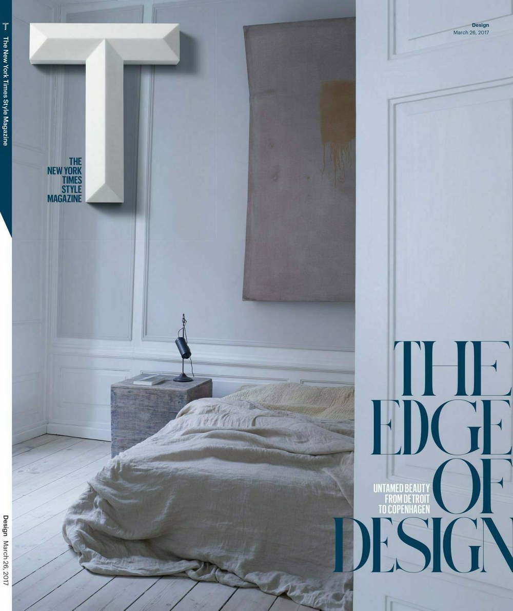
Cover of T, 2017
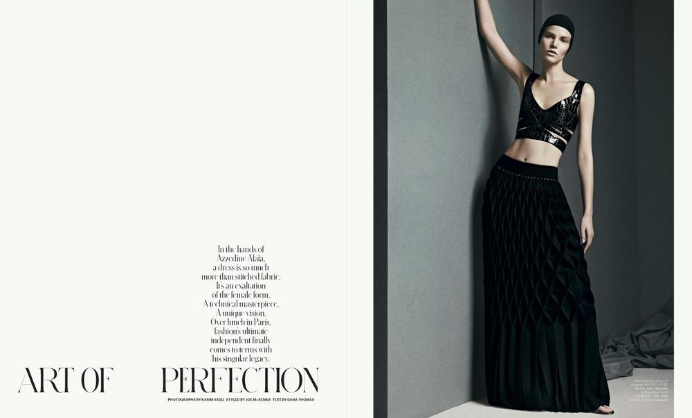
Spread from T, 2013
Spread from T, 2013
Spread from T, 2015
Pialat

| Designer | Berton Hasebe |
| Designed | 2010 |
| Last updated | 20 Aug, 2012 |
| Styles | 4 |
| Price | $50.00 style $150.00 family |
| Character set | Limited character set |
Pialat Family

Pialat Family

Pialat Family
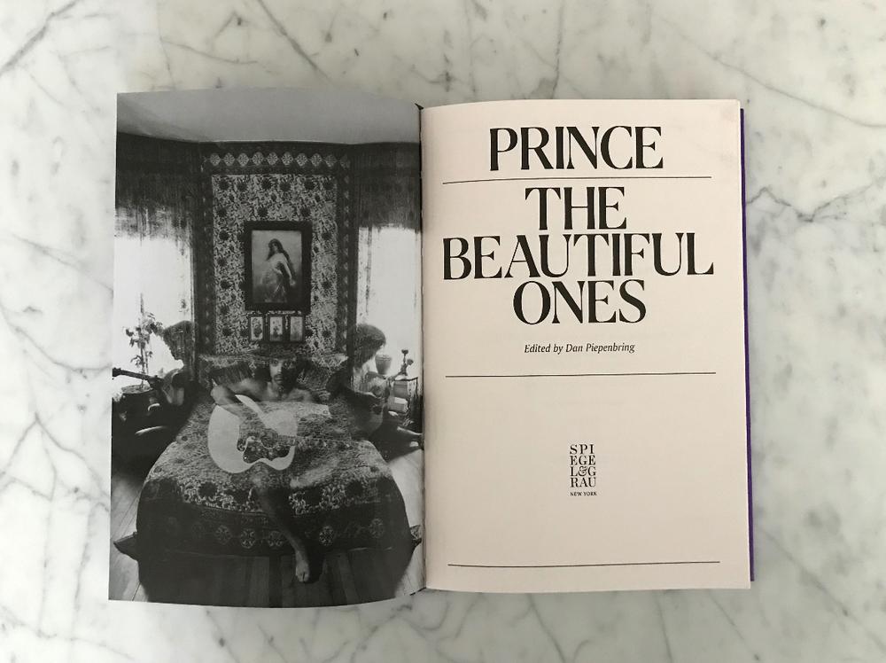
Drawn by Berton Hasebe in 2012, this was the display face for a couple of years in T, the New York Times Style Magazine, commissioned by Chris Martinez, then later used by Triboro for Prince’s posthumous memoir The Beautiful Ones.
Pialat Family
T, the New York Times Style Magazine, 2012
T, the New York Times Style Magazine, 2014
T, the New York Times Style Magazine, 2010
T, the New York Times Style Magazine, 2011
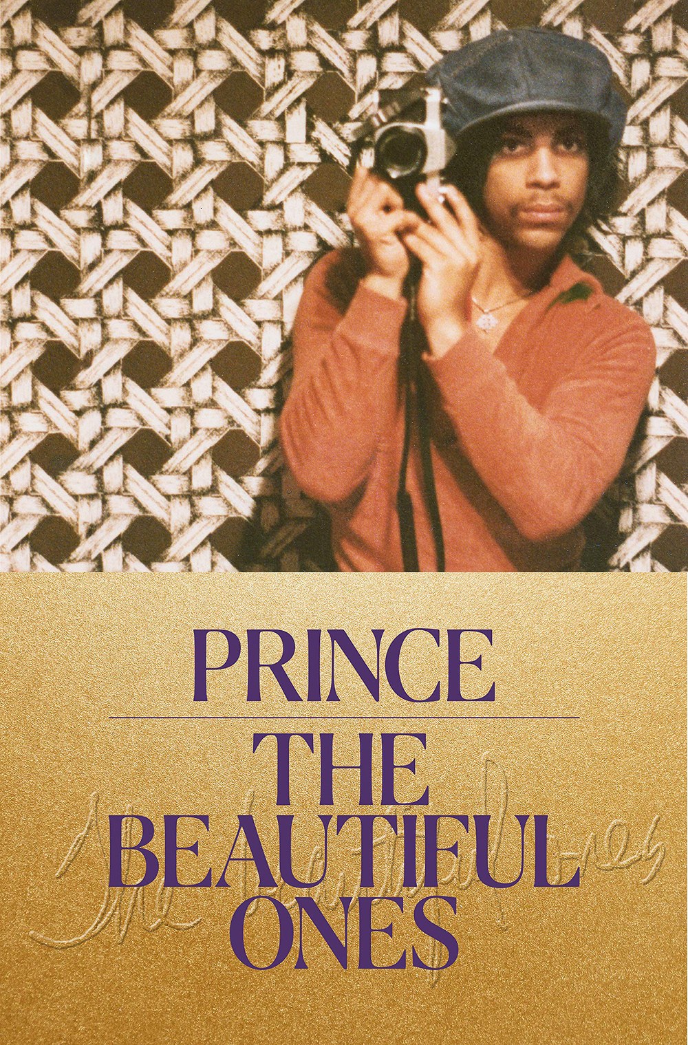
Prince’s memoir, designed by Triboro Design
Prince’s memoir, designed by Triboro Design

Prince’s memoir, designed by Triboro Design
Oboi

| Designers | Vincent Chan, Christian Schwartz |
| Designed | 2012 |
| Last updated | 23 Jul, 2012 |
| Styles | 1 |
| Price | $35.00 |
| Character set | Basic Latin + Cyrillic, no accents, limited punctuation |
Oboi Stencil Style

Oboi Stencil Style

Oboi Stencil Style
Based loosely on stencil lettering on house number plates in St Petersburg, Russia, with lots of alternate forms. Drawn for Meirion Pritchard for a special issue of Wallpaper*.
Oboi Stencil Style
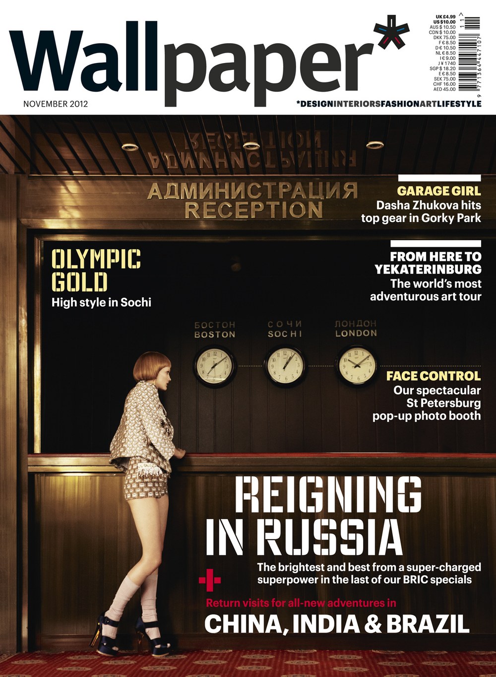
Wallpaper* November 2012 issue
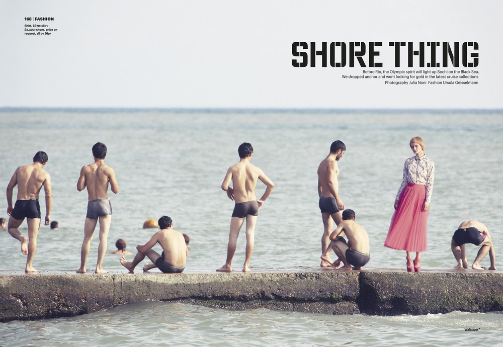
Wallpaper* November 2012 issue
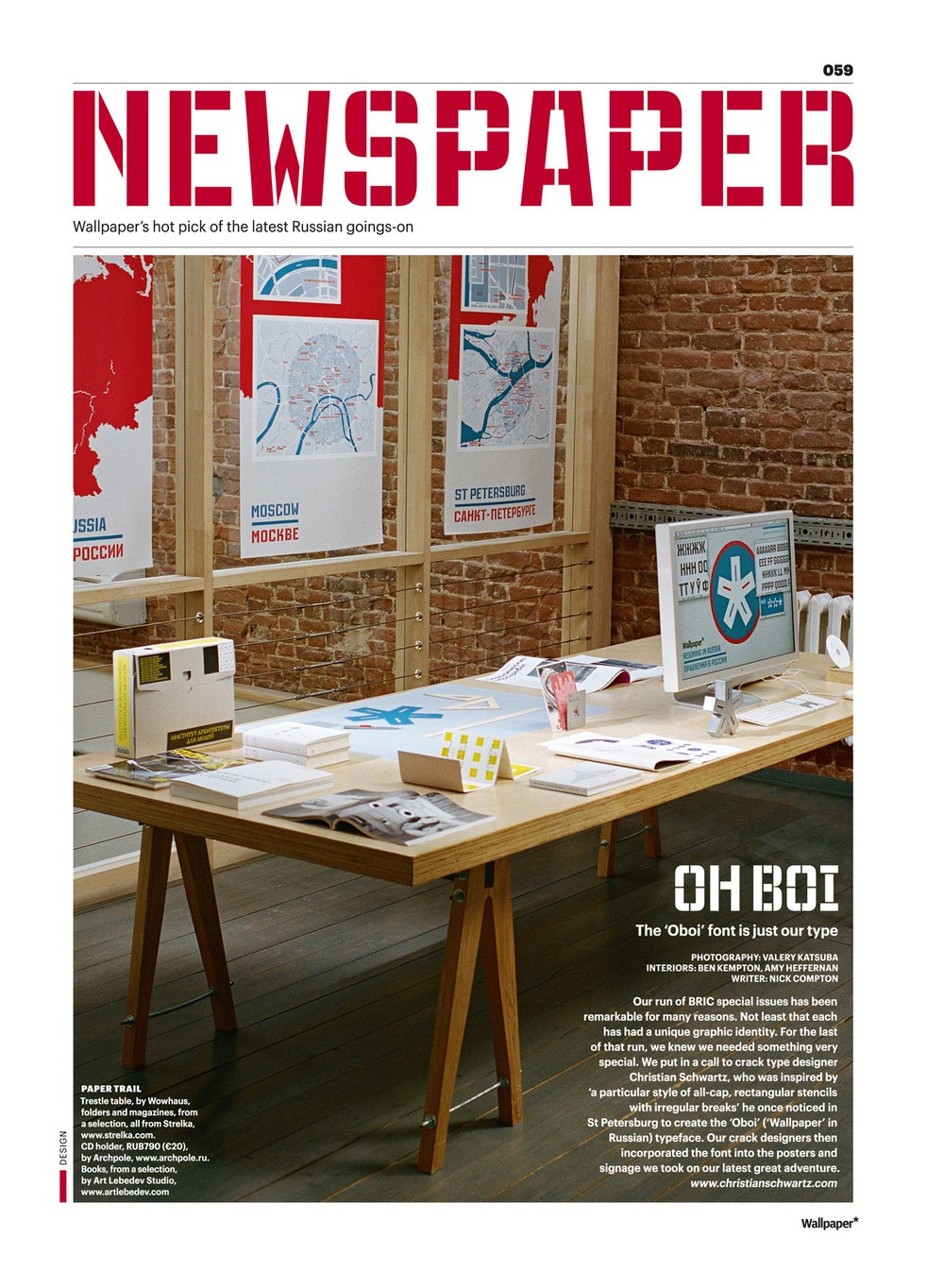
Wallpaper* November 2012 issue
Neue Haas Grotesk Stencil

| Designer | Christian Schwartz |
| Designed | 2011 |
| Last updated | 13 Sep, 2011 |
| Styles | 1 |
| Price | $70.00 |
Neue Haas Grotesk Stencil 55 Roman Style

Neue Haas Grotesk Stencil 55 Roman Style

Neue Haas Grotesk Stencil 55 Roman Style
This is a stencil version of the Regular weight of Neue Haas Grotesk, drawn for a sports issue of Bloomberg Businessweek in 2011, loosely inspired by the work of Lawrence Weiner (who despised Helvetica, as we found out the week after the issue came out).
Neue Haas Grotesk Stencil 55 Roman Style
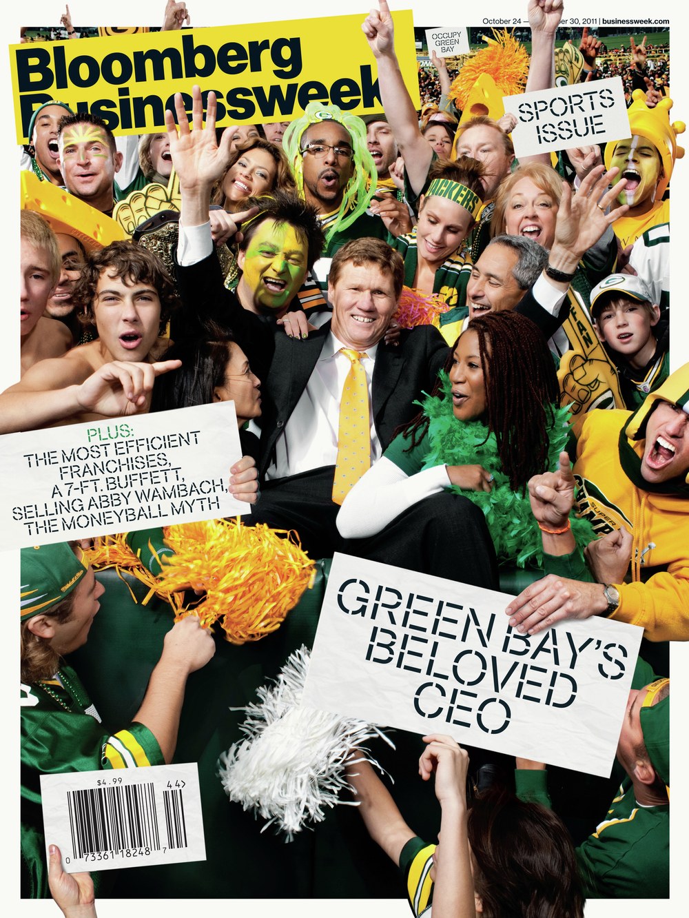
Bloomberg Businessweek cover, 21 October 2011
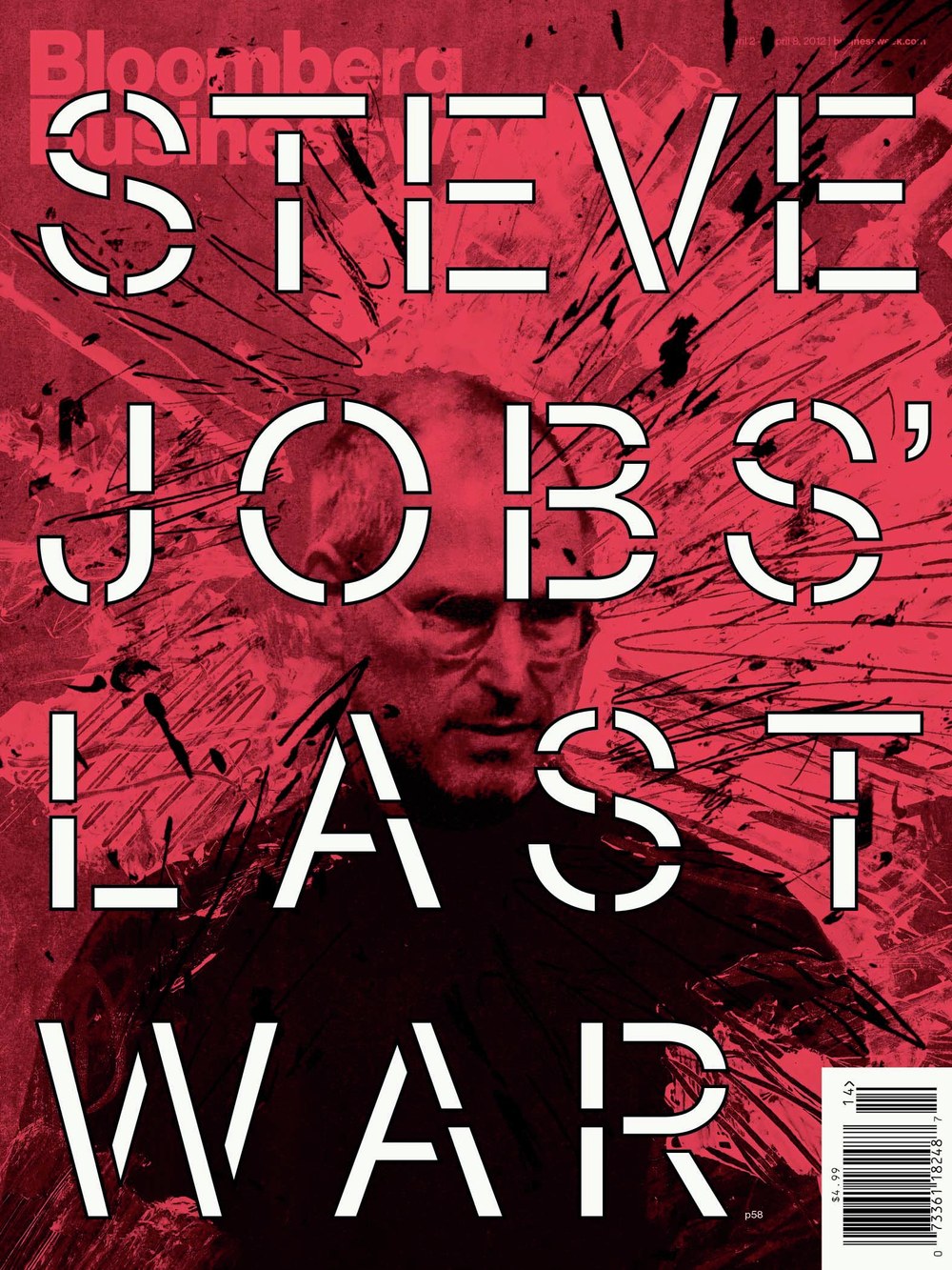
Bloomberg Businessweek cover, 30 March 2012
Guardian Compact

| Designers | Christian Schwartz, Paul Barnes |
| Designed | 2005 |
| Last updated | 19 Dec, 2007 |
| Styles | 9 |
| Price | $50.00 style $250.00 family |
| Character set | Basic character set with limited accented support |
Guardian Compact Family

Guardian Compact Family

Guardian Compact Family
Guardian Compact has shorter, simpler serifs and narrower, stiffer proportions than Guardian Egyptian Headine. People always seemed to like this compact, flat-sided variant of Guardian Egyptian, but we never got around to drawing italics and finishing it.
Guardian Compact Family
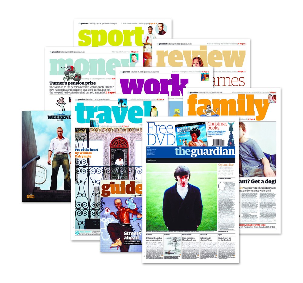
Saturday sections from the Guardian redesign in 2003.
Caslon Dot

| Designer | Paul Barnes |
| Designed | 2007 |
| Last updated | 2 Nov, 2007 |
| Styles | 1 |
| Price | $20.00 |
| Character set | Capital letters and figures, with period and at sign |
Caslon Dot Regular Style

Caslon Dot Regular Style

Caslon Dot Regular Style
Very light dotted caps, loosely related to Caslon Doric.
Caslon Dot Regular Style

Houston

| Designer | Christian Schwartz |
| Designed | 2003 |
| Last updated | 3 Nov, 2003 |
| Styles | 12 |
| Price | $50.00 style $150.00 family |
| Character set | Basic character set with limited accented support |
Houston Collection

Houston Collection

Houston Headline & Deck

Houston Text
Houston Collection
A Venetian Oldstyle for news, drawn for Roger Black’s redesign of the Houston Chronicle in 2003. The basic structures are based on British Monotype's Italian Old Style, which was based on William Morris's Golden Type. The italic (particularly the alternate italic used in feature sections) also borrows from Nebiolo Jenson Oldstyle, and there is a influence from ATF Jenson Oldstyle in places as well. The Bold has much shorter serifs than the Roman, so it can be spaced tightly
Houston Collection

2006 front page from the Houston Chronicle.
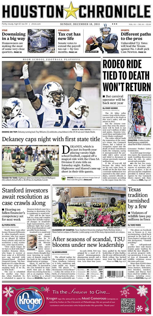
2011 front page from the Houston Chronicle, with the redesign from 2003 still in place.